Martin (XPUB)-project proposal
Graduate proposal guidelines
What do you want to make?
I want to explore the key roles of digital and physical architectures in the representation and transmission of knowledge by merging them under the form of a physical exhibition interface. To be more specific, I wish to build an exhibition space inspired from the elastic (plastic) display/render of online contents that mostly adapt to the user/viewers perspective. In that sense, I want to build an exhibiting device willing to put the spectator in the position of being the curator and user of it's own physical exhiibition space and allow a single representation/content/artwork to be displayed under a wide range of possible settings. Comparably as a pointer or a cursor, the spectator/user can move inside the space (SpectatorX/SpectatorY = MouseX/MouseY) and resize this same space (SpaceWidth & SpaceHeight = WindowWidth & Windowheight) by pushing or pulling a movable wall fixed on some rails/wheels. The number of spectators, its/their position inside the space, as well as the interactions engaged with it will affect various display factors such as the lighting, sound, projection format, information layout, etc. Such interactions could also give space to some accidents, unforeseen, bugs, deadzones and glitches that might have been intentionaly left there). This is an attempt to speculate on how the cybernetics(?) affects alls aspect of our lifes and could also transform the exhibition space, the curatiorial practice, our experience of art and the nature of representation itself.
How do you plan to make it?
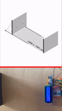
While working with Arduino Mega and Rasperry Pi, my aim is to start from the smallest and most simple prototype, gradually increase its scale/technicality until reaching human scale and getting closer from emulating the properties of a Web window (see: prototyping). Once an exhibtion space will be found/determined for the graduation, I will build a custom mobile wall, or use a preexisting one, add some handles to it, and fix it on a rail system that will allow to reduce or expend the size of a space from in between a maximum and a minimum range. This wall will include on on the back at least one sensor that will help to determine the size of the room in real time. (see schema). With the help of an array of sensors putted on the 3 static walls of the exhibition space, the space will be mapped into a grid, and will allow to know the real-time position of the spectator(s) inside of it.
In order to better define my audience, the issues, and the direction of this work, I will take advantages of the different venues organized by XPUB to involve people into testing and reflecting on various prototypes of this work in progress. (see venue1)
(see: simulation)
What is your timetable?
- 1st semester Prototyping with Arduino all long, getting started with Raspery, and finding a space to set up
- 1st prototype: mini arduio + light sensor (understanding arduino basics) [[1]]
- 2nd prototype: arduino uno + utlrasonic sensor (working with ultrasonic sensors) [[2]]
- 3rd prototype: arduino uno + utlrasonic sensor + LCD screen (working with values display) [[3]]
- 4th prototype: arduino uno + utlrasonic sensor + 2 LEDS (working with in-between distance range values detection) [[4]]
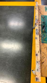
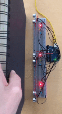
- 5th prototype: arduino uno + 3 utlrasonic sensor + 3 LEDS (mapping range values detection in a grid and attributing signals with LEDS) [[5]]
- 6th prototype: arduino uno + 3 utlrasonic sensor + 12 LEDS (mapping range values detection in a grid and attributing signals with more LEDS) [[6]]
- 7th prototype: arduino uno + 3 utlrasonic sensor + 1 buzzer + 1 LCD + 1 Potentiometer (adding audio signals to the range value detection) [[7]]
- 8th prototype: arduino uno + 3 utlrasonic sensor + 1 buzzer + 1 LCD + 1 Potentiometer + mini breadboard (separating sensors from each others) [[8]]
- 9th prototype: arduino Uno + 21 LEDS + 7 Sensor + Buzzer + Potentiometer + LCD expending the prototype to human scale
——————————— NOW —————————————————————————————————————————
- Upcoming: arduino uno + 3 utlrasonic sensor + 5V Relay + Lamp (controlling a lamp with arduino)
- Upcoming: arduino uno + 3 utlrasonic sensor + ESP8266 (WIFI) + Rasperry Pi (Self hosted website) (transmit or/and control value from arduino to computer and vice versa via WIFI transmitter)
- Upcoming: small room + arduino uno + 8 utlrasonic sensor + ESP8266 (WIFI) + Rasperry Pi (connect to a Web page)
- 2nd semester: Find what will be graduation space, build the mobile wall, and translate the setup installation to human/spectator scale.
- Show prototype and schemas of the wall to wood and metal workshops in order to get advices until final validation to build (starting to build physical elements)
- Search, find and validate what will be the space used for the installation during the graduation.
- Start building of the movable wall by considering the characteristic of the space used for graduation.
- Implement the sensors inside the movable wall, and the other devices in the fixed space
Why do you want to make it?
In opposition to the physical exhibition space, the Web offers to each of its user/visitors a custom point of view based on an innumerable and everchanging array of technological factors. I like to call this the technological context. Among these, we could list: the browser, the device, the explotation system, the screensize, the resolution, the user configuration and defaults settings, the updates, the IP adress, etc.. This technological complexity diffracts the possible renders of a same Web page in an almost infinite array of user perspectives. Therefore, this is the nature and meaning of representation itself that is redifined by the Web. Web representations are sort of plastic/elastic, they demultiplies and transforms themselves as much as needed in order to be rendered in an optimal way through our own user perspective/interface. By implementing these notions and properties into the phyiscal exhibition spaces, I would like to put a step in the curatorial practice.
From our own user perspective/point of view, behind our own screen, this technological complexity and the infinite spectrum of perspectives that it leads to can hardly be considered (expect here for example). This brings us to uncounsioulsy forget about the singularity and fragility of what we is being seen/experienced/interpretated. By creating a physical interface conceived on the model of a responsive Web page, I want to give to the visitors the power to manipulate and diffract this spectrum of perspectives by their own hands and to consider the role and effects of these mediating technologies on the visitor's behaviors and perception of an artwork/content.
On the other hand, I am attached to the idea of reversing the desktop metaphor. The desktop metaphors refers to the terms and objects that the Web borrowed from the physical world in order to make its own concepts more familiar and intelligible to its users. Now, largely democratized and widely spread in modern society, people may have now more concrete experiences of the digital/Web interface than the physical space. Museums, hotels, houses, cars interiors, restaurants are themselves becoming more and more comparable to digital interface where everything is optimized, and where our behaviours, actions and even inactions are being detected and converted into commands in order to offer a more customized (and lucrative) experience to each of us. In that sense, we are getting closer from becoming users of our own interfaced/augmented physical realities. By creating a exhibition spaces explicitly inspired from a desktop Web interface, I wish to question what could be the future of exhibition space, and what are the vulnerabilities of such technologies.
Conceiving the exhibition space as a Web interface, and the spectator as a user is also about puting together two layers of reality that are too often clearly opposed/seperated(IRL VS Online). This is about experiencing their ambiguities, similarities, and differences. It is about reconsidering their modalities by making them reflect on each others, and making the user/spectator reflect on its own agencies inside of them. (see: Reversing the desktop metaphor)
More generally, it is about reflecting on media itself, and deal with a paradox that I've always found interesting: The better a medium mediates, the more it becomes invisible and unconsidered. see: Mediatizing the media). This observation makes me want to mediate the media and to give spectators more occasions to focus on what is containing, surrounding, holding or hosting a representation instead of giving all our focus on the representation itself.
Who can help you?
- About the overall project
- Stephane Pichard, ex-teacher and ex production-tutor for advices and help about scenography
- Emmanuel Cyriaque: my ex-teacher and writting-tutor for advices and help contextualize my work
- About Arduino
- XPUB Arduino Group
- Dennis de Bel
- Aymeric Mansoux
- About Rasperry Pi
- XPUB2 students (Jacopo, Camillo, Federico, etc)
- Michael Murtaugh
- About creating the physical elements:
- Wood station (for movable walls)
- Metal station (for rails)
- Interaction station (for arduino/rasperyPi assistance)
- About theory/writting practice:
- Rosa Zangenberg: ex-student in history art and media at Leiden Universtity.
- Yael: ex-student in philosophy, getting started with curatorial practice and writtings about the challenges/modalities of the exhibition space. Philosophy of the media (?)
- About finding an exhibiting space:
- Leslie Robbins
Relation to previous practice
During the first part of my previous studies, I really started being engaged into questioning the media by making a small online reissue of Raymond Queneau's book Exercices de Style. In this work, the user/reader was encouraged to explore the 99 differents ways to tell a same story from Queneau, by putting itself in at least 99 different reading contexts. In order to suggest a more non-linear reading experience, reflecting on the notion of context, perpective and point of view, the user could unlock these stories by zooming-in or out the Web window, resizing it, changing the browser, going on a different device, etc. As part of my previous graduation project, I wanted to reflect on the status of networked writing and reading, by programming my thesis in the form of Web to Print Website. Subsequently, this website became translated in the physical space as a printed book, a set of meta flags, and a series of installations displayed in a set of exhibition rooms that was following the online structure of thesis (home page, index, part 1-2-3-4) Project link. It was my first attempt to create a physical interface inside an exhibition space, but it was focused on the structure and non-linear navigation rather than the elastic property of Web Interfaces. As a first year student of Experimental Publishing, I continued to work in that direction by eventually creating a meta-website making visible html <meta> tags in the middle of an essay. I also worked a geocaching pinball highligting invisible Web events as well as a Web oscillator inspired from analog instruments's body size, and which amplitude and frequency range were directly related to the user's device screen-size .
Relation to a larger context
Curatorial Practice / New Media Art / Information Visualization / Software Art / Institutional Critique / Human Sciences / Cybernetics
References
- Stéphanie Moser, 2010. THE DEVIL IS IN THE DETAILS: MUSEUM - Displays and the Creation of Knowledge. 1st ed. Southampton, England
- Alexander R. Galloway - The Interface Effect 1st ed. Malden, USA: Polity Press.
- Jonas Lund, 2012. What you see is what you get
- Shilpa Gupta, 2009 - 2010. Speaking Wall
- Frederick Kiesler, 1925, City of space
- Brendan Howell, 2017(?) - The screenless office


