User:Joca/Draft first chapter
Draft first chapter
Essay one
I - Reading between the headlines
The future is a utopia with everlasting afternoon sun and computers that correctly understand people. At least, that is the techno perfect Los Angeles as portrayed in Spike Jonze's movie Her (2013). While transcribing people's thoughts and organizing their life, the digital assistants even have the time to fall in love with some of their users.
Even in the LA of the future, the latter is controversial. However, there is a different scene that I remember in particular. During his commute, the main character Theodore Twombly checks the news. I expected that something spectacular would happen: Could a virtual news anchor give an update? Is the latest news combined with matching memes that pop-up as holograms? Or, if it is not about the spectacle, at least this part would be as carefully designed as the rest of the movie.
In the end, none of that follows. Even in this bright future where everything is possible, the digital assistant spits out the latest headlines and Theodore falls for a clickbait article.
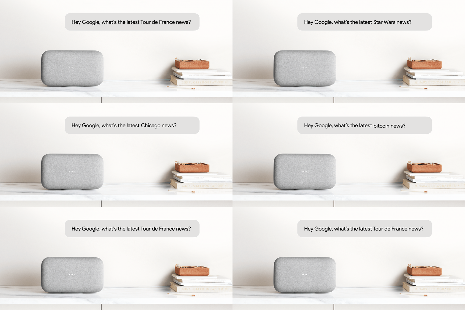
This is surprisingly similar to the way news is designed on conversational interfaces in 2019. With these type of interfaces, I mean digital assistants like Line Clova and Google Assistant that are built into smartphones, as well as devices like the Google Home and Amazon Echo. What they have in common is that these conversational interfaces provide a way to interact with digital systems with your voice, without the need to touch a screen. Ask Alexa, Assistant, or Siri for the news, and you get a briefing that features many headlines with an unknown author. If you want to know more about a specific event, the speaker will read out the article or play a particular part of an hourly news broadcast.
Although the news briefing is often demoed in the commercials and presentations of these smart speakers and digital assistants, it is not commonly used by people that use these devices. The Verge, an online publication focused on technology and culture, concluded quickly that 'Smart speakers have no idea how to give us the news.' (Brandom, 2018)
Between gossip and societal discourse
Making a computer voice read some text from the internet, without giving any context, is a questionable approach to news, but it is understandable if you take into account how conversational interfaces are mostly used nowadays: digital personal assistants that help people control their devices, in such a way that the actual technology and complexity is out of sight. This might be nice to control light switches in a home or to stream music, the most popular use cases for smart speakers at the moment (Molla, 2018). However, this urge for a nearly invisible interface ignores some specific characteristics of news and the role of journalism.
In The Elements of Journalism (2007) Kovach and Rosenstiel describe a moment where anthropologists compare their notes on communication and find some universal patterns for news throughout history and cultures: news has a certain momentness and pace. It is about what is happening outside of people's own experience but has an impact on their lives. The authors conclude that journalism is 'simply the system societies generate to supply this information about what is and what's to come' and that it is part of the human instinct to be curious.
Historian Michael Schudson (2013) argues in reaction to Kovach and Rosenstiel that gossip might be universal, but the form and the conventions in journalism are highly dependent on the time and culture. For Schudson 'journalism today
relates to the constitution of public life, an institution in which criticism and discussion is part of its function', but to get that role journalism was dependent on something like the existence of a public sphere starting in the eighteenth century and organized efforts to publish a collection of current affairs periodically.
Balancing between the gossip and the societal discourse, the idea of popular news and quality news is visible in different media, from newspapers to online. What these media have in common is that they try to create a meaningful news experience to their audience. To me, such an experience is based on this idea that you read, see, or listen to coverage of a particular news event and that it sparks a thought. Beyond the transfer of information to the brain, you start to think about how this news event relates to you as a person and your position. In case of an article about the new outfit of Kim Kardashian, it could be a chat I have with a friend after sharing the article. In the case of an article about corruption in the Brazilian government, it might motivate me to start a protest. In both cases, the article is not the end. It's a trigger for some extension.
There is a whole tradition in creating news media that facilitate a meaningful news experience fitting the character of the publication. It is not only in the choice of news to cover but also in the ways the report is designed: from the visual design of the newspaper to the role of the news anchor on broadcast television. The current form of the story on smart speakers ignores these traditions mostly, showing little cues about the situatedness of the news. Before further discussing the causes and propose an alternative, it is good to see how news found its form in other media.
The archetype of the modern newspaper developed in the United States during the first half of the 20th century, as Barnhurst and Nerone describe in The Form of News. (2001) Innovation in mass-printing and photography enabled a different way of reporting. Where text was used to record events, photography took over to give visual immediacy to the news. The role of the writing journalist changed into filtering the news-worthy aspects of an event instead of writing a full chronological report. This resulted in a shorter, matter of fact articles and the development of the idea of the newspaper encouraging a stance of objectiveness.
Looking at the difference between the journal of record and the true tabloid, the difference in content is reflected in the design. In research on Finnish and English newspaper design, Jesso Lamberg (2015) identifies a difference in visual energy: The quality newspaper has a more uniform, and text-focused design. Popular publications tend to focus on more visuals, tilted images and experimental forms of designing a newspaper. Lamberg sees that particular elements from popular newspapers have found their way to the papers of record. For example the use of big photos and little text on the front page, and the adoption of the tabloid paper format. In the end, he concludes that many aspects of newspaper design are not just functional, but also act as a way to show the character of the newspaper to the audience.
Character plays an important role as well for the way news is designed on broadcast media. Where radio news started with reading out the headlines of the newspaper, later on, it developed its own conventions. Radio news had to be vivid, and a good news anchor was one that could bring the story to life by the way it was told. With the arrival of broadcast journalism, this changed. With the addition of image in the form of video, still photos and graphics, a good news anchor was a person that could give an interpretation to the items on a screen. (Ponce de Leon, 2015)
Snowfalling
With the move to online media, there is an interesting difference in comparison to newspapers and broadcast media. A lot of news articles are not read on the website of a news organization, but aggregated and shown on different platforms.
Where in the newspaper age the front page was the defacto way to lure in the readers, and to show the identity of a news medium, the homepage of a news website could be declared dead. In a time where many news media are focused on how their content is displayed in Google News, or try to game the news feed algorithm of Facebook, defending your own platform is quite a statement. S. Mitra Kalita, the vice president for programming at CNN Digital, did so in front of an audience of social media marketers.
Although articles are distributed on other platforms, and people might not need to visit the site and apps of a news medium, it pays off to focus on the homepage according to Kalita: it's an interface where you have full control over, and one which is used by the most loyal readers. (Beard, 2018).
By structuring and showing its content differently on each medium, CNN tries to pack the same story in different ways that are relevant to readers in various situations. To some extent, the interface guides the experience of the user.
This influence of the way news is designed, is not just limited to the sites and apps of news outlets. Even when focusing on getting your story across on other platforms than your own homepage, there is an interface around that content.
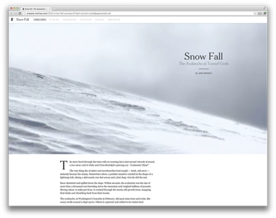
For people who create the content, the scope of the interface is limited to the one article, video or VR environment they are working on. The poster child of that approach is Snow Fall (Branch, 2012). This long read about an avalanche in Tunnel Creek was published by the New York Times. It featured a groundbreaking design with full-screen videos, slideshows, and special effects when reader scrolled through the article.
Many other publications copied the format and snowfalling was declared to be 'the future of journalism' because it showed to promise of high-quality long-form journalism online as a way to attract and engage an audience. It didn't work out that way, mostly because of the time and resources it takes to create these rich articles with custom interfaces: Snow Fall alone took 6 months to make and had 11 people working it (Thompson, 2012).
Job to be done
To understand the way digital news media are designed and how the rationale behind the design differs from older media, it is good to dive deeper in the foundations of what is considered 'good' interface design.
With the rise of the web, the quality of the interaction design became one of the critical aspects for having people use websites. In the nineties, the term user experience design (UX) was coined to focus on all issues of user interaction with the products and services of a company. (Nielsen & Norman, 1998) The field combines interaction design with psychology and many other disciplines that touch upon that topic.
Although identified as a field of design quite recently, the practice of UX already started in the fifties, with foundations that come from Human-Computer Interaction (HCI). Traditionally, this discipline approaches interface and usability from a task-based and rationalistic perspective.
HCI incorporated the importance of experiences and motivations of people using an interactive system (Bødker, 2006) and you see traces of that in UX design. The question is however what type of user experience is the goal. People are still users with a job to be done, preferably in an efficient way.
The notion of user experience got a lot of traction since the dot-com bubble, the work of firms like the Nielsen Group and the inclusion of UX in curricula of design schools. Best practices are shared in digital libraries of interaction patterns: from buttons to colors to clear text.
Humanistic interface
This led to universally accepted practices in navigating through interfaces and drive users conversion: the goals for which an interface is designed. This could be buying goods, or spending time for example. Good conversion makes the difference between a bankrupt or a profiting webshop. However, are the foundations for a successful e-commerce interface necessarily the same for the interface of a news medium?
In current task-focused UX theory, the activity of interpreting information has a secondary role. The website, app, or any experience, is seen as a means to an end. But there are other perspectives on this digital space.
Media scholar Johanna Drucker sees the interface as the combination of what we read and how we understand. People control the interface as much, as the interface ignites a particular user experience. A website is then not merely a tool, but a space where people engage with information and the systems behind it.
Building upon this idea is the concept of the humanistic interface (Drucker, 2014). This theory fills the interpretation gap in the current practice of UX design because it approaches the interaction design from the idea of critical insight: focusing on comparison, contrast and offering space to make meaning instead of merely presenting content efficiently.
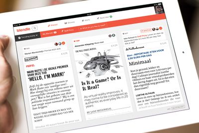
Drucker stays quite abstract about what these websites and apps would look like, stating that 'the humanistic interface is still in its infancy.' There are however examples of designs and interactions that fit this idea.Blendle is an online service where people can pay for individual articles of major print publications. In its interface Blendle puts a lot effort in recreating the visual style from colors to the official fonts of papers like Bild Zeitung, or a magazine like Vanity Fair. It helps people to visually situate the articles. (Spijkerman, 2015) In the selection of featured items on the front page, Blendle tries to balance personalization with the careful selection of pieces that offer a different point of view to that of the user.
Interfacing the comment section differently is one of the methods used by De Correspondent to involve readers and apply their knowledge. A dedicated editor for 'conversations' features interesting comments on the front page, and tries to pair readers with specialists in the comment section. Their goal is to use these conversations as starting points for new research, and it is a way to see what readers get from the articles (Wijnberg & Martèl, 2018).
On smart speakers
Although it seems like a detour, discussing the search for the form of news on media like newspapers, radio and websites make sense in the context of smart speakers. Design conventions of papers found their way in different styles to broadcast media and sites. Even in a non-visual medium like a smart speaker, this is important as most content is taken from articles on news websites. Besides that, these historical examples can also serve as a source of inspiration. A smart speaker is not a radio. Instead of a broadcasting receiver, it sends narrowcasts to a smaller audience. And besides sending information, it also captures data like voice recordings which is sent back to the datacenters of it's creators. Even with these differences in mind it can take some cues from news anchors in reporting news in an engaging way and showing the character of the news medium by the exclusive use of audio.
The role of UX theory and its emphasis on efficiency in interface design plays a vital role in the online design, but it also influences the way smart speakers are designed. In the next chapter, I will further discuss the positioning of conversational interfaces as digital assistants and tools, and why this is an obstacle to facilitating activities that require critical insight, like following the news.
 (Google, 2018)
Essay two
Intermission A
Line Clova speaker here
II - Unleash the assistants
Are you ready to get started? I tap on the speech bubble that says Yeah, let's do it. An indicator appears with three bouncing dots. Someone on the other end of the chat is typing. OK, let's get you the latest news. A GIF of a rapping Michelle Obama appears on my screen. Then a new message comes in, it took only two weeks for Michelle Obama's memoir Becoming to top the 2018 book charts. I can reply using one of two options: Next, or 📚 👏
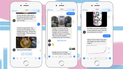
Quartz, a website for business-related news, envisions that this is the future of reading news: you chat with it. Two years ago the publication launched the Quartz Brief app, in which a jolly chat bot guides you through the news by sending story blurbs with funny GIF's and occasionally an advertisement. The app taps in on the rising popularity of chats as a way to interface digital services. This trend is especially visible in China, where WeChat is the go-to app for everything between ordering groceries to buy concert tickets. (Grover, 2014)
The chatbot is heavily restricted in its conversations as I am only allowed to send emoji or skip to the next article. One could even argue that there is no conversation happening at all, as Margaret Rhodes (2016) stated in her article in Wired after interviewing the creators of the app: 'A conversation is an exchange of ideas between two or more parties, and in Quartz’s app the user doesn’t express any original thought'.
Although these constraints are clear to me as a user, the messages do feel personal. Or at least more engaging than a block of content that floats by in a news feed. There is some logic in the statement once made by Matt Webb (2015) that it is strange not to use the same language to our software as to our friends: chatting.
Newsy speakers
Chatbots to interface the news are not common yet, but many news media are working on podcasts at the moment. Interestingly enough, these examples of audio journalism share the same appeal that the Quartz bot has: they feel more personal and engaging than text or video. This leads to an audience that listens for a long time each session. To journalists this is. At the launch of the daily podcast of The Guardian host, Anushka Asthana spoke out her ambition to delve '(...) further into the big stories and cutting through the noise to take our listeners behind the headlines'. (Guardian press office, 2018)
Following this logic, voice-activated smart speakers like Google Home and Amazon Echo are fantastic interfaces for news. You can talk to the digital assistant in a way that is even more personal than the chatbot of Quartz. And the speaker will talk back, like a personalized podcast. Listening to the news is heavily promoted by Amazon and Google. A news anchor function is integrated into both voice platforms. Google Assistant lets you scan swiftly through the press with commands like 'Play BBC Minute at 2X speed'. Using hours of news broadcasts, Amazon trained their Alexa platform to speak like news anchors do. (Vincent, 2018) The idea is that small nuances like accentuation of keywords, differences in speed and even a whisper mode make the computer voice more enjoyable to listen to, as they come closer to what people are used from the way news is presented on broadcast media.
And although the adoption of these digital assistants is growing faster than for smartphone and tablets in their beginning stage, there is something strange: news consumption on smart speakers is lower than you might expect from their popularity. (Newman, 2018)
Digital butler
There are some practical reasons for that, as Nic Newman shows in his research at the Reuters Institute for Journalism. The most stressing one is the quality of news briefings produced by smart speakers. Users complain that they are too long, not up to date and that the production quality is lagging behind.
Another problem is the attribution of the news. It is unclear to users where the stories came from, and how they could control which publications are part of the briefing. Attribution is an important aspect of news, first as a way to show that a newspaper checked that the author is following the standards of the publication (Barnhurst and Nerone, 2001). Nowadays the focus in the byline shifted from to the author and paper to the person sharing the article in a newsfeed on Facebook or Twitter.
In comparison to that the conversational interface seems more like a black box, and in the end, most users prefer other devices to stay updated about the news. Newman concludes that smart speakers and conversational interfaces are still in an early stage of development. He states that the problem with news on smart speakers illustrate '(...) how critical the development of more device-specific content might be -- along with better user interfaces'.
Newman proposes dedicated tools for publishers to create content for smart speakers, an emphasis on short 1-minute bulletins and heavy branding of the audio to make it clear to users to what publication they are listening to. What he doesn't however, is discussing the archetypical role of the smart speaker: a digital assistant.
The envisioned role of speaking computers as virtual butlers has a long history. In the early 1960s, IBM demonstrated the Shoebox, a device that recognized 16 spoken words and the ten digits from 0 to 9. People could use it as a voice-controlled calculator. (IBM Archives, 2003) A more elaborate vision on the virtual assistant is Apple Computer's concept video about the Knowledge Navigator: In this video, a digital assistant with a bow-tie assists a professor in his research to save the Amazon forest, and to remind him of his daily duties. The interaction between the professor and the digital butler is an exchange of commands and blurbs of information including a reminder to pick up a birthday cake. Looking at the way smart speakers are currently advertised, this vision on conversational interfaces is pretty much the same: a virtual assistant that picks up the phone and plans a meeting is a concept in 1987. The difference in 2018 is that Google's Duplex assistant is actually able to call a restaurant and reserve a table for two.
Master/Slave
The digital assistant might be useful for simple tasks, from making an appointment to set a cooking timer. The current practice of news briefings looks however more like a lord in the castle with the butler reading out a newspaper to him.
Even in this strange one-sided way of engaging with news current conversational interfaces are doing poorly. In the interviews done by Nic Newman users of smart speakers complain that the news briefings are not easily consumable due to their length and the unpleasant voice of the digital assistant.
This reminds me of the Master/Slave Dialectic in the Phenomenology of Spirit (1807). In one chapter of this book, Friedrich Hegel describes the dynamic between lordship and bondage. In the beginning the master is on the winning hand, living in freedom, but eventually, the slave might be better off according to Hegel: He finds meaning in and through labor, while the master sinks of in empty consumption and becomes wholly dependent on the enslaved (Siep, 2014). Are we in this case the masters that want to consume news efficiently, while the virtual assistant silently collects data and becomes smarter?
Another problematic aspect of this stereotypical role is that meaningful engagement with journalism is more than consumption of information. Earlier I referred to Johanna Drucker's work on humanistic interfaces, which is mostly focused on scholarly reading. This mode of interacting with information has some similarities with news reading, in that they both rely on critical insight and the idea that reading or listening is just the start of a further conversation. Following that idea, you can’t have a meaningful news experience for everything you’re reading because it requires a certain kind of cognitive attention.
Smart speakers are now designed to offer quick info about the weather, to give direct control to appliances in the home. The news briefings have a strange position there, as they are too long to be as immediate as a light switch. On the other hand, they are too short and functional to go as deep as for example a podcast can go.
Then comes the question of what role the conversational interface should have in the context of news. I’m advocating for slower and more in-depth information. Smartphones work great for glancing information and to snack some headlines. Audio, as done by smart speakers, could be great to go a step further. Instead of focusing on efficiency as approaching the speaker as a tool, I see that there is space to make some more use of the qualities of audio, its intimacy, immersiveness, and its character, to use this medium for new ways of storytelling and offering a literary experience. What new interpretation could a robot give to a text? Could the character of the personal digital assistant influence the way news is presented to people?
Intervention by haiku
Popular conversational interfaces like Siri, Alexa, and Assistant, are designed to serve their users. Another characteristic they share is their aim for a universal and neutral personality. Google Assistant has the same character and way of working on a smart speaker, as in the smartphone app. If there are any biases, the systems are designed to not be explicit about that. (Bogost, 2018)
I believe however that an unleashed virtual assistant would be a conversational interface that embraces its biases and shows its unique personality. A rationalistic smart speaker would look and work in another way than a progressive liberal smart speaker. They could not only serve the news in a briefing but also ask questions to provoke users, maybe annoy them. The unleashed assistant would not exclusively treat the human as a mere consumer, but maybe as a conversation partner if the character of the interface would prefer that role. The speaker is not a butler, but more of a companion with whom you have a conversation around a dining table. An entity that brings surprise and is not at all times friendly and docile.
By playing and provoking the user, I imagine that these rogue digital assistants create a space where critical insight is facilitated. In her work, Johanna Drucker calls this the humanistic interface (2014), although she mostly refers to graphical user interfaces there.
Maybe the start of the humanistic conversational interface is the happy newsbot in the Quartz app. Its voice is written by the editors working at the publication. After its initial success, there is now a new entertainment bot modeled after the culture and gossip bloggers at Quartz. The publisher continues its experiments in their Bot Studio where they experiment with bots as a way to publish news.
Although limited, the current bot already provides some delightful interventions in my day. Today it decided to end the day differently. Instead of delivering a briefing of today's news, the bot wrote a haiku that made me reflect on the stock market:
Trade wars and rate hikes
Are looming. At least today
We can catch our breath


