Andreas methods 15-05-19: Difference between revisions
No edit summary |
No edit summary |
||
| (50 intermediate revisions by the same user not shown) | |||
| Line 1: | Line 1: | ||
Word count 1500 max. | Word count 1500 max. | ||
Notes:<br /> | |||
Cosmic level <br /> | |||
Sharing information anti-entropic<br /> | |||
Stop information from degrading<br /> | |||
Difference making a difference<br /> | |||
Not repeating over and over and over and over<br /> | |||
Vermeer letter x/-ray love letter reading<br /> | |||
Taking away information<br /> | |||
Figure in the ground<br /> | |||
R.G. Collingwood | |||
==What have you been making?== | ==What have you been making?== | ||
I created an apparatus (1.), took photos with an apparatus (2.), scanned and altered the outcome (3.) and then dealt with the moving image (4.). | |||
<small> | |||
Explanation: | |||
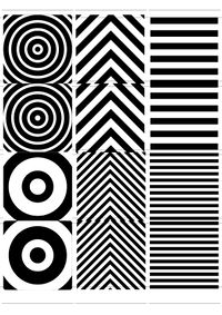
# I created a Focal camera trying to make photos similar to the lenticular technique. | # I created a Focal camera trying to make photos similar to the lenticular technique. | ||
# Together with [[User:Susanna|Susanna Fasciolo]] I made '' | # Together with [[User:Susanna|Susanna Fasciolo]] I made ''Frown'' – a photo series, depicting portraits of cyclists and people who ride their scooters over the Erasmusbridge. | ||
# Datamoshed imagery was created to deal with the noise-signal concept. | # Datamoshed imagery was created to deal with the noise-signal concept. | ||
# I made a film about the actress Hildegard Knef. | # I made a film about the actress Hildegard Knef. | ||
</small> | |||
==How did you do it? (method)== | ==How did you do it? (method)== | ||
This method is an attempt in finding out how the image is becoming its sense. Basis of this structural analyses is the thought, that even non-spoken information is inheriting speech-analogue structures | This method is an attempt in finding out how the image is becoming its sense. Basis of this structural analyses is the thought, that even non-spoken information is inheriting speech-analogue structures (Meaning that pictures can be statements). I am exploring “brevity” in terms of reduction and excess and am bringing this into a series of semiotics. | ||
Before heading directly to the moving image I wanted to get the basics straight and started out with various smaller experiments that related to the still image: | Before heading directly to the moving image I wanted to get the basics straight and started out with various smaller experiments that related to the still image: | ||
| Line 18: | Line 35: | ||
'''1.1) Analog – Focal Camera''' | '''1.1) Analog – Focal Camera''' | ||
This exercise had the purpose of examining the recognition of two subjects in one image. Kind of like twins who have two identities: the one they share with their twin brother or sister as part of a pair, and the one that they enjoy all on their own. | |||
I wanted to find out how the identity of one image changes bringing in two subjects in one. Since I already explored double exposures before my studies, I wanted to try this out with a shaped mask behind the photo paper. | |||
Building my own camera within the focal camera workshop enabled me to create images similar to the lenticular method. I | Building my own camera within the focal camera workshop enabled me to create images similar to the lenticular method. I laser-cut a stripe-shaped mask that would be placed in front of the Negative. This shape would be movable between two positions. After exposing the first half I would move the striped shape to the second position and expose the missing parts of the negative. | ||
[[File:181130 Mask Focal Camera-01.jpg|200px| | [[File:181130 Mask Focal Camera-01.jpg|200px|Fig 1. Size variations for lenticular masks]] | ||
[[File:Drosdz lenticular 02.jpg|200px| | [[File:Drosdz lenticular 02.jpg|200px|Fig 2. first film developed with this camera|first film developed with this camera]] | ||
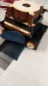
[[File:IMG 20181017 174509.jpg|100px| | [[File:IMG 20181017 174509.jpg|100px|Fig 3. fake leather is protecting the film/transparent paper from light leaks|fake leather is protecting the film/transparent paper from light leaks]] | ||
'''1.2) Digital – Glitch''' | '''1.2) Digital – Glitch''' | ||
Starting point for this exercise was the [https://archive.org/details/communications_primer Communications Primer from Charles & Ray Eames], that is based on the Input/Output diagram [aka the signal/noise diagram] for the mathematical theory of [information] processing by Claude Shannon | Starting point for this exercise was the [https://archive.org/details/communications_primer Communications Primer from Charles & Ray Eames], that is based on the Input/Output diagram [aka the signal/noise diagram] for the mathematical theory of [information] processing by Claude Shannon. | ||
From which point on would the image drift more into noise rather than signal? Is the image itself being reduced if lines of code are being deleted in digital photos or i-Frames in videos? | |||
It turned out to not be a minimization just because I deleted some digital code. Instead, the photography/film became more abstract, which felt almost like a complication of the content, ultimately leading to a maximization. To say it with the words of Flusser, the images became more and more ''‘connotative (ambiguous) complexes of symbols: they provide space for interpretation.’'' (Flusser, 2000, p. 8) | |||
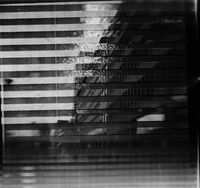
In this way it is closely connected to the information theory. This exercise had a high entropy, describing the amount of uncertainty involved in the value of a random variable. The outcome of the glitch was relatively unpredictable, but actually performing the glitch and learning the results gave some new information. | |||
Parts of my results can be found here: [[Andreas Poor Images, Compression Aesthetics & Glitches]] | Parts of my results can be found here: [[Andreas Poor Images, Compression Aesthetics & Glitches]] | ||
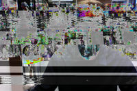
[[File:Okibashi Glitch 1 Original.jpg|200px| | [[File:Okibashi Glitch 1 Original.jpg|200px|Fig 4. Original image]] | ||
[[File:Okibashi Glitch 3.jpg|200px| | [[File:Okibashi Glitch 3.jpg|200px|Fig 5. Altered code]] | ||
'''2) Reduction through cropping an image''' | '''2) Reduction through cropping an image''' | ||
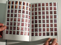
Together with Susanna Fasciolo I made a photo series called | Together with Susanna Fasciolo I made a photo series called ''Frown'', depicting portraits of cyclists and people who ride their scooters over the Erasmusbridge. The book consists of cropped images showing faces. | ||
We wanted to force the viewer to make assumptions on where these photos could have been taken. | We wanted to force the viewer to make assumptions on where these photos could have been taken. | ||
| Line 55: | Line 69: | ||
[[File:Photobook Commuters P1180475.JPG|200px| | [[File:Photobook Commuters P1180475.JPG|200px|Fig 6. Spread of the Photobook]] | ||
'''3) Reducing the set''' | '''3) Reducing the set''' | ||
For | For doing the film ''The Gifted Horse'' I had to set different limiting parameters: | ||
* Reduction to a single room/hallway. | * Reduction of the filmed space to a single room/hallway. | ||
* Reducing the colors to black and white. | * Reducing the colors to black and white. | ||
This was an attempt to make the moving image less concrete. | This was an attempt to make the moving image less concrete and related it to Flussers colour perception. When Vilém Flusser is talking about the abstraction of black-and-white photographs, he is saying that colour photographs are on a higher level of abstraction than black-and-white photographs, since black-and-white photographs are more concrete and in this sense more true. ''‘The more ‘genuine’ the colours of the photograph become, the more untruthful they are, the more they conceal their theoretical origin.’'' (Flusser, 2000, p. 44) He underlines this with his assumption that the colour in a photograph is always just based on the idea of the world. There might be a indirect connection to the real world, but it will always stay an image of the concept of the colour. | ||
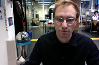
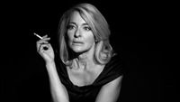
[[File:TheGiftedHorse Still3.jpg|200px| | [[File:TheGiftedHorse Still3.jpg|200px|Fig 7. Still from the short film The Gifted Horse]] | ||
Therefore the actress had to convey most of the message through emotion: her mimics and gestures. This definitely helped conveying the story of the actress more genuinely. The only support that was given by the post-production was the score, as well as the editing/rhythm of the cuts. | Therefore the actress had to convey most of the message through emotion: her mimics and gestures. This definitely helped conveying the story of the actress more genuinely. The only support that was given by the post-production was the score, as well as the editing/rhythm of the cuts. | ||
''' | |||
You can find a more precise description on the film ''The Gifted Horse'' here:''' [[Andreas methods 29-05-19]] | |||
== Relation to previous practice == | == Relation to previous practice == | ||
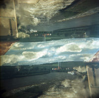
At an earlier stage (2011) I was excited by the multi-exposure photography of Gjon Mili, Duane Michals, Tamara Lichtenstein and Christoffer Relander. This led me to work with double exposures using a film camera: | At an earlier stage (2011) I was excited by the multi-exposure photography of Gjon Mili, Duane Michals, Tamara Lichtenstein and Christoffer Relander. This led me to work with double exposures using a film camera: <br /> | ||
[[File:5588246340 1e8ee4faf6 o.jpg|200px|Fig 8.]] | |||
In my bachelor thesis ''T8E18E – Necessity and relevance of hypothesis'' (2014) I wanted to find out why life-changing decisions are being made by relying on assumptions. To bring the viewer into a state of making hypothesis about a certain topic, I cropped an image in the beginning of a chapter and then revealed more and more over the course of the pages. Using that method the work is playing with the viewer’s perception and his/her assumptions by arousing, confirming or debunking them. | |||
== What do you want to make next?== | == What do you want to make next?== | ||
| Line 82: | Line 101: | ||
* Amount of cuts in an edit | * Amount of cuts in an edit | ||
* Increased density of information in a film | |||
* Length of film (short film vs feature length film) | * Length of film (short film vs feature length film) | ||
How do these parameters affect the communication/thematic/message. | How do these parameters affect the communication/thematic/message of a film? Is it possible to reduce a film similar to Malevich's painting ''Black Square'', where he tried to free the art from the weight of things? To me it seems like one of the most minimalistic approaches to art. | ||
It would also be interesting to deal with this topic in the | Or can I even change the meaning of an original work by reducing its elements, just like it happened for example with Vermeer's ''Girl Reading a Letter at an Open Window''? Another artist removed a Cupid above the girl, getting rid of the only clue suggesting it being a love story. Wouldn't it be for the work of painting restorers, we would still be led to believe that disguise and concealment would be the main messages of this artwork. | ||
It would also be interesting to deal with this topic in the ''social media'' age. For example digging out the essence of imagery/videos in a post of someones Facebook timeline. Removing decoration, accessories, etc. Finding the ''corporate identity'' of someones account. | |||
==Why do you want to make it?== | ==Why do you want to make it?== | ||
This exercise is trying to find the | This exercise is trying to find the ''modest'' or ''appropriate'' amount of communication. It shall remove decoration and accessories or even add all these redundancies to find the essence. How is simplification or excess changing the visual appearance of content? From which point of the reduction or maximization of content is distorting the content itself? On the example of translators – like for every other communication that is involving a third party – there is a risk, that para- and nonverbal signs may be terminated or corrupted. In which extent are there changes in the visual communication, that may have great impact on the reception? | ||
== Relation to a larger context == | == Relation to a larger context == | ||
How concentrated is the reception of content happening nowadays? | How concentrated is the reception of content happening nowadays? | ||
Short messages, eMail, Chats and Twitter – these and other mass-media did bring up a mode of | Short messages, eMail, Chats and Twitter – these and other mass-media did bring up a mode of correspondence, that is setting the ''virtus dicendi'' because of time- and type economy. Emoticons and the more or less creative abbreviation culture (from ''fyi'', to ''btw'') are some symptoms of this maxime. | ||
Kenneth Goldsmith is setting up an interesting hypothesis: he is claiming, that people do not read less in overall, but the omnipresence of digital media is causing the opposite. He is stating that daily news, Facebook statuses or the fast Twitter notification on the smartphones are making everyone read more, like no print medium would have been able to. That is why the amount of reading would have even increased; only the way of reading has changed. | Kenneth Goldsmith is setting up an interesting hypothesis: he is claiming, that people do not read less in overall, but the omnipresence of digital media is causing the opposite. He is stating that daily news, Facebook statuses or the fast Twitter notification on the smartphones are making everyone read more, like no print medium would have been able to. That is why the amount of reading would have even increased; only the way of reading has changed. (Goldsmith, 2016, p. 4) | ||
In the meantime even carriers of important positions are using just 140 characters to send out information of big scope. Donald Trump was therefore even called ''the master of simplification''. Are these messages therefore more authentic? Closer to the person? Or does it instead just reveal a polarization, that has been less visible before? By using short statements one can react often and quick. But quantity has the tendency to cover quality. | |||
Even in the scientific communication a row of new forms of mediation have been introduced: in addition to ''classic'' publications like books or magazine articles, blogs and social media are appearing. Evening-lectures are being expanded to Science-Slams, Pecha Kucha-nights or FameLabs. Conferences are increasingly using sharing-concepts and participative formats like fishbowls, roundtables or barcamps. Which formats can scientists, in the sense of serious mediation, be taken responsible for? Isn't scientific content too complex, to be displayed in just 140 (or even 280) characters, in ten minutes or six pictures? Or is science loosing public relevance if it is refusing the demand on brevity and participation? | |||
== References == | |||
BARTHES, R. (1978) ''Rhetorik des Bildes''. in SCHIWY G. (1964 a)(eds.): ''Der französische Strukturalismus. Mode, Methode, Ideologie''. Hamburg: Reinbek, p. 158-166 | |||
EAMES, C. and R. (1953) ''A Communications Primer'' [online]. Available at: https://archive.org/details/communications_primer (Accessed: 23 May 2019) | |||
FLUSSER, V. (2000) ''Towards a philosophy of photography''. 1st ed. London: Reaktion Books | |||
GOLDSMITH, K. (2016) ''Wasting Time on the Internet''. 1st ed. New York: HarperCollinsPublishers | |||
Latest revision as of 17:12, 25 June 2019
Word count 1500 max.
Notes:
Cosmic level
Sharing information anti-entropic
Stop information from degrading
Difference making a difference
Not repeating over and over and over and over
Vermeer letter x/-ray love letter reading
Taking away information
Figure in the ground
R.G. Collingwood
What have you been making?
I created an apparatus (1.), took photos with an apparatus (2.), scanned and altered the outcome (3.) and then dealt with the moving image (4.).
Explanation:
- I created a Focal camera trying to make photos similar to the lenticular technique.
- Together with Susanna Fasciolo I made Frown – a photo series, depicting portraits of cyclists and people who ride their scooters over the Erasmusbridge.
- Datamoshed imagery was created to deal with the noise-signal concept.
- I made a film about the actress Hildegard Knef.
How did you do it? (method)
This method is an attempt in finding out how the image is becoming its sense. Basis of this structural analyses is the thought, that even non-spoken information is inheriting speech-analogue structures (Meaning that pictures can be statements). I am exploring “brevity” in terms of reduction and excess and am bringing this into a series of semiotics.
Before heading directly to the moving image I wanted to get the basics straight and started out with various smaller experiments that related to the still image:
1) Maximize – Minimize
1.1) Analog – Focal Camera
This exercise had the purpose of examining the recognition of two subjects in one image. Kind of like twins who have two identities: the one they share with their twin brother or sister as part of a pair, and the one that they enjoy all on their own.
I wanted to find out how the identity of one image changes bringing in two subjects in one. Since I already explored double exposures before my studies, I wanted to try this out with a shaped mask behind the photo paper.
Building my own camera within the focal camera workshop enabled me to create images similar to the lenticular method. I laser-cut a stripe-shaped mask that would be placed in front of the Negative. This shape would be movable between two positions. After exposing the first half I would move the striped shape to the second position and expose the missing parts of the negative.
1.2) Digital – Glitch
Starting point for this exercise was the Communications Primer from Charles & Ray Eames, that is based on the Input/Output diagram [aka the signal/noise diagram] for the mathematical theory of [information] processing by Claude Shannon.
From which point on would the image drift more into noise rather than signal? Is the image itself being reduced if lines of code are being deleted in digital photos or i-Frames in videos?
It turned out to not be a minimization just because I deleted some digital code. Instead, the photography/film became more abstract, which felt almost like a complication of the content, ultimately leading to a maximization. To say it with the words of Flusser, the images became more and more ‘connotative (ambiguous) complexes of symbols: they provide space for interpretation.’ (Flusser, 2000, p. 8)
In this way it is closely connected to the information theory. This exercise had a high entropy, describing the amount of uncertainty involved in the value of a random variable. The outcome of the glitch was relatively unpredictable, but actually performing the glitch and learning the results gave some new information.
Parts of my results can be found here: Andreas Poor Images, Compression Aesthetics & Glitches
2) Reduction through cropping an image
Together with Susanna Fasciolo I made a photo series called Frown, depicting portraits of cyclists and people who ride their scooters over the Erasmusbridge. The book consists of cropped images showing faces.
We wanted to force the viewer to make assumptions on where these photos could have been taken.
At first, the actual topic is not being revealed. You can only see the cropped faces in a grid of 7 x 8 photos per page. Every page consists of two pages (similar to the Japanese binding) that are folded, perforated and can – ultimately – be opened on the perforation. The photo series shall leave disclosed, what the depicted persons are doing. Have all these people been in one big crowd? Are they at a demonstration? Only by opening the perforation on each page one can find out more about the scene.
3) Reducing the set
For doing the film The Gifted Horse I had to set different limiting parameters:
- Reduction of the filmed space to a single room/hallway.
- Reducing the colors to black and white.
This was an attempt to make the moving image less concrete and related it to Flussers colour perception. When Vilém Flusser is talking about the abstraction of black-and-white photographs, he is saying that colour photographs are on a higher level of abstraction than black-and-white photographs, since black-and-white photographs are more concrete and in this sense more true. ‘The more ‘genuine’ the colours of the photograph become, the more untruthful they are, the more they conceal their theoretical origin.’ (Flusser, 2000, p. 44) He underlines this with his assumption that the colour in a photograph is always just based on the idea of the world. There might be a indirect connection to the real world, but it will always stay an image of the concept of the colour.
Therefore the actress had to convey most of the message through emotion: her mimics and gestures. This definitely helped conveying the story of the actress more genuinely. The only support that was given by the post-production was the score, as well as the editing/rhythm of the cuts.
You can find a more precise description on the film The Gifted Horse here: Andreas methods 29-05-19
Relation to previous practice
At an earlier stage (2011) I was excited by the multi-exposure photography of Gjon Mili, Duane Michals, Tamara Lichtenstein and Christoffer Relander. This led me to work with double exposures using a film camera:
In my bachelor thesis T8E18E – Necessity and relevance of hypothesis (2014) I wanted to find out why life-changing decisions are being made by relying on assumptions. To bring the viewer into a state of making hypothesis about a certain topic, I cropped an image in the beginning of a chapter and then revealed more and more over the course of the pages. Using that method the work is playing with the viewer’s perception and his/her assumptions by arousing, confirming or debunking them.
What do you want to make next?
I want to explore reduction and maximization through the following parameters:
- Amount of cuts in an edit
- Increased density of information in a film
- Length of film (short film vs feature length film)
How do these parameters affect the communication/thematic/message of a film? Is it possible to reduce a film similar to Malevich's painting Black Square, where he tried to free the art from the weight of things? To me it seems like one of the most minimalistic approaches to art.
Or can I even change the meaning of an original work by reducing its elements, just like it happened for example with Vermeer's Girl Reading a Letter at an Open Window? Another artist removed a Cupid above the girl, getting rid of the only clue suggesting it being a love story. Wouldn't it be for the work of painting restorers, we would still be led to believe that disguise and concealment would be the main messages of this artwork.
It would also be interesting to deal with this topic in the social media age. For example digging out the essence of imagery/videos in a post of someones Facebook timeline. Removing decoration, accessories, etc. Finding the corporate identity of someones account.
Why do you want to make it?
This exercise is trying to find the modest or appropriate amount of communication. It shall remove decoration and accessories or even add all these redundancies to find the essence. How is simplification or excess changing the visual appearance of content? From which point of the reduction or maximization of content is distorting the content itself? On the example of translators – like for every other communication that is involving a third party – there is a risk, that para- and nonverbal signs may be terminated or corrupted. In which extent are there changes in the visual communication, that may have great impact on the reception?
Relation to a larger context
How concentrated is the reception of content happening nowadays? Short messages, eMail, Chats and Twitter – these and other mass-media did bring up a mode of correspondence, that is setting the virtus dicendi because of time- and type economy. Emoticons and the more or less creative abbreviation culture (from fyi, to btw) are some symptoms of this maxime. Kenneth Goldsmith is setting up an interesting hypothesis: he is claiming, that people do not read less in overall, but the omnipresence of digital media is causing the opposite. He is stating that daily news, Facebook statuses or the fast Twitter notification on the smartphones are making everyone read more, like no print medium would have been able to. That is why the amount of reading would have even increased; only the way of reading has changed. (Goldsmith, 2016, p. 4)
In the meantime even carriers of important positions are using just 140 characters to send out information of big scope. Donald Trump was therefore even called the master of simplification. Are these messages therefore more authentic? Closer to the person? Or does it instead just reveal a polarization, that has been less visible before? By using short statements one can react often and quick. But quantity has the tendency to cover quality.
Even in the scientific communication a row of new forms of mediation have been introduced: in addition to classic publications like books or magazine articles, blogs and social media are appearing. Evening-lectures are being expanded to Science-Slams, Pecha Kucha-nights or FameLabs. Conferences are increasingly using sharing-concepts and participative formats like fishbowls, roundtables or barcamps. Which formats can scientists, in the sense of serious mediation, be taken responsible for? Isn't scientific content too complex, to be displayed in just 140 (or even 280) characters, in ten minutes or six pictures? Or is science loosing public relevance if it is refusing the demand on brevity and participation?
References
BARTHES, R. (1978) Rhetorik des Bildes. in SCHIWY G. (1964 a)(eds.): Der französische Strukturalismus. Mode, Methode, Ideologie. Hamburg: Reinbek, p. 158-166
EAMES, C. and R. (1953) A Communications Primer [online]. Available at: https://archive.org/details/communications_primer (Accessed: 23 May 2019)
FLUSSER, V. (2000) Towards a philosophy of photography. 1st ed. London: Reaktion Books
GOLDSMITH, K. (2016) Wasting Time on the Internet. 1st ed. New York: HarperCollinsPublishers
Back to RW&RM Seminar:
