
User:Joca/essay Snowfalling Card Stacks 01
Snowfalling card stacks
Looking at interface to facilitate critical engagement with news
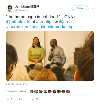
"The homepage is not dead." In a time where many news media are focused on how their content is displayed in Google News, or try to game the news feed algorithm of Facebook, defending your own platform is quite a statement. S. Mitra Kalita, the vice president for programming at CNN Digital, did so in front of an audience of social media marketers.
Although articles are distributed on other platforms, and people might not need to visit the site and apps of a news medium, it pays off to focus on the homepage according to Kalita: it's an interface where you have full control over, and one which is used by the most loyal readers. She worked on a strategy where different channels focus on specific contexts of reading and watching the news of CNN (Beard, 2018).
The mobile homepage is designed for the daily routine of readers, from the urgent news in the morning to deep reads for the commute home. Newsletters are a way to keep people up to date about specific niches. Kalita's aim with this strategy is to preserve and dominate a core audience on their own website and app, but to give hooks to connect to new users who might find CNN news via other platforms.
By structuring and showing its content differently on each medium, CNN tries to pack the same story in different ways that are relevant to readers in various situations. To some extent, the interface guides the experience of the user.
This influence of the way news is designed, is not just limited to the sites and apps of news outlets. Even when focusing on getting your news across on other platforms than your own homepage, there is an interface around that content.
After acknowledging that aspect, another question follows: to what extent can the interface play a role in the process of understanding and engaging with news in a meaningful way?
Snowfalling
In the discussion about how to improve journalism in this age, the role of the interface is often overlooked. Experiments focus on new ways of doing research, different methods to involve the audience and new ways of storytelling by using rich media: from VR to podcasts with visual notes alongside it.
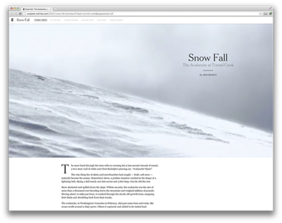
For people who create the content, the scope of the interface is limited to the one article, video or VR environment they are working on. The poster child of that approach is Snow Fall (Branch, 2012). This long read about an avalanche in Tunnel Creek was published by the New York Times. It featured a groundbreaking design with full-screen videos, slideshows, and special effects when reader scrolled through the article.
Many other publications copied the format and snowfalling was declared to be 'the future of journalism'. It didn't work out that way, mostly because of the time and resources it takes to create these rich articles with custom interfaces: Snow Fall alone took 6 months to make and had 11 people working on the graphics and the design. In the meantime, the interface of the normal articles stayed the same, because the Snow Fall was made fully outside the systems that the Times used for their 'normal' articles. (Thompson, 2012)
What the examples of CNN and the New York Times show are the influence of the interface on how people engage with an article. The design is not the de facto solution to fix journalism, but the interface can support people to engage with news in a particular way. Before imagining what that could mean for journalism, it is good to see what the foundations are behind most news interface at the moment.
Job to be done
With the rise of the web, the quality of the interaction design became one of the key aspects for having people use websites. In the nineties, the term user experience design (UX) was coined to focus on all aspects of user interaction with the products and services of a company. (Nielsen & Norman, 1998) The field combines interaction design with psychology and many other disciplines that touch upon that topic.
Although identified as a field of design quite recently, the practice of UX already started in the fifties, with foundations that come from Human-Computer Interaction (HCI). Traditionally, this discipline approaches interface and usability from a task-based and rationalistic perspective.
HCI incorporated the importance of experiences and motivations of people using an interactive system (Bødker, 2006) and you see traces of that in UX design. The question is however what type of user experience is the goal. People are still users with a job to be done, preferably in an efficient way.
The notion of user experience got a lot of traction since the dot-com bubble, the work of firms like the Nielsen Group and the inclusion of UX in curricula of design schools. Best practices are shared in digital libraries of interaction patterns: from buttons to colors to clear text.
Humanistic interface
This led to universally used practices in navigating through interfaces and lead users conversion: the goals for which an interface is designed. This could be buying goods, or spending time for example. Good conversion makes the difference between a bankrupt or a profiting webshop.
However, are the foundations for a successful e-commerce interface necessarily the same for the interface of a news medium?
In current task-focused UX theory, the activity of interpreting information has a secondary role. The website, app, or any experience, is seen as a means to an end. But there are other perspectives on this digital space.
Media scholar Johanna Drucker sees the interface as the combination of what we read and how we read. People control the interface as much, as the interface ignites a particular user experience. A website is then not merely a tool, but a space where people engage with information and the systems behind it.
Building upon this idea is the concept of the humanistic interface (Drucker, 2014). This theory fills the interpretation gap in the current practice of UX design because it approaches the interaction design from the idea of critical insight: focusing on comparison, contrast and offering space to make meaning instead of simply presenting content efficiently.
Examples in the wild
Drucker stays quite abstract about what these websites and apps would look like, stating that 'the humanistic interface is still in its infancy'. There are however examples of designs and interactions that fit this idea.
Quartz Media explores the use of chat interfaces for news with a variety of bots. They imagine the bot to be like a news-savvy friend, that can point you to interesting articles. After being locked in a dedicated app, the bot is now able to be accessed via platforms like Whatsapp and Facebook's Messenger. At this point though, it is a controlled chat and not really a conversation: people can't express their thoughts outside of the reply options offered by the bot (Rhodes, 2016)
Interfacing the comment section differently is one of the methods used by De Correspondent to involve readers and use their knowledge. A dedicated editor for 'conversations' features interesting comments on the front page, and tries to pair readers with specialists in the comment section. Their goal is to use these conversations as starting points for new research, and it is a way to see what readers get from the articles (Wijnberg & Martèl, 2018).

A publisher like Vox Media invests a lot in Chorus. This system powers various websites of this publisher and it takes a slightly different approach than most content management systems in us. Chorus enables the writers of e.g. Vox.com to organize content in non-linear ways (Pfauth, 2014), for example with stack cards. These cards would link to dossiers about topics, which can be referred to in new articles.
Current UX theory doesn't address user experience in such a way that interaction patterns can be analyzed for their influence on the critical insight of the users.
By connecting examples such as those above to the theory of humanistic interface, there is a common ground to analyze these for facilitating critical insight.
This is the first step to see these interfaces, not as isolated experiments and to discuss what works and what not. The stack cards of Vox.com didn't had the impact expected by its creators, for example. They imagined that readers would use the stack card to get all insights about complicated news topics. That would empower users to distinguish quality journalism from low-quality articles. In the end, most users ignored the cards with information in the byline. Ezra Klein, editor in chief, admitted that a single feature could not fix the news system. (Moses, 2016)
The homepage lives again, just as Kalita said. The marketeers in her audience would say that feeds on social media are vital to bringing news to a wider audience. But rather than discussing which platform would be the best for journalism and what technology will solve everything, I prefer to look at the mediating role of an interface.
The interface people watch, listen and read news in, influences the style of experiencing the news. I am interested in how design can facilitate a more meaningful news experience. Meaningful as in considering what happens after 'efficiently getting the content to a user to be consumed'. How can an interface help in provoking a debate? Or support in seeing the connections between an article and own's own situation?
Bibliography
Beard, D. (2018) Why paying attention to the homepage will pay off. Poynter. Retrieved from https://www.poynter.org/news/why-paying-attention-homepage-will-pay
Bødker, S. (2006). When second wave HCI meets third wave challenges. In Proceedings of the 4th Nordic conference on Human-computer interaction changing roles - NordiCHI ’06 (pp. 1--8). Oslo, Norway: ACM Press.
Branch, J. (2012). Snow Fall: The Avalanche at Tunnel Creek - Multimedia Feature. Retrieved from http://www.nytimes.com/projects/2012/snow-fall/index.html#/?part=tunnel-creek
Drucker, J. (2011). Humanities approaches to interface theory. Culture Machine, 12.
Drucker, J. (2014). Graphesis: Visual forms of knowledge production. Cambridge, MA: Harvard University Press.
Moses, L. (2016). Two years in, Vox.com reconsiders its “card stacks.” Retrieved from https://digiday.com/media/two-years-vox-com-reconsiders-card-stacks/
Nielsen, J., & Norman, D. (1998). The Definition of User Experience (UX). Retrieved from https://www.nngroup.com/articles/definition-user-experience/
Pfauth, E. J. (2014). An inside look into the CMS of Vox Media: Chorus. Retrieved from https://pfauth.com/publishing-platforms/vox-medias-chorus/
Rhodes, M. (2016). With Quartz’s App, You Don’t Read the News. You Chat With It. Wired. Retrieved from https://www.wired.com/2016/02/with-quartzs-app-you-dont-read-the-news-you-chat-with-it/
Thompson, D. (2012, December 21). “Snow Fall” Isn’t the Future of Journalism. Retrieved November 5, 2018, from https://www.theatlantic.com/business/archive/2012/12/snow-fall-isnt-the-future-of-journalism/266555/
Wijnberg, R., & Martèl, G. (2018). Nieuw voor leden: we maken het makkelijker om kennis te delen op De Correspondent. Retrieved from https://decorrespondent.nl/8501/nieuw-voor-leden-we-maken-het-makkelijker-om-kennis-te-delen-op-de-correspondent/217880630-8af26840