Andreas methods 10-04-19
Word count 1500 max. Steve's (brief) feedback on the draft text: You mix discussion about your work with theoretical discussion. I would like to see more of a bias toward description and discussion of your own work. Making work and discussing the choices and decisions you make is the most important research you can make. Describe your process and the 'theoretical' issues will emerge. It might be an interesting exercise to write a draft without any references to other thinkers (Bathes, Flusser, Shannon &c) and after this consider what role these theoretical elements can serve. Take your work and process seriously.
This is my main takeaway, below are a few extra comments]
What have you been making?
[Steve comments: this does not answer the question. what have you been making? maybe use this space to write an intro reviewing the things you have made this year] In my work I want to explore „brevitas“ in the moving image and bring into a series of semiotics.
From ancient times to the modern era the rhetoric has been the binding and constant guideline of communication. Therefore the term of „brevitas“ has been explored extensively in verbal/written communication. Also in product design, architecture (baroque vs minimalist design) or visual communication there has been big research on the topic of reduction vs excess. I want to bring this research into the field of film.
How did you do it? (method)
„How is the image becoming its sense?“ Roland Barthes is asking in his essay ‘Rhetorik des Bildes’. And further: ‘Where does this sense end? And if it ends, what is beyond this end?’ (Barthes 1964, p. 159). Basis of this structural analyses is the thought, that even non-spoken information is inheriting speech-analogue structures. That means that pictures can be statements. That occurs when they have their own rhetoric and it is even more the case for combination of picture and text. [ Start the main text- after a brief intro - here>>. Start with your work and your intentions for the work. >>]
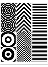
Before heading directly to the moving image I wanted to get the basics straight and started out with various smaller experiments that related to the still image:
1) Maximize – Minimize
1.1) Analog – Focal Camera
I wanted to find out what would happen if I bring in two subjects into one image. Since I already explored double exposures before my studies I wanted to try this out with a shaped mask behind the photo paper.
This exercise had the purpose of examining the recognition of two subjects in one image. From which point on would the image drift more into noise rather than signal? (see Eames Communication Primer)
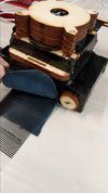
Building my own camera within the focal camera workshop enabled me to create images similar to the lenticular method. I lasercut a stripe-shaped mask that would be placed in front of the Negative. This shape would be movable between to positions. After exposing the first half I would move the striped shape to the second position and expose the missing parts of the negative.
1.2) Digital – Glitch
Starting point for this exercise was the Communications Primer from Charles & Ray Eames, that is based on the Input/Output diagram [aka the signal/noise diagram] for the mathematical theory of [information] processing by Claude Shannon.
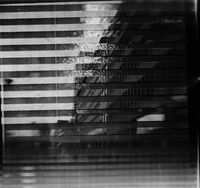
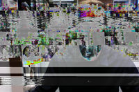
Going further I wanted to find out whether the image is being reduced if I delete lines of code in digital photos or i-Frames in videos. It turned out to not be a minimization just because I deleted some digital code. Instead, the photography/film became more abstract, which felt almost like a complication of the content, ultimately leading to a maximization. [S: I think you would benefit from really getting to grips with Claud Shannon's signal noise idea.]
To say it with the words of Flusser, the images became more and more ‘connotative (ambiguous) complexes of symbols: they provide space for interpretation.’ (Flusser, 2000, p. 8)
Parts of my results can be found here: Andreas Poor Images, Compression Aesthetics & Glitches
2) Reduction through cropping an image
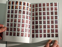
Together with Susanna Fasciolo I made a photo series called “Frown”, depicting portraits of cyclists and people who ride their scooters over the Erasmusbridge. The book consists of cropped images showing faces.
We wanted to force the viewer to make assumptions on where these photos could have been taken.
At first, the actual topic is not being revealed. You can only see the cropped faces in a grid of 7 x 8 photos per page. Every page consists of two pages (similar to the Japanese binding) that are folded, perforated and can – ultimately – be opened on the perforation. The photo series shall leave disclosed, what the depicted persons are doing. Have all these people been in one big crowd? Are they at a demonstration? Only by opening the perforation on each page one can find out more about the scene.
3) Reducing the set
When Vilém Flusser is talking about the abstraction of black-and-white photographs, he is saying that colour photographs are on a higher level of abstraction than black-and-white photographs, since black-and-white photographs are more concrete and in this sense more true. The more ‘genuine’ the colours of the photograph become, the more untruthful they are, the more they conceal their theoretical origin. (Flusser, 2000,, p. 44) He underlines this with his assumption that the colour in a photograph is always just based on the idea of the world. There might be a indirect connection to the real world, but it will always stay an image of the concept of the colour, (…)
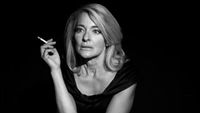
For my film for the eye I set myself similar parameters:
- Reduction to a single room/hallway.
- Reducing the colors to black and white.
Therefore the actress had to convey most of the message through emotion, which meant through her mimics and gestures. The only support that was given by the post-production was the score, as well as the editing/rhythm of the cuts.
Relation to previous practice
At an earlier stage (2011) I was excited by the multi-exposure photography of Gjon Mili, Duane Michals, Tamara Lichtenstein and Christoffer Relander. This led me to work with double exposures using a film camera: https://www.flickr.com/photos/andreasdrosdz/5588246340/in/album-72157626424809270/
It also relates to my bachelor thesis T8E18E – Necessity and relevance of hypothesis, in which I wanted to find out why life-changing decisions are being made by relying on assumptions. To bring the viewer into a state of making hypothesis about a certain topic, I cropped an image in the beginning of a chapter and then revealed more and more over the course of the pages.
What do you want to make next?
I want to explore reduction and maximization through the following parameters:
- Amount of cuts in an edit
- Length of film (short film vs feature length film)
- I want to reduce a film similar to Malevich's painting „Black Square“, where he tried to free the art from the weight of things. To me it seems like one of the most minimalistic approach to art.
How do these parameters affect the communication/thematic/message.
It would also be interesting to deal with this topic in the „social media“ age. For example digging out the essence of imagery/videos in a post on a Facebook timeline. Removing decoration, accessories, etc. Finding the „corporate identity“ of someones account.
Why do you want to make it?
This exercise is trying to find the „modest“ or „appropriate“ amount of communication. It shall remove decoration and accessories or even add all these redundancies to find the essence. How is simplification or excess changing the visual appearance of content? From which point of the reduction or maximisation of content is distorting the content itself? On the example of translators – like for every other communication that is involving a third party – there is a risk, that para- and nonverbal signs may be terminated or corrupted. In which extent are there changes in the visual communication, that may have great impact on the reception?
Relation to a larger context
How concentrated is the reception of content happening nowadays? Short messages, eMail, Chats and Twitter – these and other mass-media did bring up a mode of correspondance, that is setting the „virtus dicendi“ because of time- and type economy. Emoticons and the more or less creative abbreviation culture (from „fyi“, to „btw“) are some symptoms of this maxime. Kenneth Goldsmith is setting up an interesting hypothesis: he is claiming, that people do not read less in overall, but the omnipresence of digital media is causing the opposite. He is stating that daily news, Facebook statuses or the fast Twitter notification on the smartphones are making everyone read more, like no print medium would have been able to. That is why the amount of reading would have even increased; only the way of reading has changed.
In the meantime even carriers of important positions are using just 140 characters to send out information of big scope. Donald Trump was therefore even called „the master of simplification“. Are these messages therefore more authentic? Closer to the person? Or does it instead just reveal a polarization, that has been less visible before? By using short statements one can react often and quick. But quantity has the tendency to cover quality.
Even in the scientific communication a row of new forms of mediation have been introduced: in addition to „classic“ publications like books or magazine articles, blogs and social media are appearing. Evening-lectures are being expanded to Science-Slams, Pecha Kucha-nights or FameLabs. Conferences are increasingly using sharing-concepts and participative formats like fishbowls, roundtables or barcamps. Which formats can scientists, in the sense of serious mediation, be taken responsible for? Isn't scientific content too complex, to be displayed in just 140 (or even 280) characters, in ten minutes or six pictures? Or is science loosing public relevance if it is refusing the demand on brevity and participation?
References
BARTHES, Roland, 1978: »Rhetorik des Bildes« [1964 a], in: G. Schiwy (Hg.): Der französische Strukturalismus. Mode, Methode, Ideologie, Reinbek bei Hamburg, S. 158–166
FLUSSER, Vilém, 2000: Towards a philosophy of photography. 1st ed. London: Reaktion Books
FRIEDRICH, Thomas u. SCHWEPPENHÄUSER, Gerhard, 2010. Bildsemiotik – Grundlagen und exemplarische Analysen visueller Kommunikation, – Basel, Boston, Berlin.
HÄRTER, Andreas. 2000. Digressionen : Studien zum Verhältnis von Ordnung und Abweichung in Rhetorik und Poetik; Quintilian - Opitz - Gottsched - Friedrich Schlegel - München : Fink.
HOFMANN, Norbert. 1980. Redundanz und Äquivalenz in der literarischen Übersetzung : dargestellt an fünf deutschen Übersetzungen des Hamlet. – Tübingen : Niemeyer.
JÄGER, Dr. Maren 2007. Brevitas: Kürze in Rhetorik und Poetik MNDL/EUL-3: – 2011, Johannes Gutenberg-Universität Mainz.
NÜSSLEIN, Theodor. 2014. Rhetorica ad Herennium : lateinisch-deutsch [E-Book] herausgegeben und übersetzt von Theodor Nüßlein. – 2. Auflage. – Berlin : De Gruyter
ROSA, Hartmut. 2016 Beschleunigung und Entfremdung: Entwurf einer kritischen Theorie spätmoderner Zeitlichkeit – 5. Auflage. – Berlin : Suhrkamp,
STREHLE, S. 2012. Zeichenökonomie und symbolischer Tausch. In: Zur Aktualität von Jean Baudrillard, VS Verlag für Sozialwissenschaften.
Back to RW&RM Seminar:
