OSPworkshop
This distinction between the abstract mathematical formulation of geometric shapes, and their realization into concrete, physical forms.
Open Source Publishing- OSP organized a workshop "Up pen down" in collaboration with the choreographer Adva Zakai,
Focusing on linking typography and performance, this workshop follows a continuation of a research around the notion of stroke, in the sense of path—as opposed and informed by the notion of form (http://ospublish.constantvzw.org/blog/news/up-pen-down-invited-designers-valence).
We started by looking at a few references of typeface designed specifically using the method of setting coordinates in space for
Reference One:
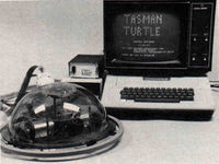
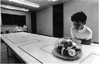
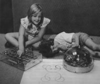
Seymour Papert (https://en.wikipedia.org/wiki/Seymour_Papert) taught mathematics through drawing instructions children would give to the computer, other children, or in this case—to a drawing robot. The English mathematician Seymour Papert tried to create an embodied understanding of mathematics through his LOGO language. Papert created a language, understood both by humans and computers, that describes drawings not in an absolute cartesian grid, but from the perspective of the person that is drawing. He called this TURTLE graphics.
Reference Two:
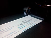
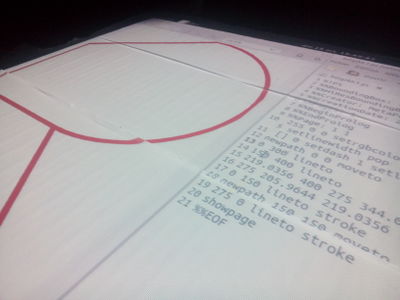
The PostScript format, for example, describes letterforms by their contour instead of their skeleton. Yet other, lesser known file formats might take an inverse approach. For e.g.: Metafont.
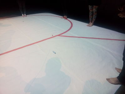
Following the idea of "instructions" and "vector drawing" we started by having one person/voice to instruct the other participants, who were taking the role of the "pen", where to move in order to draw shape of a letter with the movement of our bodies.
"blow up the scale of the movements"
our very understanding of text becomes more embodied.
By virtue of the availability of the source code and more importantly still by the open discussions around their conceptions (mailing lists, collaboration platforms), free and open source software allows the designer the better grasp the implications of the tools for their process.
•• Defining Shapes
The first signs left by man were the prints of their foot steps in sand and soft soil. The first signs consciously created by man were probably written with the index finger or a stick in the sand, then later carved in wax, wood and stone which would finally preserve the traces for centuries. The foot would leave a complete shape with one print, making it the ancestor of today’s often used outline approach. The finger however, would create a thick line that would follow its movement making it the forerunner of the calligraphic approach. Later shapes would also be drawn from the outside what took more time but would also give new stylistic possibilities. So from the very beginning both approaches would coexist as calligraphy and punchcutting coexisted. Also found objects like stones would be used to create shapes and are today known as the mosaics or grid approach.
"I always felt like pixels are an approximation of reality, and vectors are a reconstruction. " Jürg Lehni at Compression by Abstraction: A Conversation About Vectors (http://rhizome.org/editorial/2013/jul/30/compression-abstraction/)
•• Metafont - Calligraphic or Skeleton Approach
Metafont allows diff erent kind of parametrical components to be used in a font.
How it works
• Originated from linear-drawing, writing and calligraphy where diff erent kinds of pens (pointed, broad-nib, ...) get applied to a skeleton resulting in diff erent kind of characters depending on the pen.
Example Programs
• Illustrator has many tools to make fonts with a bone structure (and all kind of other vector deformation), but there is no font export.
• Metafont uses formulas and parameters to change the bone structure.
• Calligrapher from Jürg Lehni and François Rappo.
• Kalliculator uses hand placed skeletons with a very sophisticated brush model.
http://osp.constantvzw.org:9999/p/up-pen-down
at: http://christoph-knoth.com/shared/computed_type_-_christoph_knoth.pdf
Extra ref.: Line and Form: http://www.gutenberg.org/ebooks/25290?msg=welcome_stranger
Fonts: http://no-feature.github.io (previous workshop)
