OSPworkshop
This distinction between the abstract mathematical formulation of geometric shapes, and their realization into concrete, physical forms.
Open Source Publishing- OSP organized a workshop "Up pen down" in collaboration with the choreographer Adva Zakai, in Brussels.
This workshop focussed on "linking typography and performance", and follows a continuation of a research around the notion of stroke, in the sense of path—as opposed and informed by the notion of form (http://ospublish.constantvzw.org/blog/news/up-pen-down-invited-designers-valence).
We started by looking at a few references of both machines and programming languages that were designed specifically using the principles of setting coordinates in space for drawing shapes.
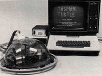
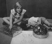
• Reference One: Roland - A Drawing Robot.
The English mathematician Seymour Papert (https://en.wikipedia.org/wiki/Seymour_Papert) tried to create an embodied understanding of mathematics through his LOGO language. Papert created a language, understood both by humans and computers, that describes drawings not in an absolute cartesian grid, but from the perspective of the person that is drawing. He called this TURTLE graphics.
Seymour Papert taught mathematics through drawing instructions children would give to the computer, other children, or in this case—to a drawing robot.
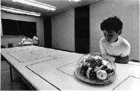
• Reference Two: Roland - A Drawing Machine.
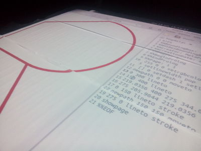
Pen plotters print by moving a pen or other instrument across the surface of a piece of paper. This plotters are vector graphic devices, they follow a script ((http://osp.constantvzw.org:9999/p/up-pen-down) which defines certain positions in a cartesian space which then will be connected while drawing.
A number of printer control languages were created to operate pen plotters, and transmit commands like "lift pen from paper", "place pen on paper", or "draw a line from here to here". This program instructs the plotter, in order, to take the first pen, to go to coordinates X=500, Y=500 on the paper sheet, to lower the pen against the paper, to move 1000 units in the Y direction (thus drawing a vertical line), to lift the pen and finally to put it back in its stall.
Different speeds can be set and looking at mechanical movement of the pen is already an amazing choreography in itself.
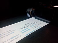
• Reference Three: Metafont - Calligraphic or Skeleton Approach.
The PostScript format, for example, describes letterforms by their contour instead of their skeleton. Yet other, lesser known file formats might take an inverse approach. It is the case of Metafont, originated from linear-drawing, writing and calligraphy where different kinds of pens (pointed, broad-nib, ...) get applied to a skeleton resulting in different kind of characters depending on the pen. Metafont uses formulas and parameters to change the bone structure, allowing different kind of parametrical components to be used in a font.
•• From 2D to 3D
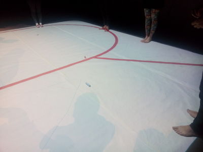
Following the idea of "instructions" and "vector drawing" we started by having one person/voice to instruct the other participants, who were taking the role of the "pen", where to move in order to draw shape of a letter with the movement of our bodies.
CODE < > DECODE
or (writing - reading)
The most interesting step went towards creating our own codes to be applied in the method of drawing shapes in space. From having previously looked at scripts from turtle graphic and plotter software, we then had to re-think what movement qualities could best benefit the representation of typographical shapes.
For eg. how to differentiate when we are "drawing" an actual shape from when we are simply moving to another spatial position to draw another shape. Or what movements can we choose to emphasize different stroke widths? Another inherent component of movement is sound, how can that bring meaning to our method of drawing shapes?
Different units could also be applied to space, body seemed to be the most natural measure tool while moving in space and defining shape proportions. Being foot steps or arm moves, or other points in space that served as reference, the important matter was to find consistency and trust our perception. It felt like from screen to real space we enter another dimension of expression that allowed us to "blow up the scale of the movements".
This experiment was overall extremely successful and most people could communicate their "type design systems" to each others.
Writing started with the movements of our bodies,probably written with the index finger or a stick in the sand, since then writing techniques evolved, and typography has been shaped and re-shaped under these changes. To understand type within the frame of movement and having experienced it in such a way, made my very understanding of type design more embodied and eventually connecting to its original "roots".
Also while analyzing various scripts I could see how movement is also implied, and that the static characters we see in front of our eyes often rely in various "moving" decisions.
It was very interesting to me to add an element of speculation to design methods that prompts us to reconsider our assumptions about — or operates as a critique of — existing practices. By means of opening discussions to the actual exercises it was created a great environment for raising ideas to be considering in near the future.
Example Programs
Illustrator has many tools to make fonts with a bone structure (and all kind of other vector deformation), but there is no font export.
Metafont uses formulas and parameters to change the bone structure.
Calligrapher from Jürg Lehni and François Rappo.
Kalliculator uses hand placed skeletons with a very sophisticated brush model.
at: http://christoph-knoth.com/shared/computed_type_-_christoph_knoth.pdf
Extra ref.: Line and Form: http://www.gutenberg.org/ebooks/25290?msg=welcome_stranger
Fonts: http://no-feature.github.io (previous workshop)
Extra Reference http://www.ubu.com/dance/hwai_cursive.html (dance and chinese calligraphy)
