Andreas methods 21-11-18
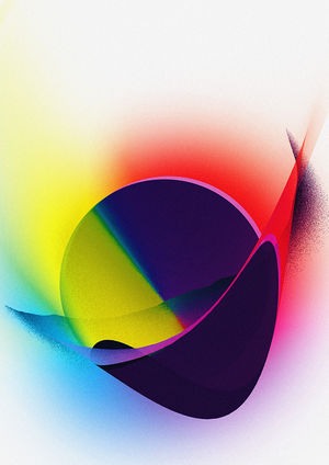
I presented following image:
My fellow students analyzed and commented this picture.
These were the comments:
- Can’t tell if it is a photograph, screenprint or silkscreen: in a way it is a puzzle of medium
- Looks airbrushed
- Steve: looks spraypainted, but also has the register that you get with screenprinting (even though you know it’s not that)
- Steve: something about the cyan, yellow, magenta and black makes you think if it was created in the realm of an experiment
- Layering is interesting – looks like the circle is covered by black. The circle looks like it is rapidly speeding downwards
- Terms of material: the sphere looks like glass, reflecting light. Being held by black container
- Reminded Mia of a mask – cross where the eyes are – model of a face
- Sphere turns into a disk – kind of moving
- Physical laws, importance in color laws (subtraction, addition, primary colors)
- Abstract composition
- Would be interesting what paper would have been chosen, if it was printed: matte paper would make it completely different than glossy paper
- Ugo: reminds him of color theory in school: what color would you add to the shadow to make it dark
- „Weirdy, digital pointilism“
- Looks like a color wheel
- Contemporary context:
- Katia: the picture reminds her of art by Kandinsky
- For Jue it looks Mid-central modern (like Mad Men series)
- Streamline design
- Brâncuși sculptures: in terms of what minimal form would you have to make to create a portrait?
- Cosmic (heavenly body going through transition) passing another heavenly body
- Hyperrealism painting
- There is some kind of play between fore- and background
- Distortion of gradual-red like a radial blur

