User:Colm/Trimester2-assesment: Difference between revisions
No edit summary |
No edit summary |
||
| Line 1: | Line 1: | ||
<style> | |||
html{ | |||
font-family: monospace; | |||
} | |||
div.container{ | |||
width: 70%; | |||
margin: 0 auto; | |||
} | |||
img.plan{ | |||
width: 50%; | |||
border-bottom: 1px solid grey; | |||
} | |||
a{ | |||
text-decoration: none; | |||
color: black; | |||
border-bottom: 1px dotted black; | |||
} | |||
</style> | |||
<div class="container"> | |||
= trim 2 assessment = | = trim 2 assessment = | ||
Tuesday 5th April 2016 | Tuesday 5th April 2016 -- 14:00 | ||
==== connecting previous assessment ==== | ==== connecting previous assessment ==== | ||
| Line 15: | Line 35: | ||
Anyway, in attempting to answer the question around the structure or sequence of the black boxes scheme, I collected a few examples of attempts of visualisations: | Anyway, in attempting to answer the question around the structure or sequence of the black boxes scheme, I collected a few examples of attempts of visualisations: | ||
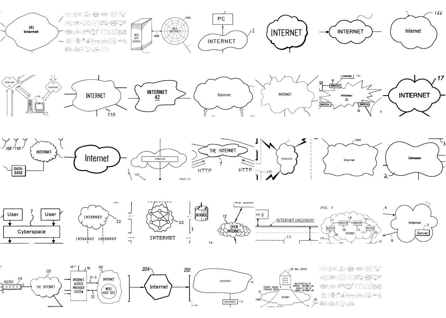
<img class="plan" src="https://pzwiki.wdka.nl/mw-mediadesign/images/1/12/Montage-5.png"> http://noahveltman.com/internet-shape/ | |||
<img class="plan" src="http://internet-atlas.net/img-web/relief33.svg"> | |||
<img class="plan" src="http://internet-atlas.net/img-web/cadre11.png"> | |||
<img class="plan" src="http://internet-atlas.net/img-web/divise13.jpg"> | |||
<img class="plan" src="http://internet-atlas.net/img-web/en-idiot1.svg"> | |||
<img class="plan" src="http://internet-atlas.net/img-web/en-collage2.svg"> http://internet-atlas.net/ | |||
<img class="plan" src=""> Michael's 'where does the code run' drawing on the wiki? | |||
<img class="plan" src=""> 'if you please draw me a cloud' ? | |||
==== Temporary conclusion: ==== | ==== Temporary conclusion: ==== | ||
| Line 57: | Line 80: | ||
==== live notes, tutorials, etc ==== | ==== live notes, tutorials, etc ==== | ||
</div> | |||
Revision as of 15:05, 4 April 2016
<style>
  html{
    font-family: monospace;
  }
  div.container{
    width: 70%;
    margin: 0 auto;
  }
  img.plan{
    width: 50%;
    border-bottom: 1px solid grey;
  }
  a{
    text-decoration: none;
    color: black;
    border-bottom: 1px dotted black;
  }
</style>
trim 2 assessment
Tuesday 5th April 2016 -- 14:00
connecting previous assessment
Slowly moving towards a broader consideration of interface and black boxing. Was the clarity I was calling for just a result of logical development following a method of boxing tools & utilities up? Are these boxes in a chain sequence or is it more organic? Where do I, the user, stand in this sequence?
The 'necessity' for such a system is clear, I'm glad one does not have to run each intricate item and dependency when executing a task. This model is not flawed or even really broken in any way. I'm looking at a logical consequence of this modeling: it's opaqueness. (Looping back to this seems terribly logical. It is suddenly quite a simple point to be looking at my research from, but anyway.)
I'm putting aside the moralistic and fearful opinions I have voiced between the start of the year and now, in order to concentrate on projects that might generate discussion / opinions for the audience it self.
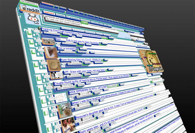
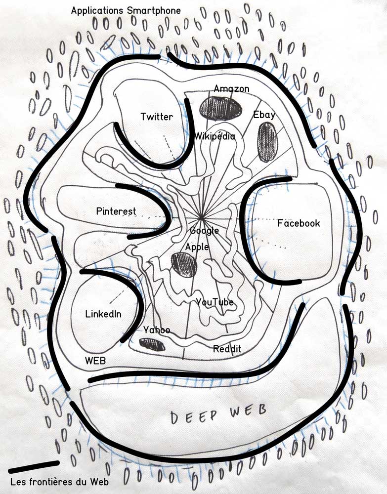
Anyway, in attempting to answer the question around the structure or sequence of the black boxes scheme, I collected a few examples of attempts of visualisations:
 http://noahveltman.com/internet-shape/


Michael's 'where does the code run' drawing on the wiki?
'if you please draw me a cloud' ?
Temporary conclusion:
I understand why these technologies are boxed up, and why these boxes must exist. I am fine with them, but understanding their sequence, and where I stand in their chain could be valuable.
So I started to look at the spaces between the boxes. Leverage points. Friction points, where it might be possible to insert objects (prototypes) in order to reveal the structure.
Prototypes:
- tips by tools: a bit old now, but still something I want to finish off. I attempted some javascript prototypes but not very promising with my skills at the moment. So I designed what I imagined the item to be, and I also have a CSS only proof of concept. Modes of address in interface.
- plug-ins / add-ons 'stylish' redesigns
greasemonkey
- scroll meter
- the starting point
- an excuse to learn js
- non critical
- question of the metrics, working out the metrics
- a bit of the physical world on screens
- relative units — relative inches
- protoype homepage
- plug-in method ?
prototype ideas
- visible traceroute, claim how complicated your page is!
- cookie display?
