User:Lucia Dossin: Difference between revisions
Lucia Dossin (talk | contribs) No edit summary |
Lucia Dossin (talk | contribs) No edit summary |
||
| Line 228: | Line 228: | ||
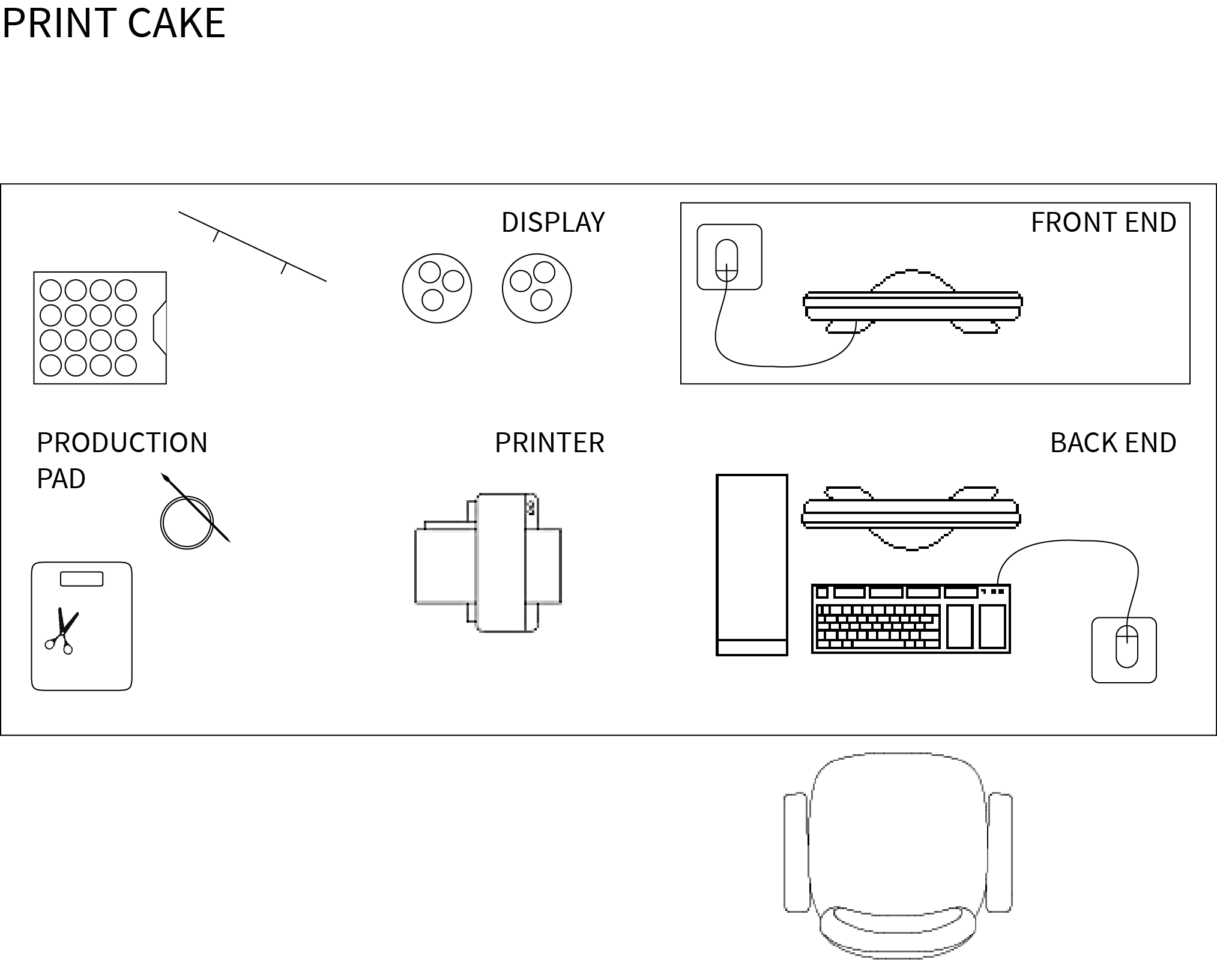
Print Cake is an on-demand print shop installation/performance where visitors can buy cupcakes decorated with a snippet of William Morris' News from Nowhere printed on edible paper and edible ink. There are two kinds of cupcakes: the standard and the customized. The former costs less than the latter. In the customized version, customers choose a color and a word, through a simple interface (a one-page website running on full screen browser without navigation bars). The word generates a snippet of text (taken from News from Nowhere). This text is placed onto a designed template and in combination with the chosen color is printed on edible paper and placed on top of the cupcake. In the standard version no choices are possible – they all have the same color and just a few variations on the text snippets. | Print Cake is an on-demand print shop installation/performance where visitors can buy cupcakes decorated with a snippet of William Morris' News from Nowhere printed on edible paper and edible ink. There are two kinds of cupcakes: the standard and the customized. The former costs less than the latter. In the customized version, customers choose a color and a word, through a simple interface (a one-page website running on full screen browser without navigation bars). The word generates a snippet of text (taken from News from Nowhere). This text is placed onto a designed template and in combination with the chosen color is printed on edible paper and placed on top of the cupcake. In the standard version no choices are possible – they all have the same color and just a few variations on the text snippets. | ||
[[File: | [[File:Table-sketch.png]] | ||
<h2>Draft #1</h2> | <h2>Draft #1</h2> | ||
Revision as of 16:41, 4 November 2014
Reading Writing Research Methodologies
Notes on Reading
- Discipline, Control and the current state of Internet - notes
- Discipline, Control and the current state of Internet - common notes (group)
- Protocol – Introduction Chapter (Alexander Galloway)
- Empire - Chapter 1.2 Biopolitical Production (Antonio Negri and Michael Hardt)
Writing
- Work description in 300 words
- On Discipline Society / Society of Control
- Observations on Being an User
- Zizek / Martens / Oppenheimer
- Interview
- Essay on Method
Prototyping Networked Media
Assignments
- Assignment #1 Python & Turtle
- Assignment #3 Python Generated Sound Files - RAW DATA
- Assignment #3 Python Generated Image Seque3nce - RAW DATA
- Assignment #4 Working with text ...................
- Assignment #5 Roll Your Own Google
Modules
Prototyping Lens Based
Assignments
- Editing Scheme ...................
- Kinect
Thematic Seminars
Politics of Craft
Sound Narrative
Archive
Self-directed Research
Cookbook
Links
EMO entry
The Magician
When making impossible things come true, the magician performs our desire. In this sense, the magician mediates the gap between reality (here understood as ‘the world as it is’) and desire. This know-how, which consists basically in mastering the art of deception, can also be used for purposes other than stage magic.
The magician is an intriguing figure: the domains where its influence can be found spread from the origins of the entertainment industry (Georges Méliès being one example) to collaborating with governments in military strategy, like Robert Houdin and Napoleon. This ability to act in different environments by applying the same knowledge principles according to different contexts is my motivation to write this entry.
Stage Magic
The magician is a professional hired to entertain by performing tricks. Those tricks might change according to technology and culture, but the principles of stage magic are old and do not change that much as the essence of our nature does not change either. For thousands of years we have been amazed by these tricks. The state of technolgy actually does not influence our ability to keep believing. We enjoy being fooled by them.
From the perspective of the audience, the magician is someone who holds the power over the unkonwn. He (or she, even though there are much more male magicians than female ones) can control things that 'normal' people can't and is able to do things that we know are impossible. (S)He basically applies knowledge about Natural Sciences, Psychology - and more recently digital technologies - for entertainment purposes. But what exactly is entertaining about that?
One possibility is that the amusement comes from our attempt to find out the secret. But that's true to just some of us: most people would actually be upset if they could unmask magicians' tricks. For the majority of the audience, the fun lies precisely in being cheated. That does not mean to say that being cheated is always fun. But a magician is someone who has our authorization to cheat us for entertainment. This authorization relies on a specific setting, a range of situations and gestures and it usually implies not damaging nor hurting anyone involved in the performance or in the audience. It's safe and harmless.
According to Simon During, ‘there are layers and depth in the magic theater environment: curiosity, comedy, fear, sadism, amazement’. (Sina Najafi and Simon During, Cabinet Magazine, issue 26, Modern Enchantments: An Interview with Simon During, 2007) Ancient magicians were involved in rituals that would go beyond the mere entertainment with balls and cards - they were said to cure diseases and perform other miraculous actions.
By being able to control the uncontrollable, the magician performs our desire: subjecting the world to our wishes and needs, instead of having to submit to it.
British magician Teller (from Penn and Teller) defined Magic as 'the theatrical linking of a cause with an effect that has no basis in physical reality, but that — in our hearts — ought to.’
Simon During, in issue 26 from Cabinet Magazine, states that ‘one of the reasons why we feel ambivalent about magic is that it can remind us of a period of our life where we found it harder to separate the real from the amazing illusion’.
History
The first reportedly known magician, Dedi, lived in ancient Egypt (2700BC) and was supposedly able to resurrect animals after having their heads cut.
Since the beginning, magic has been associated with supernatural powers. In the Middle Ages, it has been associated with witchcraft. According to the Magicpedia, in the Renaissance a few important books were published on the subject.
'Natural Magic' (Magia natvralis libri viginti, written by John Baptista Porta in 1558) was a book on Natural Sciences and contained information on 'geology, optics, medicines, poisons, cooking, magnets and its properties, fires, gunpowders, invisible and clandestine writing'. (Wikipedia)
'The Discoverie of Witchcraft' (written in 1584 by Reginald Scot) not only disclosed trick secrets but also presented a strong position against the Catholic church for persecuting people and accusing them of being witches. It is an important landmark in the history of secular magic and its relationship with Science.
It was only in the 18th century that the magician as a gentleman-performer, like we know today started to be shaped. Magic had been performed in basically 3 formats: court magic, performed for royals and aristocrats, itinerant magic, performed in taverns or other places with an audience and street magic. The performers would in some cases charge tickets but the association of magicians and pickpockets was also common. Besides the association with the obscure, supernatural, Magic was also keen of dissociating itself from crime. One important figure in this transition is Isaac Fawkes, who performed ‘dressed as a gentleman in respectable, quase-theatrical spaces’. (Sina Najafi and Simon During, Cabinet Magazine, issue 26).
Magic also guards a close relationship with science & technology and with the mass media & the entertainment industry, specially cinema. The first films were projected during magic shows in Africa, Asia and Australia. In London, the first person to exhibit films was David Devant, a magician who worked for the Maskelynes. (Sina Najafi and Simon During, Cabinet Magazine, issue 26) Georges Méliès, one of the pioneers in special effects in cinema, was an illusionist and filmmaker.
Around 1750, magicians started using electricity in the shows. ‘Magic becomes technologized, capitalized and hyped’, giving birth to modern show business. (Sina Najafi and Simon During, Cabinet Magazine, issue 26).
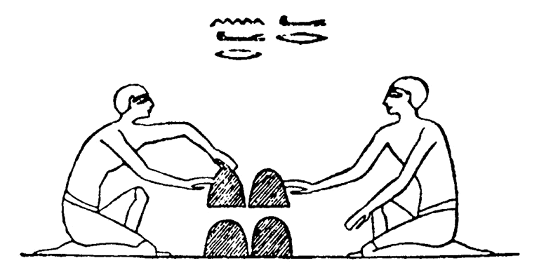
One of the most ancient performances is the 'Cup and Balls'. It has been performed for the last 2000 years. It is still considered such a relevant trick that many consider that mastering it is essential for someone to be called a magician.
Penn and Teller cups and balls
Abracadabra
The etymology of this word is uncertain but it may derive from Aramaic. Abracadabra is used as a magic word. The first mention of it was in a Medical book from century 3AD, where the word was displayed in the form of a triangle and was used as an amulet against malaria.
A - B - R - A - C - A - D - A - B - R - A
A - B - R - A - C - A - D - A - B - R
A - B - R - A - C - A - D - A - B
A - B - R - A - C - A - D - A
A - B - R - A - C - A - D
A - B - R - A - C - A
A - B - R - A - C
A - B - R - A
A - B - R
A - B
A
There are also connections between the word and the ability to write. It could have been used as a way to remember the alphabet, as 'it becomes more pronounceable and easier to remember by adding repetitive vowel "a" or "ra" sounds where there are none and adding an alliteration "bra" at the end'. (Wikipedia)
Magic Organizations
Worldwide there are many organizations that aim to keep the art of magic alive – and secret. The oldest one is The Society of American Magicians, founded in New York in 1902. A few years later (1905), the Magic Circle is founded in London. Both associations are still active. For a more complete list of this kind of organizations, check http://en.wikipedia.org/wiki/Category:Magic_organizations.
Magic and Strategy
Magic also performs an important role in military strategy. Deception techniques have been used for military purposes more frequently than one would imagine at first thought.
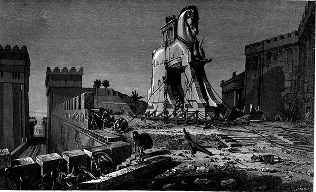
Even though there are no evidences that the Trojan Horse actually happened, the idea behind it is a clear example of military action based on deception techniques.
In 1856, religious leaders in Algeria were performing miracles which were helping raise the idea of a rebellion against French colonialists. Napoleon then brought French magician Robert Houdin who performed tricks that were more impressive than the ones performed by the religious leaders, gaining influence over the rebels and dissipating the religious leader’s power.
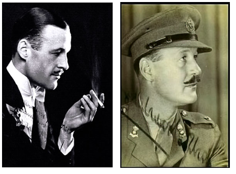
During WWII, Jasper Maskelyne helped the British army in several actions, the largest one being the supposed disappearance of the Suez Canal to mislead German bombers. He worked with 14 assistants, including an architect, art restorer, carpenter, chemist, electrical engineer, electrician, painter, and stage-set builder, a group whose nickname was the "Magic Gang". "He built a mockup of the night-lights of Alexandria in a bay three miles away with fake buildings, lighthouse, and anti-aircraft batteries. To mask the Suez Canal, he built a revolving cone of mirrors that created a wheel of spinning light nine miles wide, meant to dazzle and disorient enemy pilots so that heir bombs would fall off-target." (http://www.magictricks.com/war-magician.html) Even though the accuracy of this achievement is controversial, there is no doubt that magicians are skilled in the art of deception. Therefore, it is not uncommon that magicians and illusionists work for or give advice for governments, armies and intelligence services.
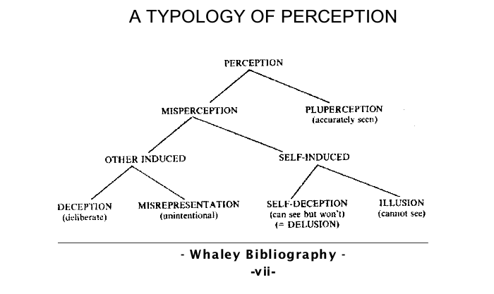
Barton Whaley has studied the relationship between war and the tactics and methods of the magician. In his publication ‘Detecting Deception: A Bibliography of Counterdeception Across Time, Cultures and Discipline' (2006, Foreign Denial & Deception Committee Washington, DC), he clearly defines deception and dissects the differences between existing categories of deception.
“I define deception as any attempt—by words or actions—intended to distort another person's or group's perception of reality. And to keep matters simple, a lie is any statement made with the intent to deceive. These definitions avoid confusion with mere misinformation, incomplete information, or the truth value of statements. But they do permit us to include the authorized lies and deceptions practiced with our knowledge and approval by stage actors, magicians, and poker players. Moreover, this definition gets around the worrisome problem of self-deception. Instead, for our present purpose, the target of a deception is not oneself but always another's mind.”(Whaley, Detecting Deception, p.7)
‘Some Operational Uses of the Art of Deception’, written in 1954 by John Mulholland, a magician who worked for the CIA, was intended to teach the readers how ‘to perform in a variety of acts secretly and undetectably’. (Jonathan Allen, Cabinet Magazine, issue 26)
Bibliography
[...]
Graduation Proposal
Draft #2
Introduction
“One of the horrible words we use is users. I am on a crusade to get rid of the word ‘users’. I would prefer to call them ‘people.’”
Don Norman, 2008 – UXWeek [1]
“The best interface is no interface.”
Golden Krishna, 2013 – SXSW [2]
In the last decade, the vocabulary that addresses human-computer interaction has been changing, specially among designers. The terms 'user' and 'interface' are being replaced. The change in the vocabulary reflects not so much the verification of a fact (users are people, in this case) as it reflects a design choice (we want users to be defined as people). As in any design choice, there are reasons underneath it.
The alleged reasons for adopting the new vocabulary are at first sight humanistic: 'user' is seen as a degrading term because it reduces the ambiguous and complex event of being human. Designers design for 'people', not for users. I do not necessarily disagree with the content of this argument, but I will comment on that later.
The shift from interface requires a bit more of context. Common sense tends to consider interface literally as the graphic component (icons, layout, text) of the interaction between human and computer. But an interface is actually the point of contact between human and computer, not the format in which this contact is made. There are command line interfaces, text-based interfaces, graphical interfaces and so on.
That said, it is a puzzle to understand the meaning of a statement like 'the best interface is no interface'.(http://www.cooper.com/journal/2012/08/the-best-interface-is-no-interface.html) As we have just seen, an interface is a point of contact between two elements in the interaction. So, 'no interface' would mean 'no interaction'. Once again, I do not totally disagree with the arguments presented in the article. I do not believe that a graphical interface is the solution to every problem. But that is just not reason for me to say that the best interface is no interface.
In both cases, the ex-user and the no-interface, it is clear that the computer is becoming more and more invisible. There is an emphasis on this invisibility, it is an ideal to pursue.
This iPad trailer puts that idea into words (and image and sound), right in the first 30 seconds: 'We believe technology is at its very best when it's invisible. When you're conscious only of what you're doing, not the device you're doing it with. And iPad is the perfect expression of that idea. It's just this magical pane of glass that can become anything you want it to be.'
In this setting, the device (no longer a computer) is there but it's not supposed to be noticed. There is, in the new terminology trend, a clear intention to consolidate the idea of invisible technology.
While I am not defending that we should use computers that don't work, I do believe that being confronted with problems to solve does help a user understand better the computer s/he uses not only in a technological level, but also understand the material, social, legal conditions under which technology operates.
I believe the motivations for the shift in terminology derive from a market strategy (a result of large scale penetration of computers into the market, as a way of making computers easier for consumers to use) rather than from a legitimate concern regarding the depth of the human experience and life quality standards. (Actually, it's very well possible that the depth of the experience is becoming more and more flat instead. But that is beyond the scope of this proposal.)
Let's try to see the terminology issue in another context: students are people – and so are teachers. By calling students 'students', instead of people, we are not degrading them as human beings - we are indicating their role in a school, defining their position in the relationship. By erasing this differentiation, the possibility of addressing the relationship is unreachable.
Erasing the possibility to address a relationship does not make this relationship better. It removes any possibility to transform it whenever needed. 'By removing our knowledge of the glue that holds the systems that make up the infrastructure together, it becomes much more difficult, if not impossible, to begin to understand how we are constructed as subjects, what types of systems are brought into place (legal, technical, social, etc.) and where the possibilities for transformation exist.' (Matt Ratto, 2007 - Ethics of Seamless infrastructures http://www.i-r-i-e.net/inhalt/008/008_4.pdf)
In the context of human-computer interaction, I am not questioning the need for a better definition of the terms. I am questioning the terms chosen as 'better'. I believe this is too important to be left to designers, cognitive specialists, marketing gurus, software developers and giant tech companies to decide. Nor should the user's agreement be equivalent to a click on a button without actual knowledge over what this is all about. This project needs more visibility, clear definitions and debate.
Research
In the context of the introduction above, what does it mean to say 'the best interface is no interface'? What are the motivations and consequences of such a statement in regards to the visibility of technology?
Previous Works
Last year I have been working on projects which aim to put user passiveness, unawareness and consumerism in the spotlight, by sometimes unveiling the structure running behind the surface, other times by disguising the critique into something digestible and fun to play with.
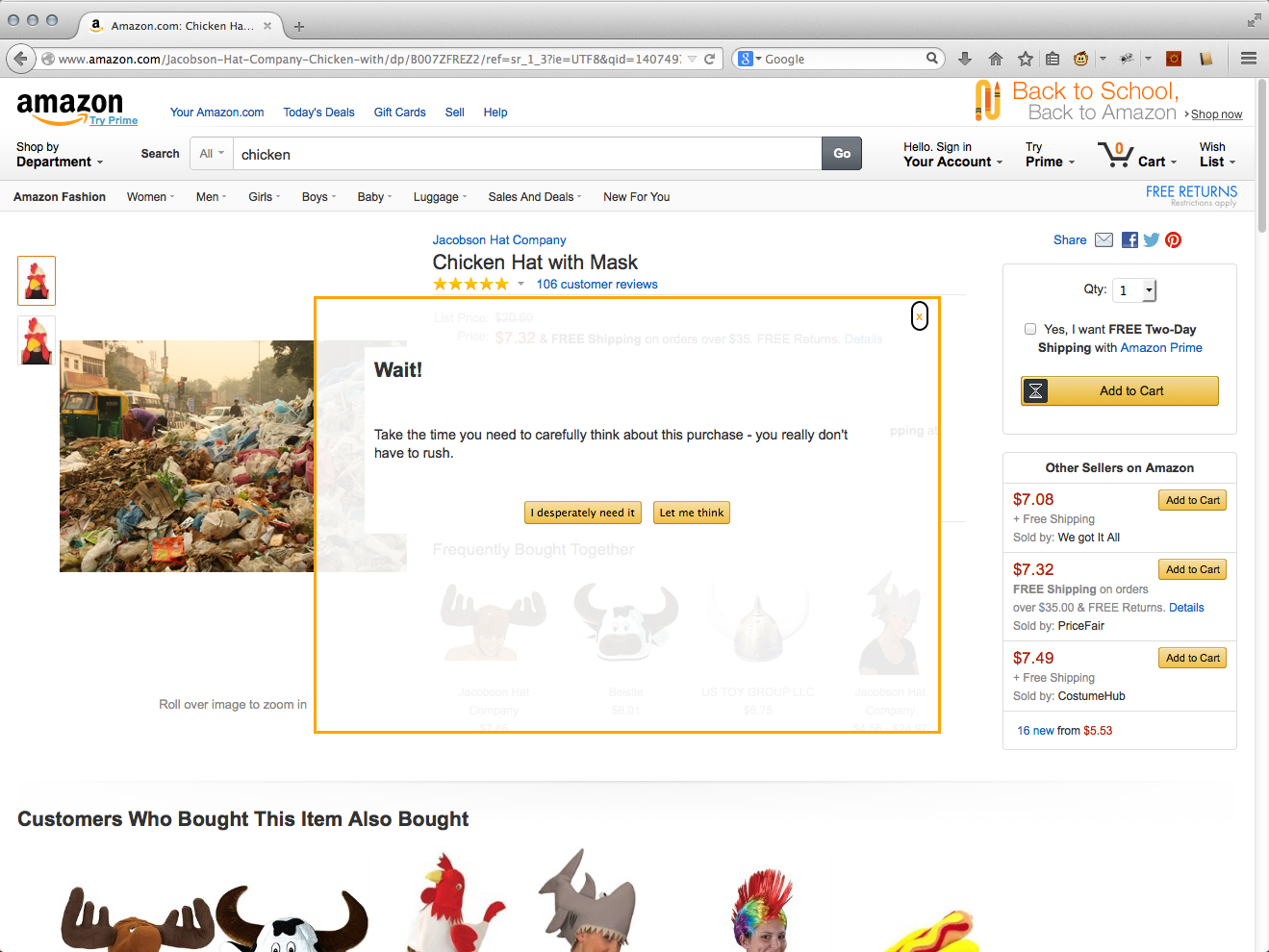
Let Me Think Let me think is a browser plug-in that interferes in the online shopping experience at Amazon by canceling the 'buy in one click' feature. By adding time to the shopping cycle, I'm trying to break this automatic, almost unconscious behavior that web shops wants us to engage with. Just clicking on things and buying without reflecting on what we're doing. It has to be downloaded and installed, which means it requires that the user performs some action to make it happen.
Free Association Index The Free Association Index. The index in this case is a set of subjective relationships among words, accessible through a Google-like interface. By using a well-known interface in a different context of use, I intend to rise questions about how the content was gathered and about the legitimacy of the results.
[[File:]]
Print Cake Print Cake is an on-demand print shop installation/performance where visitors can buy cupcakes decorated with a snippet of William Morris' News from Nowhere printed on edible paper and edible ink. There are two kinds of cupcakes: the standard and the customized. The former costs less than the latter. In the customized version, customers choose a color and a word, through a simple interface (a one-page website running on full screen browser without navigation bars). The word generates a snippet of text (taken from News from Nowhere). This text is placed onto a designed template and in combination with the chosen color is printed on edible paper and placed on top of the cupcake. In the standard version no choices are possible – they all have the same color and just a few variations on the text snippets.
Draft #1
“Design is how it works.” Steve Jobs, 2003 – launching of the iPod http://www.nytimes.com/2003/11/30/magazine/the-guts-of-a-new-machine.html
“One of the horrible words we use is users. I am on a crusade to get rid of the word ‘users’. I would prefer to call them ‘people.’” Don Norman, 2008 – UXWeek http://vimeo.com/2963837
“The best interface is no interface.” Golden Krishna, 2013 - SXSW http://www.theverge.com/2013/3/10/4086392/samsung-golden-krishna-the-best-interface-is-no-interface
In the last decade, the vocabulary that addresses the user has changed. To some, 'User' is considered a degrading, negative term - calling someone a user is reducing the ambiguous and complex event of being human.
Others would disagree and say that it's exactly because/when we are able to see the difference between the computers and us that we are able to develop and explore our human potential while interacting with a computer.
Another word that seems to be about to disappear is interface. According to a group, interface is what is always on our way when we are trying to accomplish one task. Let's get rid of these words, says the mantra of the modern designer. Designers should use 'people' instead of 'users', and 'experience', instead of 'interface'.
For the other group, interface is itself part of the experience, and a user is a human being interacting with a computer - a human being who can learn from interacting, from solving a problem, for understanding that a relationship is being carried on.
Even though it does not seem to be possible to simply divide the world in two opposing groups regarding their preferred terminology when it comes to human-computer interaction, there are (and this is specially true in the group of designers and gurus defending the combination of no interfaces and no users) two different images of human being in question: one pursues a very efficient, productive, goal-oriented ideal - the other cares about the process, in first place (which does not mean to say that the result does not matter at all).
This iPad trailer puts that idea into words (and image and sound), right in the first 30 seconds: 'We believe technology is at its very best when it's invisible. When you're conscious only of what you're doing, not the device you're doing it with. And iPad is the perfect expression of that idea. It's just this magical pane of glass that can become anything you want it to be.'
'Words matter' (Don Norman, Designing for People - http://www.jnd.org/dn.mss/words_matter_talk_a.html). And the reasons why words are being replaced to refer to an idea matter as much. 'People' and 'Experience' go together with the idea of Invisible Technology. This world without graphical interfaces is a world full of networked sensors and smart devices. A world where 'our' decisions are made (or limited) by algorithms, based on profile settings and other relevant data collections, such as purchase history, social media friends, latest search or how far our car is from home.
While I don't necessarily think that the world needs more screens and clickable/touchable buttons, neither do I believe that the simple extermination of screens (in many cases treated as synonyms for interface) will make the world a better place to live.
But there is more. Even if graphical interface disappears, that does not mean that technology has to be invisible due to that disappearance. In other words, what makes technology visible or invisible ('hidden' seems to suit better) is the purpose, the intention, the strategy, the hardware, the legislation - not the technology itself.
I believe this is too important to be left to designers, cognitive specialists, marketing 'gurus', software developers and giant tech companies to decide. Nor should the user's agreement be equivalent to a click on a button without actual knowledge over what this is all about. This subject needs more clear definitions, visibility and debate.
'By removing our knowledge of the glue that holds the systems that make up the infrastructure together, it becomes much more difficult, if not impossible, to begin to understand how we are constructed as subjects, what types of systems are brought into place (legal, technical, social, etc.) and where the possibilities for transformation exist.' (Matt Ratto, 2007 - Ethics of Seamless infrastructures http://www.i-r-i-e.net/inhalt/008/008_4.pdf)
Research
The following questions indicate the direction of my research:
What is an interface? (This question will also address the user and the computer, as I believe it is impossible to define interface without defining them.) If words matter and design is how it works, what does it mean to say 'the best interface is no interface'?
Previous Work
Last year I have been working on projects which aim to put user passiveness, user awareness and consumerism in the spotlight, by sometimes unveiling the structure running behind the surface, other times by disguising the critique into something digestible and fun to play with.
[IMAGE] The Free Association Index. The index in this case is a set of subjective relationships among words, accessible through a Google-like interface. Let me think is a browser plug-in that interferes in the online shopping experience at Amazon by canceling the 'buy in one click' feature. Print Cake is an on-demand print shop installation/performance where visitors can buy cupcakes.
The Free Association Index works just like Google. The difference is, of course, that you get another sort of results. You search for a word and you get a list of other words. These words were connected to the search term by using a subjective criteria. When you click on a word in the results, you get another set of corresponding words. Besides that, each word you click is recorded within the sequence started in your search. If you want, you can print the whole word sequence of your search and see your free association path.
Also, by clicking on a word (and thus excluding all other displayed results for the searched term), it will be given a rate that could be used to modify the results in future searches. The criteria for this is not defined yet. There are multiple parallel indexes, each one being made using different input material. This way, the same search term would show different results, depending on the index you're using.
It will be possible for users to add entries to the index by suggesting connections to words. These suggestions, when accepted, will be displayed differently in the page. It is important to emphasize the origin of the entry.
[IMAGE] Let me think is a browser plug-in, which means it has to be downloaded and installed. It requires that the user performs some action to make it happen.
Once it is installed, when user visits the Amazon.com website, the 'Add to Cart' button is removed from the page. In its place, my own button is used. This personalized, truly customized button does not behave as the original one: instead of putting the products in the shopping cart immediately, a pop up screen is displayed, with a question such as 'Do you really need to buy a [name of product]?Take your time and think about it.' User can then Cancel the plug-in and go back to Amazon's regular website or keep thinking about the purchase. The pop up screen will be withdrawn in any case, but if user chose to keep thinking, by clicking on the modified button again, a new question will be displayed and the purchase is postponed one more time.
By adding time to the shopping cycle, I'm trying to break this automatic, almost unconscious behavior that web shops wants us to engage with. Just clicking on things and buying without reflecting on what we're doing.
[IMAGE] Print Cake is an installation/performance where cupcakes are decorated with a snippet of William Morris' News from Nowhere printed on edible paper and edible ink and sold for customers/visitors.
There are two kinds of cupcakes: the standard and the customized. The former costs less than the latter. For the customized version, customers choose a color and a word, through a simple interface (a one-page website running on full screen browser without navigation bars). The word generates a snippet of text (taken from News from Nowhere). This text is placed onto a designed template and in combination with the chosen color is printed on edible paper and placed on top of the cupcake. In the standard version no choices are possible – they all have the same color and just a few variations on the text snippets.
Two of the projects share a common wish for bringing awareness to our online experience. By rejecting a position in which the user reacts automatically and/or unconsciously to the system or by playing with the idea of a subjective index which mimics the way Google works, I believe I am questioning structures which are taken for granted most of the time. By being aware of how a structure works it gets easier for us to see which values are underneath it, allowing us to act more critically towards it.
In Print Cake, there are noticeable differences in relation to previous projects – first, there is a big shift in my role in the project. In Print Cake, I am physically present. Second, there is a change in the place where the project happens: the web not only is a side tool, less visible. The interface is not even recognizable as something running on the browser, because all elements that could indicate that were removed from the screen. It looks like a standalone application – it could even run on a local network, actually. But there are also commonalities, such as the call for participation and access to the 'production-line' space.
Work Survey
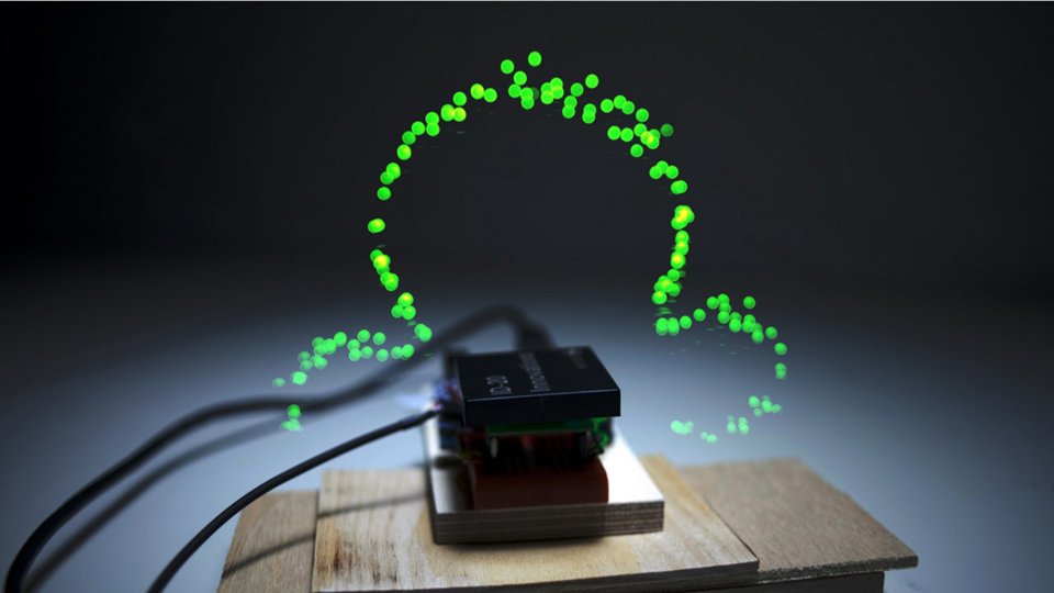
Immaterials: Light painting WiFi
Timo Arnall
http://vimeo.com/20412632
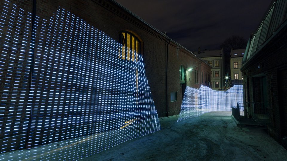
Immaterials: the ghost in the field
Timo Arnall, Jack Schulze & Einar Sneve Martinussen
http://vimeo.com/7022707
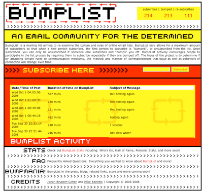
BumpList, an Email community for the Determined!
Jonah Brucker-Cohen
http://www.coin-operated.com/2010/05/13/bumplist-an-email-community-for-the-determined-2003/
Superglue
Danja Vasiliev, Joscha Jaeger, Michael Zeder
http://www.superglue.it
Revealing Errors – Website
Benjamin Mako Hill
http://revealingerrors.com/

Literature Survey
The Interface Effect, Alexander R. Galloway, Polity Press, 2012
The User Illusion, Tor Norretranders, Penguin Books, 1991
Parasite, Michel Serres, Minetota Press, 2007
Windows and Mirrors, Jay David Bolter and Diane Gromala, MIT Press, 2003
Sandbox Culture, Aymeric Mansoux, [yet unpublished] 2013
Human-Machine Reconfigurations, Lucy Suchman, Cambridge University Press, 2007
I, for one, welcome our new Overlords, Lasse van den Bosch Christensen, PZI, 2014
The visible problem of the invisible computer: a skeptical look at information appliances, Andrew Odlyzko, AT&T Labs Research, 1999
Turing Complete User, http://contemporary-home-computing.org/turing-complete-user/, Olia Lialina, 2012
No to no UI, Timo Arnall, http://www.elasticspace.com/2013/03/no-to-no-ui, 2013
The best interface is no interface, Golden Krishna, http://www.cooper.com/journal/2012/08/the-best-interface-is-no-interface.html, 2012


