Alecio-thesis outline: Difference between revisions
No edit summary |
No edit summary |
||
| Line 2: | Line 2: | ||
INTRODUCTION | === INTRODUCTION === | ||
A photograph has edges, the world does not. The edges separate what is in the photograph and what is excluded. This is where the structures of the photograph begins with the image and works its way out to the frame, where it ends. | A photograph has edges, the world does not. The edges separate what is in the photograph and what is excluded. This is where the structures of the photograph begins with the image and works its way out to the frame, where it ends. | ||
Revision as of 15:24, 27 November 2021
From Landscape to Portrait: How aspect Ratio changed the way we perceive the world.
INTRODUCTION
A photograph has edges, the world does not. The edges separate what is in the photograph and what is excluded. This is where the structures of the photograph begins with the image and works its way out to the frame, where it ends.
The frame of the photograph also sets up a relationship between its edge and its subject. It can contain and hold an image and by composition gather the objects and create subject matter. Without the frame, there can be no composition.
Framing speaks with the aspect ratio, and the aspect ratio is strictly related to the historical period and the technology in use. Documentary photography has been historically rooted in the landscape format, the analog square format gave the possibility to choose which was the better orientation afterwards, and today’s imagery production is mostly vertical due to the usage of smartphones.
What makes for good image cropping? Open literatures generally have two different opinions: image cropping guided by attention and image cropping informed by aesthetics.
What’s interesting for me as image maker, is analyzing how the photographs format it’s strictly related to the technology (and historical period), and how our perception of the meaning images can changes according to the format or kind of frame.
What gets lost in the crop? How to define an image efficiency? How our ability of interpret images has changed through history? These are some of the fundamental questions that I would like to investigate within my thesis research.
CHAPTER .1 REALITY SEEN THROUGH THE FRAME
In this chapter, I will introduce the role that image composition plays in image aesthetic and “visual efficiency”. Quantifying the aesthetic value of a photograph is a very hard problem, for this reason I will introduce fundamental visual theories such as Gestalt and geometrical sections to set up the necessary rules to build up the conversation. I will touch arguments such as the passive vs active frame and the “Decisive Moment” theory. Afterwards, I will outline the evolution of the aspect ratio along photography history in relation to the technology in use.
1.1 What is composition?
1.2 A brief history of the Aspect Ratio
1.3 Paying attention to the frame: Passive or active frame and the decisive moment
CHAPTER .2 HOW WE TAKE PICTURE IS HOW WE PROCESS THE WORLD
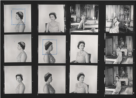
A never ending photography question is: the photograph happens during the shooting or during the editing process? Also, is editing cropping considered as cheating? Cropping images can be considered a controversial technique as you can alter the image meaning. In photojournalism, cropping is widely considered outrageous as the image can’t be a reliable document anymore. On the other hand, cropping can considerably improve the image visual performance and balance. For instance, the analog square format of camera such as the Rolleiflex used by Cecil Beaton, enabled photographers and editor to choose the most suitable orientation after the shot. On the contrary, nowadays the most preferred orientation became the vertical, due to the widespread use of smartphones.
2.1 On cropping photographs: Between Ethics and Strategy
2.2 Why shooting squares can transform the landscapes
2.3 Going vertical and essential with the advent of smartphones
CHAPTER .3 CASE STUDY: STEPHEN SHORE IMAGERY ANALYSIS
Stephen Shore's photographs often appear as unstudied snapshots before revealing themselves, on closer examination, to be carefully calculated and balanced. His images show a deep consideration of framing, with lines and colors chosen to emphasize the formal qualities of the places or objects within the frame, heightening the viewer's focus. His imagery production it’s well know to be un-cropped, usually cutting objects at the margins and leaving room for the viewer’s interpretation and imagination.
3.1 Introduction to Stephen Shore’s work
3.2 Building a mental image: Pointing vs framing
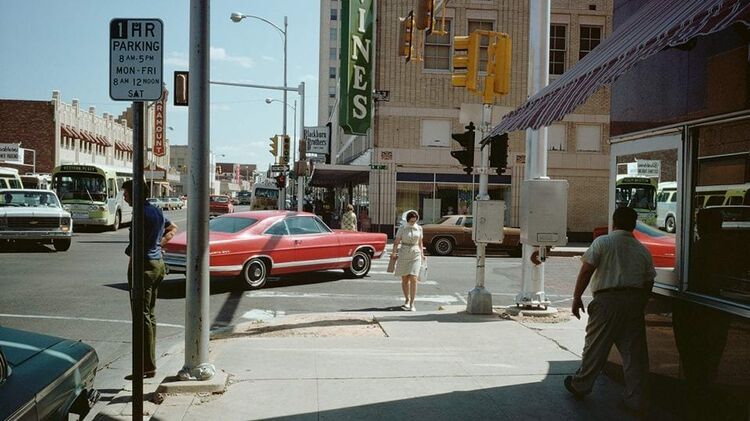
3.3 Image analysis: Oklahoma City, Oklahoma, July 1972
4. REFERENCES
Arnheim R, 1982 The Power of the Center: A Study of Composition in the Visual Arts (Berkeley, CA: University of California Press).
Cartier-Bresson, H., MATISSE, H., & TÉRIADE, E. (1952). The decisive moment.
Daston, L., & Galison, P. (2007). Objectivity. New York, Zone Books.
Jurgenson, N. (2011). Digital Dualism and the Fallacy of Web Objectivity. Online. Available at https://thesocietypages.org/cyborgology/2011/09/13/digital-dualism-and-the-fallacy-of-web-objectivity/
Mcmanus, Ian & Zhou, Fanzhi & l'Anson, Sophie & Waterfield, Lucy & Stöver, Katharina & Cook, Richard. (2011). The Psychometrics of Photographic Cropping: The Influence of Colour, Meaning, and Expertise. Perception. 40. 332-57. 10.1068/p6700.
Ritchin, F. (2009). After photography. New York, W.W. Norton.
Shore, S. (2020) “Q&A with Stephen Shore and Gregory Crewdson.” YouTube, uploaded by Yale MFA Photography, 20 Apr. 2020, www.youtube.com/watch?v=LXpQ1wCH7mU&t=1522s.
Sontag, S. (1977). On photography. New York, Farrar, Straus and Giroux.


