User:Jacopo/st7: Difference between revisions
| Line 93: | Line 93: | ||
It wasn’t just home users that benefitted from The Print Shop’s abilities – schools were also big fans of The Print Shop, using its capabilities to create everything from banners for events like dances to signs reminding students to get to class on time. Smaller organisations and businesses also found The Print Shop to be an economical solution for their newsletters, in-store signage and advertising. User groups and not-for-profit organisations used Print Shop-generated output in the ‘cut-and-paste’ layup of newsletters and other homemade publications, '''the beginnings of the ‘desktop publishing’ phenomena that gradually saw computer programs replace traditional typesetting and layup with all-digital ‘in the box’ software design solutions.''' | It wasn’t just home users that benefitted from The Print Shop’s abilities – schools were also big fans of The Print Shop, using its capabilities to create everything from banners for events like dances to signs reminding students to get to class on time. Smaller organisations and businesses also found The Print Shop to be an economical solution for their newsletters, in-store signage and advertising. User groups and not-for-profit organisations used Print Shop-generated output in the ‘cut-and-paste’ layup of newsletters and other homemade publications, '''the beginnings of the ‘desktop publishing’ phenomena that gradually saw computer programs replace traditional typesetting and layup with all-digital ‘in the box’ software design solutions.''' | ||
[[File:MACE_Journal_Apr_1985-22-copy.jpg|300px|thumb|right|Submissions to Mace Journal, Apr. 1985 ]] | |||
With no self-interest at all, the publishing industry was extremely skeptical of the emerging threat posed to them by low-cost home computers and dot-matrix printers, mocking the ‘poor quality’ output they produced as unsuitable for anything anyone would dare show to anyone else – but The Print Shop demonstrated people’s standards were much lower than they had anticipated. All kidding aside, a new middle ground was established (somewhere between markers and markup) and other software publishers eagerly jumped into it, creating not just ripoffs like PrintMaster, but new software such as The Newsroom, Create-A-Calendar and Awardware, each designed to provide a new ‘good enough’ solution in an area previously limited to professional or handmade alternatives. | With no self-interest at all, the publishing industry was extremely skeptical of the emerging threat posed to them by low-cost home computers and dot-matrix printers, mocking the ‘poor quality’ output they produced as unsuitable for anything anyone would dare show to anyone else – but The Print Shop demonstrated people’s standards were much lower than they had anticipated. All kidding aside, a new middle ground was established (somewhere between markers and markup) and other software publishers eagerly jumped into it, creating not just ripoffs like PrintMaster, but new software such as The Newsroom, Create-A-Calendar and Awardware, each designed to provide a new ‘good enough’ solution in an area previously limited to professional or handmade alternatives. | ||
Revision as of 16:07, 25 February 2021
Situationist Times
'The society of spectacle', Situationism, Unitary Urbanism and Psychogeography
The Society of Spectacle was written by Guy Debord in 1967, during western revolutionary times. It stands as a cutting-edge criticism to Marx's theory.
How do we change our perception towards time, work and living?
Promoting the creation of Situations, providing new possibilities (literally ways-out) from the paths designed by consumerism.
"In the society dominated by modern conditions of production life is presented as an immense accumulation of spectacles", which occupy our time, while making our free-time part of the consumerism engine. Reality has become image obsessed, ephemeral constructions are preferred by real experiences, increasingly addicted by commodity feticism. Capitalism has also redefined what survival means at a higher level; introducing the idea of an Augmented Survival, where the common sense of needs are disrupt and subvert.
Annotations with Martin:
https://www.figma.com/file/OLgacgzb5jq9LC9HWOddUN/Situationists'-Annotation-by-Jacopo-and-Martin?node-id=0%3A1
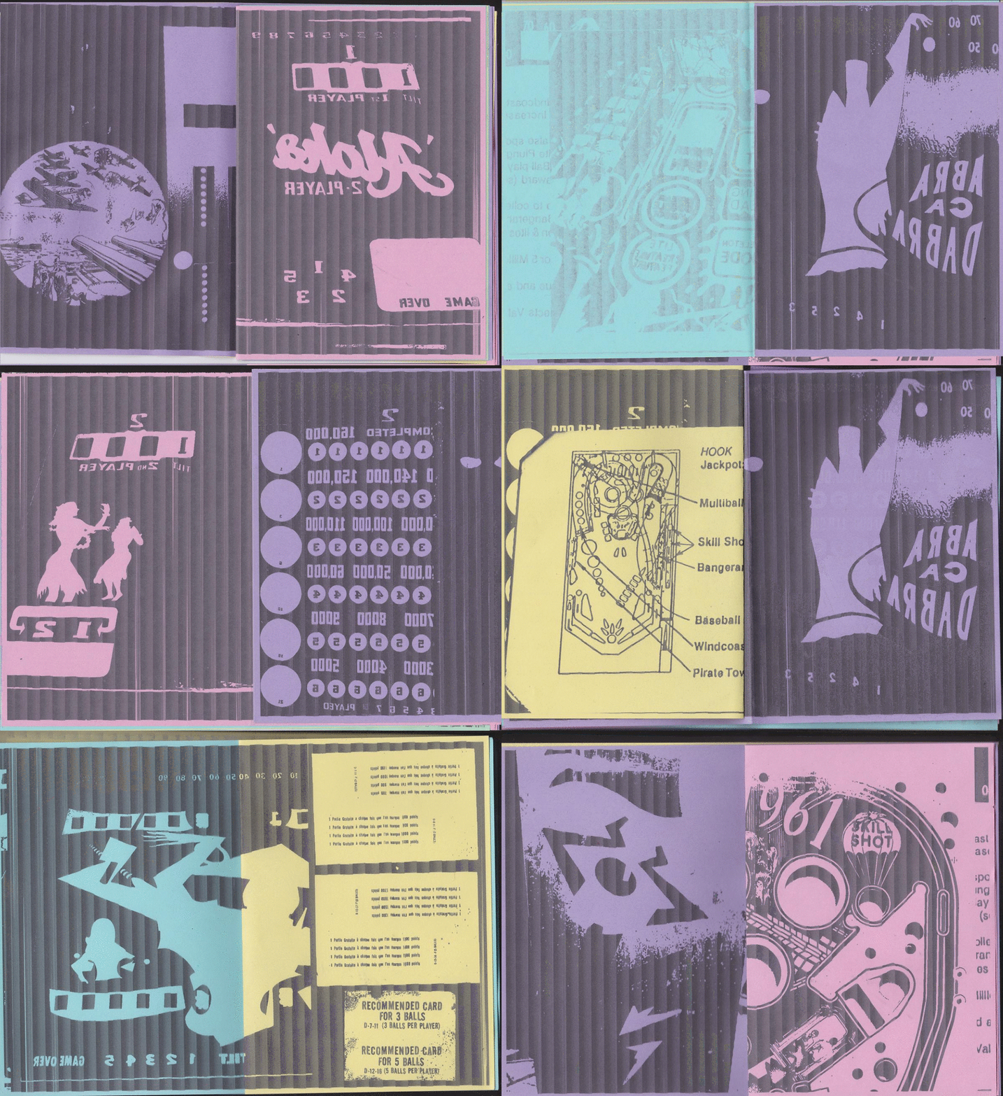
During the first week, I started collecting material around graphics and aesthetic of the Pinball, while highlighting the technical structure of the physical game. I printed a small publication, composed by pictures of hidden parts of the game, like reversed sides of the backglass, wires floating down from the main surface, and spreads from original printed instructions - following the path of situationist aesthetics, which include annotations made trought collage, juxtaposition, radical edits and plagiarism.
Main source: The Internet Pinball Database
//www.ipdb.org/search.pl
Readings
- 1) Visceral Facades: taking Matta-Clark's crowbar to software, Matthew Fuller
https://bak.spc.org/iod/Visceral.html
- 2) Ted Nelson, Literary Machine
https://hub.xpub.nl/bootleglibrary/book/199
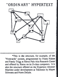
"Hypertext will not be "another type" of obscure structure, but a framework of reunification", to bring literature, science, art and civilization to new heights of understanding, in which everyone's contribution is thought to be valued. We can see the Hypertext Structure as a Pattern Language
A design pattern systematically names, motivates, and explains a general design that addresses a recurring design problem in object-oriented systems. It describes the problem, the solution, when to apply the solution, and its consequences. It also gives implementation hints and examples. The solution is a general arrangement of objects and classes that solve the problem. The solution is customized and implemented to solve the problem in a particular context. - DesignPatternsBook
- 3) Writing a platformer for the TIC-80 fantasy console
https://medium.com/@btco_code/writing-a-platformer-for-the-tic-80-virtual-console-6fa737abe476
- 4) Gangland and Philosophy
https://www.cddc.vt.edu/sionline/si/gangland.html
Watching
- 1) Computers for Cynics 5 - Hyperhistory:
https://www.youtube.com/watch?v=_9PmIkAYhI0
- 2) Splitting, Gordon Matta-Clark (1974)
- 3) Society of the Spectacle: WTF?
https://www.youtube.com/watch?v=RGJr08N-auM&ab_channel=TomNicholas
Others
The Computer Chronicles - Hypercard (1987)
https://www.youtube.com/watch?v=FquNpWdf9vg&ab_channel=TheComputerChronicles
HyperCard was an approachable development tool for the Macintosh that allowed creators to use then-revolutionary hyperlinks to make databases, multimedia presentations, and even...games. Myst was made using HyperCard, by letting players warp from one stationary image to another (and by using video files to further flesh out its world). Hypercard is described by the creator as *“a software erector set, which lets non-programmers put together interactive information”*
HyperCard runs on Apple Macintosh System 7.5.3: https://archive.org/details/AppleMacintoshSystem753
Using The Hypercard to create a non-linear narrative navigation into folders and files.
- Un-functional storytelling*
Travelling with HTML Map tags Image maps aren’t as popular today as they once were. In the past, they were very common, and used to create navigation menus on lots of popular websites. While they are rarely used for this purpose any longer, image maps are still a valuable way to display complex sets of links. The basic idea behind an image map is that you combine two different components: *) A map of defined linked areas
- ) An image
The map is overlaid on the image, and the clickable areas coincide with portions of the image. In HTML the image and the clickable areas are coded separately. However, from the visitor’s perspective, it appears that portions of the image itself are linked to different destination.
https://html.com/images/how-to-make-an-image-map/
Building a Paradise? On the Quest for the Optimal Human Habitat
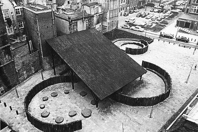
Do humans have a natural habitat? If yes, is it the original habitat of early hominids or the most optimal environment for today’s humans? Are these two the same thing and, if not, what does ‘optimal habitat’ mean? The concept optimal habitat could be examined from four viewpoints:
1) paradise;
2) urban design based on environmental psychology;
3) favorite places;
4) environment as an invitation for action.
I conclude that an optimal habitat is not a collection of more or less fixed elements but an environment that can be experienced as a beneficial feedback loop based on and responding to cognitive, emotional, aesthetic, and other needs. Different environments can prompt or hinder this experience of optimal habitat and consequently improve or diminish subjective well-being.
The term ‘human habitat’ is borrowed from Arnold Berleant, to whom it means a humane habitat, that is, an environment where people live, work, and socialize thrivingly.[4],[5] By the optimal habitat, I mean Berleant’s human habitat, but I add the qualifier to distinguish from those environments that people inhabit but do not thrive in; in ecology, a habitat is simply the residing area of an organism, not the best possible one. Paradise refers to a long-standing mythical-cultural concept of an environment that offers bliss, ease, and perfection; a place of ultimate harmony and lack of need. Aesthetic, in this paper, means a sensuous quality that is contemplated and valued from the pleasure and/or fascination it evokes.
In today’s parlance, paradise is usually understood as a lush and beautiful place of leisure and enjoyment, perhaps rare and longed-for, such as a holiday destination, spa, or tropical island.[6] It is conceivable that paradise represents the idealized environment for humans. Who would not dream of ease, joy, and harmony, lack of need and discord, and eternal sunshine?
- ) What's fundamental for surviving? Try to imagine a landscape where you just have to find main sources to stay alive.
- ) Build your own paradise.
https://www.contempaesthetics.org/newvolume/pages/article.php?articleID=806#FN58
The Print Shop Approach
The perfect way to express yourself.
In the early 1980s, if you wanted posters to advertise a yard sale or a party, your options were pretty limited.
The Print Shop was designed by David Balsam and programmed by Martin Kahn for the Apple II originally as a video greeting card system, but Broderbund founder Doug Carlston suggested the application print the cards instead and the rest is history. Teenage whiz-kid Cory Kosak was responsible for translating (or ‘porting’) it to other computers such as the Atari 800 and Commodore 64.
It wasn’t just home users that benefitted from The Print Shop’s abilities – schools were also big fans of The Print Shop, using its capabilities to create everything from banners for events like dances to signs reminding students to get to class on time. Smaller organisations and businesses also found The Print Shop to be an economical solution for their newsletters, in-store signage and advertising. User groups and not-for-profit organisations used Print Shop-generated output in the ‘cut-and-paste’ layup of newsletters and other homemade publications, the beginnings of the ‘desktop publishing’ phenomena that gradually saw computer programs replace traditional typesetting and layup with all-digital ‘in the box’ software design solutions.
With no self-interest at all, the publishing industry was extremely skeptical of the emerging threat posed to them by low-cost home computers and dot-matrix printers, mocking the ‘poor quality’ output they produced as unsuitable for anything anyone would dare show to anyone else – but The Print Shop demonstrated people’s standards were much lower than they had anticipated. All kidding aside, a new middle ground was established (somewhere between markers and markup) and other software publishers eagerly jumped into it, creating not just ripoffs like PrintMaster, but new software such as The Newsroom, Create-A-Calendar and Awardware, each designed to provide a new ‘good enough’ solution in an area previously limited to professional or handmade alternatives.
These applications formed the foundation upon which the desktop publishing industry was built –sure, the Macintosh and LaserWriter invaded the commercial printing industry, but they would have had a harder time had software like The Print Shop not aided in fostering an acceptance of computer-generated print media by the general public first. And the demand for consumer self-publishing solutions didn’t end there – lower cost 16-bit computers such as the Atari ST combined with cheaper design packages such as Timeworks Desktop Publisher and higher-quality 24-pin printers meant that those computer users who had previously found such great utility in The Print Shop and its brethren were able to advance in their amateur printing wizardry to full-scale in-the-box design, creating everything from brochures to how-to books in the comfort of their own homes – and without sacrificing too many Big Macs.
> https://paleotronic.com/2019/08/20/a-tongue-in-cheek-look-at-broderbunds-the-print-shop/
Derivistribusi
Distribusi is a content management system for the web that produces static index pages based on folders in the filesystem. It is inspired by the automatic index functions featured in several web servers. It works by traversing the file system and directory hierarchy to automatically list all the files in the directory and providing them with html classes and tags for easy styling.
Images automatically-collected with scraping tools into a printable PDF document: File:Esso-Antilles.pdf
- ) Distribusi basic: https://networksofonesown.varia.zone/tools/distribusi/README.pdf
Plain Text Games
Pads
- ) https://pad.xpub.nl/p/SituationistTimes_Glossary
- ) https://pad.xpub.nl/p/JacopoMartin_SituationistTimes
- ) https://pad.xpub.nl/p/12012021
- ) https://pad.xpub.nl/p/19012021
- ) https://pad.xpub.nl/p/26012021
- ) https://pad.xpub.nl/p/02022021
- ) https://pad.xpub.nl/p/03022021
- ) https://pad.xpub.nl/p/2021-02-04-prototyping
- ) https://pad.xpub.nl/p/2021-02-08-prototyping
- ) https://pad.xpub.nl/p/whatremains
- ) First collective ideas: https://pad.xpub.nl/p/ideas_issue_14


