Special Issue 22 Visual Design: Difference between revisions
No edit summary |
Berna Bereit (talk | contribs) (→Poster) |
||
| (19 intermediate revisions by 3 users not shown) | |||
| Line 1: | Line 1: | ||
Notes taken while meetings: [https://pad.xpub.nl/p/SI22-visual-design] | |||
- proposal for elements that will be designed: | - proposal for elements that will be designed: | ||
| Line 14: | Line 16: | ||
- label + map in similiar colours and same fonts | - label + map in similiar colours and same fonts | ||
==Proposal 1== | ==Proposal 1== | ||
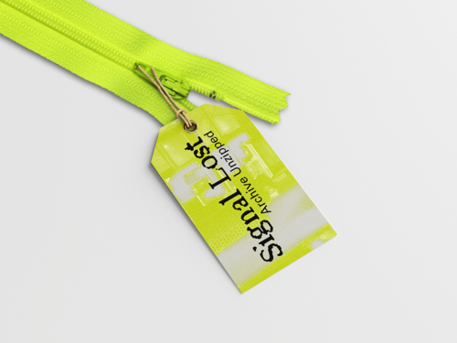
[[File:231123 xpub1 si22 lable layout bg 01.png|thumb|500x500px|Proposal for lables with title of work, the background is a disorted image of pirate bay taken by Alessia and Michel|center]] | [[File:231123 xpub1 si22 lable layout bg 01.png|thumb|500x500px|Proposal for lables with title of work, the background is a disorted image of pirate bay taken by Alessia and Michel|center]] | ||
| Line 24: | Line 24: | ||
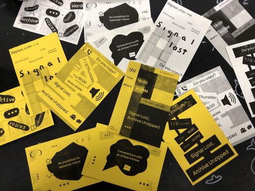
[[File:Test1-yellow paper.jpg|thumb|idea of having yellow paper for all th eprinted matter|center|500x500px]] | [[File:Test1-yellow paper.jpg|thumb|idea of having yellow paper for all th eprinted matter|center|500x500px]] | ||
==Proposal3== | |||
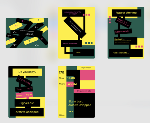
more colors, blocks, graph/ steps/ but can be non linear | |||
[[File:Screenshot 2023-11-27 at 17.25.45.png|thumb|center|500x500px]] | |||
==Sketches from 3rd Meeting== | |||
Sketches from the 3rd meeting about visual meeting: | |||
[[File:Sketch2.jpg|left|450x450px]][[File:Sketch3.jpg|450x450px]][[File:Sketch4.jpg|left|450x450px]][[File:Sketch-m3-visual.jpg|450x450px]] | |||
==Worm color scheme== | |||
HEX codes | |||
[[File:Colors-of-worm.png|thumb]] | |||
yellow: #c5ff26 | |||
pink: #eb2891 | |||
grey: #b9b9b9 | |||
== | black: #000000 | ||
== Proposal 1-2 Bernadette promo image == | |||
[[File:231128 xpub1 si22 share-pic layout bg Zeichenfläche-2.png|right|300x300px]] | |||
[[File:231128 xpub1 si22 share-pic layout bg Zeichenfläche-1-Kopie.png|left|300x300px]] | |||
[[File:231128 xpub1 si22 share-pic layout bg Zeichenfläche-1.png|center|300x300px]]- there should probably be the time as well (6pm open doors) | |||
== Proposal 1 Senka promo image == | |||
[[File:Visual design sketch 2.png|450x450px|center]] | |||
== Proposal Mania == | |||
[[File:Visual design sketch 22.png|thumb|fonts: Resistance Regular(title) and Bitter Regular(body)|450x450px|left]] | |||
[[File:Visual design sketch 23.png|450x450px|center]] | |||
[[File:Visual design sketch 24.png|thumb|fonts: BianZhiDai base (title) and Piazzolla Regular(body)|450x450px|left]] | |||
[[File:Visual design sketch 25.png|450x450px|center]] | |||
[[File:Visual design sketch 26.png|thumb|fonts: Terminal Grotesque Open Regular(title) and Atkinson Hyperlegible Regular (body)|450x450px|center]] | |||
==Map== | |||
draft: The map will be folded into 4, so the cover is right corner then underneath a second page, third on the left and left upper corner the last one. On the other side, inside the shape there are titles of all the projects- the things that remained | |||
[[File:Map1-print.png|thumb|left]] | |||
[[File:Map2grey.png|thumb|left]] | |||
[[File:Screenshot 2023-12-03 at 17.33.10.png|thumb|left]] | |||
[[File:Screenshot 2023-12-03 at 17.33.30.png|thumb|center|784x784px]] | |||
== Flyer == | |||
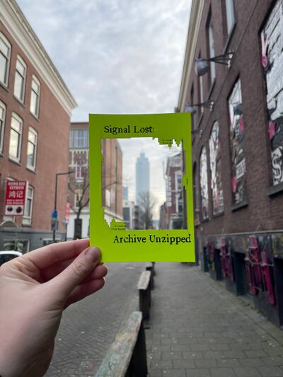
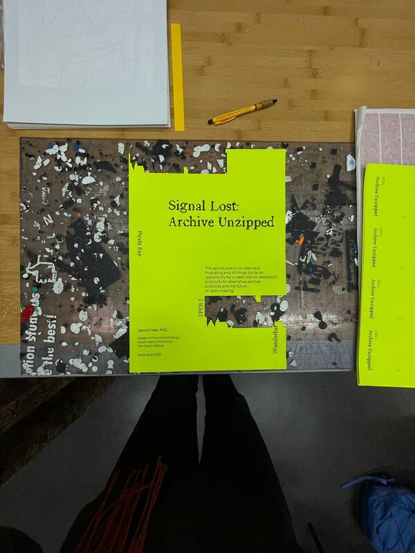
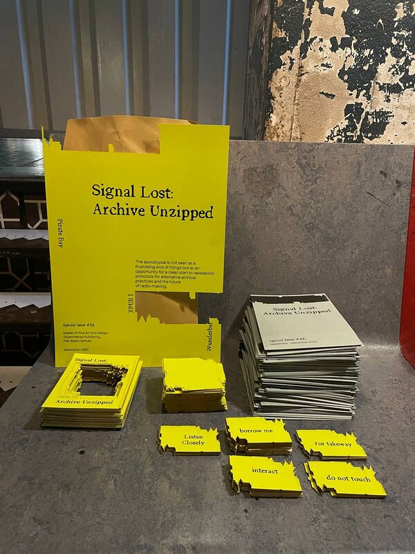
The flyers were printed on neon lime-green 330g paper and afterwards lasercutted. Visually we played with the element of the abstract shape that was cut out representing metaphorically the lost signals and playing with the element of "what do you want to archive when an apocalypse happens?". Visitors could take the flyers and position it in front of elements that they would like to archive, filling the empty place with a background. | |||
[[File:Photo 2024-01-03 15-08-13 (2).jpg|left|thumb|533x533px|photo of video surveillance at kebab store (pre-dunch)]] | |||
[[File:Photo 2024-01-03 15-08-15 (2).jpg|center|thumb|533x533px|photo taken outside of Radio WORM]] | |||
== Poster == | |||
[[File:Photo 2024-01-03 15-08-16 (2).jpg|center|thumb|800x800px|photo of the poster after lasercutter session]] | |||
[[File: | == Overview of all the produced materials == | ||
[[File:Photo 2024-01-03 15-08-15.jpg|center|thumb|800x800px|poster, maps, flyers, projects name, guiding tiles with "borrow me", "interact", "for takeaway" and "do not touch"]] | |||
Latest revision as of 15:17, 3 January 2024
Notes taken while meetings: [1]
- proposal for elements that will be designed:
- Labels for each project attached to zipper with title (+ keywords)
- guiding map including narrative + all the projects with title + description (map doesn't show exact location rather what can be explored in general - so visitors read about project and then have to find it)
(map maybe instead of introduction wall/poster)
- using colors of worm for coherent design
- pockets white lace with lime-green zipper
- label + map in similiar colours and same fonts
Proposal 1
Proposal 2
yellow paper, idea of a manual / instruction / protocols
Proposal3
more colors, blocks, graph/ steps/ but can be non linear
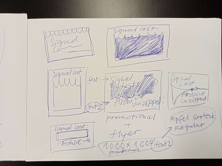
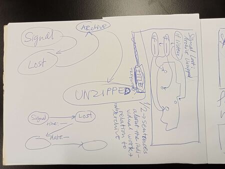
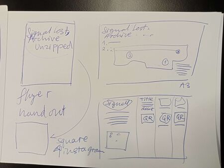
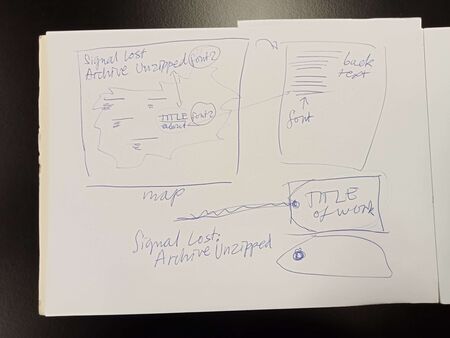
Sketches from 3rd Meeting
Sketches from the 3rd meeting about visual meeting:
Worm color scheme
HEX codes
yellow: #c5ff26
pink: #eb2891
grey: #b9b9b9
black: #000000
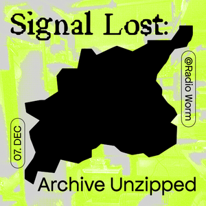
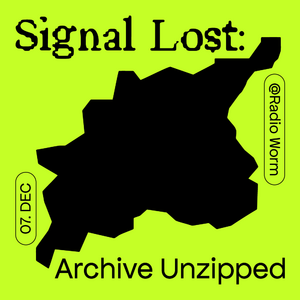
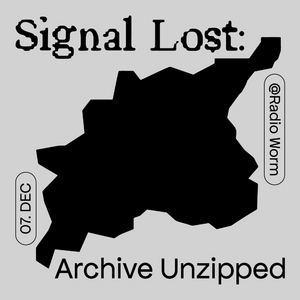
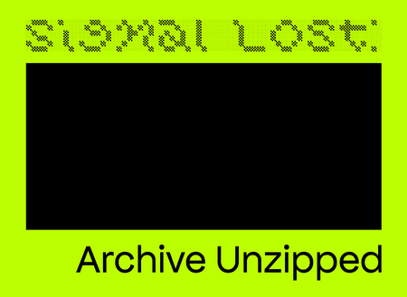
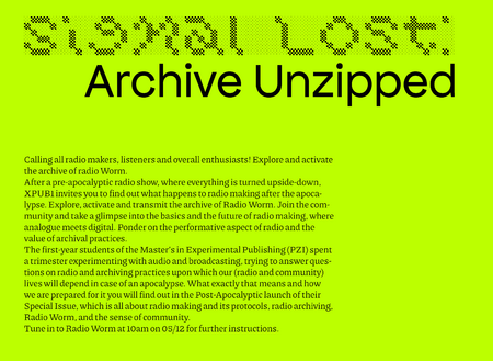
Proposal 1-2 Bernadette promo image
- there should probably be the time as well (6pm open doors)
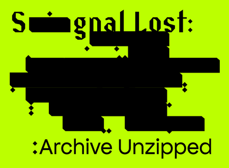
Proposal 1 Senka promo image
Proposal Mania
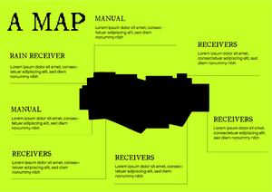
Map
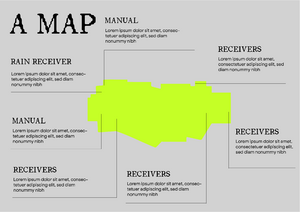
draft: The map will be folded into 4, so the cover is right corner then underneath a second page, third on the left and left upper corner the last one. On the other side, inside the shape there are titles of all the projects- the things that remained
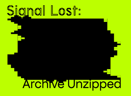
Flyer
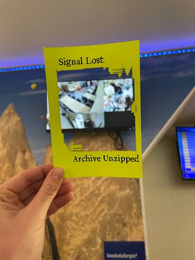
The flyers were printed on neon lime-green 330g paper and afterwards lasercutted. Visually we played with the element of the abstract shape that was cut out representing metaphorically the lost signals and playing with the element of "what do you want to archive when an apocalypse happens?". Visitors could take the flyers and position it in front of elements that they would like to archive, filling the empty place with a background.
