Special Issue 22 Visual Design: Difference between revisions
Berna Bereit (talk | contribs) |
Berna Bereit (talk | contribs) |
||
| Line 45: | Line 45: | ||
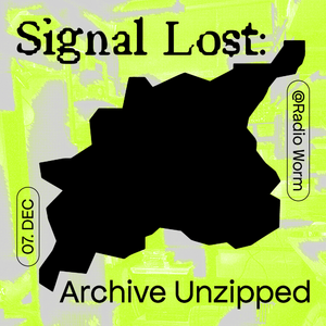
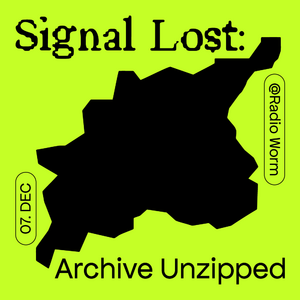
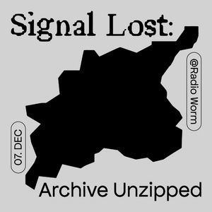
== Proposal 1-2 == | == Proposal 1-2 == | ||
[[File:231128 xpub1 si22 share-pic layout bg Zeichenfläche-2.png|right|300x300px]] | [[File:231128 xpub1 si22 share-pic layout bg Zeichenfläche-2.png|right|300x300px]] | ||
[[File:231128 xpub1 si22 share-pic layout bg Zeichenfläche 1.png|center|300x300px]] | [[File:231128 xpub1 si22 share-pic layout bg Zeichenfläche-1-Kopie.png|left|300x300px]] | ||
[[File:231128 xpub1 si22 share-pic layout bg Zeichenfläche-1.png|center|300x300px]] | |||
Revision as of 23:24, 28 November 2023
Notes taken while meetings: [1]
- proposal for elements that will be designed:
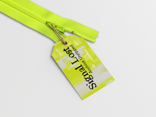
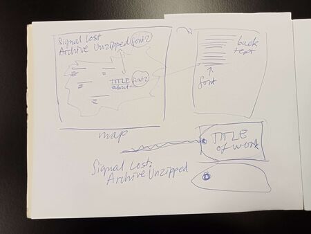
- Labels for each project attached to zipper with title (+ keywords)
- guiding map including narrative + all the projects with title + description (map doesn't show exact location rather what can be explored in general - so visitors read about project and then have to find it)
(map maybe instead of introduction wall/poster)
- using colors of worm for coherent design
- pockets white lace with lime-green zipper
- label + map in similiar colours and same fonts
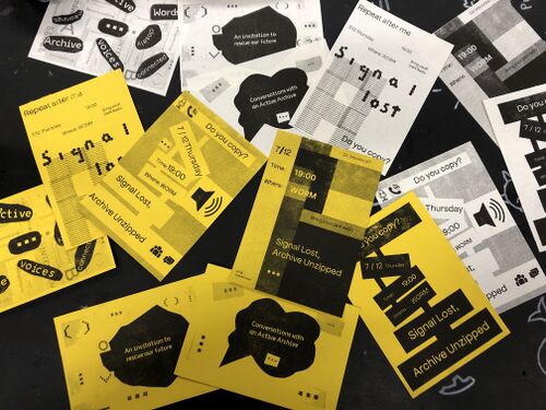
Proposal 1
Proposal 2
yellow paper, idea of a manual / instruction / protocols
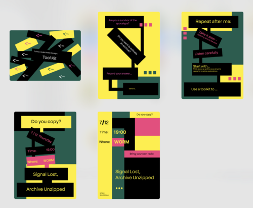
Proposal3
more colors, blocks, graph/ steps/ but can be non linear
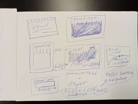
Sketches from 3rd Meeting
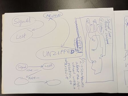
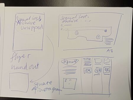
Sketches from the 3rd meeting about visual meeting:
Worm color scheme
HEX codes
yellow: #c5ff26
pink: #eb2891
grey: #b9b9b9
black: #000000

