Special Issue 22 Visual Design: Difference between revisions
Berna Bereit (talk | contribs) (created page to discuss visual design of SI22) |
No edit summary |
||
| Line 14: | Line 14: | ||
- label + map in similiar colours and same fonts | - label + map in similiar colours and same fonts | ||
==Proposal 1== | |||
==Proposal 2== | |||
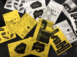
yellow paper, idea of a manual / instruction / protocols | |||
[[File:Test1-yellow paper.jpg|thumb]] | |||
more colors, blocks, graph/ steps/ but can be non linear | |||
[[File:Visuals-signal lost-07.png|thumb]] | |||
[[File:Visuals-signal lost-09.png|thumb]] | |||
[[File:Visuals-signal lost-10.png|thumb]] | |||
[[File:Visuals-signal lost-11.png|thumb]] | |||
Revision as of 17:23, 27 November 2023
- proposal for elements that will be designed:
- Labels for each project attached to zipper with title (+ keywords)
- guiding map including narrative + all the projects with title + description (map doesn't show exact location rather what can be explored in general - so visitors read about project and then have to find it)
(map maybe instead of introduction wall/poster)
- using colors of worm for coherent design
- pockets white lace with lime-green zipper
- label + map in similiar colours and same fonts
Proposal 1
Proposal 2
yellow paper, idea of a manual / instruction / protocols
more colors, blocks, graph/ steps/ but can be non linear

