User:Zpalomagar/PYRATECHNIC
Superpower Maps
Tancredi and Paloma
Cartography and data visualisation normally are intended as objective ways to depict spaces and information, but what happen when subjects, or communities, decide to map their own data?
Superpower Maps is a workshop where the participants will explore alternative ways to represent data enhancing self-knowledge through the process of map-making.
We will collect personal data, define relevant parameters and develop rules and codes to create graphic visualiations. From personal sketches to collective mapping we will create hand-drawing maps questioning the role of rendering realities, turning complex information into emotional cartographies.
Title
SUPERPOWER DIAGRAMS: make your own data-cartography
Who is leading the workshop
Paloma
Format
Mapathon (collective mapping session).
Participants will be asked to produce their own cartographic poster zine based on datasets referring to house speculation in the city of Rotterdam. Superpower diagrams is a workshop to explore the storytelling of visualising and speculate with data. This workshop will introduce the concept of radical maps and counter-cartographies in order to render information and to use them as a socio-political communication tool and an editorial mechanism.
Key topics
Collaborative mapping, visual grammar, diagramming, counter-cartographies, re-publishing maps.
Short description
What will happen
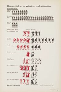
The workshop will start with a small introduction to counter-cartographies and collaborative mapping showing a small atlas of references and explaining how are they using diagrams as an editorial tool ( Bureau d’Études, Iconoclasistas, Otto Neurath, Market cafe magazine, dear data, etc. )
Then, the participants will be provided with datasets about house speculation in the city of Rotterdam. They will receive different data from diverse fonts (municipality, communities, online voices…), in 3-4 people groups, we will choose a dataset to work with and the storytelling/ strategy to communicate this data (What is the message that I am going to spread).
The next step will be to create a visual language in order to translate the dataset into a graphic communicative element (pictographic grammar, design strategy). We will design codes for translation reading and interpretation and we will start our collaborative mapping session. The visual language will be hand-drawn or using fast reproduction tools (photocopy machine, stamps, Letraset, tracing paper, etc.).
The goal of the workshop is to create a poster-zine, that we have the capacity to reproduce so, in parallel to the creation of the visual language we will design a layout and print strategy. (Riso print in order to work just with two colours and fast production ???? It would be nice but maybe too complicated if participants are not familiar with this print method, otherwise, we can just use regular A3 printers).
The workshop will finish with the print and the creation of the poster-zine and a small sharing a discussion about different strategies that have used.
Why (relevance)?
Images are produced and consumed in our current culture in quantities that would have been unthinkable in any previous period in human history so this is a crucial area to communicate with societies. Moreover, a lot of the information we have on the internet, especially when it’s related with data sets, requires complex interpretation procedures so for me, visual communication becomes a necessary tool to engage with modern human.
Furthermore, cartographies are tools between art, architecture, design, activism and technology that can also be used as the base of collaborative processes so I hardly believe that they are a superpower mechanism to make societies gain awareness, to reclaim a reality, to render invisibility and to use design elements to make activism.
Outcome: what will be goal of the session?
The goal of the session is to produce a cartogrtaphic poster-zine based on collaborative mapping that allow us to render a reality about house speculation in Rotterdam.
maximum amount of participants
20 ¿?
Prerequisites, material to bring
Sketch tools, laptop. The workshop is mainly computer free but we can need laptops to print and process some information.
Some interesting references
Atlas Gesellschaft u Wirtschaft - Otto Neurath
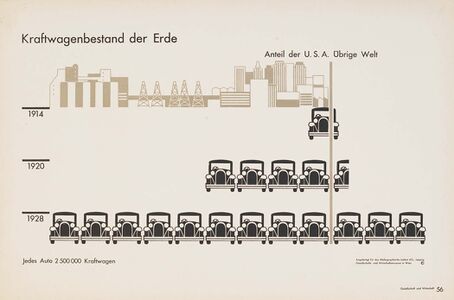
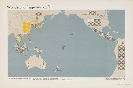
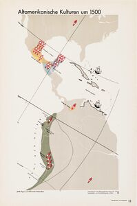
Commissioned by the Bibliographisches Institut in Leipzig, the atlas Gesellschaft und Wirtschaft is one of the best-known examples of Otto Neurath’s “Viennese method of pictorial statistics” (at the time it wasn’t yet called ISOTYPE) in action. It was published as a large-format (30×45 cm) folder containing 130 plates, 98 of which display maps and charts relating to topics such as history, migrations, economics, urbanism, etc. A complete PDF version of Gesellschaft und Wirtschaft can be downloaded for free here.
The maps and charts were originally hand-crafted by the staff from the Gesellschafts- und Wirtschaftsmuseum in Wien (Social and economic museum of Vienna), whose core team included Neurath, “transformer” Marie Reidemeister (later Marie Neurath) and graphic designer Gerd Arntz. Futura, which had been adopted by the Museum for all its printed matter some time in 1929, was used for titles, captions, numbers, etc., but the 30 plates of end matter (afterword by Neurath, statistical sources, index, contents) were typeset in Berthold-Grotesk (bottom picture).
The last couple of years have seen a steady stream of publications devoted to Neurath, his method and his work, most notably Isotype: design and contexts, 1925–1971, edited by Christopher Burke, Eric Kindel and Sue Walker. Though more modest in scope, Robin Kinross and Marie Neurath’s The transformer: principles of making Isotype charts is also a treat.
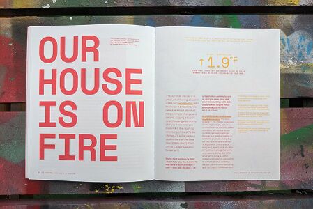
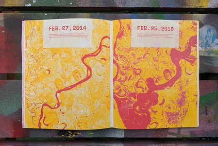
Market Cafe Magazine
Market Cafe Magazine is a zine about data visualization founded in 2017 by information designers and educators Tiziana Alocci and Piero Zagami.
Reading Market Cafe Magazine you will hear from different voices about what designing information means and where it's going. Our mad research brought us to discover the most talented and finest people in the industry to guide you through this journey. Market Cafe Magazine is 100% independent, self-published and self-distributed in London.
Market Cafe Magazine is not only a zine. It's also an online and offline community: we organise workshops and meetups to discuss the different sides of working with data. Subscribe our spam-free newsletter, follow us on Instagram and Twitter or join our Facebook group Data Loves Zines to know about our next events.
Dear Data
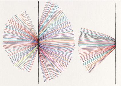
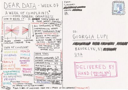
Dear Data is a year-long, analog data drawing project by Giorgia Lupi and Stefanie Posavec, two award-winning information designers living on different sides of the Atlantic.By collecting and hand drawing their personal data and sending it to each other in the form of postcards, they became friends.
Each week, and for a year, we collected and measured a particular type of data about our lives, used this data to make a drawing on a postcard-sized sheet of paper, and then dropped the postcard in an English “postbox” (Stefanie) or an American “mailbox” (Giorgia)!Eventually, the postcard arrived at the other person’s address with all the scuff marks of its journey over the ocean: a type of “slow data” transmission.
Over the fifty-two weeks, the collecting of data about our lives became a kind of ritual. We would spend the week noticing and noting down our activities or thoughts, before translating this information into a hand-drawn visualization.
On the front of the postcard there would be a unique representation of our weekly data, and, on the other side (in addition to the necessary postage and address), we would squeeze in detailed keys to our drawings: the code to enable the recipient to decipher the picture, and to fantasize about what had happened to her new friend the week before.
We prefer to approach data in a slower, more analogue way. We’ve always conceived Dear Data as a “personal documentary” rather than a quantified-self project which is a subtle – but important – distinction. Instead of using data just to become more efficient, we argue we can use data to become more humane and to connect with ourselves and others at a deeper level.
Ni por todo el oro del mundo! - Iconoclasistas
Los mapeos se realizaron en Jujuy y Córdoba, como parte de las actividades de la Unión de asambleas ciudadanas (UAC); y en Buenos Aires, Bariloche, Tucumán, El Dorado (Misiones) y en Ciudad del Este (Paraguay), a partir de la convocatoria del equipo de pedagogía popular Pañuelos en Rebeldía. También en mapeos que organizamos durante la «gira de la cosmovisión rebelde», años 2008-2009, con movimientos estudiantiles y culturales en Córdoba, Rosario, Resistencia, Mar del Plata, Olavarría, Tandil y San Andrés de Giles. En esos espacios no sólo se compartió saberes e información, sino que también se fue corrigiendo lo sistematizado, fortaleciendo así el desarrollo de un trabajo en etapas. Un momento crítico se generó cuando a los participantes les planteamos lo siguiente: teniendo en cuenta que diseñaríamos mapas de circulación pública ¿deberíamos mostrar también las resistencias y logros de las organizaciones? Este dilema se resolvió de forma positiva en un segundo encuentro de la UAC en Córdoba, cuando decenas de delegados de asambleas y comunidades votaron a mano alzada la importancia de visibilizar las resistencias y organizaciones en lucha.
