User:Charlie/CSS Ornamenta
*****PAGE IN PROGRESS******
CSS {Ornamenta:✷;}
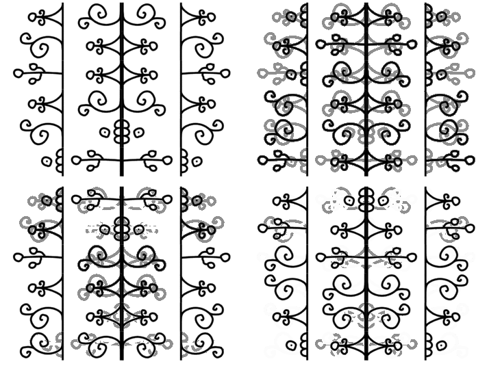
CSS Ornamenta or the ornament generator through HTML+CSS+Javascript is a continuation of my passion for ornamental design as a skeptically-spiritual practice (I won't elaborate, for now). A journey which started during my Illustration BA in which I created a series of intricate paper-cut ornaments, which I risograph printed into a zine, titled Ornamenta Magica.
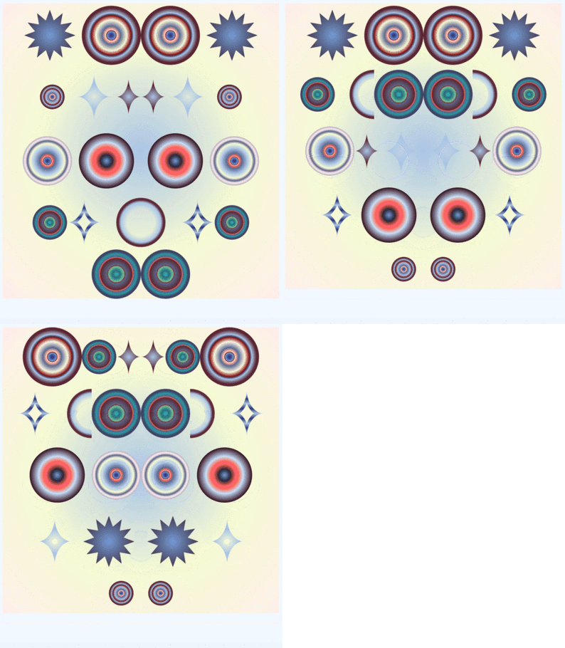
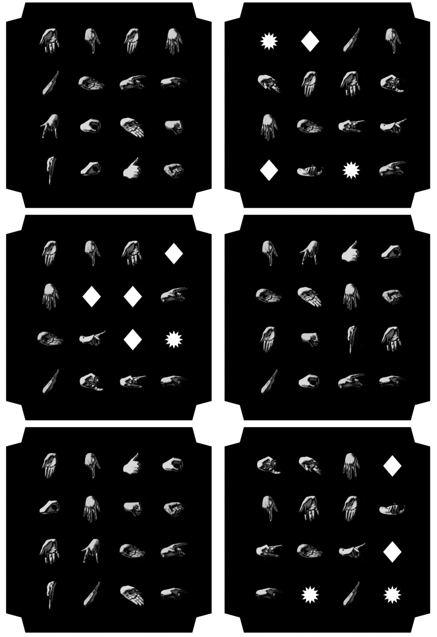
The ornament generator is a personal project I started during SI#26. It first started as code which randomized the order of images within a parent div, and then cloned them into another mirrored div to create a symmetrical effect.
✷ Prototypes ✷
<script>

function shuffleElements(container) {
    let elements = Array.from(container.children);
    console.log(elements);

    for (let i = elements.length - 1; i > 0; i--) {
        let j = Math.floor(Math.random() * (i + 1));
        [elements[i], elements[j]] = [elements[j], elements[i]];
    }

    elements.forEach(el => container.appendChild(el));
}

window.addEventListener('load', function() {
    let leftContainer = document.getElementById('left');

    shuffleElements(leftContainer);

    let rightContainer = document.getElementById('right');
    let clone = leftContainer.cloneNode(true);
    // clone.removeAttribute("id");
    clone.style.margin = "0";
    clone.style.padding = "0";
    rightContainer.appendChild(clone);
});

</script>
✷ Current ✷
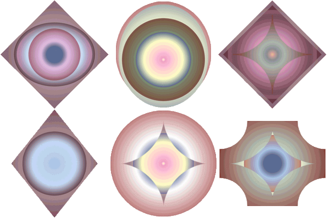
The current form resulted out of an additional interest in CSS shapes as the base for creating ornamental elements, and more complex gradients. Or, creating ornaments using only code. (♡ 𝓁𝒾𝓂𝒾𝓉𝒶𝓉𝒾𝓸𝓃𝓈 ♡)
The idea to 'nest' the divs came from a feedback session with Doriane. Which I experimented a lot with, but have since put the project ~on hold~ to focus on other stuff.
✷ The code ✷
The HTML is constituted of 'empty' div tags nested into each other. Resulting in multiple CSS shapes 'spawning' into each other, creating ornamental patterns.
The divs themselves create a sort of pattern in the code!
<!-- NESTED DIVS -->
<div class="text">Titan</div>
<div class="titan">
    <div>
        <div>
            <div>
                <div><div><div></div></div>
                    <div>
                        <div>
                            <div>
                                <div><div></div>
                                        <div>
                                            <div></div>
                                        </div>
                                </div><div></div>
                            </div>
                        </div>
                    </div>
                </div><div></div>
            </div>
        </div>
    </div>
</div>
The Javascript first lists the classes that are to be assigned to the parent divs (I assigned a different selection to different parent divs). Then selects all divs within the parent and randomly assigns the classes to each div.
The list for the .sigil parent-div includes multiple 'blank'/non-defined classes as well, to create less and more complicated ornaments.
//CLASS RANDOMIZER
document.addEventListener('DOMContentLoaded', function() {
    // List of all the classes
    const SIGILclasses = [
    const TITANclasses = [
        'cir1', 'cir2', 'cir3', 'cir4', 'cir5', 'cir7',
        'diam1', 'sparkle1','blur1', 'blur2',
        'cir1', 'cir2', 'cir3', 'cir4', 'cir5', 'cir7',
        'diam1', 'sparkle1','blur1', 'blur2',
    ];

    // Select all divs inside .titan
    const titanDivs = document.querySelectorAll('.titan div');

    // Function to assign random classes
     const TITANassignRandomClasses = (divCollection) => {
        divCollection.forEach(div => {

            const randomIndex = Math.floor(Math.random() * TITANclasses.length);

            div.classList.add(TITANclasses[randomIndex]);
        });
    };

    TITANassignRandomClasses(titanDivs);
});
The most fun part is the CSS! Which is full of simple and more complicated shapes using clip-paths (copied from the web!!). I mostly experimented with gradient colors and transparencies.
/* SHAPES & GRADIENTS */
.cir1 {
    overflow: visible;
    border-radius: 50%;
    background: radial-gradient(ellipse, rgb(255, 254, 194) 0%, rgb(253, 161, 218) 5%,
    rgb(255, 254, 194) 50%, rgb(62, 75, 154, 0.5) 70%, rgb(34, 47, 62, 0) 80%,
    rgb(34, 47, 62, 0) 100%);
}

.diam1 {
  clip-path: polygon(50% 0%, 100% 50%, 50% 100%, 0% 50%);
  background: radial-gradient(circle, rgb(170, 195, 230, 0) 0%, rgb(92, 40, 55, 0.5) 40%,
  rgb(92, 40,55) 100%);
  box-shadow: 10px 10px 100px 100px rgb(92, 38, 52);
}

.cross {
    overflow: visible;
    --mask: radial-gradient(40px at 40px 40px,#0000 98%,#000) -40px -40px;
    -webkit-mask: var(--mask);
          mask: var(--mask);
    background: radial-gradient(circle, rgb(59, 191, 203, 0) 0%, rgb(23, 107, 115, 0.5) 10%,
    rgb(118, 193, 157, 0.5) 22%, rgb(129, 13, 13) 100%);
}

...
✷ Riso print ✷
I ♡ refreshing the ornaments in my phone browser and taking screenshots of the best ones! I've also tried to riso-print some of the ornaments, which turned out great. I look forward to work on them more and make a whole risograph zine out of it.


