Peripheral Centers and Feminist Servers/Communication
This page documents the communication production team of Peripheral Centers and Feminist Servers.
Colofon
The (English) colofon was written in the 2024-03-13 Methods class, in this pad. It was later translated to Dutch by XPUB1's Dutch speaking students.
English
Peripheral centers and feminist servers investigate multiple approaches to the conditions of serving. It interrupts the endless flow of data that fuels the economy, exposing the cracks and gaps of the techno-scientific paradigm imposed on society. Here commands are executed, connections made, trust exchanged, and resources shared.

This feminist data center brings to light the physical infrastructure and actual labour which enable the processes we perform every day. In this exploration, we think through feminist approaches that reveal the concealed layers of our on(off)line interactions. We broaden our understanding of how this tangible, energy-intensive infrastructure truly operates behind the seemingly innocent notion of the 'cloud'.

The various projects within Peripheral centers and feminist servers expose their infrastructure, emphasizing the material conditions of their production. We advocate that the fairy tale of immateriality has real socio-economic-environmental consequences.
Dutch
Peripheral centers and feminist servers onderzoekt meerdere benaderingen omtrent de omstandigheden van serving. Het doorbreekt de eindeloze flow van data die de economie voedt, door de scheuren en gaten in het techno-wetenschappelijke paradigma dat aan de samenleving is opgelegd bloot te leggen. Hier worden commands uitgevoerd, verbindingen gelegd, vertrouwens uitgewisseld en bronnen gedeeld.

Dit feministische data center brengt de fysieke infrastructuur en de daarbij behorende arbeid die de processen mogelijk maken die we dagelijks uitvoeren aan het licht. In deze zoektocht werken wij vanuit en door de feministische benaderingen die de verborgen lagen van onze on- en offline interacties onthullen. We verbreden ons begrip van hoe deze tastbare en energieslurpende infrastructuur werkelijk opereert achter de ogenschijnlijk onschuldige term van 'de cloud'.

De verschillende projecten binnen Peripheral centers and feminist servers leggen hun eigen infrastructuur bloot, met een nadruk op de materiële omstandigheden van hun productie. We pleiten ervoor dat het sprookje van de immaterialiteit daadwerkelijk sociaal-economische en ecologische gevolgen heeft.
Design Process
Meeting 2024-03-14
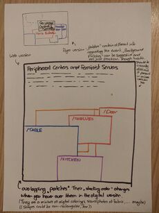
We met online (Jitsi) on Thursday to discuss the production work. Notably, we want (need) to have the (digital) flyer ready by next Monday. We intend to use this for print as well, and also to make a quilt patch out of this. Ideally, this web version has an interactive element and leads to different SI project pages on the quilt.
Some more decisions were made this meeting. This subsection is dedicated to some notable ones.
Early prototypes
We individually made some rough prototypes to get the inspiration flowing and to communicate some ideas with eachother.
Fonts
We agreed to use open source and otherwise situation-aware fonts. We compiled this list of resources:
- https://www.design-research.be/by-womxn/
- https://velvetyne.fr/
- https://notyourtype.nl/discoveries/ofl-font-bianzhidai-is-out/
Software
We agreed to use FLOSS tools to make any digital imagery. A non-exhaustive list of such tools at our disposal:
- Krita
- GIMP
- Inkscape
- scribus
- The collective drawing tool from a previous prototyping class
- pen and paper
Keywords
In 2 minutes, we jotted down some keywords to communicate what directions we had in mind, and to guide us when designing. There was no need to adher to these keywords.
- chaos
- layers
- not clear
- no certain emphasis
- seams
- servers
- patchwork
Round of Prototyping
We decided to do a round of Exquisit Corpse prototyping: we would make a prototpye and hand it over to the next person. We would then also get a new prototype to work on. There would be 2 handovers, so that every prototype would include the voice of each of us. For the handover we followed this direction:
Anita > Zuzu > Thijs > Anita
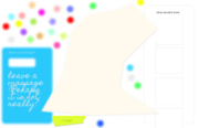
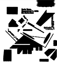
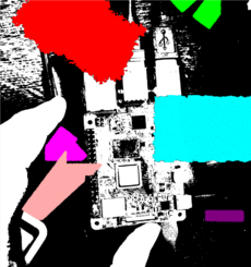
The following are the results of this Exquisit Corpse prototyping:
| ---> | ---> |
| ---> | ---> |
| ---> | ---> |
Meeting 2024-03-16
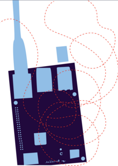
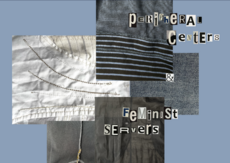
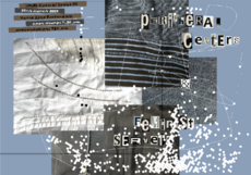
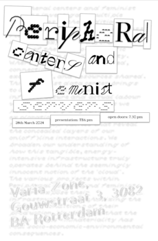
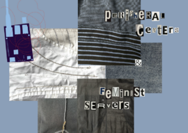
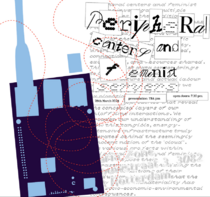
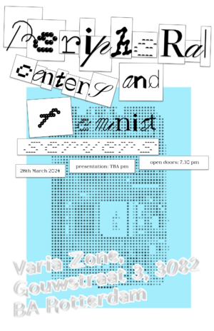
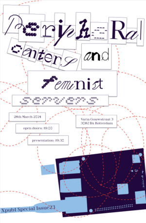
We met Saturday evening to discuss the 3 prototypes that were the result of the Exquisit Corpse prototyping round, and decide on a further course of action. Some elements we liked from the prototypes was the lettering with different fonts, the subtle interactivity of the web prototype, the use of chopchop and the squiggly lines. We noticed the prototypes shared many common ideas, so we were keen to combine some elements. Below, there are some rough prototypes made during this meeting.
We also voiced a few concerns. Notably: the use of fabric as a visual might make sense to use, but as we're not using the quilting metaphor explicitly in the SI, it might suggest that this project is more about fashion than about feminist servers. Also, if we're not careful, the lettering might raise an association with ransom letters. Finally, the website is a little slow at the moment, and the SVGs are impolitely large.
Feedback 2024-03-18
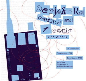
Monday morning, we proposed the two drafts to the group in the SI class with Alice. A vote showed that there was n proference for one design over the other. We decided to combine the two drafts and incorporate the following feedback we got:
- Add to image: XPUB special Issue Launch
- Varia's name is Varia, not Varia Zone
- Don't split postal code (and maybe address not to prominent, could be replaced with 'XPUB SI launch')
- Legibility: 'feminist' hard to read
Add 'Thursday' to date- 7:30pm or 19:30? -> 19:30
- Title / info structure on the left more natural to read
- Chopchop image looks like a walktie talkie -> changed the length of the cord and changed orientation
(do we need to add logos? Might be a requirement from the school)
Final Design
Webflyer
We used the functionality of one of the Exquisit Corpse prototypes that used svg animation. For this, it was necessary to clean up the svg and add class="moveable" to all elements that we want to be animated. This webflyer is not the landing page of the webquilt. Later, we might add the colofon or other information to it.
- The webflyer can be found here
- See the code here in the git repository
The svg is added to the webpage as an object:
<object id="flyer" type="image/svg+xml" data="flyer.svg" ></object>
The responsiveness is currently very rudimentary:
<style>
    #flyer {
        width: 100%;
        max-width: 1000px;
    }
</style>
The animation is also very basic. There is a function that selects a random 'moveable' element from the svg and translate it between 10 and 60 px in both x and y directions. This function is called every 200ms. This functionality is all wrapped into an event listener, so that it only starts when the svg is loaded into the page.
// get the svg element in the DOM
var flyer_obj = document.getElementById("flyer");

// start animation once the svg element is loaded
flyer_obj.addEventListener("load",function(){

    // fetch the svg structure and find all elements belonging to the class 'moveable'
    var svg_doc = flyer_obj.contentDocument;
    var moveables = svg_doc.getElementsByClassName("moveable");

    // function to move one random element of the class 'moveable'
    function move_svg_el() {
        // generate a random id
        var r_id = Math.floor(Math.random() * moveables.length);

        // generate random translations (unbounded, minimum of 10px)
        var r_x = get_r_polarity() * (Math.random(50) + 10);
        var r_y = get_r_polarity() * (Math.random(50) + 10);

        // translate the selected element with the generated distances
        var s = 'translate(' + r_x.toString() + ',' + r_y.toString() + ')';
        moveables[r_id].setAttribute('transform',s);
    }

    // eveny 100ms, call the function that animates one element
    var timer = setInterval(move_svg_el, 200);

}, false);
Sticker
With the Brother QL700 label printer (new addition to the studio), we made sticker version of the flyer, too:
Handouts
Concept
After the flyer we turned our attention to the handouts. We knew we wanted the following aspects to be part of the design:
- The different projects with title and blurb
- A 'patchwork' that resembles the quilting practise that has been the base for this special issue
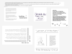
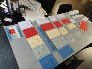
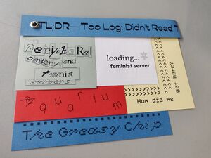
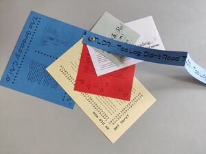
Very quickly we settled on the idea of stacking 'patches' for the different project on top of each other. Not all patches would be the same: they could differ in color, material and styling. An eyelet in the corner would hold them in place. In the stack, the titles of all projects would be visible. Once opened, by turning the patches, the blurbs would become readable.
Blurbs
/Aquarium
Welcome. From now on imagine yourself as a goldfish, you are a digital goldfish living in a virtual aquarium.

The Aquarium is a sci-fi concept: wherever there are servers, there exists a virtual aquarium. Within this aquarium reside digital fish—embodiments of consciousness—observing human behavior. Each fish possesses autonomy. As users navigate the labyrinthine activities of the servers, these digital fish reflect their actions. The ecosystem of the aquarium extends beyond mere observation. It embodies the subtle interplay between users and the digital infrastructure they inhabit. In this text-based game, players assume the roles of these digital fish, each representing a unique perspective within the server ecosystem.
/Door: How did we get here?
How did we get here?

The door is a point of access. Walking through the door, guests have a chance to see the processes that take place here to ensure the flow of information that enables our everyday interactions on(off)line. This all happens behind an invisible infrastructure that we want to reveal.

How did we get here? invites you to interact with a website that takes you on a journey through the streets of our city, and welcomes you to our reimagined data center. Aiming for seamfulness by revealing and sharing processes, (re)sources, and tools.

This data center challenges the conditions of serving, by regulating the amount of connections. Thus you need an access token, which will be handed to you by someone who trusts you, to embark on the web journey. These tokens are limited to ensure that the resources are not depleted.
/Kitchen: The Greasy Chip
The Greasy Chip is comprised of several interconnected parts. On the one hand, there is the fridge, stove and bin. These appliances are part of a filesystem which deliberately obscures taken-for-granted divisions between physical and digital space. These parts of the filesystem are indissociable from the process of despatching meals to guests. Tonight, for one night only, we're offering chickpea curry to go. Through a web interface, you have the chance to cook and serve this dish. Follow along to the recipe and use the web-based terminal interface to make the meal.
/Table: Loading: Feminist Server...
A card-browser game: get a card, type the command in the browser. Receive an interpretation of its function, a connected feminist concept and instructions to execute. Serve and be served as you turn into a feminist server yourself by playing and interacting with the cards both online or one-on-one in the space.

Central to the project is the analogy between software and the material world. This allows for an exploration of the interaction between online and offline environments, and making conscious how this interaction shapes us.

The performative and educational elements are the means of this exploration, as the game invites actions in the physical space. Through self-reflective and relational qualities, it calls upon the feminist method and literature. A reconsideration of words with a set meaning will occur while playing.

The player(s) will get acquainted with important computational terms and commands, which enable associations extending beyond the terminal, into the social and eventually the personal spheres.
/Shelves: TL;DR
In a seamless world, awareness of techno-social infrastructure surfaces only when it's not working. But when you upload a photo, install an application, move a file, a technology serves, works, labours to execute what you've asked of it.

Inaccessible files track this work as data. These files are inaccessible in two ways: they're hard to retrieve and even harder to decipher. While these hidden files contain the not so hidden infrastructures of a server, they only manage to show a portion of it. After all, log files have a bias towards the technological ecology, prioritizing the labour of machines.

The actual infrastructure consists of much more: the people maintaining for the tech to work. A feminist data center acknowledges and fosters the infrastructure surrounding this technology; the physical labour, the decisions about shared spaces, the different knowledges that depend on each other for the network to exist.

tl;dr researches ways to make sense of these hidden labour that goes on in a feminist server through logged and unlogged effort.
Creation Process
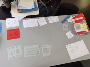
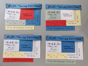
At first, we considered using scrap paper only. However, we didn't want to deplete the communal XPUB studio resources completely, so we ended up buying most of the paper. We worked with 5 colors: a white, yellow, grey, red and blue. All patches come in all 5 colors, except the title patch which comes in 2.
After printing (with the big office printers) and cutting (with the big quillotine cut and manual cutting machine), the handouts needed to be assembled. To achieve the patchwork effect, we semi randomly selected one version of each patch and stacked them on top of each other.
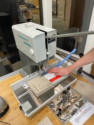
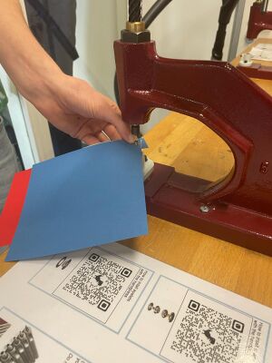
We used Ø5mm eyelets, bought at the WdKA shop, to hold the handouts togeter. At the publication station, we used the gole puncher to punch Ø5.5mm holes into each stack of patchworks. We then used the handpress in the fabric station to install the eyelets.
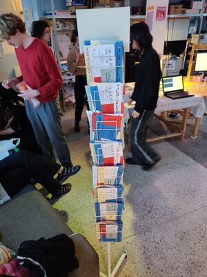
Final Handouts
We made an edition of 70 handouts. During the launch event, they were displayed for take away near the entrance in a flyer rack from Varia.


