
Notes on color.
color and filmmaking
intro
writing on color in the 1950s dreyer regretted that just a few color films worthy of note had been made. at the time he was planning to make a film on the life of jesus and had already written a script for it. dreyer, who is now known for his black and white works, wanted to make the jesus film in color. he had been planning it for years and at that point it had become what he called the project "of his life". unfortunately, the life of jesus was never made, so we can only assume from the script and from fragments of ideas recorded here and there what it would have been like. what dreyer lamented about the state of color cinema and likely wanted to oppose in his color life of jesus was cinema's need to stick to the principles of naturalism at all times; as he saw it, in the few instances when film strayed from naturalism and managed to produce something visually original, it was mainly because it was heavily borrowing from other visual arts, such as painting.
one can agree or disagree with dreyer’s disappointment, but the situation has not changed all that much since then, at least where narrative cinema is concerned. it looks like the aspiration of cinema is that to adhere at least in part to some sort of naturalism, and perhaps there are reasons for it. naturally, dreyer was speaking from the standpoint of the creative, which is not always the most practical. the history of cinema is filled with cases of productions not going where the creatives want to, to a lesser or greater extent. actually, it looks like the cases in which things went in the exact direction envisioned by the creatives have been the absolute exception. and to be fair, if there ever was an aspect of filmmaking that had to deal heavily with technical limits of the medium, it’s been definitely color.
the way colors are presented reflects the intentions and fascinations of the image maker. but this is not all. another important consideration to make is that often there has been a rift between what the industry and what the creatives wanted. of course these two positions were sometimes coincident, but more often than not they were at odds with one another. often the creatives had to find ways to accommodate what was available to their needs, which was largely set either by the requirements of the industry, by technical restrictions, or both. the history of color in movies is one made of battle of patents, belligerent funding and court cases. while the business figures were mostly busy trying to make profitable choices by securing technologies that would give them an advantage on the competition, filmmakers were often left with the doubt about whether they should welcome novelties or reject them. some thoroughly embraced technical innovations from the get go. there are many others who instead resisted them through and through. and there are also those who were skeptical and nevertheless made color fully their own.
color has been extremely important and extremely problematic at the same time, and from the very beginning. bringing color to the moving image has been from the start a preoccupation for those working in the film industry. this is probably why, from the very first years of cinema, a vast number of techniques to add color to films proliferated. limitations have always been a crucial factor in the development of technical implementations, but even those wouldn’t stop color films to be produced.
in the early years of cinema color was not rare. silent films had actually a variegated palette, which included hues as sepia, amber, crimson, rose, lavender, cobalt blue. in silent film color was certainly an embellishment, but not only. it was actually employed symbolically and poetically to enhance the message of the images. tinting and toning for instance were essential not only to draw the eye in, but also to create atmosphere and mood and to complement the story in various ways. one could almost say that color in silent film was providing a visual soundtrack to the images on screen. this use of color was rather sophisticated all things considered and even with substantial changes it has persisted until now. naturally, the level of complexity has increased and it’s not as immediately readable as in early cinema, but the core reasons for using color in films have not really changed. these reasons could be summed up as wish to entice the eye, setting a mood, giving information that other elements of the movie alone couldn’t provide.
this essentially means that color is generally used cosmetically, poetically and symbolically. capable filmmakers and movie directors, while adopting color for specific qualities, are able to blend more than one of these approaches seamlessly. yet, even when blending is seamless one dominant intention is often recognizable.
uses and categories
the role of cosmetic color is insidious to define, as it encompasses a range of purposes and accommodates a variety of styles. first of all, its aim is believability, to present a credible impression of lifelikeness. another fundamental preoccupation is of course how the image should look. so besides giving an impression of reality, color is intended as a pervasive repoussoir: by drawing the eye to the images, it contributes throughout to hold the viewer’s attention. the term “cosmetic" doesn’t necessarily have a negative meaning, it simply identifies color used for its esthetic quality. the cosmetic use of color is likely the most common in narrative cinema—one could almost affirm it is the “default” use for color. cosmetic color is far from simple however, it can be extremely baroque. in films where poetic or symbolic use is dominant there’s often a degree of color used for its purely cosmetic qualities. cosmetic use of color is however not only determined by concern with storytelling. it has also to do with the industry (showcasing and/or promoting a specific process/innovation/etcetera) and with target audience (choice of a type of color palette depending on recipients).
according to its poetic use, color expresses something subtle and intangible. for instance, a state of mind, a sentiment, an atmosphere. poetic color shows reality not necessarily as it is, but through a filter. its manner of working is not ascribable to entirely rational processes. to an extent it's possible to convey the same message expressed through poetic color without it. naturally we’re not referring to a literal translation, but to the fact it would be possible to express similar messages by working the black and white in a way proper to it. eastern and asian filmmakers in particular excelled at this way of working with color. culturally they have been able to embrace a higher level of abstraction, which seems necessary to work with color associations more freely. a number of european filmmakers also devoted time and effort in enhancing the poetic qualities of color in film. one only has to think about the works of directors as ozu and de oliveira, to understand what poetic color is like and what it's capable of. in general terms, most cinema considered "d'auteur" employs a degree of poetic color.
ozu seems exemplary in this regard. while after he transitioned from black to white to color stock (he made his final six features in agfacolor) the design of his movies was to a degree affected by it, his translation from black and white to color didn’t impact at all the type of film he was making, nor did it have an impact on the message of his cinema. one thing that color allowed ozu is greater liberty with details. one could say ozu kept making the same film all along, and while the color ones with their being so vivid and accurately designed are perhaps more immediately charming, the message they express is the same as those in black and white: emphasizing a feeling of awareness of transience and passing of time.
symbolic color is much more problematic. following semiotic classification, use of color in this category ceases to have a primarily indexical and iconic meaning. that is, color stands in for something else, for something cultural. also, because even complex symbolism becomes transparent with overuse, unless handled carefully it gets old very fast. this is why symbolic color has been used more often than not in combination with poetic and cosmetic color, and rarely alone. the hollywood melodrama made extensive use of color as symbol, thanks also to technicolor’s impressive visual rendition, which also includes its extreme fake connotations. well-known examples are the films of minnelli, of nicholas ray, of douglas sirk. sirk especially was a master of color symbolism; his perspective on the subjects of his works however was always highly ironic. cases like sirk apart, symbolic color is most effective when used sparsely. the effect it generates cannot be reproduced by other means. it is thus irreplaceable. this is because color stands for something entirely conceptual and it acquires almost a verbal quality.
in genre film
cinematic genres exploited symbolic color through and through, with very uneven results. the history of cinema demonstrates that some content cannot be expressed fully without color. however, in a level-headed discourse there doesn’t seem to be space for color to forcefully come forth on its own. when not tamed, color has been mostly relegated to the realm of the fantastic and has been mostly associated with the childish, the threatening, or the exotic. this is why the animation, the musical and the horror genre, even with all their limitations, seem to have been the ideal playground for color to emerge in full force. the technicolor esthetic for instance, which is often associated with disney animated features (as a matter of fact, disney saved technicolor at a critical juncture) and with musicals, overplayed the role that awe and overwhelming visual stimulation have on the spectator, sometimes at the expenses of other factors. because of its lack of demand on realism, animation made use of color more effectively than real-action cinema.
the musical and the horror are two genres that made use of color extensively as well. like animation, the musical was for decades identified with color moving pictures. and not just blandly: it was often full-blown technicolor extravaganza. musicals embraced color early on, and were in fact an ideal way of showcasing its capabilities. for horror things went differently, as it was a genre often relegated to low budget productions. if it’s true that for financial reasons horror movies adopted color relatively late, because of limitations filmmakers working in horror had to be inventive and make the most of what they had. while one can clearly see that horror movies are surely plagued by a number of technical and conceptual issues, at the same time lots of unbridled color experimentation came from them. this is one of the reasons why, within the panorama of narrative cinema, horror was extremely influential for alternative filmmakers.
in experimental film
experimental and independent cinema learned and appropriated a certain way of making use of color close to what was attempted in b-movies and, for the most part, ignored or only hinted at by dominant cinema. often starting out as a reaction, the avant-garde proceeded to dismantle the language for its own purposes. color became crucial in questioning established practices of craftsmanship and spectatorship. most importantly color started to stand out more and more as a value in its own that was not easily ascribable to other expressions. visual approaches varied wildly from filmmaker to filmmaker and sometimes from film to film as did the focus and the issues investigated.
the production of experimental and independent cinema in color included stances as diverse as the abstract animation studies of mary ellen bute, far removed from customary modes of cinematic storytelling; the shorts of norman mclaren, who brought together sound and visual experimentation. stan brakhage went further and connected the powerful presence of color with the many nuances of human experience. brakhage saw the notion of color as contaminated by culture. his films propose to a degree the reconstruction of the same untainted vision of the child before the advent of cultural bias. this philosophy of a pure, universal interconnection of all things is deeply rooted in brakhage's most famous color works' times (the 1960s). brakhage came from a milieu distant from tarkovsky's, but curiously his view is not all that different from that of the russian filmmaker as seen in the ending of andrei rublev, where the color takes over, becoming an immersive transcendental experience.
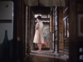
tarkovsky’s idea of color transcendence has been pursued in other works, perhaps less austere and more down-to-earth. before andrei rublev, sam fuller used black and white and color in combination in the b-movie shock corridor to work the idea of creeping madness—which is a path to transcendence in a way. color sequences filmed on cheap color stock as the one used in home movies are exploded in the spectator’s face at time when the character on screen is experiencing a crisis. the idea was reinterpreted and reversed in happy together, where color is actually more prominent than the monochrome, with more intimate, poetic tones, but also to describe a state experienced by the main characters.
feminist and queer cinema also made use of color to explore alternative ways of filmmaking from those established by dominant culture. mulvey’s riddles of the sphinx for instance is an attempt at deconstructing patriarchal structures of storytelling by using camera movement and color. in the acrobatic section of the film extreme use of color abstracts the feminine body and rejects its role as spectacle.
queer cinema embraced color for its being “dangerous and trivial.” besides its valuable hedonistic attributes, color becomes therefore an instrument of resistance, demolition and reshaping of gender identity. terayama and jarman are just two examples of how color was adopted for its exceedingly sensual, disruptive qualities. jarman’s final film is perhaps the ultimate color film. blue, made shortly before his death, shows an expanse of pure, unbroken international klein blue. the film echoes jarman’s own use of pervasive color in his early 8mm films from the 70s. perhaps dreyer would see blue as borrowing from painting, and that may be the case to some extent. nevertheless jarman's final film refuses entirely the idea that film has to adhere to naturalism, and it does it by reducing the filmic text to it to basic components of spoken word and flat, superficial, all-inclusive color.

Fantômas, Feuillade
The End of Summer, Ozu

All that Heaven Allows, Sirk

Shock Corridor, Fuller

Pastoral, Terayama


Sources:
Batchelor, D. (2000) Chromophobia, Reaktion Books.
Batchelor, D. (2014) The Luminous and the Grey, Reaktion Books.
Dreyer, C.T. (2012) Dreyer on Colour Film, in Wahl, J. 'Carl Theodor Dreyer and Ordet: My Summer with the Danish Filmmaker', The University Press of Kentucky.
Layton, J. and Pierce, D. (2015) The Dawn of Technicolor, George Eastman House.
Brown, S., Street, S. and Watkins, L. (2012) Color and the Moving Image: History, Theory, Aesthetics, Archive, Routledge.
Brakhage, S. (2001) Essential Brakhage: Selected Writings on Film-Making, McPherson.
http://www.davidbordwell.net/
https://zauberklang.ch