Mia/History of the Photobook
1. Selection: photo books as a reference for various reasons
- Tacita Dean: FLOH
- Michael Wolf: Hong Kong Trilogy
- Ed van der Elsken: Sweet life
- Hans Verschoor: Voordeuren
- Krijn Giezen: Meubels/Furniture
- Kristoff Czar
- Kristoff Czar
2. Analysis of 1 chosen photo book: Tacita Dean - FLOH
GENERAL INFROMATION :
- Hardcover: 188 pages
- Publisher: Steidl; 1st edition (3 Sept. 2001)
- Language: English
- ISBN-10: 3882436735
- ISBN-13: 978-3882436730
- Dimensions: 25.7 x 2.5 x 30.7 cm
TYPE OF BOOK : Photo book as artistic statement, conceptual
BOOK AS AN OBJECT :
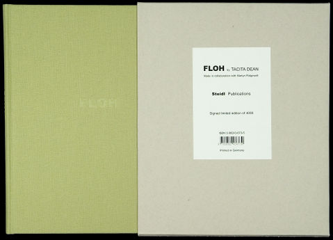
Tacita Dean's book titled FLOH comes in the cardboard case of dimensions around 25x2x30 cm. The natural colour of cardboard, simple structure and visible stapling make for raw, naked design, forming a simple box with a white label on the front side. This sticker acts as a front and back at the same time, including all the information on the book: its title, author, publisher, number of copies in the limited edition (4000), ISBN number and barcode, everything on the front cover. Inside the case which is open on one side, there is a hard covered book of rather thick text block consisting of signatures sewn together. Cloth covering is in light green-grey colour, front cover being blank except for the title FLOH pressed in without ink just as a 'blind stamp’ or ‘embossing'. Very simple design has only one contrasting detail - the red headband. On covers or spine there is no other information besides the pressed word FLOH – the title. Opening the book we can see blue-grey end paper with again no information regarding the author, year or publisher. No text at all. On the first page there is artist’s signature handwritten in pencil and number of the copy out of 4000.
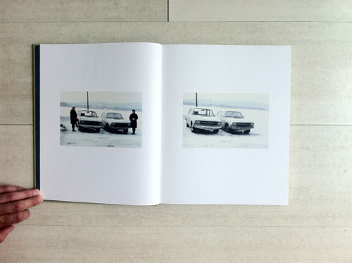
On the outside, the book reminds me of a family photo album with common lining as well as with blueish end-paper. The case where the book is kept in resembles the box someone’s grandparents would have to store pictures of relatives, ancestors and memories. With its simplicity, books outward appearance relates to the personal and modest. But turning the first page, we see artist’s original signature and numbering, creating a feeling of handling with precious, valuable object - an original – similar to etchings or other original prints. Inside the book there is no numbering of pages, introduction nor description, the book consists of snapshot pictures of people, holidays, instances from everyday life, portraits etc. Some pages unfold to make 3 page spread (for example the page with a man and his yellow car). The story is built on merely visual experience, absence of text allowing us to focus on the photographs and how they relate to each other.
CONTENT AND CONTEXT :
The inside therefore reveals itself as an artist book, as a catalogue of Tacita Dean’s work, or so it seems. However, we can sense certain tension between the layout that resembles classic, catalogue-like presentation of photographer’s work, while the pictures themselves do not have common aesthetics or even look like they belong to different contexts. Family snapshot is one of the most humble of photographic genres, it is ubiquitous and rarely considered art. Despite its aesthetics have been introduced in contemporary photography, merely a snapshot is not yet in the field of art. Lack of coherence between disparate images therefore triggers viewer’s interest – how are these snapshots related to each other, who are the people captured etc. The title Floh, meaning flea in German, is a hint to the concept of the book. As mentioned it was made by a British artist Tacita Dean in collaboration with Martyn Ridgewell. As a matter of fact, the artist chose images she bought in flea markets in Europe and US, namely cheap, forgotten, unimportant pictures that did not belong anywhere anymore.
Each image by itself remains silent and mysterious and its first meaning will never be known to the viewers, because it was abandoned, lost, misplaced and as such ended up on the flea market. Pictures that once embodied personal memories are detached from their origin. Inserted in a larger sequence of disparate snapshots, they become a part of different narrative. >>Dean gives them both life and potential narrative – discreet and enigmatic, but a narrative that speaks of memory, desire, loss, hope, redemption, truth, fiction.<<
OPINION :
Even though Tacita Dean is not the only artist who made a book with vernacular photographs (postcards, studio portraits), I chose FLOH because it has more of a conceptual background and is blurring the line between everyday life and art. I think it is an interesting idea to make a photobook – an artist book – of found pictures of unknown authorship, origin and low artistic merit and thus turn them into a new whole. I like that besides artist’s curatorial intervention, interpretation of the book depends largely on the imagination of the reader (viewer). Thus he can make up stories about enigmatic disparate pictures, trying to find their relations. I chose this work because I wanted to show how an original book can be an artwork and a statement, despite (or because of) being made with found pictures or works of others. With this work I sensed how can such ordinary, insignificant documents become a part of a very precious object, signed by the artist.
3. Make your own photobook
First ideas - BRUSHSTROKES (working title)
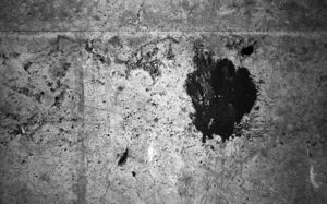
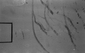
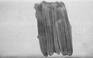
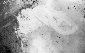
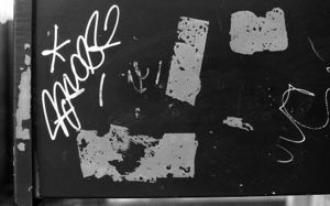
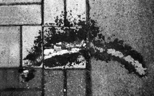
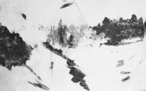
For starters, I wish to make a photobook as a collection of >>brushstrokes<< - shapes and patches that resemble brushstrokes from paintings or drawings. The series could be called a typology, a collection of images with similar shape or form. Since my other practice is strongly rooted in painting and drawing, I'd like to explore it through this typology. Pictures capture stains, drips, strokes and patches that visually echo painter's fragments from the canvas, but in exterior, public space. It is also about bringing attention to insignificant or even redundant fragments of my surroundings and trying to see interesting, even personal signature in such details.
Could lead also to actual comparison and juxtaposition of painter's strokes and found ones (on each spread 1 pair, named after the artist or specific painting/drawing). ← too straightforward (later comment)
Photobook as a sketchbook (with some blank pages left for further intervention of potential owner)?
- thicker paper, structured (rough surface)
- blank cover (no image or text, maybe simple intervention with embossing the title)
Work flow:
- take, collect and select pictures suitable for the concept (BW film, analog camera → black and white as means of abstraction, certain detachment from reality)
- consider mixing photograms, drawings, fragments of paintings with the photographs
- think about the format, dimensions, paper and other physical qualities for the book (could work as a sketchbook, could be unfinished work - opera aperta)
- the title! (Brushstrokes/Sketchbook/Trace/Sketches)
Materialising - first phase
I aim at the final object that is between a photobook and a sketchbook, which means that the user is invited to intervene in the book with his own gestures, drawings and brushstrokes. However, I would like to avoid any explanatory text in the book itself. In other words, I do not want any written instructions for the user that would explicitly guide him to use the book. Instead, the form itself should be open enough and designed in a way to invite the owner to use the book as a sketchbook.
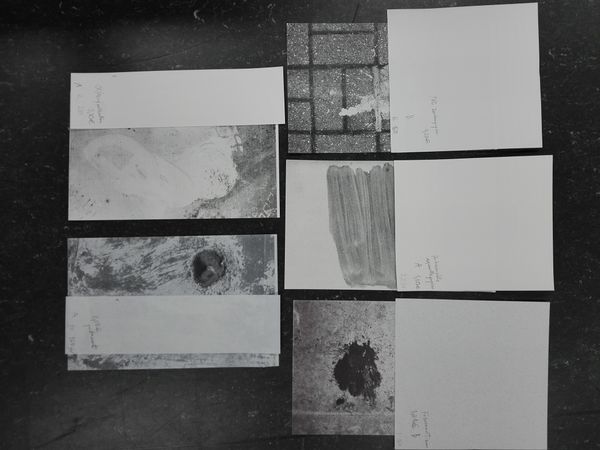
Firstly, I try to achieve this with the type of paper. For test prints I chose 10 different papers, all matte and with grammage ranging from 80 to 250 g/m². The main criterion was if paper is suitable for drawing with pencils, charcoal, ink or even with paint. Even though the print (laser print of non-superb quality by school copy machine) sunk in the uncoated structured paper, resulting in low-contrast and less-detailed images, watercolour, canvas-like and rough drawing paper turned out to best meet my expectations.
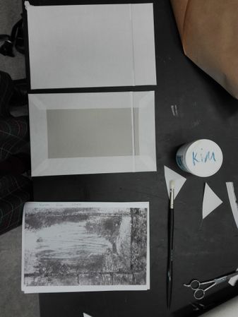
- paper selection, gluing covers, cutting, binding...
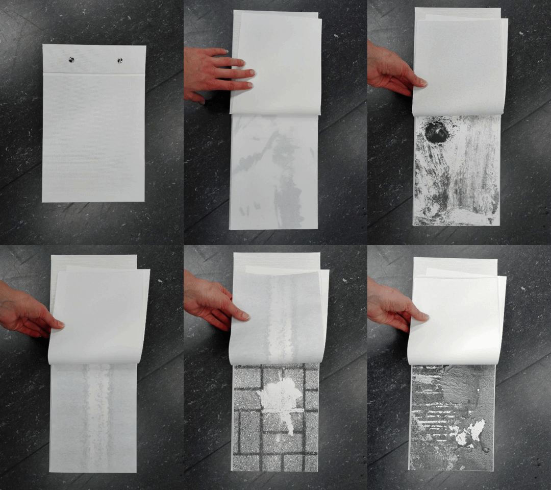
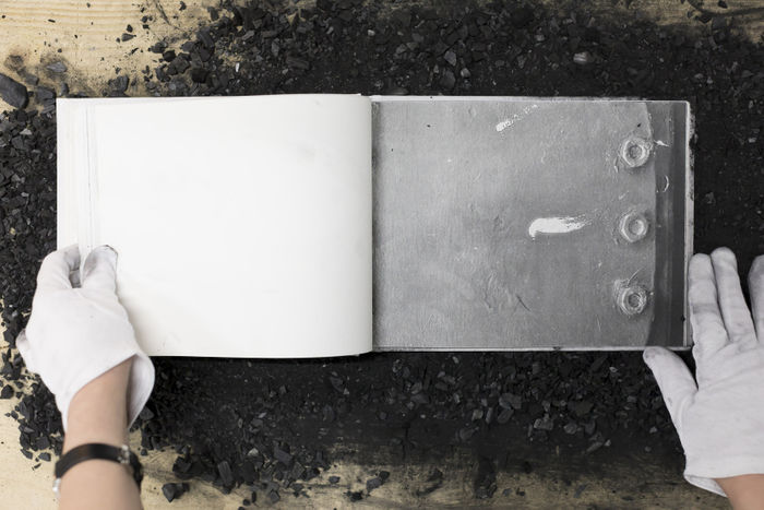
For the final book, I am aiming at the slightly smaller size than A4, with the fold of the binding being few centimeters wide, making for an almost square rectangular of the >>image frame<< or >>drawing surface<<. I wish the binding to be open, allowing the user to change the order and potentially add pages to the book. Therefore I would go for the binding with Chicago screws that can be taken apart and mounted back together when the changes are done. Binding would be on the short side, however, I do not want to specify the orientation of the book. This is often one of the features of sketchbooks, that you can choose how to turn it (depending on your subject or other preferences).
Considering the text, I only want to include the title (temporarily >>Brushstrokes<<). If chosen precisely, it might help encourage the user to intervene in the book!
- problem: How to make the book that stimulates the user to leave marks in it without being too explicit or straight forward (like adding a pen, instructions, etc.).
- solutions: 1. Have images on left pages and blank pages on the right (turn the book upside down) and/or have double cover (back and front cover both acting as a front cover, depending how you change the book)
2. in front of the new owner (right after they get the book) make few marks yourself to 'demonstrate' and break with the perception that the book is untouchable and should be handled with care
Cover being very prone to marks of use, scratches and lines etc. (making a clean white cover, or some fragile material, silver print or similar surface that gets scratched/stained easily) - the cover being scratched with time would resonate with the images inside: marks, fragments and accidents in everyday environment, isolated and made equal to painter's gesture.
Comment on the final dummy
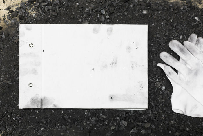
After making a hard cover with white fabric, cutting and arranging all the pages and binding the whole book, I finally got a physical result that I am quite satisfied with. White cover accidentally got stained already in first 10 minutes, which met with my aspirations about the design being prone to marks and traces of use. I added quite a few blank pages, more than I thought at the beginning, but it turned out that images (which are filling whole pages) have enough space to breathe throughout the book. Besides, (at least I hope) this makes the user wonder why there are so many blank pages and this emptiness calls for user's intervention. The character of the book is closer to a notebook or a sketchbook. But also blank pages vary in tone, texture, thickness and material (some of them are canvas to paint on, some of them semi-transparent parchment, watercolour paper etc.). I was trying to select materials carefully, choosing the ones that are really good to draw or even paint on. Few keywords that would describe the book: empty, thick, tactile, changeable The order of the pictures is not based on any narrative concept and since the screws can be taken apart, pages added/rearranged and then put back together, the order of pages is changeable. It feels more like wandering in space (between blank pages) and from time to time running into peculiar fragments (photographs). In that sense it echoes the process of how the pictures were taken. In general, I am quite satisfied with the result, I think I have met the goals that I set for this project. However, I wish to receive feedback from viewers that do not know what the project is about - to get an idea of what the object itself triggers in person who is dealing with it.
First presentation - Exhibition in DobraVaga (3.5.-1.6. 2019, Ljubljana, Slovenia)
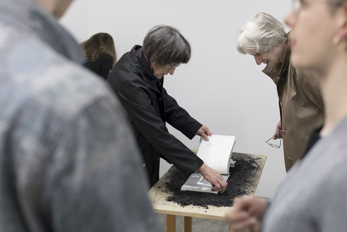
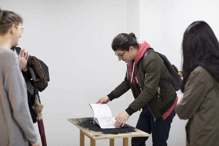
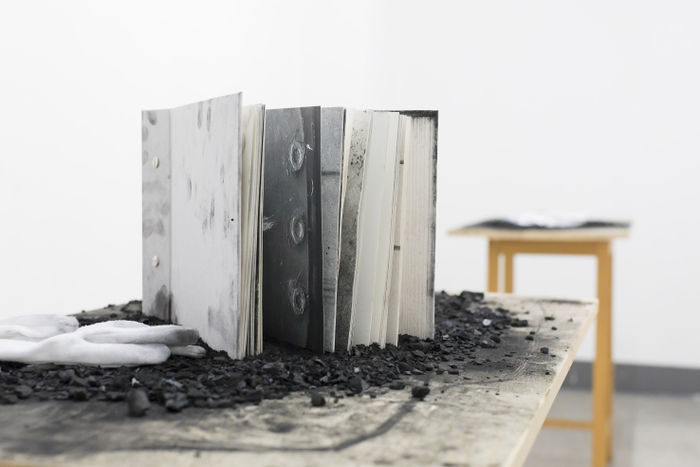
After taking additional pictures, I made a second book (keeping the design of the 'final dummy'. I presented them on a solo show in a small gallery space DobraVaga in Ljubljana, Slovenia. Out of curiosity how people (re)act to it, I went for charcoal-covered tables as a place for presenting the books.
There was no direct instruction in the work itself because I wanted to avoid text in the book (no title was written on the covers either), however, on the wall, there was a short text, explaining the project's background and its way of presentation which encouraged visitors to handle the book with less restraints.
Overall experience was better than I expected, and visitors were interested as well as intrigued by the work and its interactive aspect. The white gloves (which I placed in case some visitors wouldn't want to stain their hands), turned out to be an ironic element. As they were dunked in charcoal dust, they did not protect the sensitive book from people's hands, but instead stained it even more. As some visitors told me, they perceived the white cotton gloves as an ironic element. This was for me an unexpected moment which I believe added another layer to the concept of the exhibited work.
It was satisfactory to see that some people even took some chunks of charcoal and drew on empty pages, whereas children found uncovered parts of the table itself were a better canvas...
Since the exhibition is open for one month, I wish to fix the books in the end with a spray fixative to freeze them in the end state. I see this could mark a beginning of a series ...
photos by Aleš Rosa

