Mia/City Traces (exhibition in Pivka, SI, 2019)
Short description
Hisa kulture v Pivki - exhibition text
Between 4. and 25. 10. 2019, my solo exhibition titled City Traces is (was) on show in Hiša kulture v Pivki (Pivka, SI), curated by Mojca Grmek.
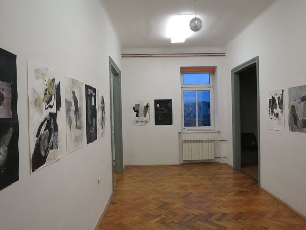
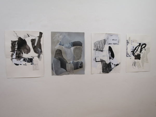
The red thread of the setup was relation between drawing and photographic image. The space consists of three rooms: in the first one, I exhibited collage works on paper as the most literal and basic means of combining photography and drawing.
- First room (ph: Leon Zuodar)
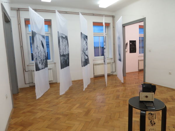
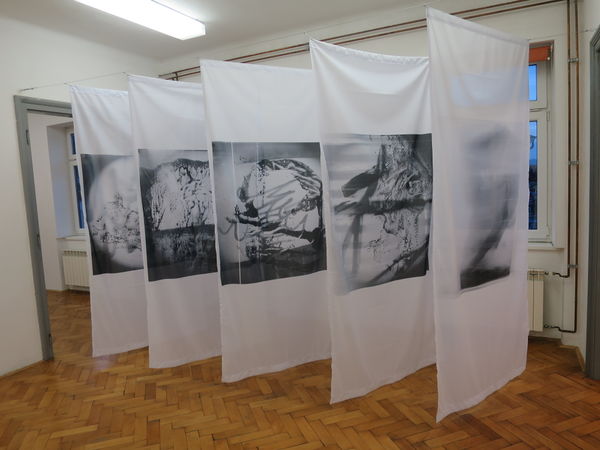
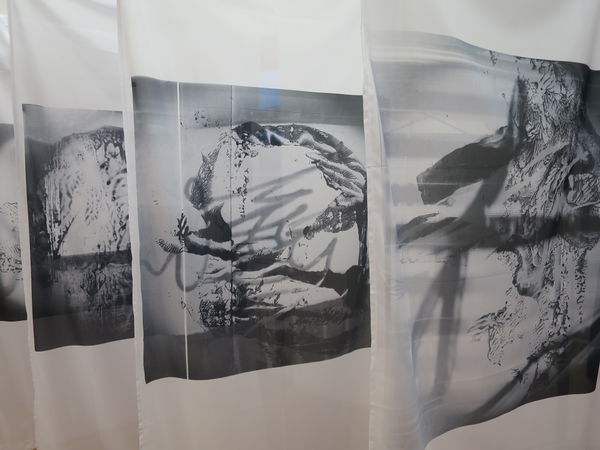
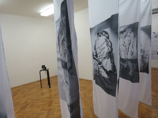
The passage to the second room was partially blocked by one of the prints of the Drawing-Camera pictures. I exhibited the selection of 5 photo-drawings, printed on fabric and hung in a corridor-like formation between the doors of the central room in the gallery which presented the Drawing-Camera project. The Drawing Camera itself was placed on a small pedestal on the side, so that visitors could have a closer look and insight in the process of making.
- Second room (ph: Leon Zuodar)
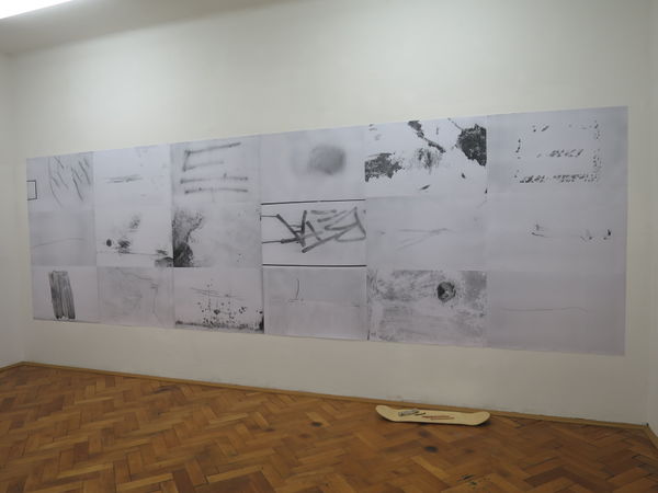
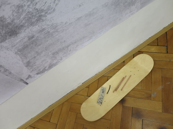
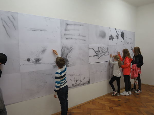
In the third room, photographic series Trace was presented, this time in a form of a wallpaper. Resembling a wall, covered in graffiti, it meant a transfer of the urban surfaces to the interior of the gallery space which is located in a small town in a rather rural area. Visitors themselves were encouraged to intervene (draw) on the wall which turned out to be an attractive element for the public.
- Third room (ph: Leon Zuodar)
Visitors' responses (in pointform)
- positive feedback on collage works
- familiar with this type of works from my previous practice
- Why is it BW?
- they found curtains intriguing
- curious about the material, techniqe
- Does the camera actually work? How?
- Drawing Camera looks 'retro'
- they like that image is visible from both sides, transparency
- children enthusiastic about the Trace wallpaper
- Photo-Drawings remind them of Japanese woodcus
- landscapes
What needs to be changed/developed (short self-analysis)
Trace (3rd room)
- wallpaper with pencils on the side does not evoke the same feeling and idea than the photobook, not spontaneous enough
- wallpaper might work, but the setup should be different (leaving the traces unintentionally)
- Possibly as the flooring (people walking over the so called artwork) - larger scale as the photobook
- prints need to be better quality and glued on the wall better, to merge as much as they can with the gallery space
Risbaparat (2nd room)
- curtains worked quite well
- technically good solution with stretched cables
- prints form a corridor (blocking and implying the passage at the same time)
- installed diagonally but parallel to one another - enough space inbetween for the viewer, not completely closed
- rhythm
- they appear light and floating because of the movements in the room
Collage works (1st room)
- tried out frameless presentation (that I was happy with)
- repetition (within the works presented as well as close resemblance to my previous collages/paintings - is there anything new?!)

