Lea/Photo Book
Session Two: Present your dummy
Session Two: Present a photobook
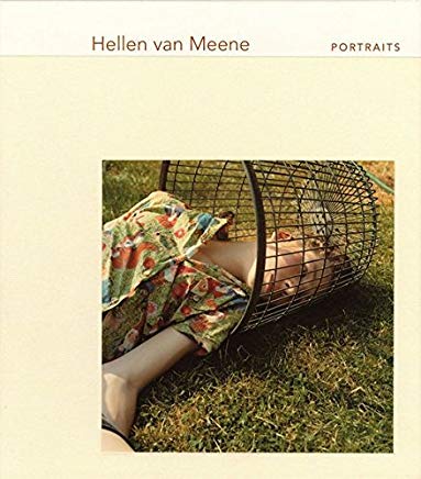
Hellen van Meene I Portraits
Introduction
I want to show you the book from Hellen van Meene. Its called portraits and include portraits of mostly jung girls and some jung boys. I choose this book because I was impressed by the composition of each photo. The light, the colors the setting and the poses affected me as well. But on the other hand, I also like the quiet and minimalistic design of the book and the well done printing of each picture.
Designer
The book was designed by Miko McGinty. She has collaborates with different artist and curators. She self say that she is using a method in designing a book to consider the core of there practice and translate it into a publication that captures their concept an aesthetic. Her goal is to achieve the most direct connection between the reader and the artist within the structure of the book.
Photographer
Hellen van Meene is born in 1972 an is a dutch photographer. She studied at the Gerrit Rietvield Akademie and at the College of Art in Edinburgh. Her work was first exhibited in 1996 and has been shown around the world since then. Her photos are in the collection of many prominent museums, including Guggenheim NYC and MoMA. She lives and works in Heiloo.
The book as an object:
The book looks like a square book but the proportions are 233mm x 215mm. The images inside quadratic. It is on of the smaller books of her. And it is 17mm thick. It has 94 pages. The design of the book is very classic. The binding is a stitch binding and the book has a Hard Cover. There is a picture on the cover which is sticked on the cloth binding. The color of the cloth binding is not pure withe. The author and name of the book is standing above the cloth binding. The designer used a color for the typoprahy which is related to the photo on the cover. It also could be a color chosen from the cover photo. The name of the author is bigger than the name of the book. The designer chose this decision to highlight the author more than the book name itself. So all in all it looks to me as an well thought out cover. It looks quiet and interesting. And that is also the feeling I get from the pictures inside. When you open the book there is the end paper. It is a normal white paper, because there is normally nothing written or printed on. The book has two title pages. On the firs one, there is only written the name of the Photographer. The second one, who is also double page there is on the left site a photo. It is a different one than at the cover. And on the right side are more information about the book. It tells you about a text which is in the book and is written by Kate Bush and about the Name of the publishing house Schirmer/Mosel.
Content and context:
What is it about? The book includes portraits of mostly jung girls, posing for the camera. They are adolescents who are in the ages of getting women. In the first glimps you could think, that the portraits are taken at spontaneous private moments in the lives of her subjects. But on a second look you will recognize soon that each photos is made with a striking composition. Each portrait has a different setting. It doesn´t look like the photos were take in a studio. Each portrait have special light setting (natural light) and a different surrounding. The I would say the half of the pictures are made outdoors an the other half was made indoors. There is no description why some are made inside and some are made outside. I think it is also not relevant. Because of the look of the furniture, it looks like the pictures who made indoors are at someones homes. And the pictures which made outside are taken in someones garden or in a park.
The models are no professional ones and are photographed in sensible, delicate and poetical poses. Most of the girls wearing little clothing so you can see parts of the skin. The girls looking sometimes as if the are a helpless or in a interrogative condition.
Hellen van Meenes goal is to investigate the bodies as a thing which is shown as a specific, tactile and sensual characteristic. She is interested in thinks like, how the incidence of light look of the skin and hands, that are looking different or contorted in water. I was thoughtful by looking at the images. I asked myself how get Hellen van Meens the approval to take the pictures of the girls who are looking so confronted with herself. Because there is no story to be told, where the order is essential, it is not important to look at it from the beginning to the end. But I think the order of the pictures in this book are made by a astethic choice, like a rhythm which van Menne like or think it fits to his subject and her topic. I found out that there is one boy in this book on several pictures and they aren´t next to each other. But I didn´t found out any algorithm or reason why the order is like this. It is also interesting, that there are only seven pictures on the left sides of the double pages. I also didn´t find any specific reason for it. I also think it is because van Meene likes the flow of the order and the effect of break between photos on to the left and right side.
Relation content and form:
Each photograph is on a own page. I think it was a good decision only to put one photo of a double page. It gives the photo who is always full with emotion enough space on the page. Also if you have two photos at one page, you can´t concentrate on one picture. You always connect the two images. I guess because of that reason van Meene wanted to show only one photo at the page.
All photos have space to the edge like a passepartout and have the same size and the same position. The photos are beside of the passepartout a little bit smaller but it gives the photos a feeling of quietness and safeness, I think. You could also say, the photo have enough space to breath.
There is no text of information by to the pictures. There is even no page numbering. There is one text at the end which was written by Kate Bush and is translated into german by Melanie Walz. She wrote an article four pages long about the work and the subject of Hellen an Meene. I like it always if you have such a kind of text in a photo book. Because you get a lot of information about the author the topic and also about photography itself, that you can´t see in the pictures. On the last page is a small index about the pictures. All pictures are called untitled and you can information about the page number and the year where the photos have been taken. It is weird that the page numbering was written next to the tittles of the pictures, because there is no numbering on the actually pages. It would be very hard if you want to figure out wich page 42 for example is. It means you have to count every page. I saw in a other book where they also hadn´t page numbering on the pages that they used small pictures at the end to inform about information from the images. I think that would fit better.
Why was it made? I think the book was made to show a selection of her work. (And to get money and to get a bigger audience with it). The book was published in 2004 but she started to take pictures of jung people some years before. It has not a specific topic and there wasn´t a specific exhibition. But this book is published by the publisher schemer mosel, which is a german company. So it was made for german speaking people at one point at least.
Purpose: For whom was the book made? I guess the book was made for people who are interested in photography especially in portraits and in the content. I don´t know if she wanted to reach a special audience. I also think art collectors are interested in the book as well.
Session One: Introduction
Morning: Fritz Gierstberg showed us some photobooks and explained some basic information about it.
Afternoon: Visiting the Photomuseum and the exhibition about Ed van der Elsken, Lust for life.


