Elysa/photobook
Analysis of "Tracks"
The book as object
Size: A5
Materials: The paper used is like newspaper-paper, but more sturdy and firm.
Binding: The “binding” is two black staples.
Pages: 24
Cover: Paperback. I guess a “zine” would accurately describe it.
Colours: Black-and-white and hot pink.
Content and context
What is it about? It’s about a man reliving old memories in a forrest. It’s about identity, memory, loss, and our relationship with nature.
Why was it made?
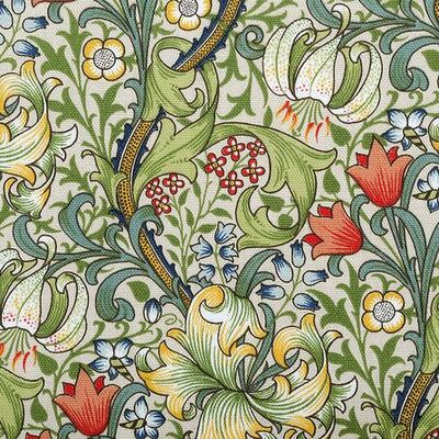
It was made as a collaboration between a writer and a photographer. It’s made in association with the William Morris Gallery, so I guess it’s also to honour the memory and the work of William Morris. It’s commissioned by Rough Trade Editions.
Who made it?
The writer is Luke Turner, and the photographer is Eva Vermandel. The design is done by Craig Oldham, and the type is designed by Timothy Donaldson. Published by Rough Trade Books.
Vision on book design?
As I said before, the book is made out of collaborations. What I find interesting about this book is that the writer and the photographer were inspired by each other. So the photos are illustrative to the text, but the text is also illustrative to the photos. I also think it’s interesting what they did with the design, the blocks of hot pink. I feel like these are brought in to maybe put a certain weight into the story. Luke Turner has wrote another book, but that’s a memoir. I don’t know what it looks like. Eva Vermandel has made other photobooks, and Craig Oldham, does all kinds of stuff. I think Craig Oldham is very interesting, because he works in so many different disciplines. Maybe that’s why he chose such a weird combination of the hot pink with the black-and-white and the rather upsetting story.
/ Eva Vermandel / Craig Oldham
Purpose
I feel like this book was made for people who are interested in the works of William Morris and more contemporary works. Although I think knowing Morris’ works isn’t a prerequisite for enjoying and being interested in this book. I think it’s also made for people who are interested in the (overlapping) borders of photography, storytelling, stories, and design. This book is a first edition.
Relation content and form
Title
The title of the book is “Tracks”. This refers both to the memories the main character has, as the ‘tracks’ they leave on his mental health, as well as the ‘tracks’ physical beings leave in nature (the forrest in this case) and vice versa.
Presentation of photographs on the page
It really differs. Sometimes the photos bleed at the edges of the pages, sometimes they don’t. Sometimes they take up an entire page, sometimes they don’t. The placing on the page also differs: in the middle, on the edge, partly on the next page.
Montage and narrative
If you look at just the photos I feel like it’s a very loose narrative. Although I do feel the photos move from observing the forrest to more becoming the forrest. The last photo, for me, really feels like as if you’re dying almost. Or as if you’re one with the forrest, and looking to the rest of the world from that perspective. With regard to the placing of the photos on the page there’s a sequence of three semi-spreads in the middle of the story.
Image-text relations
The content of the text and the photos are closely related in this book. As I said before: these are a response to each other. I feel like they leave room for each other and help each other. They don’t touch each other physically.
Typography
Designed by Timothy Donaldson, I feel like it’s very based on William Morris’ textile designs.

