User:Zpalomagar/PROJECT PROPOSAL: Difference between revisions
Zpalomagar (talk | contribs) No edit summary |
Zpalomagar (talk | contribs) |
||
| Line 3: | Line 3: | ||
==Relation to a larger context== | ==Relation to a larger context== | ||
[[File:p_iconoclasistas.png|250px|thumbnail|right| | [[File:p_iconoclasistas.png|250px|thumbnail|right|Otra Pampa es posible, Iconoclasistas]] | ||
Last year data became the most valuable asset on Earth surpassing oil. There is a vital process in how to understand this information, transform it and make an emotional document with them. We are not machines, we are not excited with number but with emotions so we have to transform knowledge behind data into sensitive elements. Links between knowledge and visuality not only have historic roots, but they also have historical and cultural dimensions.
| Last year data became the most valuable asset on Earth surpassing oil. There is a vital process in how to understand this information, transform it and make an emotional document with them. We are not machines, we are not excited with number but with emotions so we have to transform knowledge behind data into sensitive elements. Links between knowledge and visuality not only have historic roots, but they also have historical and cultural dimensions.
| ||
Revision as of 11:52, 17 October 2019
THIRD DRAFT
Relation to a larger context
Last year data became the most valuable asset on Earth surpassing oil. There is a vital process in how to understand this information, transform it and make an emotional document with them. We are not machines, we are not excited with number but with emotions so we have to transform knowledge behind data into sensitive elements. Links between knowledge and visuality not only have historic roots, but they also have historical and cultural dimensions.
Today we are surrounded by information, it is everywhere, there is much more information that we can process in our life. I believe in the collection selection and transformation of this information into a visual element that engage with society. This is the result of hard work between the artistic practice, the design and the technologic tools that we can use to achieve this goal. This is about turn complex phenomena into images.
References
Drucker, J., 2014. Graphesis: visual forms of knowledge production, MetaLABprojects. Harvard University Press, Cambridge, Massachusetts.
Vossoughian, N., 2011. Otto Neurath: the language of the global polis. Nai Publushers, Rotterdam.
This is not an atlas: a global collection of counter-cartographies, First edition. ed, 2018. , Sozial- und Kulturgeographie. Transcript, Bielefeld.
Diagrams of Power, First edition.ed, 2019, Patricio Dávila, Onomatopee. Rotterdam.
Lima, M., 2011. Visual complexity: mapping patterns of information. Princeton Architectural Press, New York.
Tufte, E.R., 2001. The visual display of quantitative information, 2. ed. ed. Graphics Press, Cheshire, Conn.
Caquard, S., 2013. Cartography II: Collective Cartographies in the Social Media Era.
Mesa del Castillo Clavel, M. (2012). Víctimas de un Mapa. Phd. Universidad de Alicante, Alicante.
SECOND DRAFT
What do you want to make?
An Atlas that explore the potential of cartography and diagrams as a socio-political communication tool which can amplify the voice of communities and give visibility to their common interests, revealing hidden information and making the reader raise awareness about their social crisis.
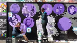
Cartographies were understood during centuries as tools of power and domination, they used to define territory and draw its borders and resources. In 1995 Nancy Peluso introduced the term Counter-mapping referring to efforts to map "against dominant power structures, to further seemingly progressive goals”. Nowadays technology has a crucial role in the process of revert the power-based structure of mapping. This alternative approach to traditional cartographies allows to draw realities based on people voices and not in politic interest.
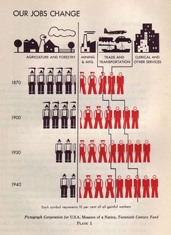
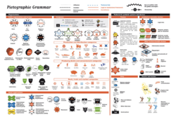
Information can be translated into visual elements in very different ways following ha wide variety of protocols and rules. Diagrams are based on codifications of language to produce visual elements (Drucker, 2014). I want to explore these translation methods from isotypes to tech solutions for a global language. To translate the information coming from people to maps and diagrams, I have to develop a collection of digital tools that allows me to process, select and represent this data. I also want to explore the gaps of visual representation with digital tools as Ramon Amaro explains, the visual world is dominated by western culture leaving big gaps in terms of global communication.
Collectivity and crowdsourcing are also key points of the elaboration of maps and diagrams with communities. I want to explore the digital possibilities of crowdsourcing and collaborative processes that represent the wisdom of crowds. These collective processes have an added value since people with very different backgrounds intervene from anywhere in the world.
I want to look for social voices online through petition platforms, online communities, twitter angry hashtags … These voices are usually lost in between an overwhelming amount of information. I’m going to extract these claims and to translate it into counter-maps drawing a multilayer social cartography of the city of Rotterdam that allows popularising this information through visual language. Then I want to test the role of online publishing of this information and the process of re-publishing maps.
Moreover, I’m going to define paths to give this information back to society. This maps or visualisation can be understood as urban tools for designers, architects and urban planners being able to materialise these claims. Maps are a cross-disciplinary tool, as a hybrid design element for professionals.
Why do you want to make it?
I believe in the necessity of amplifying the information that represents people voices and taking it as a base to built better societies. Cartographies and diagrams are powerful tools for that because you challenge their domination history and transform them into a new understanding of societies based on people claims. I see mapping as a means to an end: I map for a cause.
Images are produced and consumed in our current culture in quantities that would have been unthinkable in any previous period in human history (Drucker, 2014) so this is a crucial area to communicate with people. If we add to this that a lot of the information we have on the internet, especially when it comes to data groups, requires complex interpretation procedures, for me visual communication becomes a necessary tool to engage with modern man, who receives a large part of his knowledge through pictorial impressions ( Vossoughian, 2011).
Cartographies are tools between art, architecture, design, activism and technology. I identified myself in a blurry area between some of these disciplines that is why I hardly believe that cartographies, diagrams and maps are the perfect tools for me to communicate my vision of the world. Also because technology can be a crucial point in the development of these elements. This is not about automatic data visualisation but about emotional and affective cartographies that connect with people. As a personal interest, I have always been fascinated about graphic novels like Building Stories by Chris Ware that explores alternative visual storytelling challenging the traditional text-based layout of novels and give the reader freedom to read in interpret a story. We need new visual strategies that allow us to explore alternative readings, as Jan Tschichold explained: “as a rule, we no longer read quietly line by line but glance quickly over the whole, and only if our interests are awakened do the study in detail”.
How do you plan to make it?
I plan to create an Atlas that explore the potential of cartography and diagram. In order to understand counter- cartographies, I want to develop a collection of maps or diagrams (atlas of hidden realities) that amplify social realities happening in Rotterdam that is published online but is lost among tons of information online. I want to use these maps to draw a different city based on people or having peoples interest as a starting point and not any other power structure.
First I plan to develop an inventory of digital tools that I can use to visualise information. Be conscious about digital possibilities or representation, then I want to collect information about social claims in the city of Rotterdam and build my own data sets from people petitions. The next step would be to translate this information into a graphic element and finally explore how to republish it to spread people’s voice and how to transform it into a useful tool for designers.
Creating my own collection of codes and visual languages to visualise information in our post-digital era.
What is your timetable?
September/October:
Develop an inventory of useful tools for representation and becoming familiar with them and with formats (D3, Python, Json datasets, CVS…)
Working on Project proposal and Thesis Outline
Star to look for an online platform where social voices are present and first thoughts about how to collect this data
November:
Finish project proposal and Thesis Outline
Star First Chapter
Collect information to visualise (amplify)
Start to develop some speculative cartographies/visualizations with this information
December:
Write the First Chapter
Continue to develop some speculative cartographies/visualisations with this information
January/February:
Write Thesis
Work more into details of cartographies and visualisations created
Start to make counter-maps collection public. Different mediums where to publish?
March/April:
Finish Thesis
Finish Atlas of alternative cartographies
May/June:
Work on the graduation stuff and finish some prototypes if needed
Who can help you and how?
Steve/ Marloes - Global language/writing support
Michael - How to collect and process data
André - Translation of data into graphic elements?
I would also like to contact with some external people that are working in the Netherlands or outside to talk about their experience with counter-mapping and diagraming ( Lize Mogel, Patricio Dávila, André Mesquita???)
Onomatopee - “Diagrams of power” exhibition was inspiring - How a drawing or a map can express power, especially with cartography and representation of territories - geopolitical maps. Can I find someone in Eindhoven that can help me with that?
Relation to previous practice
During my practice and formation as an architect, I have always understood diagrams and maps as my main personal tool for communication, for expressing my ideas and I have always try to turn these drawings into generative elements for architecture and urban design. Furthermore, during my professional practice, I have been working in different urban projects that tried to use people voices to develop maps that could generate new urban models for specific areas.
Looking at the projects of last year The Network we (de)served was a space for me to research about crowdsourced practices to map networks and how it can be represented through diagrams. With this project, I started to engage with collaborative processes and the concept of “wisdom of crowds”. I understood the additional value of multi-sourced creations and co-productions. The project The Library is Open and more specifically the workshop marginal conversations revealed a huge interest on me in amplifying, in this case, a text with participative activities. I understood the workshop format as a space to enrich a source with inputs from very different people. We were also working in this project in the visual coding that people use when they were annotating and how to understand this visual traces. With the project entreprecariat, I also worked with the concept of the power of capitalism and structures of power that is precisely the starting point of this research when cartographies are understood as instruments for domination.
Relation to a larger context
Last year data became the most valuable asset on Earth surpassing oil. There is a vital process in how to understand this information, transform it and make an emotional document with them. We are not machines, we are not excited with number but with emotions so we have to transform knowledge behind data into emotional elements. Links between knowledge and visuality not only have historic roots, but they also have historical and cultural dimensions.
Today we are surrounded by information, it is everywhere, there is much more information that we can process in our life. I believe in the collection selection and transformation of this information in a visual element that hides storytelling. This is the result of hard work between the artistic practice, the design and the technologic tools that we can use to achieve this goal. This is about turn complex phenomena into images.
References
Drucker, J., 2014. Graphesis: visual forms of knowledge production, MetaLABprojects. Harvard University Press, Cambridge, Massachusetts.
Vossoughian, N., 2011. Otto Neurath: the language of the global polis. Nai Publushers, Rotterdam.
This is not an atlas: a global collection of counter-cartographies, First edition. ed, 2018. , Sozial- und Kulturgeographie. Transcript, Bielefeld.
Diagrams of Power, First edition.ed, 2019, Patricio Dávila, Onomatopee. Rotterdam.
Lima, M., 2011. Visual complexity: mapping patterns of information. Princeton Architectural Press, New York.
Tufte, E.R., 2001. The visual display of quantitative information, 2. ed. ed. Graphics Press, Cheshire, Conn.
Caquard, S., 2013. Cartography II: Collective Cartographies in the Social Media Era
FIRST DRAFT
What do you want to make?
Explore cartography's potential as a socio-activist tool understanding them as communication tools which are able to use global languages. Maps and diagrams can be powerful devices in society and can have a key role in creating visibility for hidden information, behaviours or processes.
I want to create a speculative collections of radical cartographies that allows me to experiment how to use social mapping and diagraming revealing hidden realities. Exploring cartographies in a non conventional way of visual language and trying to take advance of the possibilities that online publishing can complement this tool.
Analyse cartographies as tools between art and design, geography and activism. Using new techniques and technology. This is not about data visualisation but about emotional and affective cartographies.
Explore the relation between diagrams and urban design and architecture elements. The use of maps as a cross-disciplinary tool, as a hybrid design element.
These cartographies, sometimes define as counter-cartographies, radical cartographies or experimental mapping are defined in the book “This is not an atlas” as visual elements that exist beyond the traditional spheres of cartography, and in most cases their creators are primarily activists, critical educators, militant researchers, artist and/or part of social movements. I see mapping as a means to an end: I map for a cause.
Use communities in order to create maps, use collaborative processes and collective making —> wisdom of crowds.
How do you plan to make it?
Developing an atlas of small tools or experiments that allows me to produce radical speculative cartographies in Rotterdam that give visibility to hidden information about social practices, social behaviour, activism and use these maps as a key element to publish.
Creating my own collection of codes and visual languages to visualise information in our post-digital era.
Explore the public information that is available in the Netherlands and transform it with a collection of tools into something legible for people, into a communicative and expressive element - decoding information through design processes -
What is your timetable
Collection of small experiments in parallel to explore global language information visualisation and visual communication.
For cartographic experiments ( in parallel with writing) Collecting data Analysing Define how to translate into a graphic element Translation process ( exploring different tools or software elements to do it -dimanic visualisation) How to use this element as a communication tool for a community Make it public Repeat this process with several variations
Why do you want to make it?
As an architect I have spend my career translating thoughts and ideas into drawings. Furthermore I have always be fascinated about diagramming and graphic novels (Building stories - Chris Ware) that create an universal diagrammed- based tool to challenge the traditional storytelling path and create a new free world to process and perceived a story.
I also understand cartographies and mapping as a key element between some disciplines that I identify myself ( art, architecture, design, activism and technology) so this element is my way to communicate with the world.
As Johanna Drucker explains in her book “Grapheses” Images are produced and consumed in our current culture in quantities that would have been unthinkable in any previous period in human history so this is clearly a crucial area to communicate with people
Who can help you and how
Steve - Global language Michael - How to collect and process big amount of data André - Translation of data into graphic elements ? External people who are working with diagrams and mapping in the Netherlands TBD - maybe interviews ?
Relation to previous practice
Collaborative network processes - crowdsourcing Workshops - Cartography & community / How to add value in collaborative sessions - wisdom of crowds The library is open - How to make visible hidden processes and information Entreprecariat - Power of capitalism - Structures of power - “Diagrams of power” exhibition was inspiring - How a drawing or a map can express power, specially with cartography and representation of territories Interpretation in annotations/codification of languages- visualisation are always interpretation (humanistic problems of interpretation) During my practice as an architect I have always understood diagrams and maps as a generative elements for architecture and urban design. Expressing at the same time a conceptual and supported idea
Relation to a larger context
Last year data became the most valuable asset on Earth surpassing oil. There is a vital process in how to understand this information, transform it and make emotional document with them. We are not machines, we are not excited with number but with emotions so we have to transform knowledge behind data into emotional elements. Links between knowledge and visuality not only have historic roots, they have historical and cultural dimensions.
Today we are surrounded by information, it is everywhere, there are much more information that we can process in our life. I believe in the collection selection and transformation of this information in a visual element that hide a storytelling. This is the result of a hard work between the artistic practice, the design and the technologic tools that we can use to achieve this goal. This is about turn complex phenomena into images
References
Grapheses - Johanna Drucker
This is not an Atlas - Kollektiv Organgotango
Diagrams of Power - Patricio Dávila
Visual complexity - Manuel Lima
The Visual Display of Quantitative Information - Edward R. Tufte
Cartographies of time - Grafton. A Rosenberg. D
The Datafied Society - Mirko Tobias, Karin van Es
Written Language and Picture Language after Otto Neurath - Popularising or Humanising Knowledge - Friedruch Stadler


