User:Zpalomagar/HACKPACT
#H1_CHALLENGE CHANGE.ORG DISPLAY
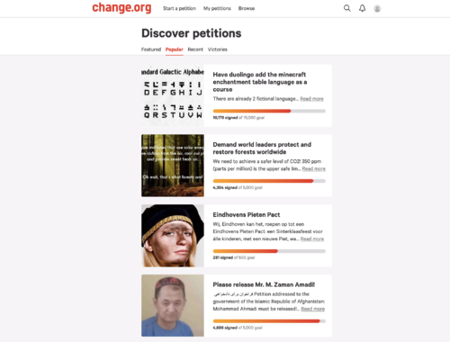
The starting point of this proposal is looking for online spaces where people or communities can publish their suggestions or requests. Taking as reference one of the most important platforms all over the world in order to achieve this goal(change.org), this hackpact develop an experiment challenging the display of the conventional structure that is followed in the platform. In order to work with visual content, I’m going to extract just the visual elements that are display in the website (you can only update one picture on each petition).
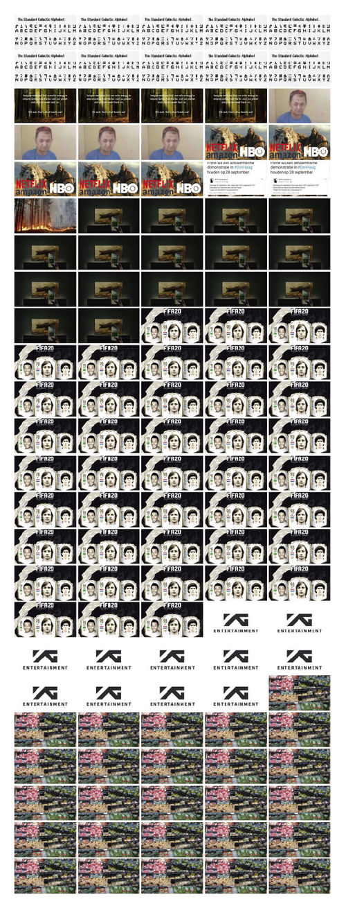
The traditional representation method introduced by Otto Neurath ,when isotypes were created, said that in order to facilitate the lecture and comparison of quantitative data, you must repeat an item as many times as you need proportionally to the amount it represents. In this example each photo represents 1000 people supporting a petition.
With this alternative HTML structure the information that is transmitted to the reader is purely visual and you can infer people interest just with a glance and notice the difference in support and relevance between them.
#H2_LOOKING AT THE WORLD WITH EMOJIS
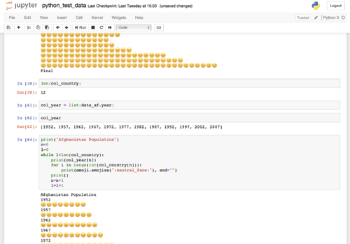
This hackpact has the goal of experimenting python as a tool to read data (cdv files) and visualise it. The database used for this experiment is a cdv file with population of every country in different years. With this piece of code we can read this data and create lists of the information that we are interested in. With this translation of data we are able to extract this quantitative information and work with that as if it was a python element.
I am going to use two additional libraries for python. On the one hand pandas library in order to read data from the cdv file and on the other emoji library to use the universal emoji library for visualise the result.
Each emoji represent 1 million of citizens so the strategy used to display the information is repetition in the same way as I did in the previous example.
I did this experiment using Jupiter Notebook in order to have momentary results that allowed me to debug the code and keep the previous versions there with annotations
Netherlands Population
1952🥪🥪🥪🥪🥪🥪🥪🥪🥪🥪
1957🥪🥪🥪🥪🥪🥪🥪🥪🥪🥪🥪
1962🥪🥪🥪🥪🥪🥪🥪🥪🥪🥪🥪
1967🥪🥪🥪🥪🥪🥪🥪🥪🥪🥪🥪🥪
1972🥪🥪🥪🥪🥪🥪🥪🥪🥪🥪🥪🥪🥪
1977🥪🥪🥪🥪🥪🥪🥪🥪🥪🥪🥪🥪🥪
1982🥪🥪🥪🥪🥪🥪🥪🥪🥪🥪🥪🥪🥪🥪
1987🥪🥪🥪🥪🥪🥪🥪🥪🥪🥪🥪🥪🥪🥪
1992🥪🥪🥪🥪🥪🥪🥪🥪🥪🥪🥪🥪🥪🥪🥪
1997🥪🥪🥪🥪🥪🥪🥪🥪🥪🥪🥪🥪🥪🥪🥪
2002🥪🥪🥪🥪🥪🥪🥪🥪🥪🥪🥪🥪🥪🥪🥪🥪
2007🥪🥪🥪🥪🥪🥪🥪🥪🥪🥪🥪🥪🥪🥪🥪🥪
import pandas as pd
import emoji
data = pd.read_csv ('countries.csv')
netherlands = data[data.country == 'Netherlands']
l_netherlandspopulation = list(netherlands.population / 10**6)
l_netherlandsyear = list(netherlands.year)
print("Netherlands Population")
n=0
l=0
while l<len(l_netherlandspopulation):
    print(l_netherlandsyear[n], end = '')
    for i in range(int(l_netherlandspopulation[n])):
        print(emoji.emojize(":sandwich:"), end="")
    print()
    n=n+1
    l=l+1
- Some other countries:
Spain Population
1952💃💃💃💃💃💃💃💃💃💃💃💃💃💃💃💃💃💃💃💃💃💃💃💃💃💃💃💃
1957💃💃💃💃💃💃💃💃💃💃💃💃💃💃💃💃💃💃💃💃💃💃💃💃💃💃💃💃💃
1962💃💃💃💃💃💃💃💃💃💃💃💃💃💃💃💃💃💃💃💃💃💃💃💃💃💃💃💃💃💃💃
1967💃💃💃💃💃💃💃💃💃💃💃💃💃💃💃💃💃💃💃💃💃💃💃💃💃💃💃💃💃💃💃💃
1972💃💃💃💃💃💃💃💃💃💃💃💃💃💃💃💃💃💃💃💃💃💃💃💃💃💃💃💃💃💃💃💃💃💃
1977💃💃💃💃💃💃💃💃💃💃💃💃💃💃💃💃💃💃💃💃💃💃💃💃💃💃💃💃💃💃💃💃💃💃💃💃
1982💃💃💃💃💃💃💃💃💃💃💃💃💃💃💃💃💃💃💃💃💃💃💃💃💃💃💃💃💃💃💃💃💃💃💃💃💃
1987💃💃💃💃💃💃💃💃💃💃💃💃💃💃💃💃💃💃💃💃💃💃💃💃💃💃💃💃💃💃💃💃💃💃💃💃💃💃
1992💃💃💃💃💃💃💃💃💃💃💃💃💃💃💃💃💃💃💃💃💃💃💃💃💃💃💃💃💃💃💃💃💃💃💃💃💃💃💃
1997💃💃💃💃💃💃💃💃💃💃💃💃💃💃💃💃💃💃💃💃💃💃💃💃💃💃💃💃💃💃💃💃💃💃💃💃💃💃💃
2002💃💃💃💃💃💃💃💃💃💃💃💃💃💃💃💃💃💃💃💃💃💃💃💃💃💃💃💃💃💃💃💃💃💃💃💃💃💃💃💃
2007💃💃💃💃💃💃💃💃💃💃💃💃💃💃💃💃💃💃💃💃💃💃💃💃💃💃💃💃💃💃💃💃💃💃💃💃💃💃💃💃
Cuba Population
1952🌴🌴🌴🌴🌴🌴
1957🌴🌴🌴🌴🌴🌴
1962🌴🌴🌴🌴🌴🌴🌴
1967🌴🌴🌴🌴🌴🌴🌴🌴
1972🌴🌴🌴🌴🌴🌴🌴🌴
1977🌴🌴🌴🌴🌴🌴🌴🌴🌴
1982🌴🌴🌴🌴🌴🌴🌴🌴🌴
1987🌴🌴🌴🌴🌴🌴🌴🌴🌴🌴
1992🌴🌴🌴🌴🌴🌴🌴🌴🌴🌴
1997🌴🌴🌴🌴🌴🌴🌴🌴🌴🌴
2002🌴🌴🌴🌴🌴🌴🌴🌴🌴🌴🌴
2007🌴🌴🌴🌴🌴🌴🌴🌴🌴🌴🌴
Finland Population
1952⛄⛄⛄⛄
1957⛄⛄⛄⛄
1962⛄⛄⛄⛄
1967⛄⛄⛄⛄
1972⛄⛄⛄⛄
1977⛄⛄⛄⛄
1982⛄⛄⛄⛄
1987⛄⛄⛄⛄
1992⛄⛄⛄⛄⛄
1997⛄⛄⛄⛄⛄
2002⛄⛄⛄⛄⛄
2007⛄⛄⛄⛄⛄
#H3_HOW DOES THE NETHERLANDS LOOK IN THE WORLD?
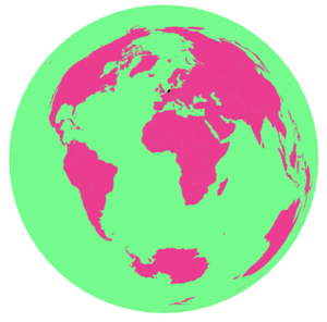
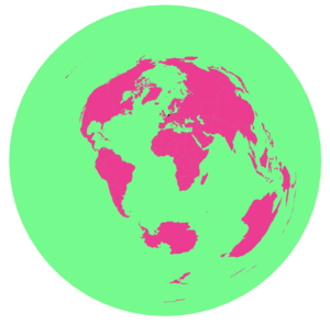
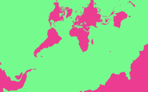
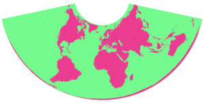
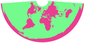
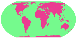
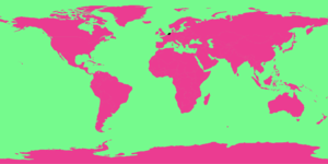
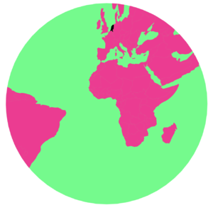
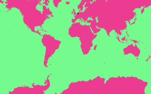
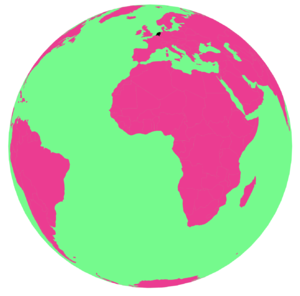
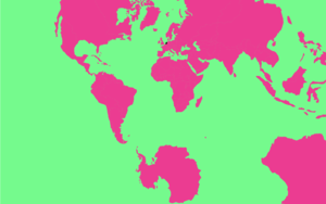
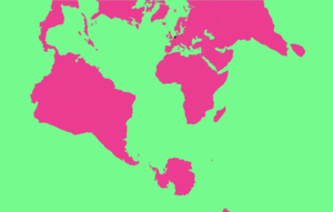
I’ve started to research how to draw maps based on GeoJSON files and how can you modified them. Based in D3 script I’ve experiment different projections that you can use in order to represent world cartographies. Because the standard settings are not the only option I did this small experiment highlighting the Netherlands in each map and observing how the dimension and the position of the country change. All this projections are real and true because it doesn’t exist an universal way of transforming a sphere into a plan just consensus or tradition but why not to experiment with that?.
In order to change the projection of the maps we need to add a couple of scripts (d3-array and d3-geo).
<!DOCTYPE html>
<html>

<head>
  <title>Map projection experiments</title>
  <meta charset="utf-8">
  <script src="https://d3js.org/d3.v4.min.js"></script>
  <script src="https://d3js.org/topojson.v2.min.js"></script>
  <script src="https://d3js.org/d3-array.v1.min.js"></script>
  <script src="https://d3js.org/d3-geo.v1.min.js"></script>

  <style>
    path {
      fill: #FF1493;
    }

    .graticule {
      fill: none;
      stroke: none;
      stroke-width: .5px;
    }

    .foreground {
      fill: #00FF7F;
      stroke: none;
    }
  </style>
</head>

<body>
  <svg width="960" height="600"></svg>
  <script>

    const svg = d3.select("svg")
    const myProjection = d3.geoEqualEarth()
    const path = d3.geoPath().projection(myProjection)
    const graticule = d3.geoGraticule()

    function drawMap(err, world) {
      if (err) throw err

      svg.append("path")
        .datum(graticule)
        .attr("class", "graticule")
        .attr("d", path);

      svg.append("path")
        .datum(graticule.outline)
        .attr("class", "foreground")
        .attr("d", path);

      svg.append("g")
        .selectAll("path")
        .data(topojson.feature(world, world.objects.countries).features)
        .enter().append("path")
        .attr("d", path);
    }

    d3.json("https://unpkg.com/world-atlas@1.1.4/world/110m.json", drawMap)


  </script>
</body>

</html>
#H4_HIERARCHICAL SETTINGS
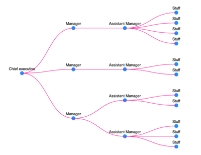
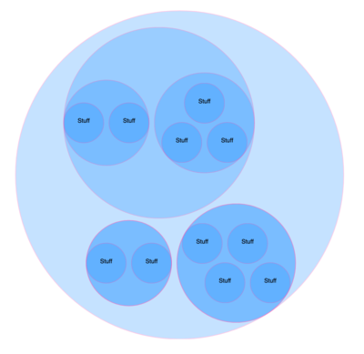
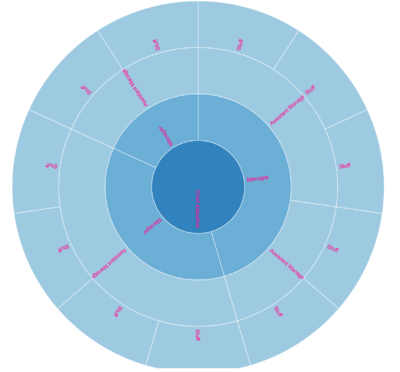
When I started to dive a little deeper into the possibilities of visualization with d3 I came across many predefine layouts of hierarchical structures. What does it mean? Are we being pressured to represent our data hierarchically?. Traditionally diagrams and maps have been understood as element of power, as tools for represent powerful structures and this is another example that it’s true. The goal of this Hackpact is to explore how is the process of representing hierarchical structures with D3, different layout of visual possibilities and how is the data that represent this information.
In order to develop a dataset I built a simple Json file that express the hierarchical structure of a company that have a Chief Executive whose children are the Managers whose children are the Managers assistant whose children are the Staff.
<!DOCTYPE html>
<html>
<head>
	<meta charset="utf-8">
	<title>D3 tutorial</title>
	<script src='https://d3js.org/d3.v3.min.js'></script>
</head>
<body>

	<script>

		var canvas = d3.select("body")
			.append("svg")
			.attr("width", 500)
			.attr("height", 500)
			.append("g")
				.attr("transform", "translate(50,50)");

		// with cluster layout all data that don't have children are in the same level
		// var tree = d3.layout.cluster()
		var tree = d3.layout.tree()
			.size([400,400]);

		d3.json("hierarchicalstructure.json", function(data){

			var nodes = tree.nodes(data);

			var links = tree.links(nodes);

			var node = canvas.selectAll("node")
				.data(nodes)
				.enter()
				.append("g")
					.attr("class", "node")
					// to flip the nodes you just have to change the x and the y
					.attr("transform", function (d) {return "translate(" + d.y + "," +d.x + ")"})

				node.append("circle")
					.attr("r", 5)
					.attr("fill", "dodgerblue");

				node.append("text")
					.text(function(d) {return d.name;})
					.attr("transform", "translate(0,-8)")
					.attr("font-family","sans-serif")
					.attr("font-size","10px")
					.attr("text-anchor","middle")
					.attr("fill","black");


				var diagonal = d3.svg.diagonal()
					// To rotate the paths
					.projection(function (d) {return [d.y, d.x];});

				canvas.selectAll("link")
					.data(links)
					.enter()
					.append	("path")
					.attr("class", "link")
					.attr("fill", "none")
					.attr("stroke", "deeppink")
					.attr("d", diagonal);

		})

	</script>

</body>
</html>
