
User:Simon/physical bootleg library
the physical bootleg library
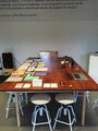
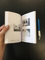
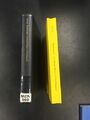
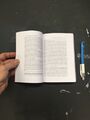
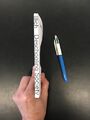
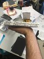
The physical bootleg library is housed in a disused champagne crate. It contains books that I have bootlegged myself, or ones that others have. It also contains donated books. The library travels, and is part of bootleg library sessions held at PZI and at other locations.
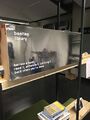
The crate, closed, in the XPUB studio where it usually resides
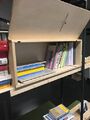
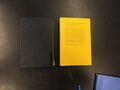
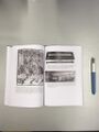
The crate, open, with books inside
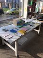
At Varia, Gouwstraat 3, with books distributed on table
At the Library, Karel Doormanhof 45, ready to be unpacked
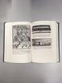
At Onomatopee Projects, before the bootleg library session
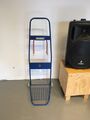
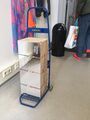
The IKEA trolley the physical bootleg library usually travels on, bootlegged to become AIKE (a homage to Biyi's husband, whose name is Aike)


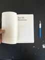
books i've bootlegged that are contained within
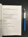
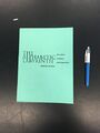
Feminist Art Manifestos
First edition
Printed: 12.09.19
Dimensions: 130x180mm
Cover stock: Clairefontaine Trophee (green) 210gsm
Text stock: Bio Top 80gsm
Binding: Perfect bound (hot glue)
Pages: 180pp
This book took quite some time to lay out. The original publication exists as an EPUB. You have to buy it, and it's not available in this format from the usual pirate libraries, but I did find an HTML version on https://monoskop.org/media/text/feminist_art_manifestos/
I ran pandoc on the HTML file to turn it into a .rtf so that I could lay it out in InDesign using this command:
$ pandoc -s source.html -o new_source.rtf
This retained italics and hyperlinks (which was super nice), but there were lots of line-breaks that I didn't need and had to remove manually as find/change in InDesign is indiscriminate...
In some ways the digital book is superior to the printed version as you can click on the hyperlinks to visit the source pages of many of these texts, something which is obviously impossible in the printed version, although it does say where the manifestos can be found.
The interesting thing about doing this as a book sprint is the speed at which you have to make design decisions. This makes the design quite minimal, and the only typographic conceit here was with a decision to use a variety of indentation styles, which refers to the multiplicity of feminist manifestos. The interesting thing for me about these texts is that they show many different artistic views of feminism which don't necessarily agree with each other.
During the time I was laying out this publication, I was invited by Artemis to join her and Paloma in applying to present our Marginal Conversations workshop in Athens at the ETC (Eclectic Tech Conference) festival. We were all pretty excited about the prospect, however as it turned out, some of the organisers were unsure about me presenting a workshop as a cis-gendered hetero man. Although I was disappointed, I understood the reasoning, as due to the nature of this particular conference (which started as a way for women and queer, trans & non-binary folk to share skills outside of a patriarchal male-dominated tech culture. I was reassured that this was not the opinion of all of the organisers, but of some, however, they were trying to reach a compromise with me and each other. I found this an interesting sidenote to the publication I was producing, in which there is a plurality of views that co-exist.
Front cover
Spread
Bootleg acknowledgment


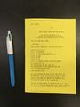
Second edition
Printed: 05.03.20
Dimensions: 130x180mm
Cover stock: Clairefontaine Trophee (grey) 210gsm
Text stock: Laser 80gsm
Binding: Perfect bound (hot glue)
Pages: 224pp
I decided to print a second edition of this book for two reasons; 1) someone had borrowed the first edition three months ago and it hadn't been returned, and 2) what's a books of Feminist Art Manifestos without any images?
I spent quite some time tracking down images to use in the book. Oftentimes I couldn't find an image that directly corresponded to the writer/writers of each manifesto, which created an interesting opportunity to think about who is represented by each text. Sometimes it was an image of an artwork (if the manifesto was written by an artist), sometimes an image of a collective or the publications they produces, often a portrait of the author or authors, sometimes an image of the manifesto as it appeared in print originally. Each manifesto text is prefaced by an image - abutting the text of a previous manifesto. This creates an interesting connection between seemingly disparate elements and waves of feminist movements. The book was printed in the same size as the first edition, with a grey cover, and noticeably more pages due to the addition of so many colour images.
Front cover
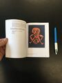
Spread: WSABAL manifesto alongside image of Nancy Spero's painting Sheela-na-gig
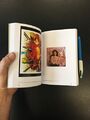
Spread: Work and portrait of Chila Kumari Burman
Spread: Dora Garcia
Spread: YES Manifesto, alongside FAAB Manifesto
Bootleg acknowledgment
Bootleg acknowledgment, closeup
Spine
Back cover


Almost Transparent Blue
Printed: 14.09.19
Dimensions: 112x172mm
Cover stock: Clairefontaine Trophee (white) 120gsm
Text stock: Bio Top 80gsm
Binding: Perfect bound (hot glue)
Pages: 114pp
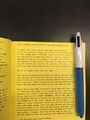
One of my favourite novels for its striking descriptions of colour. Written by "the other Murakami" (not Haruki). This was a relatively easy case of taking the text from an EPUB I found online. Again, the most tedious thing was removing the soft returns. Once I got through that, I decided to reflect the episodic nature of the novel by beginning every section with a drop cap. Another design decision was in the format - as it is originally a Japanese novel, I wanted to use a specific novel size common in Japan of 112x172mm. The blue square on the cover is a post-it note that I photocopied in single colour - blue; an impromptu decision. The cartridge was running out, which produced a very transparent blue.

Front cover

Spread: Sections introduced with drop capitals
Back cover


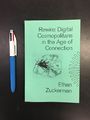
Rewire: Digital Cosmopolitans in the Age of Connection
Printed: 19.09.19
Dimensions: 130x180mm
Cover stock: Heavy green stock (unknown brand) - around 210gsm
Text stock: Bio Top 80gsm
Binding: Perfect bound (hot glue)
Pages: 331pp
Artemis messaged me asking if I was in the studio, and if I could find a book of Steve's that was about how the internet makes it seem like we're connected, though we're not. I found Steve's copy, but as Artemis was still in Greece I did a quick search online to see if I could find a digital version. The only one I could find was an EPUB, which I converted to an RTF using pandoc.
This book took quite a while to produce as it was important that the page numbers matched the original publication (for citation purposes), so I painstakingly set the text to the same line count and flow as the original publication. I also included the Library of Congress bibliographic details for this purpose.
Front cover
Bootleg acknowledgement
Back cover


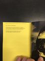
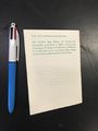
THE MANUAL
Printed: 22.09.19
Dimensions: 140x190mm
Cover stock: Rainbow (yellow) 120gsm
Text stock: Rainbow (yellow) 120gsm
Binding: Perfect bound (hot glue)
Pages: 104pp
THE MANUAL (How To Have A Number One The Easy Way) is a rather tongue-in-cheek guide to how to write a hit pop song, made by members of the KLF (Bill Drummond and Jimmy Cauty), who had a hit song in 1988 with Doctorin' the Tardis. This is a printed book made from a .txt file, found online, and still bearing the file path from the directory it came from as well as date and time of creation. I retained these details for this printed book (only substituting actual numbers for page number and page count) in reference to the provenance of the file, and to be clear about the raw nature of its origin. As a .txt, it doesn't contain any styling or italics and I wanted to retain this crudeness in the design.
There's also an audio description of the book, which might be interesting to convert via speech-to-text at some point: https://audioboom.com/posts/1730244-the-manual-on-how-to-get-a-numbet-one-hit-the-easy-way
Front cover
File path of the txt displayed as a running header
Bootleg acknowledgement


The Carrier Bag Theory of Fiction
Printed: 25.09.19
Dimensions: 90x120mm
Cover stock: Clairefontaine Trophee (ivory) 120gsm
Text stock: Clairefontaine Trophee (ivory) 120gsm
Binding: Staple bound
Pages: 16pp
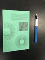
Ursula K. Le Guin's short essay appears in a compilation called Dancing at the Edge of the World, which I've found impossible to find online through the usual pirate libraries such as Library Genesis, aaaaaarg.fail and Monoskop. Perhaps this points to a gender bias in what is perceived as knowledge (Le Guin was a woman wrote mostly science-fiction)? In lieu of not being able to find the compilation, I decided to print this book in a very small size (90x120mm) and retain the annotations from the PDF I found. I digitised them by making them into vectors, and printed the text and annotations in green. In this way I wanted to speculate on what would happen when a reader was confronted with annotations that seemed to be part of the source, not a para-text added after publication.
Front cover
Digitised annotations
Back cover with bootleg acknowledgement


The Electronic Revolution
Printed: 30.09.19
Dimensions: 200x280mm
Cover stock: Ursus (silver) 200gsm
Text stock: Ursus (silver) 120gsm
Binding: Staple bound
Pages: 32pp
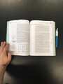
The Electronic Revolution is an essay by William S. Burroughs, in which he outlines his radical concepts of the cut-up, and the written word as a virus that makes the spoken word possible. The text was introduced to me by Florian Cramer in a seminar on media activism, networks, and mail art that he delivered last year as part of Special Issue 9: The Network We (de)Served. Both of these ideas can be applied to what I'm doing with this bootleg library - reformatting and annotating texts as a way to create conversations around them. I found a pdf of the text on ubuweb, where it was published under their ubuclassics imprint. This was devoid of any other publication details that usually accompany "official" publications, such as date of publication, identifier etc. The text was also riddled with punctuation and spelling errors, which I decided to keep in the bootlegged print publication. There were no italics so I used a font I had ripped from a Canadian calendar featuring Eskimo drawings and Inuit script - the font looked like a grotesque (Helvetica?) and had a low contrast, and was only available in regular (no italics) so it was usable for this design. I set the text in a symmetrical layout with large margins at either side, and decided on a suitable large scale format for more relaxed reading.
Front cover
Spread: Ample margins for annotation
"Language is a virus"
Bootleg acknowledgment


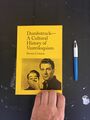
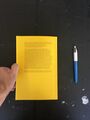
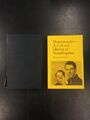
Dumbstruck—A Cultural History of Ventriloquism
First edition
Printed: 29.10.19
Dimensions: 150x235mm
Cover stock: Clairefontaine Trophee (yellow) 210gsm
Text stock: Bio Top 80gsm
Binding: Perfect bound (hot glue)
Pages: 433pp
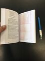
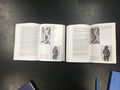
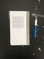
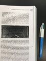
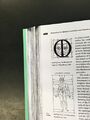
This book took about 40 hours to create, the longest time it's taken so far... I found a PDF on Lib Gen, but for some reason the OCR'd text was tracked quite tight making each line look like a very long word - this was even worse when printed. After a quick search on worldcat, I discovered that this book was available to be borrowed from the Royal Library in the Hague. Off I went to borrow the book. I planned to scan it using the bookscanner, but the cameras kept crashing after scanning half the 433 page book. So, I managed to extract the text using Calibre's book convert process from PDF > RTF. However, after placing the text in an InDesign layout, all of the numbers appeared as missing characters. From the looks of the PDF it seemed that these were perhaps from an Opentype font's custom stylistic set, which would explain why they weren't turning up in my system fonts. Also, in the index at the back of the book the numbers seemed to have the appearance of hyperlinks (when hovering over the hand icon appears) but when clicked, did absolutely nothing. So I began the rather painstaking process of laying out the book with exactly the same text flow and page numbers as the source. The work included removing headers and page numbers from the RTF, scanning all photos from the printed book, endlessly wordspacing paragraphs to make sure they fit where they should on each page, styling the text, removing manually written hyphenation (this was done programmatically, and ended up with a few words that were joined together in the case of examples like "re- and dis- associate" becoming reand disassociate") and the seemingly endless task of manually entering in EVERY number. At times it felt a bit masochistic, but I used this time to reflect on the process, thinking a lot about the changes I was making to preserve the form of the original. Ironically, this also involved a lot of forced line breaks, which would make the task of anyone who wanted to bootleg this book a bit more difficult (forced line breaks are the bane of the bootlegger). Another strange thought - I'm reading these books as I redesign them, but my reading happens on a more superficial level perhaps, meaning that I'm not absorbing the content fully, but reading it like a machine would as I look for anomalies and address them.
Front cover
Title page
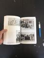
Spread: Image section
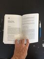
Spread: Section begins
Back cover


Second edition
Printed: 28.11.19
Dimensions: 150x235mm
Cover stock: Clairefontaine Trophee (yellow) 210gsm
Text stock: Bio Top 80gsm
Binding: Perfect bound (cold glue)
Pages: 433pp
Clara Balaguer asked me for a copy of this book, and it seemed like a good opportunity to try a new printing and binding process. I decided to print the book double-sided on A4 paper, as opposed to the previous method of 2-up imposed printing on A3 paper. I wasn't very satisfied with how the previous printing method had produced a "split" in the book due to the paper grain direction. Yin Yin Wong at PS Rotterdam had recommended printing double sided rather than 2-up to avoid this, so this was the technique I decided to try out. I also decided on hand-binding it with cold glue, a technique which I had recently learned. Cold glue binding is done with equipment and materials such as a hacksaw, scissors, medical gauze (or cheesecloth), brushes, PVA glue, bookbinding thread, a jig to hold the book in while notches are cut and the spine receives its initial gluing, and a book press to keep the book in overnight, which stops the book from warping due to the high water content of the PVA glue. Cold glue binding allows the book to lay open flat on a table, a benefit I was keen to apply to this edition of the book as I was dissatisfied by how tight the binding of the first edition was because I had used the hot glue binding machine, which takes much less time but for thick books can produce a lower quality result. I was quite pleased with how this book came out, however, when applying the cover I had to decide not to glue it to the spine. Cold glue binding results in a rough spine, and hot glue creates a smooth layer of glue that dries quickly, producing a smooth spine. The only way to avoid this is to not attach the cover to the spine if using cold glue.
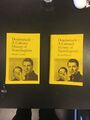
Bootlegged books front covers: Second edition (left) and first edition (right)
Front covers: Source publication (left) and second edition bootleg (right)
Beginning of image section: Source publication (left) and second edition bootleg (right). The second edition bootleg book lies open more easily due to the cold glue binding
Spines: Source publication (left) and second edition bootleg (right)
Back covers: Source publication (left) and second edition bootleg (right)


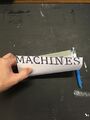
Literary Machines
Printed: 19.11.19
Dimensions: 120x145mm
Cover stock: Clairefontaine Trophee (cream) 210gsm
Text stock: Clairefontaine Trophee (cream) 210gsm
Binding: Staple bound
Pages: 20pp
A reprint of Ted Nelson's Literary Machines - a small booklet in which Nelson outlines his ideas for Project Xanadu, hypermedia and hypertext. I found this on Monoskop as an OCR'd PDF. What was interesting was how the traces of the scan persisted in the PDF - the dark edges around the pages, the bend of the paper on the glass, the warping in text from moving the paper while scanning. I simply re-imposed these pages onto a new document (of a different size), creating margins around the text and retaining these visual traces. The cover was made simply from taking each page marker, cropping it to the width of the margins (while retaining the dark edges) and stacking them on top of each other.
Impromptu front cover, with page numbers stacked on top of each other
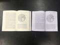
Spread: Pages 3 & 4
Spread: Pages 6 & 7
Spread: Pages 13 (in the PDF as a half page) & 14
Self back cover (page 19)


A Voice and Nothing More
Printed: 19.11.19
Dimensions: 155x235mm
Cover stock: Ursus glossy white 210gsm
Text stock: Bio Top 80gsm
Binding: Perfect bound, cold glue
Pages: 226pp
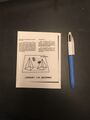
This is another book where I took a text file and laid it out again in InDesign, like the copy of Dumbstruck that I bootlegged. However, this time I made a code to indicate the page numbering and text flow of the source publication. This was to provide comfortable, consistent tracking to the letterspacing - one of the issues with Dumbstruck was that, in an attempt to keep the text flow and page numbering the same, some paragraphs were too tightly, or too loosely kerned. I feel this is a more elegant solution, however, it might pose problems if someone else tried to do the same as I had (taking the text from a source publication and laying it out) as the code is now part of the text. The cover was made with glossy paper, and custom-cut vinyl stickers. In time these will probably come off, but that's conceptually sympathetic to the content of the book, which is about the transience of the voice.
Front cover, with white vinyl text and graphics
Spine
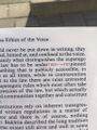
Code referring to text flow of the source publication

Bootleg acknowledgement
Spread: Book opens easily due to cold glue binding


Information ages : literacy, numeracy, and the computer revolution
Printed: 26.11.19
Dimensions: 155x235mm
Cover stock: Clairefontaine Trophee (white) 210gsm
Text stock: Laser 80gsm
Binding: Perfect bound, cold glue
Pages: 320pp
I could only find this as a printed book available for purchase online, or to borrow from the closest library, which is the Koninklijke Bibliotheek in The Hague. So, I went to the KB in the Hague, registered a membership (costing 7,50 euro per year) and borrowed the book. I scanned the book on a photocopier back at PZI (it took about 40 mins and many apologies to those who wanted to use it), and then printed and bound it by hand using a cold glue binding technique. The file produced by scanning actually took longer to be transferred over the network than it did to scan the entire book. I optimised the file after receiving it, which produced splotchy text and images (in some places the print looked damaged by water). The cover was an impromptu decision - to use the same method. The copy was made in about 2 hours.
Front cover: Bootleg (left) and source publication (right)
Spine: Source publication
Spine: Bootleg
Spines: Source publication (left) and bootleg (right)
Spread: Source publication (left) and bootleg (right)
Spread: Images in source publication
Spread: Images in bootleg


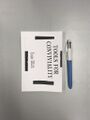
Tools for Conviviality
Printed: 28.11.19
Dimensions: 113x170mm
Cover stock: Clairefontaine Trophee (white) 210gsm
Text stock: Laser 80gsm
Binding: Perfect bound, cold glue
Pages: 128pp
This book was made quite quickly - by using a script in InDesign to place a multi-page PDF into a blank document. The cover was also made quickly, on the photocopier. The economy of speed produces what looks like a poor image zine aesthetic. This is becoming an interesting methodology for me - making books quickly by any means necessary. I just want the printed text, in a format that is going to be somewhat durable - detailed typographic consideration is hardly applicable here.
Front cover
Spread
Spine


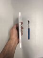
Writing Machines
Printed: 16.12.19
Dimensions: 139x190mm
Cover stock: Clairefontaine Trophee (white) 210gsm
Text stock: Laser 80gsm
Binding: Perfect bound, cold glue with book tape on spine
Pages: 148pp
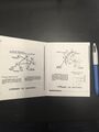
N. Katherine Hayles' Writing Machines is a book that has a very particular materiality. Hayles worked closely with a designer to create the printed book, reflecting the concepts contained within of new forms of textuality in technotexts and cybertexts. I made a quick bootleg of this book, working from a PDF I found on Monoskop. It was only when the PDF was printed and bound as a book did I see the design come to life - particularly in the lenticular effect of the edge printing on each page, which when held at the right angle, reads the title; in one direction "WRITING" and in the other "MACHINES". Small discoveries like this often come up when printing a PDF - not just size, weight, and the haptic experience of the codex form but also other features that reveal themselves only when the book is printed and bound.
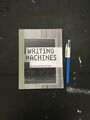
Front cover
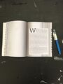
Spread
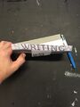
Fore-edge text, visible when bent toward the back cover
Fore-edge text, visible when bent toward the front cover


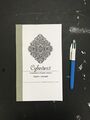
Cybertext
Printed: 17.12.19
Dimensions: 131x216mm
Cover stock: Clairefontaine Trophee (white) 210gsm
Text stock: Laser 80gsm
Binding: Perfect bound, cold glue with book tape on spine
Pages: 214pp
Espen Aarseth's Cybertext is a book that found its way towards me through a couple of other sources - first of all Tancredi recommended I read it, then I came across it when reading Writing Machines by N. Katherine Hayles. Aarseth's PhD dissertation proposes the idea of "cybertexts", which are part of the genre of what he calls "ergodic literature". In a nutshell, these are texts which require "non-trivial effort" to read. These texts are in both printed form (e.g. Danielewski's House of Leaves) and also in digital form (the book contains a section on MUDs - Multi User Domains - which are large gaming environments in which texts (both in the sense of software, and also narratives) are assembled on the fly. I printed this from the PDF, retaining all the marks that had come from its scanning, then bound it with cold glue and a strip of book binding tape on the spine for extra strength.
Front cover
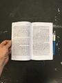
Spread, with annotations from the PDF
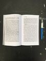
Spread, with dark marks around edges from the scan
Back cover


The Alphabetic Labyrinth
Printed: 20.12.19
Dimensions: 190x260mm
Cover stock: Heavy green stock (unknown brand) - around 210gsm
Text stock: Laser 80gsm
Binding: Perfect bound, hot glue
Pages: 330pp
Johanna Drucker's The Alphabetic Labyrinth is a book that traces the history and development of the alphabet. Full of diagrams and densely populated with these histories, it demands printing and reading in physical form. A PDF just won't do. I printed this from a PDF that I laid out quickly in InDesign using my trusty placemultiplePDFpages script. The cover was made on the photocopier, a technique I was well-acquainted with from my days as a teacher, where lessons would be literally cut and pasted together to be copied on the glass. The task that took the most time was making sure the pages would be printed at reasonable size, while economising on paper. For this reason, I wanted to print it double-sided on A4 paper with minimal excess. The annotations (interestingly, many in Greek - a coincidence as the book focuses for some time on development of the Greek alphabet) and artefacts from scanning were retained (such as darkened page edges), creating a materiality that reminds one the book is most definitely loved, copied, and shared.
Front cover
Annotations
A spread
Closeup, featuring darkened edges from scan
Spine
Back cover


The Open Work
Printed: 20.12.19
Dimensions: 123x180mm
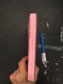
Cover stock: Heavy pink stock (unknown brand) - around 210gsm
Text stock: Laser 80gsm
Binding: Perfect bound, hot glue
Pages: 322pp
I had a PDF of Umberto Eco's The Open Work that I wanted to read, but hadn't got round to it. Such a vast, sprawling text needs to be read and digested slowly, so I decided to print the PDF. Unfortunately, the file I had was a scan of spreads, not pages, so after placing all the pages in InDesign I had to make sure that each page of the file corresponded to each page of the book. I used a dark line at the centre of each page to align with the edge of the pages in the InDesign file. Little did I know or realise at the time that this was an artefact from OCR, and that the text was riddled with such quirks that at times made the text almost unreadable. This happens sometimes if you edit a PDF in a program such as Adobe Acrobat Pro, which includes the option to run OCR all over the document. However, this function doesn't just layer an invisible txt over the images in the PDF, it replaces the images with a text file, in a font (or fonts) specified by the editor. I think that is what happened here, because on printing I discovered that a multitude of artefacts resulting from this technique - unreadable lines, characters that most likely were interpretations of marks and smudges, and a change in font every three or four pages, making for a text that had what seemed to be multiple personalities. This would be a great design approach for such a text - which is about participatory processes making up an art work - but most likely just a happy accident. The cover was made on the photocopier, simply by cutting text from the PDF, pasting and copying it to a heavy sheet of pink paper.
Front cover
Spread
OCR artefacts
Spine


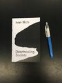
Deschooling Society
First edition
Printed: 13.01.20
Dimensions: 110x170mm
Cover stock: Clairefontaine Trophee (white) 210gsm
Text stock: Laser 80gsm
Binding: Perfect bound, cold glue
Pages: 160pp
I made this book with and for Luke (a friend), as a favour, and also to show him how to bootleg a book. I'd already redesigned the text, and printed it double-sided on laser paper. What he wanted to know how to bind books. Luke had been helping me out a lot with getting the bookscanner running, and it seemed like a nice way to repay him. The problem came when we tried to bind the book using the hot-glue machine, which was once again not working as it should and the result we got was less than optimal. So, I showed him how to notch-bind using cold glue, and he took the text block home with him to try out the technique himself, using a DIY book press made from two chopping boards. One the text block was dry, he brought it back to me to show him how to apply the cover. I'd already printed the cover on a piece of paper, but had been using it to write quick notes on in the interim. It's ironic, I'm surrounded by paper, but scrap paper can be hard to come by. Rather than printing the cover again, I decided to tear away all the areas I'd written notes on it, and then photocopy this with the lid open, leaving black where there was no paper. It was another impromptu, make-do decision, but one that lent an interesting mark - removal of all that is not necessary - and in line with the type of radical pedagogical approaches the author of the text was aiming at.
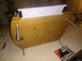
Luke's DIY book press
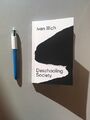
Front cover
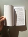
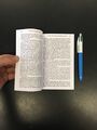
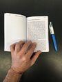
Spread
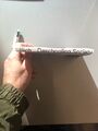
Spine
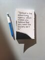
Back cover
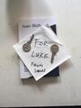
The book, left with keys I borrowed from Luke while staying with him and Alice in January, 2020


Second edition
Printed: 29.01.20
Dimensions: 110x170mm
Cover stock: Clairefontaine Trophee (white) 210gsm
Text stock: Laser 80gsm
Binding: Perfect bound, hot glue
Pages: 160pp
I decided to print another copy of Deschooling Society for the physical bootleg library when the hot glue machine was working properly again. It was interesting to compare the differences between the two different binding methods - not something I usually see as I don't often bootleg more than one copy of a book.
Front cover
Spread
Spread
Spine
Back cover
Spines: First edition (top), second edition (bottom). The difference in cold vs hot glue is apparent here - hot glue ensures a smooth, square spine
Back covers: First edition (left), second edition (right)


Che Guevara: Guerilla Warfare
Printed: 13.01.20
Dimensions: 135x210mm
Cover stock: Heavy pink stock (unknown brand) - around 210gsm
Text stock: Laser 80gsm
Binding: Perfect bound, hot glue
Pages: 175pp
A copy of Guevara's Guerilla Warfare, printed with/for Luke. We made the cover on the photocopier, make-do style. The text refers to Guevara's system of annotating - a pity the PDF I had wasn't available in colour.