
Bo & Rita: Difference between revisions
No edit summary |
No edit summary |
||
| Line 35: | Line 35: | ||
</gallery> | </gallery> | ||
* No stage for the teacher: less hierarchy = students and teacher seen as equals in terms of space. (of course there is hierachy, but!) | |||
* Feels like more discussion, the teacher and the students are in a circle | |||
==Colors== | ==Colors== | ||
| Line 43: | Line 43: | ||
</gallery> | </gallery> | ||
* The school is mostly painted in black. Colors have meanings (maybe black provides a cozy feeling, black absorbs light) | |||
* Very corporate and clean (different of the ideia of an art school) | |||
<gallery> | <gallery> | ||
| Line 50: | Line 50: | ||
</gallery> | </gallery> | ||
* Colors influence the way we perceive spaces | |||
* Yellow provides a vibrant feeling): giving you breaktime/seperation from the black space. | |||
* Piano as a creative escape | |||
==Habits== | ==Habits== | ||
| Line 59: | Line 59: | ||
</gallery> | </gallery> | ||
* Water purifier and disposable cup standing at the entrance of the building. | |||
* Easy accessibility & Standing out well | |||
* By having cups for free, we get more influenced to change our habits. | |||
==Places of passage== | ==Places of passage== | ||
| Line 68: | Line 68: | ||
</gallery> | </gallery> | ||
* A Place of passage: A lot of print materials are hanging on the wall. | |||
* They are not just a passage, but it becomes a useful space: A place to take a break and have a chatting. | |||
Revision as of 16:00, 2 October 2018
Open space concept

- No physical walls = Willem de Kooning School prides itself for having an open-space concept
- However, there is some boundaries on the floor taping/marking (Yellow mark on the ground)

- Open spaces can be a negative impact on concentration
- Can be easily disrupted by outside
Group Table
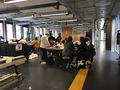
300px

- No individual tables (in order to promote gatherings with each other, exchange of ideas)
Lights

- Big windows: light as a big influence on happiness/practicality
Free discussion

- No stage for the teacher: less hierarchy = students and teacher seen as equals in terms of space. (of course there is hierachy, but!)
- Feels like more discussion, the teacher and the students are in a circle
Colors

- The school is mostly painted in black. Colors have meanings (maybe black provides a cozy feeling, black absorbs light)
- Very corporate and clean (different of the ideia of an art school)

- Colors influence the way we perceive spaces
- Yellow provides a vibrant feeling): giving you breaktime/seperation from the black space.
- Piano as a creative escape
Habits

- Water purifier and disposable cup standing at the entrance of the building.
- Easy accessibility & Standing out well
- By having cups for free, we get more influenced to change our habits.
Places of passage

- A Place of passage: A lot of print materials are hanging on the wall.
- They are not just a passage, but it becomes a useful space: A place to take a break and have a chatting.