API/RSS
field of interest:
How dense are the news? How news could be visually presented as a single unit?
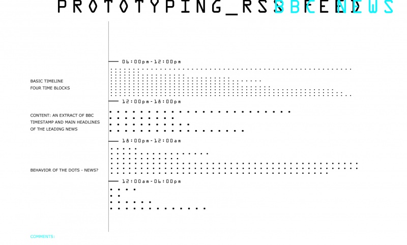
I am using RSS from BBC News(for now) as a source. I want to built simple map of time and content.
When the news is published online and what is the main subject matter?
br>
( Are the news feed relevant or accurate to the current time of the event
or they have been driven by "right" time to be broadcasted)
outcome:
to combine, recombine and compare different sources
highlight certain concentration, density and flow of the data.
I am considering grabbing more than one source of news Worldcrunch [1] and Aljazeera RSS [2]
So far I have BBC headlines + the pubDate + basic interface (html + SVG)
I need some help to link them together.
notes on real data visualization :
* timeline consists of four time swats, where the news headlines will be displayed, embedded as links.
* simple visual id - each news represented as a data point - equal by its layout different by its content.
* behavior of the single point - need to be consider and develop furthermore?how?

open for proposals
pls write your comments here:
