User:Wyn/Special Issue 26
Study CSS like a linguist
Introduction to the core function of the CSS
In the CSS workshop, We learned the CSS properties like linguists, we explored two fundamental concepts: display and position properties. The display determines how elements interact with each other on a page; The position defines how elements are placed within their container.
We could choose the display and position group, focusing on the fundamental properties that how they work in the webpage.
I learned that display determines how elements relate to each other in the document flow. The key values we covered were:
| display: block |
|---|
- Elements take up the full width available and start on a new line;
| display: inline |
|---|
- Elements only take up necessary space and flow within the text
| display: inline-block |
|---|
- A hybrid that allows width/height settings while flowing inline
| display: none |
|---|
- blank; Completely removes the element from view
The Position Property:
Position controls where elements are placed relative to other elements or the viewport. We explored:
| position: relative |
|---|
- Elements can be offset from their normal position
| position: absolute |
|---|
- Elements are positioned relative to their nearest positioned ancestor
| position: fixed |
|---|
- Elements are positioned relative to the viewport
CSS drawing
The face metaphor fits the functions of display and position. To understand concepts, I created an interactive face using HTML and CSS. This practice helped me visualize how display and position work together. The face became my canvas (like absolute positioning), with features like ears, eyes, and mouth representing different positioning scenarios. I used slider input (-webkit-slider-thumb) to move the facial features. Also, add transform and translateY to achieve precise positioning of the thumbs. The combination of different display and position values creates complex layouts.
position: relative on the face container creates a positioning context for absolute-positioned elements (like the ears)
position: fixed is similar to the facial feature (like eye-group and eyebrow-group) in the face container and makes different visual effect
display: block is like the face outline - it always takes up the full width available, starting on a new line
display: flex helps arrange eyes and eyebrows in pairs (but I didn't use it in the end) in an organized way

The face metaphor helped me remember that: The face itself (container) is like position: relative, providing a reference point Features like ears (position: absolute) need the face as their positioning context Eyes and eyebrows (display: flex) need to maintain their relationship with neighboring elements.
Learning-by-doing
Aesthetic swap
Dorian introduced a browser extension - scratch that allows direct CSS code modification, changing the webpage styling. This helped us deepen our understanding of CSS by actively transforming existing websites. Rather than just building from zero, I chose to explore how CSS can reshape existing web content into different aesthetic styles.
I am interested in ASCII(American Standard Code for Information Interchange) art recently, as a character encoding standard that became fundamental to early computer and internet communication, it represents a significant moment in internet history and design. In the early days of the internet, when graphical capabilities were limited, based on 128 characters and the monospace font-size, the ASCII art was a creative solution for visual expression. Guidance from Dorian helped me better understand the core concept behind this practice.
Historical context
ASCII art reveals an even deeper historical context. Tracing back to the ages without the internet, typewriter artists were already exploring how standard characters could be arranged to create visual patterns and images, as Joseph explained in the prototype course. Variety typewriters and their historical perspective helped us dig the root of typography and found that ASCII art wasn't just a technical limitation of early computers, but part of a longer tradition of creating art with text characters. From stamp printer to dot matrix-printers, the form of ascii art had transformed serval times.
|
|
|


Practice! Practice! Practice!
https://pad.xpub.nl/p/csssheet
The key element of ASCII Art is the character itself so that I can play with the font and the font space; It always uses overlap and shadow effects to create a pattern; The frame has character decoration, so I can emphasise to mimic the ASCII Art. For the colour, it is always black and white, but for the nostalgic effect, I add grey and green. The details as follows:
- Character Manipulation:
Monospace fonts ensure each character takes up the same space
Letter spacing and line height control create the text pattern
Using specific ASCII characters like "░▒▓" and "..・。.・゜✧"
- Layering and Shadow Effects:
Pseudo-elements (::before and ::after) create overlapping layers
Text shadows add depth
Mix-blend-mode creates texture through layer interaction
- Decorative Frames:
Button brackets "[ ]"
Border decorations with "-+%$%+-."
Frame-like structures using simple ASCII characters
- Image Treatment:
Converting images to black and white (grayscale)
Increasing contrast for sharper definition
Adding pixelation effects
- Text Effects:
Using opacity for transparency
Creating patterns through character repetition
Implementing hover animations that mimic old computer displays
The main CSS commands:
- Positioning:
position: relative/absolutetop,leftz-index
- Text Styling:
font-family: monospaceletter-spacingline-heighttext-shadow
- Display and Layout:
display: inline-block/blockoverflow: hiddenwhite-spaceword-break
- Visual Effect:
opacitymix-blend-modefilter(for images)content(for pseudo-elements)
- Border and Decoration:
borderbox-shadowoutline

Change the wiki page
|
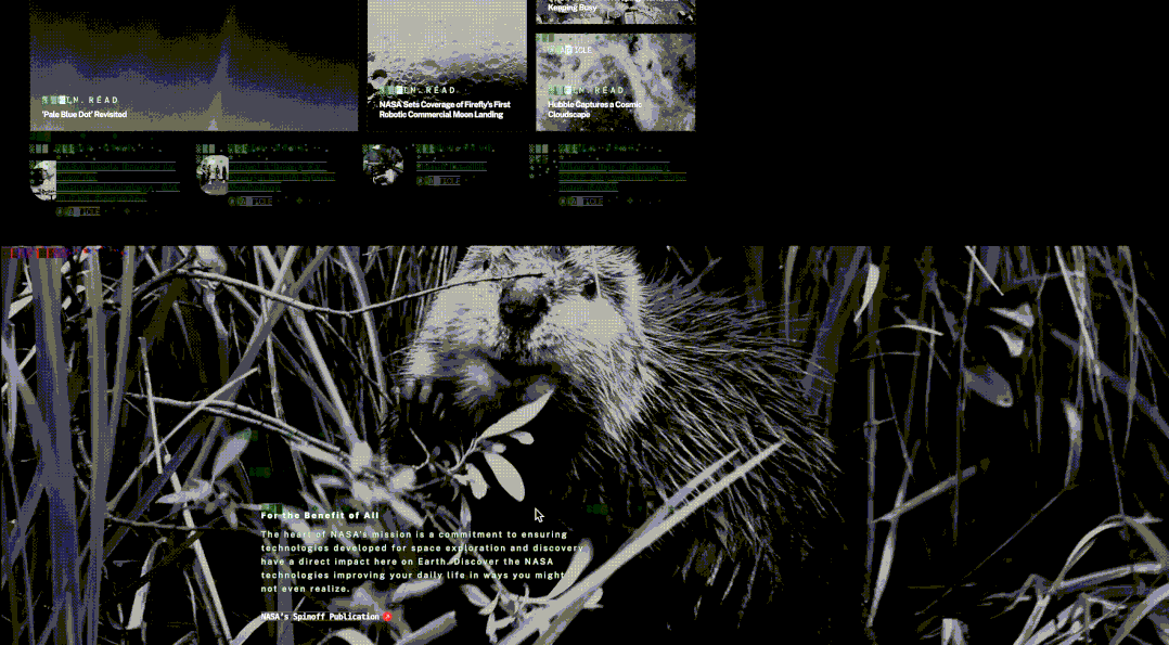 Change the NASA webpage
Poetics, Concrete Poetry
Based on A Dao of Web Design, I want to use the techniques it mentions, visualizing a concrete poetry:
- colour: less colour more style sheet;
- layout: use(rem, em, %)rather than(px, pt); avoid fixed units (pixels, points);
- font: avoid fixed font sizes (points or pixels); use percentages for font sizing, relative sizes for elements like headings (e.g., 130% of body text);
- content and presentation Separation: avoid presentational HTML tags; use semantic HTML elements (em instead of I) and CSS for controlling page presentation;
According to Zhuangzi's story:
Penumbra asked Shadow:
“Before you moved, now you stop.
Before you sat, now you get up.
Why are you so inconstant?”
Shadow said:
“Shall I wait before doing anything?
Is what I am waiting for also waiting for something?
Shall I wait for the scales of a snake or the wings of a cicada?
How do I know why it is so? How do I know why it isn't so?”
I wanted to visualise all the metaphors in this story, so I tried CSS-drawing but couldn't achieve the effect. I then explored CSS Doodle, but that made my code increasingly complex. Eventually, I decided to use Figma to design the scene and export HTML/CSS for a cleaner implementation.
In this visualization, I've used several elements to represent philosophical concepts:
Shadow and Penumbra: The two overlapping circular forms represent the dialogue participants. I've used 3D transforms to give them an elliptical appearance. Snake sheddings and cicada silhouettes: These symbolize life's transformations - snakes shed their skin to grow, while cicadas emerge transformed after years underground. Stars and sun: These celestial elements represent time's passage and cyclical nature, complementing the conversation about constancy and change.
For the shadow and penumbra effects, I used .shadow-circle, .penumbra-circle {
 position: absolute;
 width: 15rem;
 height: 15rem;
 transform: translate(-50%, -50%) rotateX(60deg) scale(1, 0.6);
}
The 3D transformation gives the appearance of an oval seen in perspective, which I found more visually interesting than simple circles.
For the penumbra's textured appearance, I created a repeating linear gradient: .shadow-pattern {
 background-image:
   repeating-linear-gradient(180deg,
     rgba(50, 100, 150, 0.3) 0px,
     rgba(50, 100, 150, 0.3) 1px,
     rgba(70, 120, 170, 0.2) 2px,
     transparent 3px,
     transparent 7px);
}
This gives a subtle lined texture without needing external images.
I positioned the dialogue text on opposite sides of the composition to create balance and to visually separate the two speakers. The sun is positioned in the upper right, casting its influence over the entire scene. I made sure to implement responsive breakpoints so the composition works across different screen sizes: @media (max-width: 1000px) {
 .svg-container {
   width: 50%;
 }

 .shadow-circle, .penumbra-circle {
   width: 160px;
   height: 160px;
 }
My sister gave me a suggestion, she thought the snake shed looks like intestine, I'd better represent a good shape of this metaphor. While not perfect, it captures the essence of Zhuangzi's dialogue on action versus inaction, the nature of change, and uncertainty. To respond to a dao of web design, I understand that easy way to create a acessible webpage.

https://hub.xpub.nl/cerealbox/~wyn/pratice/poetry%20css/penumbra_asks_shadow.html