Counter-Tourist Information Center/Communication
A page for the SI24 communication documentation! As with last SI, we have organised ourselves into production teams again. This time, communication and holding are merged!
Deliverables
- A brochure, including:
- Advertisements for real and fictional projects
- A (counter-)map
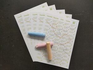
- A stickerpack to annotate this (or any other) map
- An invitation, including:
- A website
Styleguide
Inspired by Rotterdam Tourist Information
Here you can also find the design system of the Gemeente Rotterdam: https://www.figma.com/design/ZWSC4gCrOXRUR9UX3aoZ8x/Gemeente-Rotterdam-Design-System
Font they Use is PX Grotesk, [1]. Expensive Swiss font with many styles
Found a repo with the font in downloadable format, if we want to be cheeky 🏃🕴🏻💰
https://github.com/fictive-kin/pmarchive/tree/master/static/fonts
Since we don't want to be cancelled in the micro-typography sphere we opted for FLOSS options. The fonts used on the website can be found here https://git.xpub.nl/XPUB/SI24/src/branch/main/web/fonts
Colors used for website(stolen from Rotterdam tourist information): dark grey color: #212529
bright green color: #81d742
Process
Brochure
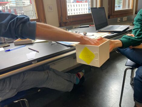
We each wrote names and places on pieces of paper, and put them in a box. We then randomly grabs two to combine name and place.
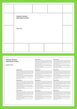
We then loitered to the Rotterdam Tourist Information Center and stocked up on postcards and maps to get inspired to forge the first draft of the brochure (here, made by Senka)
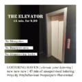
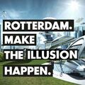
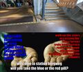
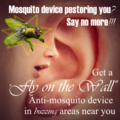
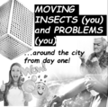
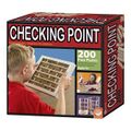
Example ads:
Feel free to add your own ad to the slideshow, we will put them all in the brochure
Meeting 2024-06-17
Meeting with Martino. We made a few decisions:
- We would like to have a map (there seem few projects that use a 'standard' map)
- As there are few projects in the city, we'd like to present locations on this map that are relevant in different ways (e.g. mosquito's, places that sparked thoughts, ...). We will propose a mapping exercise tomorrow, Tuesday 18th, with the whole group.
- The map will be accompanied by ads -- some fictional, some related to projects.
- The back of the map will contain the blurbs -- a non-linear experience
There are some questions still:
- We would like to provide the brochures in different languages, but don't know if this is feasible (to ask of others)
Mapping Exercise
During the prototyping class with Lousia on 2024-06-18, we proposed a mapping exercise to generate content for the brochure. We gathered prompts, divided into a handful of relevant categories, in this pad. We then had the opportunity to respond to these prompts with an anecdote, a drawing or an empty sticky note that was then stuck to a location on a map.
(To add: photo's of the exercise and the result)
Though we had intended the exercise to generate content to put on the map of the brochure -- a way to connect the projects to relevant locations --, we ended up mostly using the prompts. A selection of them was turned into the sticker sheet.
Meeting 2024-06-18
Medewerker Tags
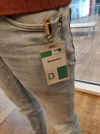
When we visited the municipality earlier in the trimester, we were handed access passes for the day. Some of us got a pass saying guest, but curiously, some said medewerker.
For the Counter-Tourist Information Center, we have made stickers as medewerker passes. For one, we can wear these ourselves to indicate we are associated with the project and available for questions. But the stickers are also provided on the counter (i.e. bakfiets), so that anyone willing can become a medewerker themselves.
Reviews
We are gathering (fictional) reviews for the Counter-Tourist Information Center. These are gathered in this pad. Two examples:
⭑⭑⭑⭑✩
The counter tourist info center offers me a free apple tart and coffee, so nice and friendly! Also, the person told me about their secret local hotspots in Rotterdam.
⭑⭑✩✩✩
Offers mid activities that confused me. Why are they based in a bakfiets?!? I just feel disoriented
Reviews are added to the website.
Sticker Sheet
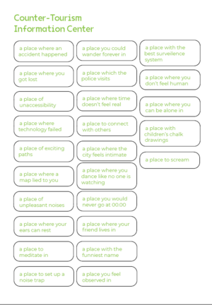
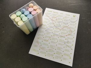
We like the clunky physicality of the brochure. One flips between different sides of the paper to view the map, indulge in the ads and read the blurbs. To make the connection between these components stronger, we provide a sticker sheet. Stickers are prompt-like, e.g. 'a place where I could wander forever'. They can be stuck on the map on a location that resonates with the prompt. You could stick a sticker to the physical world. The sticker could prompt you to make this location yourself. To this end, we provide chalk as an invitation.
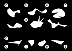
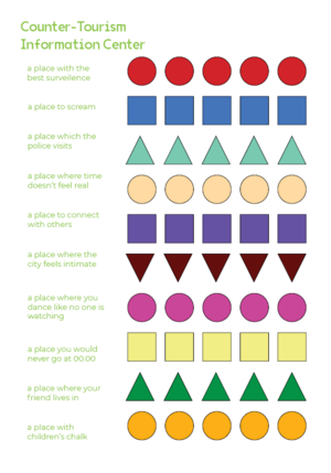
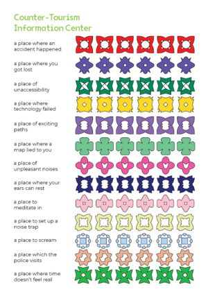
Initial designs took prompts from the map making exercise. We were on the fence between using the prompts as stickers, or using figures instead.
|
|
|
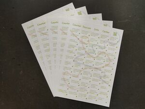
Ultimately, we decided to go with just the prompts. We added some chalk-like background to connect the stickers to the chalk-toolkit.
|
|
|

