Textonpracticefinal2023
Claudio's Text on practice
Screen version:
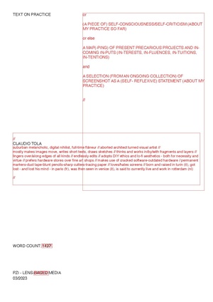
Layer 1: Actual Text on practice (1500 words)
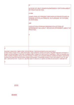
Layer 2: Annotations
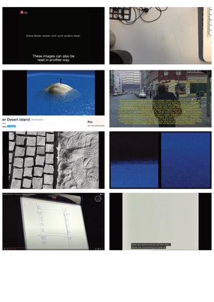
Layer 3: Images
Print version:
Text: A4 tracing paper, unbinded
Images: 9.5x5.5cm, inserted through the pages
(still have to scan/photograph it and upload it. will do. but it's printed already!)
a few words on why I made it this way:
I wanted it not to be just a description of my practice, but also to give an impression of it - of my own way of writing, thinking, working . A fragmented, layered, scattered, cumulative way, whose sense is to be found in the continuous, recursive re-editing of the pieces in always unstable, unsure wholes. A plain text pasted on a wiki page did not feel ok. The medium is the message right? Tracing paper comes from my architecture background. I use it to break through the paper surface and give visual depth to the text, layer it. The actual, formatted text on practice is overlayed with extra annotations, few words or
Images come from an uncurated collection of screenshots, taken over the past months because in one way or another resonated with the processes I was going through. I did not want to pinpoint them to one or another bit of text, but rather let the reader guess associations.


