Superpower Maps
Cartography and data visualisation normally are intended as objective ways to depict spaces and information, but what happen when subjects, or communities, decide to map their own data?
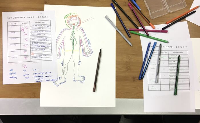
Superpower Maps is a workshop where the participants will explore alternative ways to represent data enhancing self-knowledge through the process of map-making.
We will collect personal data, define relevant parameters and develop rules and codes for creating graphic visualisations. From personal sketches to collective mapping we will create hand-drawn maps questioning the role of rendering realities, turning complex information into emotional cartographies.
WELCOMING AND INTRODUCTION
Hello everybody, we are P & T from the experimental publishing master course and this is the superpower maps workshop. This year we are preparing our research project and our tutors suggest us to organize a series of workshop related to test some of the concepts we are working on. I'm working on ... and I'm working on ... so we decided to put our interests together and design a workshop based on mapping personal data with or without a geographical reference.
Our goal is to rethink the role of cartography which usually is imposed from a top-down norm. Instead, we want to highlight how it can be useful for self-knowledge:
- to augment the capacity to abstract and interpret in personal visual codes our subjective daily life
- to reveal biases and relations among the representations of geography and time
- and to enhance a collective approach to re-think public spaces
The workshop is organized into three parts:
- In the first part of the workshop we will choose one of our days in Rotterdam and take a moment to rethink at it. Then we will save the actions we did during that day in a simplified dataset.
- In the second part, each of us will create a visualization of its own data with a caption. Then in small groups, we will discuss and compare the different ways of interpreting and representing data.
- In the last part of the workshop, and after a small break, we will gather to share the relevant clues highlighted during the discussion in groups. Then all together we will convert our data to fit on the map of Rotterdam trying to re-think our captions in a geographical context.
REFERENCES
Dear Data - Giorgia Lupi and Stefanie Posavec
Otto Neurath - Isotypes and time diagram
Du Bois, W. E. B - Georgia negro
The Naked City - Guy Debord
Power maps - Mark Lombardi
History of architecture - Charles Jencks
SELF-REFLECTION & MAKE YOUR DATASET
>>> provide dataset's form
The dataset track actions and parameters about the data that you are going to represent in your diagram.
This information is about one day (real or fictional) you live in Rotterdam.
The first column represents the actions that you consider relevant to visualize in your map. It can be any type of activity like walking, drawing, biking, thinking etc. It's important to think that would be interesting that these actions imply any type of geographic information to use it in the second part of the workshop.
The second column represents the quantitative information of the action that will make us have conscious about a volume of information and the last column represents the parameters, this also implies a subjective understanding of quantities, how do you record the times that you walk? each time that you stand up? time-slots? Make your own subjective understanding of it.
In the third column, you can add everything that you consider consistent to define the action that you chose with more detail. If we are defining the action talking we can establish as a parameter the language, the interest that we have in the conversation or how many people were involved. This data set will de the guideline that you will use for your representation. Make it as complete as you can to draw a compelling document.
>>> self-reflection Before to start to write down the data we are going to do 5 minutes of 'meditation' to remember a bit more about what you have done during the day you choose. So just focus on your day passing through the most relevant things that you did. I'll play some environmental music to help you to relax and focus. - eventual methods (for example - backward)
>>> make your dataset
MAKE YOUR MAP and CAPTIONS
>>> provide A3s and A4s
During the next 40 minutes, we will draw a personal representation of your data. You are free to explore new visual codes and experiment with the possibilities of using the paper space and the tools however you want. You should try to make a document readable that express the information that you have on your dataset. You should draw a visual representation as well as a key caption that define how to read and interpret your visual grammar. Please your caption and drawing can be in the same sheet but it should be differenced, we will work after that with both documents.
BREAK
READABILITY TEST
>>> Divide in small groups (2 - 3 people)
The readability test is based on a conversation to check how understandable is your diagram and how do you approach other's drawings. You should try to read and explain your interpretation of your partner's diagram and start a discussion with him/her.
Try to identify relevant patterns and peculiarities that creates the identity of each drawing and be focus on how the paper space is been used, how the time is represented, are there any scales? etc.
Discuss if there are any similarities between your drawings.
GENERAL DISCUSSION
>>>trigger questions to consider during the 'readability test'
- How to represent the time?
- Did you define scales?
- Are you duplicating information?
- Have you found similarities in your representations?
- how do you start to represent the data? do you follow the timeline or the order in the dataset? alternative order?
- Are you using general conventions to represent your data?
DRAW A COMMON MAP
Now we are going to represent again the information of our dataset on a geographical map. The goal of this part is to explore the adaptability of the codes that we generated. We should try to follow the key caption that we design in the first part to represent the same data. Feel free to adapt the document in order to make your information understandable. The elaboration of this map will take place in a collaborative action so you should deal with the representations that others are doing and be flexible to redefine your strategies and find your space in the map.
This is a reflection on the adaptation of the visual grammar that you created to geographic variables geographical map without geography (at the end) - Kandinsky's style
WRAP UP
- What data did you miss in the translation, what information did you include?
- Were you forced to redefine your codes?
- Did you find some information impossible to represent?
- Which is the relationship between geography and time?
OUTPUT
- Collection of visual representations of idividual data
- Collective visual representation and interpretation of geodata


