Jellehavermans:researchonbackdrop
Ideas
First idea
Arthur Fellig 'Weegee' (1899 - 1968)
Weegee worked in Manhattan's Lower East Side as a press photographer during the 1930s and 1940s and developed his signature style by following the city's emergency services and documenting their activity. Much of his work depicted unflinchingly realistic scenes of urban life, crime, injury and death. Weegee published photographic books and also worked in cinema, initially making his own short films and later collaborating with film directors such as Jack Donohue and Stanley Kubrick.
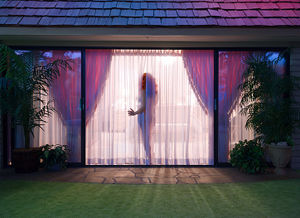
Colorful, aesthetic remakes of Weegee pictures? Turning obscure and dark photos of brutal reality into fabricated pieces who appear as from a movie. Crime scene photos as a source for a photo series in Hitchcockian styled pictures.
Link to article by The Guardian
Late 50’s > 60’s technicolor aesthetic.
Inspirational photographers/video artists: - Alex Prager - Gregory Crewdson - Juno Calypso
further research
Question by Ines: What is it you like about old 50s & 60s era films?
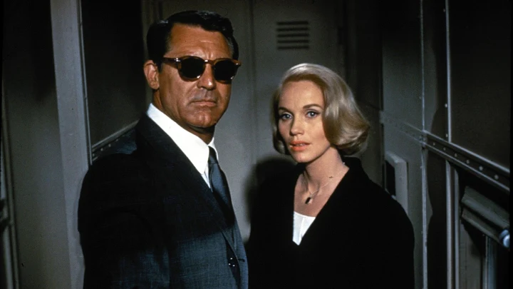
I think I’m appealed mostly by the shallow image of it all. It is basically an advertisement; it portrays a small and idealised version of a certain time. For example; in movies like North By Northwest almost every ingredient is part of an American fantasy. There is the handsome, successful male lead; a tanned, older but still attractive man who runs a business in a big, flashy city. He wears pretty suits and despite being dragged into a conspiracy, he remains fairly calm and looks best. His pursuit to the pretty landscapes of the United States even get him to show off his awesome sunglasses. And of course there’s the pretty Femme Fatale played by Eva Marie Saint. A spy that has sex with the male character after just one dinner. It turns out she’s not on his side though, but soon she finds herself falling for the male lead and she even needs his help to get out of her mess at some point. And then there are the many pursuits through some of the most well known and beautiful places in the United States. This movie is not really a thriller, but more of an exciting road trip, you might say. Maybe that’s what’s so appealing for me; it’s a fantasy. A fantasy for white American males.
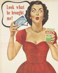
If we talk about music, lightning and colour grading; everything is very appealing too. The music is beautiful; especially the soundtracks done by Bernard Herrmann, I think are very well done and fit the movies perfectly. The lightning and colour grading are used to create a visually appealing and intense image. Everything is highly saturated; colours ‘pop’, sometimes almost to a degree where you are starting to question them. The red lips of female actresses and the (often) blue eyes of the main characters are vivid and lively. Also, there is this typical Technicolor aesthetic that really is nostalgic; because it reminds us of a time long gone. Film is grainy, colourful and looks like a chrome postcard. Similar to the ads of the era.
I almost feel silly for liking this stuff right now; but I’ve always been appealed by pretty pictures; the aesthetics of fashion and advertisement. The need for people to project a certain reality in which everything is so perfect you can’t help but want it for yourself, although you know it’s fake.
Instagram is basically the same; scrolling through endless pictures which portray a idealised and highly edited projection of a certain ‘reality’. One in which it is cool to have hand tattoos, where people dine all day in fancy restaurants but never have to take a shit or get fat. A reality that is so different from the actual one that it makes people glued to their phone for hours on end. But the amazing part about a Hitchcock film is that it especially made to suck you in, and then spew you out. It is 2 hours of pure entertainment. Horror, suspense, laughter and maybe even a tear. A craftful mix.
I can only wonder if Hitchcock was not only trying to create this fantasy like world through his movies, but maybe also tried to include some form of subtle reflection. Maybe he was not; maybe he just used this beautiful American white fantasy of the 50’s as a décor to explore his own obsessions… Freudian themes and the human fear of the All American citizen to become ‘the wrong man’.
Those themes however, they are good material for a good story, but not what I’m mainly interested in. What I like however, is the way Alfred Hitchcock was a master in creating haunting, horrorlike scenes in which you could be on the edge of your seat, but still feel comfortable. He danced on the thin line between horror and suspense; never losing sight of a visually compelling image. So even in his best written scenes; lighting, shadows and color grading were essential.
During a course I did on the director I learned that he would always remain a little uncomfortable in the States. Mainly because he was an Englishman at heart, and would remain so. A man that wasn’t used to the warm Los Angeles weather, and could therefore maybe see The United States in a completely manner than a director from the UK could. Maybe that’s why some of his Hollywood films have so many classical decors (highly decorated, wooden interiors with old fashioned paintings) that doesn’t really ring so ‘American’ sometimes; even though the actors moving in those rooms are very American indeed.
For me, another interesting thing about Hitchcock films in particular is that they portray a very particular ambiance through lightning and colors that is sometimes surreal. By using backdrops, real images and a bunch of bizarre effects Hitchcock manages to really capture a certain ambiance. The location is almost like a character molded by the director; it has it’s own particular look and behaves in a certain way. But because he used to many backdrops and effects; some of his movies feel almost theatrical; like you are watching at a décor. I think Rear Window and Rope are the best example of this. I think this is interesting because it says something about his perceptions of film. I feel he never tried to make a movie as realistically as possible, mainly because he wanted to create a story for a clear audience. And stories are always fantasies in a way; consisting of details that are either deliberately put in or left out.
Notes on Hitchock & Truffaut
Suspense is not fear perse; scene with a telephone operator, who is just excited to hear if they end up saying I love you against each ochter. That’s suspense too. - Hitchcock
Rear screen projection is objective; it is supposed to be real but is it is more dream likeRear screen projection is objective; it is supposed to be real but is it is more dream like - Hitchcock
My mind is visual; films work without dialogue - Hitchcock
Funny ideas: - Putting a light inside a glass of milk to create a lumines effect in Suspicion (1941). - Kiss scene between Cary Grant & Ingrid Bergman in Notorious (1946) - Story doens’t really matter in Vertigo (1958). Plot is thin, just something to put cinematographic poetry 'on'. - City of San Francisco is a character in Vertigo (1958)
Objects in Hitchcock films are fetish objects; pins, keys, handcuffs and rope. His films are about personal obsessions. Making the audience get immersed into his fantasies. Showing dark desires and obessions in a way that was acceptable for the masses.
Video experiment
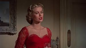
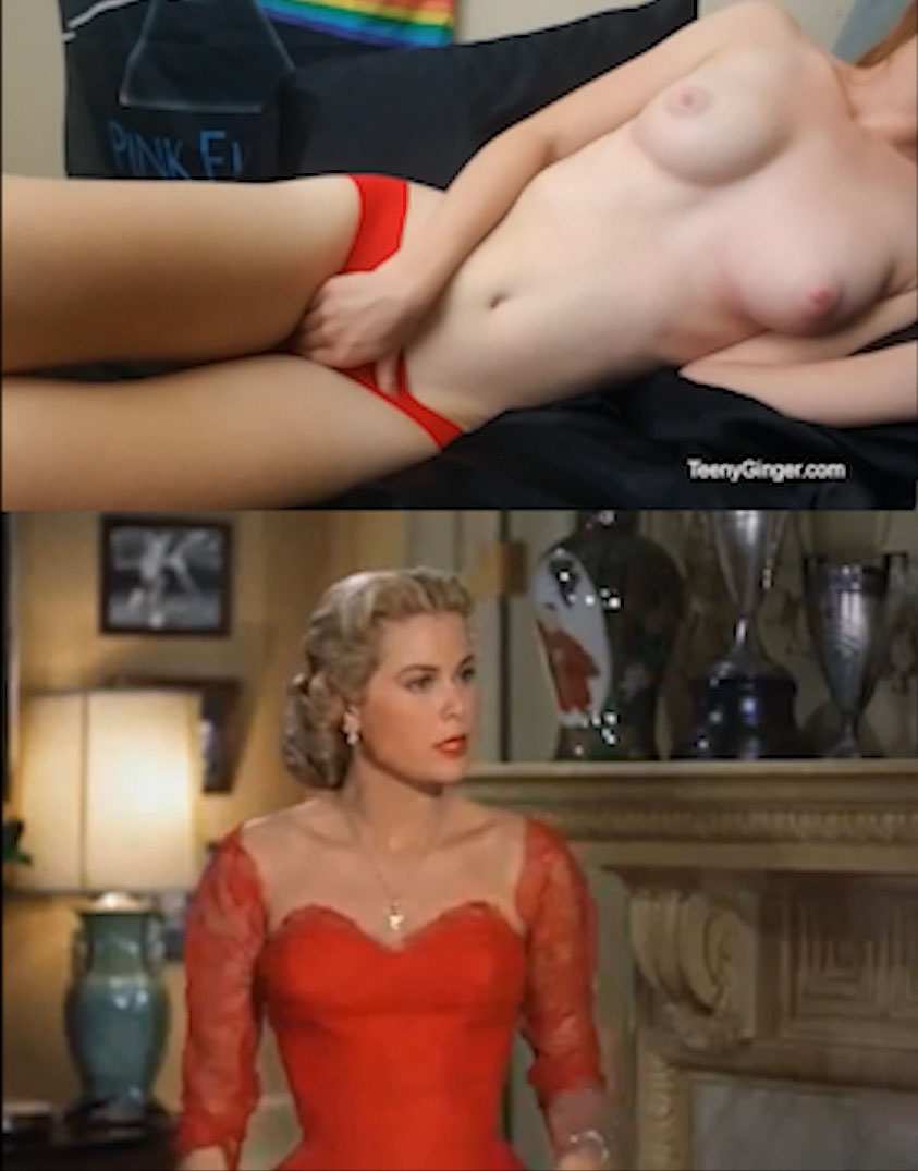
Teenyginger VS Grace Kelly in Dial M For Murder
Common theme; red clothing
Interesting correlation between two different kinds of video from a different era with a similar erotic style. In both video's red is portrayed as a sensual color. In combination with the skin of the female it projects an erotic message of desire. You could argue that both images are made for men. In both fragments women try to appeal the men by dressing up in a certain manner. However; you can also argue that the video of Teenyginger is feminist; because despite making content aimed at men, she is the author of the video and decides what she shows and how. Besides that, all the money she earns with the video goes into her own pocket, that while Hithcock decided how Grace Kelly would look in the film.
We must ultimately be able to account for the most basic fact of aesthetic experience, the fact that delight lies somewhere between boredom and confusion.’ 5 Situations of either extreme immediacy or extreme reliability do not contribute as might be expected to the actual richness of a media experience. Most people need some kind of interplay between surprise and uniformity to keep them actively involved.
In media accidents like these, the void involves the unknown – that which cannot be described or planned for. These empty spaces of non-understanding trigger a horror vacui: a fear of voids to which nothing else can be compared and that is beyond all possibilities of calculation, measurement or imitation.

