User:Thalia de Jong/assessment TV commercials
ROKEN IS ZÓÓÓ
For these last two months, I have been working on several television commercials for an anti-smoking campaign for the Dutch Cancer Society, the KWF. It was fun! And stressful. And a lot of hard work. And fun!
I worked together with my friend Julia Veldman. She used to be my number one rival back when I was but a design baby in Eindhoven. I always envied her work and the way that it was completely different from mine and so intuitive and smart. Now we combine forces from time to time and I think we make a great team.
The assignment:
Create three short commercials around the slogan 'Roken is zóóó...' (Smoking is sóóó...) and fill in the blanks with something that is crazy outdated. The point of the campaign is not to point out that smoking kills (we all know that by now) but rather that smoking is way too uncool for us youngsters. The target audience is aged 15 to 25.
Me and Julia were not the only ones asked to create commercials and there were at least 8 other filmmakers envolved in creating some 50 commercials. In the end a selection would be made and by now, we know that two of our three commercials will be aired on television on the 15th. If we finish the third one on time and it's as good as planned for it to be, that too will be aired, be it a week later.
So. We pitched some 12 ideas. Selected it down to three.
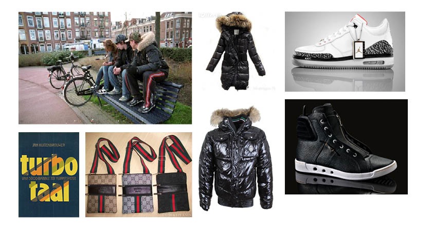
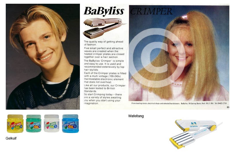
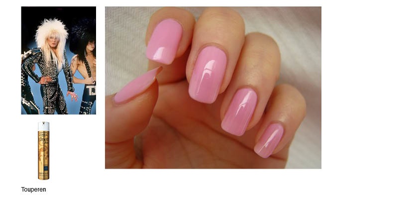
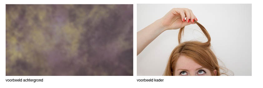
Then we found some reference pictures.
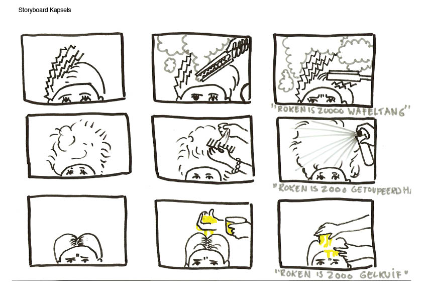
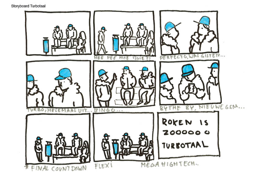
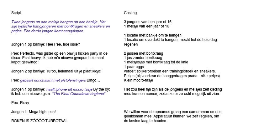
Made some storyboards.
Made a few tests
And ended up with these two that made the cut.
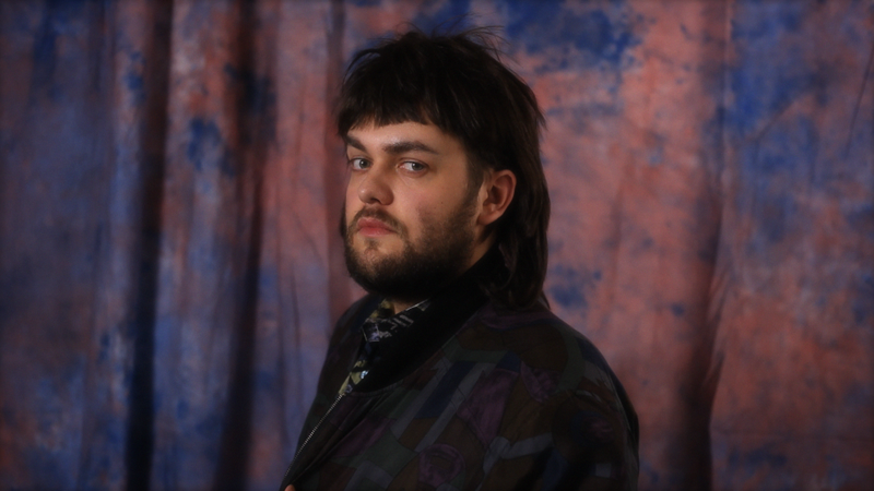
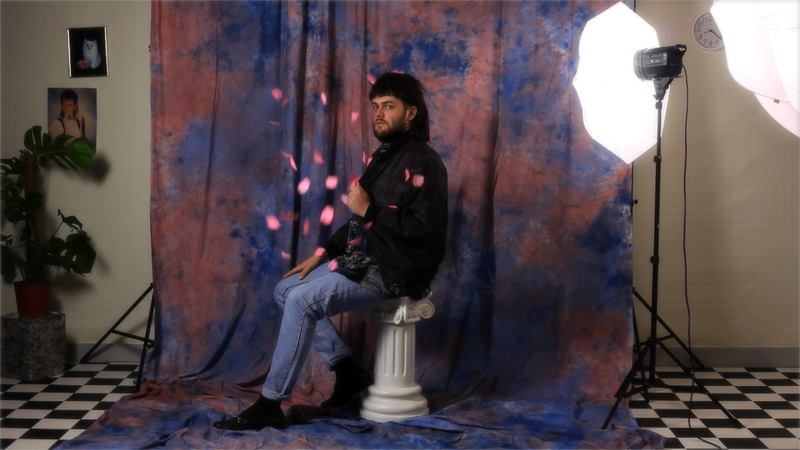
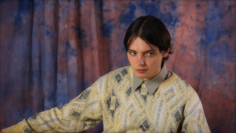
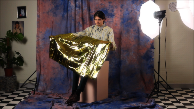
The third commercial will be a series of 80's photo portraits, filmed right before the shot is taken. I won't show but some stills, since the series isn't done yet.
But have a look at two of our twelve models: Niek and Dennis! They look, well... at the very least they look 80's appropriate...

