Counter-Tourist Information Center/Communication
A page for the SI24 communication documentation!
Deliverables
- ...
Styleguide
Inspired by Rotterdam Tourist Information
Here you can also find the design system of the Gemeente Rotterdam: https://www.figma.com/design/ZWSC4gCrOXRUR9UX3aoZ8x/Gemeente-Rotterdam-Design-System
Font they Use is PX Grotesk, [1]. Expensive Swiss font with many styles
Found a repo with the font in downloadable format, if we want to be cheeky 🏃🕴🏻💰
https://github.com/fictive-kin/pmarchive/tree/master/static/fonts
Since we don't want to be cancelled in the micro-typography sphere we opted for FLOSS options. The fonts used on the website can be found here https://git.xpub.nl/XPUB/SI24/src/branch/main/web/fonts
Colors used for website(stolen from Rotterdam tourist information): dark grey color: #212529
bright green color: #81d742
Process
Brochure
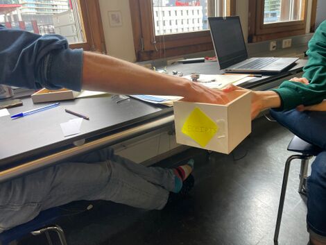
We each wrote names and places on pieces of paper, and put them in a box. We then randomly grabs two to combine name and place.
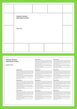
We then loitered to the Rotterdam Tourist Information Center and stocked up on postcards and maps to get inspired to forge the first draft of the brochure (here, made by Senka)
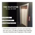
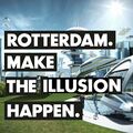
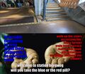
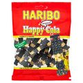
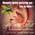
Example ads:
Feel free to add your own ad to the slideshow, we will put them all in the brochure
Meeting 2024-06-17
Meeting with Martino. We made a few decisions:
- We would like to have a map (there seem few projects that use a 'standard' map)
- As there are few projects in the city, we'd like to present locations on this map that are relevant in different ways (e.g. mosquito's, places that sparked thoughts, ...). We will propose a mapping exercise tomorrow, Tuesday 18th, with the whole group.
- The map will be accompanied by ads -- some fictional, some related to projects.
- The back of the map will contain the blurbs -- a non-linear experience
- ...
There are some questions still:
- We would like to provide the brochures in different languages, but don't know if this is feasible (to ask of others)
- ...

