Mia/image analysis
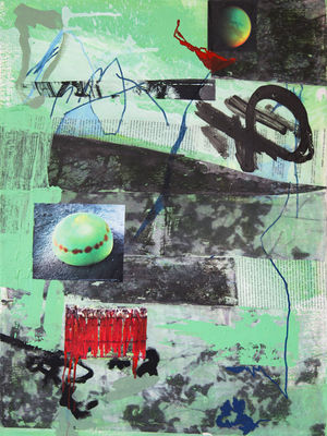
what do I hear from you: (Analysis of Mia's picture (Untitled, 2018))
What are we seeing? Collage of images Ask myself how it's made Mixed media Print or silkscreen? Squeegee, screen print It looks like some parts were made intuitively Arbitrary vs. controlled Layers, textures Layers make space 2 spheres (you make a connection before you think of what they are) Sphere like a fruit and a planet Aerial perspective (make distance with colour) Gradation – vibration Chains, locks on bridges, people in orange pyjamas that go to Guantanamo Bay (prison and torture) Could be a cut-out of a photo --> but it seems painted because it's the same colour as lines above (red drip) Space structures 2 spheres and 2 aggressive shapes – red cutting, aggressive lines, sharp --> SOFT vs. SHARP Blue line – childish approach, naive, spontaneous (filing the lines) A stencil (a piece of paper on top of another) left top corner Repetition above (green has a continuity on different levels) left part Negative part of this same pattern from black print (right bottom corner) IT'S REALLY HEAVY like someone is in the pain Vegetation I see a tree, a face … Cut and paste, like in digital work, but it's not digital – interesting composition Why do you think it's not digital? Could be a photo cut and pasted in certain software. – But I can see the paint over! Spheres are from different environment (planet, object from flora that we cannot identify, a balloon full of liquid, but it has some organic texture) One is celestial and one is terrestrial, you see a similarity of form but in a different association – a balance. Space is doing it all the time Playing with form and space The red colour is connected of the two spheres, it is really popping out Why do you think she made it? It's a pleasure of making things Could be that she had a lot of energy, she felt aggressive? Could have underlying meanings, I can only guess These things might have a relationship with the text, all things look very intentional It doesn't matter to read the text, maybe it's the intention to not be able to read the text I'm sure it's not a random text, I think it's an article What would you associate it, context? Basquiat, expressionism ‘Bloody universe’ Transferring imagery from elsewhere (with acetate) - Rauschenberg, moving towards pop art Between abs. expressionism and pop art, 60's aesthetic It doesn't seem flat, it also goes back Is this a landscape (so many strong horizontal lines)? Steve used to paint (to get into the immediacy effect – feeling, being excited, producing relations between things, surprise yourself – same with text, writing!) Painting is also discovering where you're going, not necessarily directed or predicted

