User:Marlon/projectproposal
Nov 24, 2013
Introduction
The Template This graduation year I am looking into template culture, inspired by a Samsung smartphone commercial that promises its customers a chance to 'design their lives'. Mobile phones, apps and social networking sites are branded as services we can use to express ourselves online or to display our distinct personalities. But in reality, there is something quite depersonalizing about it: we are all taking the same type of pictures on the same type of phone and uploading them to the same website.
Not only do these devices and websites guarantee some kind of palette to 'paint your life' more beautiful, but extra features will help users manage every aspect of their busy lives. Not manage, compose! A semblance of control is promoted, not just related to lifestyle, but over the use of these applications as well. You decide the content, style and the presentation. But is this promise fulfilled or are they not just templates (or interfaces, filters) with minimal customization options? And do these templates, by giving users the option to customize and personalize, only generate a mass of homogenous content?
Part of my investigation will be the template as a very literal (media)object: as a web framework, the parameters of the interface a user encounters, the available colors and fonts of a Tumblr layout or the filters of an Instagram account. But the topic becomes more interesting when the template signifies the joined effort of all these applications to generate a sort of predictable (and economically valuable) avatar version of ourselves.
This topic is connected to my interest in user-generated content (or artwork) that is created within the limitations of these applications or that manages to break them. Think of: mods for games, subtitles for illegal downloads, reviews on Youtube or beauty pageants on Instagram. Related are also works of fan art or fan fiction, created from a more soft or flexible template, but still using the original material as a framework.
Methodology My research should also focus on form, on the graphic or visual language of digital culture, the boundaries and technical limitations of a medium. This has been my trusted method of working: recontextualising, repurposing or reusing content I find online. This time, the images, comments, the posts are not the important aspects, the manner they are presented to us is. Through the interfaces, templates and control panels we encounter while we're browsing, uploading and contributing. The template becomes the content.
Form Visual exploration? Collection of small (graphic) projects? A catalogue?
Relation to previous practice
Research trajectory During the last two years of my bachelor, a fascination with the viral workings of the World Wide Web led to a number of projects. I focused on the process of finding information, especially in the case of current news events. Via image search engines or social networking sites I collected comments or images related to a topic and then attempted to recreate these stories or reinterpret the information. Some examples:
Tsunami by proxy (2011)
This graduation piece is a collection of around 1200 postcards, printed with popular images found online that depict the earthquake, tsunami and nuclear disaster in Japan. (Natural) disasters are visual stories and the images that most accurately capture the imagination of the viewer are very popular online, even if they are stills from movies or images from other disasters.
PSYOP (2010)
PSYOP is a collection of forum posts 'published' as a poetry book. The posts are comments on the 'Balloon boy hoax' of October 2009, as I was struck by how much meaningless content was produced by the online spectators of the story. The story went viral, picked up by the traditional media and more people rushed to their computer to share their advice, opinions, links and hastily generated gifs. The book is a chronological narration of the hoax, interspersed with quotes and screen captures from news broadcasting (a lot of the same messages and images repeated - a logical effect of 24/7 news coverage).
At PZI, my research stepped a bit away from the news items. And I became more interested in sharing, peer-to-peer networks and how these notions are made visual. During the second trimester this resulted into an investigation that can be divided into three sections:
Pirate Bay Archive
Karel Bilek created an archive of the Pirate Bay, a website that indexes (illegal) content available for download. The archive, an 75MB .XML file (a format used to store data), contains over 1,6 million links to torrent files. That would make it possible to recreate The Pirate Bay if it would ever be taken offline. As a very simple exercise I randomly displayed one item of the list on a website, with a link to the download. This gives users access to an enormous amount of content, but without the 'search option' it loses almost all its functionality.
.NFO-files
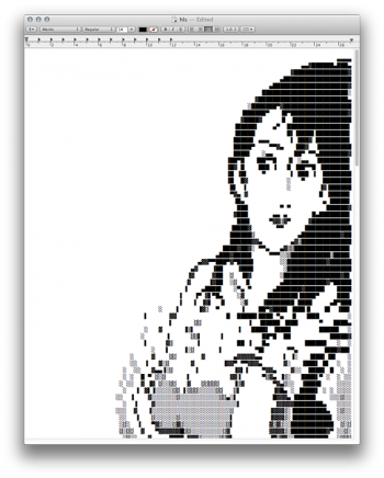
.NFO files are a prominent tradition within the file sharing subculture. In the past the limited technical possibilities set boundaries for how the file looked and although the software used to create these files has developed significantly, the overall look of an .NFO file has remained the same, all due to its nostalgic value. I am impressed with how the creators of these files manage to construct something great with very little: a limited toolbox of white on black or black on white symbols is used to make impressive pieces of work. The files have changed from a necessity to a form of expression. It is the "corporate identity" of individuals or groups of people that manifest themselves online.
Peer-to-peer-to-Peer-to-peer
A collage of images, downloaded via Google Images and printed on seperate pages, that symbolize peer-to-peer networks. The printed pages overlap, connecting the peers of one diagram to those of another, forming a larger network of peer-to-peer networks.
Peers can form a network of nodes in which they share data peer-to-peer, without any central coordination. Currently the term "peer-to-peer" is at the height of its popularity, something you see reflected in the striking amount of images visualising the system that circulate the Web. Though the system stays the same, its use is in constant development. This "evolution" can be observed when looking at these images: the older images are smaller in file-size, with low-tech graphics depicting desktop computers, while the newer versions illustrate the increasing social impact of the peer-to-peer system.
Reading list
Books
1. Andrejevic, M (2004) Reality TV
Chapter Two: The Promise of the Digital Revolution
2. Galloway, A (2012) The Interface Effect
3. Manovich, L (2008) Software Takes Command
Practical steps
October/November
1. Start by making (very) small projects, to avoid getting stuck in thinking, reading and conceptualizing. They will focus on analyzing each aspect of a template, without the actual content. What does an Instagram filter look like by itself? What are the visual aspects of an interface? How are mobile phone apps branded and advertised? I will extract these elements, catalogue them, display them in a different context?
2. Collect and document these projects in a work log.
3. Of these small projects I will hopefully be able to select one or two or three that will lead to further investigation and turned into a bigger, conceptually stronger project.


