Joana's Sum.: Difference between revisions
No edit summary |
|||
| Line 61: | Line 61: | ||
[[File:Score_for_“Trio_B,_Running”_.jpg|400px| center]] | [[File:Score_for_“Trio_B,_Running”_.jpg|400px| center]] | ||
'''1. Yvonne Rainner, a hybrid of composition methods using languages from both mathematics and linguistic creating structures based on definitions and path mapping. | |||
''' | |||
[[File:Childs_geo.png|550px|center|http://www.pcah.us/posts/238_from_an_art_of_refusal_lucinda_childs_dances_in_silence_1973_78]] | [[File:Childs_geo.png|550px|center|http://www.pcah.us/posts/238_from_an_art_of_refusal_lucinda_childs_dances_in_silence_1973_78]] | ||
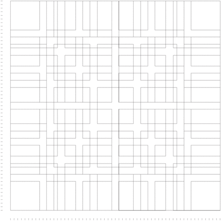
2. For her choreography piece Melody Excerpt, Lucinda Childs, developed a ‘grid’ structure to represent all possible pathways that each dancer would traverse during the performance. The units used for stage measurement were in feet; in this version, the dimensions are 32 by 28 feet. Each dancer is represented by a distinct color. | |||
'''2. For her choreography piece Melody Excerpt, Lucinda Childs, developed a ‘grid’ structure to represent all possible pathways that each dancer would traverse during the performance. The units used for stage measurement were in feet; in this version, the dimensions are 32 by 28 feet. Each dancer is represented by a distinct color.''' | |||
[[File:Trisha_Brown,_Untitled_(Locus),_1975,_graphite3.jpg|400px|center]] | [[File:Trisha_Brown,_Untitled_(Locus),_1975,_graphite3.jpg|400px|center]] | ||
'''3. Trisha Brown defines dancing as something "in between geometry and the gesture” ...as in geometry everything begins, with points and everything else is a construction. | |||
''' | |||
[[File:Thinking_with_Type_Grid_7.gif|450px| center |http://www.thinkingwithtype.com/contents/grid/]] | [[File:Thinking_with_Type_Grid_7.gif|450px| center |http://www.thinkingwithtype.com/contents/grid/]] | ||
4. Since then, the grid has been commonly used as an ordering system, it would rationalize the composition process, providing both a creative and technical tool. The grid not only establishes order, but also the relations within the elements to be displayed, attributing specific inner network in the page layout. Karl Gestner would define the grid as a program: “if the grid is considered as a proportional regulator, a system, it is a program par excellence” (at Designing Programs - pp.16) | |||
'''4. Since then, the grid has been commonly used as an ordering system, it would rationalize the composition process, providing both a creative and technical tool. The grid not only establishes order, but also the relations within the elements to be displayed, attributing specific inner network in the page layout. Karl Gestner would define the grid as a program: “if the grid is considered as a proportional regulator, a system, it is a program par excellence” (at Designing Programs - pp.16)''' | |||
</small> | </small> | ||
| Line 88: | Line 92: | ||
‘’’Choreographing Design: Graphic | ‘’’Choreographing Design: Graphic Events’’’ | ||
<small>Primarily my experiments focus on the construction of temporality, the time (duration) within a particular constructed space. I am interested in reflecting on how digital technology often transforms the function and perception of space and time. The construction of space in this case, is equivalent to the production of a surface, in the generic sense it means a flat space to display, but which deals with similar questions of third dimensional space. As in Yvonne Rainer’s words, organizing space is often a compromise between a set of open and closed possibilities: “First, if it is true that spatial order organizes an ensemble of possibilities (e.g.. by a place in which one can move) and interdictions (eg. by a wall that prevents one from going further), then the walker actualizes some of this possibilities..But he also moves them about he invents others.” (pp.36) - Y. Rainer at Mind is a muscle | <small>Primarily my experiments focus on the construction of temporality, the time (duration) within a particular constructed space. I am interested in reflecting on how digital technology often transforms the function and perception of space and time. The construction of space in this case, is equivalent to the production of a surface, in the generic sense it means a flat space to display, but which deals with similar questions of third dimensional space. As in Yvonne Rainer’s words, organizing space is often a compromise between a set of open and closed possibilities: “First, if it is true that spatial order organizes an ensemble of possibilities (e.g.. by a place in which one can move) and interdictions (eg. by a wall that prevents one from going further), then the walker actualizes some of this possibilities..But he also moves them about he invents others.” (pp.36) - Y. Rainer at Mind is a muscle | ||
Similar to Rainer’s approach, in these experiments both time and space can be compared to ‘containers’, which hold potential events: “… the mode of resistance in Rainer’s work can be defined in terms of both the temporal and the spatial structures - the one hour and forty five minutes and the theatre architecture - being considered as ‘containers’ within which she manipulates or elaborates upon conventional expectations” (pp.68) at Mind is Muscle . The metaphor of the container has too been introduced by design thinkers, relating to the formal structures which are built to contain the graphic content. “Design … it holds emptiness or nothingness within”, say Kenya Hara. In this context, design may work as well as a container, but of fusion of Rainer’s and Hara’s concepts, a container for graphic events to unfold. | Similar to Rainer’s approach, in these experiments both time and space can be compared to ‘containers’, which hold potential events: “… the mode of resistance in Rainer’s work can be defined in terms of both the temporal and the spatial structures - the one hour and forty five minutes and the theatre architecture - being considered as ‘containers’ within which she manipulates or elaborates upon conventional expectations” (pp.68) at Mind is Muscle . The metaphor of the container has too been introduced by design thinkers, relating to the formal structures which are built to contain the graphic content. “Design … it holds emptiness or nothingness within”, say Kenya Hara. In this context, design may work as well as a container, but of fusion of Rainer’s and Hara’s concepts, a container for graphic events to unfold. | ||
The piece ‘Mouse Event’(2.1), follows this reflection of a surface as a container for possible events to unfold. Here I present a webpage with a black background, which displays the mouse position when the cursor is still, and switches to a timer, when the mouse moves. The minimal setting, at the sound of the music Nocturne op.9 No.2 Andante, from Chopin, allows for an augmented attention to the movement of the mouse. Although this movement is some sort of a ’neutral doing’, this webpage allows the user to move in the screen, but following no purpose. (3. Yvonne Rainer, “A Quasi Survey of Some ‘Minimalist’ Tendencies in the Quantitatively Minimal Dance Activity Midst the Plethora, or an Analysis of Trio A,” in Gregory Battcock, ed., Minimal Art, A Critical Anthology (New York: E. P. Dutton, 1968), 263–73.). A situation in which the user is highly aware of its presence, while challenging the line between inertia and movement. | The piece ‘Mouse Event’(2.1), follows this reflection of a surface as a container for possible events to unfold. Here I present a webpage with a black background, which displays the mouse position when the cursor is still, and switches to a timer, when the mouse moves. The minimal setting, at the sound of the music Nocturne op.9 No.2 Andante, from Chopin, allows for an augmented attention to the movement of the mouse. Although this movement is some sort of a ’neutral doing’, this webpage allows the user to move in the screen, but following no purpose. (3. Yvonne Rainer, “A Quasi Survey of Some ‘Minimalist’ Tendencies in the Quantitatively Minimal Dance Activity Midst the Plethora, or an Analysis of Trio A,” in Gregory Battcock, ed., Minimal Art, A Critical Anthology (New York: E. P. Dutton, 1968), 263–73.). A situation in which the user is highly aware of its presence, while challenging the line between inertia and movement. | ||
The use of spatial field to reflect on the use of rhythmic or non-rhythmic articulation of basic movements, is a major aspect in choreographic methods. In the design field, this can be translated to conventionalized movements, such as scrolling a surface. The scrolling as the main movement, connects with the idea of depicting a basic, conventional ‘digital-user’ type of motion, which departs from ‘real bodies’ and is performed at ‘real time’. In this particular case, a strong influence on my work came from Yvonne Rainers’ continuous attention to found movement and its incorporation as material for composing new choreographic arrangements: “Rainer selected found movement as her material - whether from everyday pedestrian or work activity, ballet, contemporary or popular dance, mime or vaudeville (…) and choreographed specific patterns and combinations from this material… ” p.19 (at Mind is a muscle - dans.rtf) (+ link hand movie). | The use of spatial field to reflect on the use of rhythmic or non-rhythmic articulation of basic movements, is a major aspect in choreographic methods. In the design field, this can be translated to conventionalized movements, such as scrolling a surface. The scrolling as the main movement, connects with the idea of depicting a basic, conventional ‘digital-user’ type of motion, which departs from ‘real bodies’ and is performed at ‘real time’. In this particular case, a strong influence on my work came from Yvonne Rainers’ continuous attention to found movement and its incorporation as material for composing new choreographic arrangements: “Rainer selected found movement as her material - whether from everyday pedestrian or work activity, ballet, contemporary or popular dance, mime or vaudeville (…) and choreographed specific patterns and combinations from this material… ” p.19 (at Mind is a muscle - dans.rtf) (+ link hand movie). | ||
The Movement-Visibility (2.2), is a collection of webpages that experiments with the sense of place within a text. While the design constrains the display options of the text, it allows for a landscape of movements within the surfaces of the webpages by scrolling in it. | The Movement-Visibility (2.2), is a collection of webpages that experiments with the sense of place within a text. While the design constrains the display options of the text, it allows for a landscape of movements within the surfaces of the webpages by scrolling in it. | ||
Following my interest on systems of measurement and representational conventions of body proportions, I started reflecting on the meaning of its use and developing a more subjective understanding in my design practice. There is a multitude of built codes on the proportions and dimensions of spaces to be applied to design methods. In these could be included the units for measuring space, such as pixels, and ‘em’, or the ‘Golden Ratio’, to set the page proportion to value of 1:1.618. As a counterpoint to such standards, the ‘hand size text block’ (2.3) represents a thought experiment that relates proportions and measurements to the use of organic units while composing a webpage, enhancing the relations between the screen and the presence of the body. The use of centimeters in the html / css structure, is a way to speak closer to the body measurement conventions and proportions of the human scale. | Following my interest on systems of measurement and representational conventions of body proportions, I started reflecting on the meaning of its use and developing a more subjective understanding in my design practice. There is a multitude of built codes on the proportions and dimensions of spaces to be applied to design methods. In these could be included the units for measuring space, such as pixels, and ‘em’, or the ‘Golden Ratio’, to set the page proportion to value of 1:1.618. As a counterpoint to such standards, the ‘hand size text block’ (2.3) represents a thought experiment that relates proportions and measurements to the use of organic units while composing a webpage, enhancing the relations between the screen and the presence of the body. The use of centimeters in the html / css structure, is a way to speak closer to the body measurement conventions and proportions of the human scale. | ||
1. | '''1.''' Photobook: installation/sculpture: https://pzwiki.wdka.nl/mediadesign/PHOTOBOOK//_finale | ||
2. | |||
2.1 Mouse Event + print version Yammi Ichi : http://pzwart1.wdka.hro.nl/~jo/notebook/web_exp/one/loationmouse.html | '''2.''' Website experiences (durational spaces) : http://pzwart1.wdka.hro.nl/~jo/notebook/series/untitled.html | ||
'''2.1''' Mouse Event + print version Yammi Ichi : http://pzwart1.wdka.hro.nl/~jo/notebook/web_exp/one/loationmouse.html | |||
Curtain falling - scrolling: http://pzwart1.wdka.hro.nl/~jo/notebook/web_exp/two/linedown.html | Curtain falling - scrolling: http://pzwart1.wdka.hro.nl/~jo/notebook/web_exp/two/linedown.html | ||
2.2 Movement-Visibility collection (spacing) - scrolling as main (micro-) movement feature. simultaneity / positioning / length: http://pzwart1.wdka.hro.nl/~jo/rehearsal_Feb./two/scroll-multiple2.html | |||
2.3 http://pzwart1.wdka.hro.nl/~jo/notebook/hand_centimeters.html | '''2.2''' Movement-Visibility collection (spacing) - scrolling as main (micro-) movement feature. simultaneity / positioning / length: http://pzwart1.wdka.hro.nl/~jo/rehearsal_Feb./two/scroll-multiple2.html | ||
'''2.3''' http://pzwart1.wdka.hro.nl/~jo/notebook/hand_centimeters.html | |||
</small> | </small> | ||
| Line 148: | Line 159: | ||
▪ Sound: my voice; background noise and silence. | ▪ Sound: my voice; background noise and silence. | ||
[[File:Screen_Shot_2016-03-17_at_20.33.50.png|400px | [[File:Screen_Shot_2016-03-17_at_20.33.50.png|400px]] [[File:Screen_Shot_2016-03-17_at_20.34.07.png|350px]] [[File:Captura_de_ecrã_2016-03-19,_às_19.37.00.png|200px]] | ||
[[File:Perfor_live_code_jochicau_projection.png|400px|left]] | |||
''Micro-Structure'' | ''Micro-Structure'' | ||
| Line 156: | Line 168: | ||
[[File:Perfor_live_code_jochicau_screen.png|400px|center]] | [[File:Perfor_live_code_jochicau_screen.png|400px|center]] | ||
</small> | </small> | ||
Revision as of 19:42, 19 March 2016
THESIS ~ Joana
Introduction
My research project explores compositional methods in graphic design and choreography. By investigating diverse graphic design methods, and a selection of post-modern choreographic approaches, I aim to research what choreographic qualities could be implemented and explored in design. And what powers of invention or transformation it sets free. Transdisciplinarity becomes a key concept for this methods, as to explain the dynamic movement of crossing such boundaries and opening a new field of possibilities:
Choreographic Concepts >>>> Graphic Design = New Compositional Process (Re-articulation/ Co-formation of compositional and thematic concerns.)
I believe design methods can learn from methods in choreography, challenging the conventional design thinking. ‘Choreographing design’ is then a creative arrangement, a pursuit for a new composition methodology/ system. There are two components in it: the design, which uses graphic elements to communicate; and the choreography driven by principles of movement and the presence of the body. The essential lies in between, in the process of understanding design beyond itself towards a choreographic approach.
My thesis will be divided in two parts: in the first part I will be concentrating in relating the references from both the design and choreography spectrum, structuring it and unveiling common threads. In the second part I will reflect on how such body of knowledge can inform my practice in the translation of choreographic principles to design, and how these can be reflected upon the current time and current circumstances.
References:
_
Design
Karl Gestner; Geoff Cox and McLean; Kenya Hara.
_
Choreography
Yvonne Rainer; Merce Cunningham; Lucinda Childs; Anne Teresa De Keersmaeker; Wiiliam Foresythe. _
Brian Massumi (media theorist); Alva Noë (philosopher/ EEC programme - Embodied Embedded Cognition)
PART 1.
The Common Ground
A cross-referencing system: http://pzwart1.wdka.hro.nl/~jo/inventory/
▪ The common languages: Mathematical and linguistic, numeric and alphabetic systems for defining/ordering (time and space). Various units of measurement have been applied to systems of order, and its application traversed various disciplines from ancient to contemporary times.
▪ The common structures: Composition (time and space): Grid Systems / Scores and Scripts. - Formal Set of principles to be applied. The process of composition has raised questions of body proportions, and our relation to time and space.
▪ On (actual and virtual) movement: Acknowledging a critical and exploratory approach to how the human movement, perception and embodiment work may give design new pointers. Presenting movement as the "basis of accessibility", allowing humans into "achieving access to the environment" (Alva Noë).
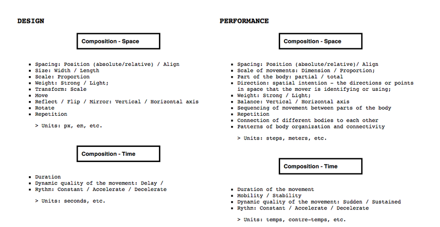
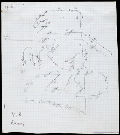
1. Yvonne Rainner, a hybrid of composition methods using languages from both mathematics and linguistic creating structures based on definitions and path mapping.
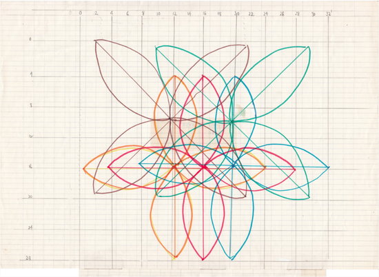
2. For her choreography piece Melody Excerpt, Lucinda Childs, developed a ‘grid’ structure to represent all possible pathways that each dancer would traverse during the performance. The units used for stage measurement were in feet; in this version, the dimensions are 32 by 28 feet. Each dancer is represented by a distinct color.
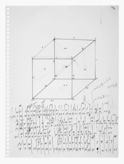
3. Trisha Brown defines dancing as something "in between geometry and the gesture” ...as in geometry everything begins, with points and everything else is a construction.
4. Since then, the grid has been commonly used as an ordering system, it would rationalize the composition process, providing both a creative and technical tool. The grid not only establishes order, but also the relations within the elements to be displayed, attributing specific inner network in the page layout. Karl Gestner would define the grid as a program: “if the grid is considered as a proportional regulator, a system, it is a program par excellence” (at Designing Programs - pp.16)
PART 2.
‘’’Establishing new Grounds: Choreographing Design’’’
For the most part of my design work I use digital media tools, formats and abstract formal languages. Being digital code, html and css structures along with various scripts my main composition tools. The screen my stage, and the viewers [1] , my audience. My creative environment is therefore embedded in the conventions and formal constrains of such tools and technologies, often leading to recursive acts of critical reflection upon how to relate to tools and the environment I am in ?
[1] Viewer is used among other possible designations — user, reader, spectator, interactor, etc. and in this case referring to mostly digital devices. — it is though relevant to highlight the presence of the body: being here and now; and its perceptive and interpretative role.
‘’’Choreographing Design: Graphic Events’’’
Primarily my experiments focus on the construction of temporality, the time (duration) within a particular constructed space. I am interested in reflecting on how digital technology often transforms the function and perception of space and time. The construction of space in this case, is equivalent to the production of a surface, in the generic sense it means a flat space to display, but which deals with similar questions of third dimensional space. As in Yvonne Rainer’s words, organizing space is often a compromise between a set of open and closed possibilities: “First, if it is true that spatial order organizes an ensemble of possibilities (e.g.. by a place in which one can move) and interdictions (eg. by a wall that prevents one from going further), then the walker actualizes some of this possibilities..But he also moves them about he invents others.” (pp.36) - Y. Rainer at Mind is a muscle
Similar to Rainer’s approach, in these experiments both time and space can be compared to ‘containers’, which hold potential events: “… the mode of resistance in Rainer’s work can be defined in terms of both the temporal and the spatial structures - the one hour and forty five minutes and the theatre architecture - being considered as ‘containers’ within which she manipulates or elaborates upon conventional expectations” (pp.68) at Mind is Muscle . The metaphor of the container has too been introduced by design thinkers, relating to the formal structures which are built to contain the graphic content. “Design … it holds emptiness or nothingness within”, say Kenya Hara. In this context, design may work as well as a container, but of fusion of Rainer’s and Hara’s concepts, a container for graphic events to unfold.
The piece ‘Mouse Event’(2.1), follows this reflection of a surface as a container for possible events to unfold. Here I present a webpage with a black background, which displays the mouse position when the cursor is still, and switches to a timer, when the mouse moves. The minimal setting, at the sound of the music Nocturne op.9 No.2 Andante, from Chopin, allows for an augmented attention to the movement of the mouse. Although this movement is some sort of a ’neutral doing’, this webpage allows the user to move in the screen, but following no purpose. (3. Yvonne Rainer, “A Quasi Survey of Some ‘Minimalist’ Tendencies in the Quantitatively Minimal Dance Activity Midst the Plethora, or an Analysis of Trio A,” in Gregory Battcock, ed., Minimal Art, A Critical Anthology (New York: E. P. Dutton, 1968), 263–73.). A situation in which the user is highly aware of its presence, while challenging the line between inertia and movement. The use of spatial field to reflect on the use of rhythmic or non-rhythmic articulation of basic movements, is a major aspect in choreographic methods. In the design field, this can be translated to conventionalized movements, such as scrolling a surface. The scrolling as the main movement, connects with the idea of depicting a basic, conventional ‘digital-user’ type of motion, which departs from ‘real bodies’ and is performed at ‘real time’. In this particular case, a strong influence on my work came from Yvonne Rainers’ continuous attention to found movement and its incorporation as material for composing new choreographic arrangements: “Rainer selected found movement as her material - whether from everyday pedestrian or work activity, ballet, contemporary or popular dance, mime or vaudeville (…) and choreographed specific patterns and combinations from this material… ” p.19 (at Mind is a muscle - dans.rtf) (+ link hand movie). The Movement-Visibility (2.2), is a collection of webpages that experiments with the sense of place within a text. While the design constrains the display options of the text, it allows for a landscape of movements within the surfaces of the webpages by scrolling in it.
Following my interest on systems of measurement and representational conventions of body proportions, I started reflecting on the meaning of its use and developing a more subjective understanding in my design practice. There is a multitude of built codes on the proportions and dimensions of spaces to be applied to design methods. In these could be included the units for measuring space, such as pixels, and ‘em’, or the ‘Golden Ratio’, to set the page proportion to value of 1:1.618. As a counterpoint to such standards, the ‘hand size text block’ (2.3) represents a thought experiment that relates proportions and measurements to the use of organic units while composing a webpage, enhancing the relations between the screen and the presence of the body. The use of centimeters in the html / css structure, is a way to speak closer to the body measurement conventions and proportions of the human scale.
1. Photobook: installation/sculpture: https://pzwiki.wdka.nl/mediadesign/PHOTOBOOK//_finale
2. Website experiences (durational spaces) : http://pzwart1.wdka.hro.nl/~jo/notebook/series/untitled.html
2.1 Mouse Event + print version Yammi Ichi : http://pzwart1.wdka.hro.nl/~jo/notebook/web_exp/one/loationmouse.html Curtain falling - scrolling: http://pzwart1.wdka.hro.nl/~jo/notebook/web_exp/two/linedown.html
2.2 Movement-Visibility collection (spacing) - scrolling as main (micro-) movement feature. simultaneity / positioning / length: http://pzwart1.wdka.hro.nl/~jo/rehearsal_Feb./two/scroll-multiple2.html
2.3 http://pzwart1.wdka.hro.nl/~jo/notebook/hand_centimeters.html
Applied Research
‘’’The Piece: Live Coding / WebPage Act I, II and III ’’’
- from choreography - - to design:
A deeper consciousness of the presence of the body (embodiment) in design, which would highlight the condition of users as being temporally present, spatially aware, and considering movement and ephemerality as an integral aspect of designing.
The choreographic processes may employ as well improvisation and chance strategies for the purpose of developing innovative solutions, exploring an interplay between pattern, variation, and repetition. This strategy, when applied to design, allows for non-linear narration, and new ways of navigation, turning the screen into a stage for new relations and operations between elements.
While developing compositional processes in design that accommodate a scope of variable choreographic elements, I encountered some difficulties in communicating such processes, or of designing in a way that can be interpreted by readers. - a way to both reflect on the methods and share them with a broader audience, more heterogeneous readership.
I started using esoteric programming languages as an attempt to overcome the abstractness of algorithmic code and simultaneously as a way to develop my own design language which derives from choreographic concepts. Esoteric programming languages, also called esolang, are used when writing software, integrating a new grammar to the existing one. Although an esolang doesn’t have a proper functionality, it is used in combination with other programming languages to explore alternative ways of composing and writing code. Another advantage of esolang, is the fact that it allows for a minimalistic set of instructions based on key terms, in these case relating to the predefined choreographic parameters in the design composition.
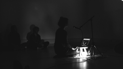
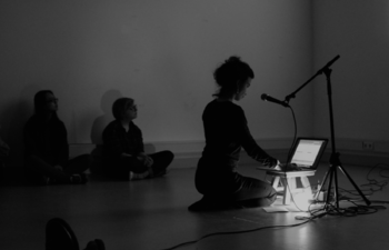
This way, a new hybrid form of composition combining principles of choreography and formal structures of coding is born. And whilst in the other works the ‘choreographic code’ is being executed by the computer, requiring a more or less active role by the user; in this “Piece” the ‘choreographic code’ may as well be performed by the designer, in the form of a live performance.
- WHY live performance?
▪ Process is exposed. Revealing the generative nature of composition: the way the piece unfolds reflect the conditions of its creation; process of becoming: becoming a structure, becoming concepts in the form of words, text, visual, sounds.. drawing on Deleuze and Guattari to understand creation as a compositional possibility, a mode of balancing that allows for an autonomy of creation as a kind of becoming- environment.
▪ The performative aspect of the act of coding is a way to make more transparent the process of composition and to enhance the nuances and transient caracter of coding. When the scripts are generated in real time, the choreographic decisions are taken in real time, instead of being completely predefined.
▪ The way the piece unfolds reflects the conditions of its creation: not to look at an object but being part of an event.
▪ Embodiment: being present, here and now. Breaking the distancing between mind/body, self/other, subject/object, designer/design piece; discovery/invention.
Macro-Structure
▪ One or more projections (depending on how the screen will be divided);
▪ A computer and Me in the center.
▪ The audience sits/ lays around, in an informal setting.
▪ Sound: my voice; background noise and silence.
Micro-Structure
▪ The screen/ webpage projections as stages for cross-referencing choreographic concepts and methods with design scripts, tools and processes.

