Counter-Tourist Information Center/Communication: Difference between revisions
| Line 29: | Line 29: | ||
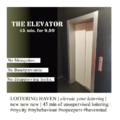
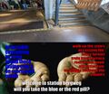
<big>'''Example ads:'''</big><br> | <big>'''Example ads:'''</big><br> | ||
Feel free to add your own ad to the slideshow, we will add them in the brochure | |||
<gallery mode="slideshow"> | |||
File:mama_gerts_allewway.jpg | |||
File:elevator.png | |||
File:Adv rotterdam.jpg | |||
File:Trycyclead.jpg | |||
File:Roffamem2lorenzo.jpg | |||
[[File:Roffamem1lorenzo.jpg | |||
</gallery> | |||
<!-- here the old version, just in case the slideshow is not appreciated >:((( | |||
[[File:mama_gerts_allewway.jpg|300px]] | [[File:mama_gerts_allewway.jpg|300px]] | ||
[[File:elevator.png|250px]] | [[File:elevator.png|250px]] | ||
| Line 37: | Line 47: | ||
[[File:Roffamem2lorenzo.jpg|335px]] | [[File:Roffamem2lorenzo.jpg|335px]] | ||
[[File:Roffamem1lorenzo.jpg|450px]] | [[File:Roffamem1lorenzo.jpg|450px]] --> | ||
Revision as of 19:20, 12 June 2024
A page for the SI24 communication documentation!
Deliverables
- ...
Styleguide
Inspired by Rotterdam Tourist Information
Font they Use is PX Grotesk, [1]. Expensive Swiss font with many styles
Found a repo with the font in downloadable format, if we want to be cheeky 🏃🕴🏻💰
https://github.com/fictive-kin/pmarchive/tree/master/static/fonts
Since we don't want to be cancelled in the micro-typography sphere we opted for FLOSS options. The fonts used on the website can be found here https://git.xpub.nl/XPUB/SI24/src/branch/main/web/fonts
Colors used for website(stolen from Rotterdam tourist information): dark grey color: #212529
bright green color: #81d742
Process
Brochure
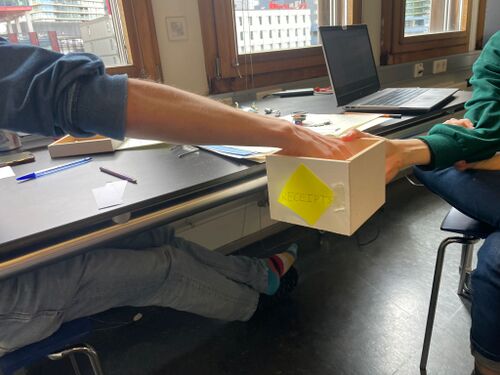
We each wrote names and places on pieces of paper, and put them in a box. We then randomly grabs two to combine name and place.
Example ads:
Feel free to add your own ad to the slideshow, we will add them in the brochure


