Counter-Tourist Information Center/Communication: Difference between revisions
Wang ziheng (talk | contribs) m (→Brochure) |
No edit summary |
||
| Line 40: | Line 40: | ||
File:Roffamem1lorenzo.jpg | File:Roffamem1lorenzo.jpg | ||
File:HappyRemoter.jpg | File:HappyRemoter.jpg | ||
File:Ghost Moving.png | |||
</gallery> | </gallery> | ||
Revision as of 06:44, 16 June 2024
A page for the SI24 communication documentation!
Deliverables
- ...
Styleguide
Inspired by Rotterdam Tourist Information
Font they Use is PX Grotesk, [1]. Expensive Swiss font with many styles
Found a repo with the font in downloadable format, if we want to be cheeky 🏃🕴🏻💰
https://github.com/fictive-kin/pmarchive/tree/master/static/fonts
Since we don't want to be cancelled in the micro-typography sphere we opted for FLOSS options. The fonts used on the website can be found here https://git.xpub.nl/XPUB/SI24/src/branch/main/web/fonts
Colors used for website(stolen from Rotterdam tourist information): dark grey color: #212529
bright green color: #81d742
Process
Brochure
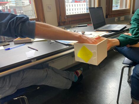
We each wrote names and places on pieces of paper, and put them in a box. We then randomly grabs two to combine name and place.
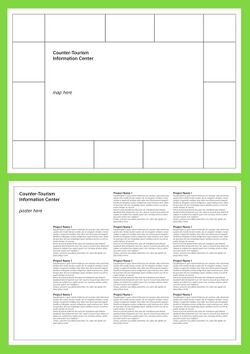
We then loitered to the Rotterdam Tourist Information Center and stocked up on postcards and maps to get inspired to forge the first draft of the brochure (here, made by Senka)
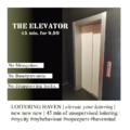
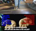
Example ads:
Feel free to add your own ad to the slideshow, we will put them all in the brochure
