Peripheral Centers and Feminist Servers/TL;DR: Difference between revisions
No edit summary |
No edit summary |
||
| Line 53: | Line 53: | ||
[[File:Annotation-log sketch-2.png|400px|thumb|center|alt=Annotation-log sketches]] | [[File:Annotation-log sketch-2.png|400px|thumb|center|alt=Annotation-log sketches]] | ||
[describe how sketches led to the following designs] | [describe how sketches led to the following designs] <br> | ||
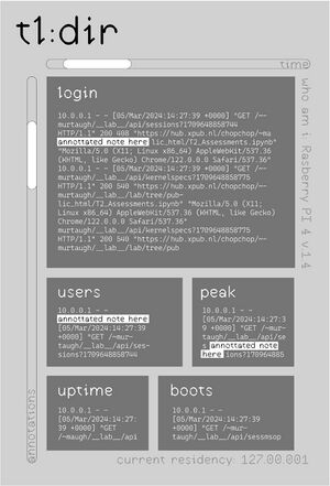
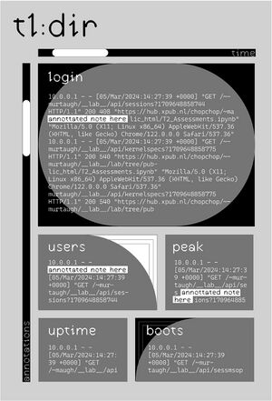
After multiple sketches and discussions, Senka drafted 2 versions of the design that would have multiple 'windows' in which different logs will be updated. The sketch was kept black and white, mostly accounting for it being displayed on an e-reader in the end. Two sliders were implemented to slide through time and the annotation of the logs. Time would show different logs presumably by day, ideally from the start of chopchop's life, while the annotation would display different layers/tiers of annotation of what that logs mean to all of us as a community of practice. | |||
{|style="margin: 0 auto;" | {|style="margin: 0 auto;" | ||
|[[File:Tldr-design-v1a.jpeg|thumb|center|First digital mockup, version a]] | |[[File:Tldr-design-v1a.jpeg|thumb|center|First digital mockup, version a]] | ||
|[[File:Tldr-design-v1b.jpeg|thumb|left|First digital mockup, version b]] | |[[File:Tldr-design-v1b.jpeg|thumb|left|First digital mockup, version b]] | ||
|} | |} | ||
The fonts chose are open-source and free. One is Ductus, a font by Amélie Dumont, and the other is a Microsoft font called Cascadia Code, which Senka accidentally stumbled upon while browsing the fonts on their laptop. It's a super decent monospace font, and a very good fit for imitating the terminal font, while having slightly better kerning and a very good italic version. The other font choice is for annotations. The annotation have a 'highlighted' background to mimic highlights and analogue annotations. <br> | |||
[describe 2024-03-13 meeting between Senka and | [describe 2024-03-13 meeting between Senka, Thijs, and Rosa that led to the following updated design] <br> | ||
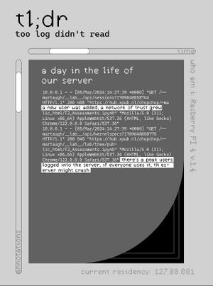
After considering the actual size of an e-reader screen as well as a hierarchy of information these windows pose, the final sketch included all of the information in one 'windows/page/screen'. The user is supposed to just scroll down to view as much as they would want to. | |||
[[File:Tldr-design-v2.jpeg|thumb|center|cap]] | [[File:Tldr-design-v2.jpeg|thumb|center|cap]] | ||
Revision as of 21:09, 22 March 2024
This page documents the TL;DR project part of Peripheral_Centers_and_Feminist_Servers
In a seamless world, awareness of techno-social infrastructure surfaces only when it's not working. But when you upload a photo, install an application, move a file, a technology serves, works, labours to execute what you've asked of it.

Inaccessible files track this work as data. These files are inaccessible in two ways: they're hard to retrieve and hard to decipher. While these hidden files contain the not so hidden infrastructures of a server, they only manage to show a portion of it. After all, log files have a bias towards the technological ecology, prioritizing the labour of machines.

The actual infrastructure consists of much more: the people maintaining (rebooting, organizing, meeting) for the tech to work. A feminist data center acknowledges and fosters the infrastructure surrounding this technology; the physical labour, the decisions about shared spaces, the different knowledges that depend on each other for the network to exist.

TL;DR researches ways to make sense of the hidden labour that goes on in a feminist server through log files and unlogged effort / activity.
Project description
[describe project matter of factly] [photos of project in varia during launch]
Motivation and evolution
A typical scenario in which one interacts with log files -- a typically scenario in which we have interacted with log files in setting up and maintaining our community server chopchop -- is when something is not working. One must first locate these files, and then try to make sense of the gargantuan data compilations containing cryptic information so matter-of-factly, that the matter of fact is lost on the reader.
These technologies are situated, there's a community using and maintaining, surrounding and being build on them. The same is true for chopchop. In our experience with this server, alongside our research on feminist servers, we have found several problems with this described scenario:
- The files are inacessible, unreadable, to many. This results in assymetric responsibilities in maintenance and potentially introduces an implicit technosocial hierarchy in the community working with such a technology.
- The files are inaccessible, hidden away. This implies the server's internal workings are meant to be hidden: there's a seamless experience the image of which needs to be kept up.
- Both cases of inaccessibility increase the distance between the technology and the human, in an attempt to naturalize the first in the life of the latter. In this process, the awareness of the situatedness, the collaboration between tech and human, tends to get lost.
- The agency of accessing the files is with the human.
- These logs are biased towards technology. Again, they ignore the community surrounding it. This invisibilizes labour such as maintaining the technology.
Initial idea
In its conception, we wanted to shift the agency from user to technology. We played around with several ideas:
- Transforming the logs into an emoticon. After a preset time interval, this would be printed. This idea was a play on the emoticon-feedback-pillars in e.g. grocery stores and airports [example image?].
- Logging the launch event itself, e.g. by counting the people coming in and out, and making an analogy with server components.
- Having a central view of certain (fictional) components of the server, that would need to be kept within certain thresholds to keep the event going. For example, a bucket that slowly fills over time, and needs to be discharged lest it overflows (an analogy for garbage collection). This would put some focus on the communal aspect of maintenance.
We decided to develop the first idea further.
Comments by Joseph and Manetta
We proposed the initial idea to Joseph and Manetta. They had two comments:
- Are you not creating even more bureaucracy?
- What actually makes this feminist? (additionally, Manetta voiced concerned about a feminine connotation with emojis)
We felt the need to rethink the idea from the ground up, this time.
Updated idea: a diary
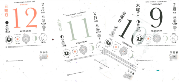
Senka showed a tear off calendar they used. This calendar displays lots of information aside from the date: constellation visualizations, historical events related to the date, ... We felt inspired by its ability to compile varried, difficult information in an approachable, readable way. In addition, the idea of time that is associated with a calendar resonated. With this in mind, we workshopped more ideas.
What if chopchop kept a diary? A compilation of important data, reporting both on the technical as well as the non-technical aspects involved in being / maintaining / using a server. Visualized and written in an accessible way. Hosted online to make it visible to anyone.
With this idea, we hope to expose some of the invisible labour surrounding a server, and address the problems of inaccessibility with traditional logging.
Design process
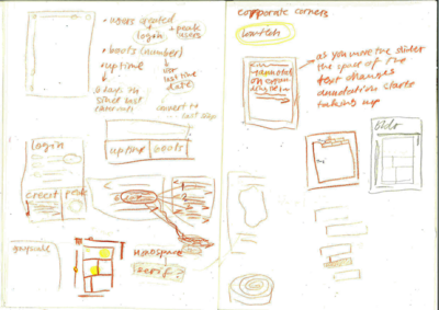
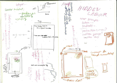
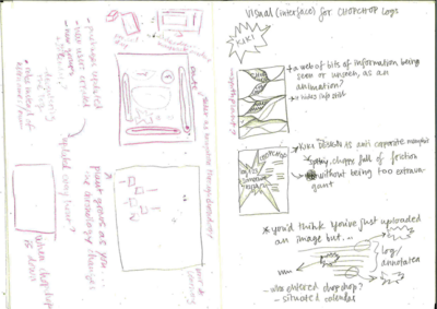
[describe how sketches led to the following designs]
After multiple sketches and discussions, Senka drafted 2 versions of the design that would have multiple 'windows' in which different logs will be updated. The sketch was kept black and white, mostly accounting for it being displayed on an e-reader in the end. Two sliders were implemented to slide through time and the annotation of the logs. Time would show different logs presumably by day, ideally from the start of chopchop's life, while the annotation would display different layers/tiers of annotation of what that logs mean to all of us as a community of practice.
The fonts chose are open-source and free. One is Ductus, a font by Amélie Dumont, and the other is a Microsoft font called Cascadia Code, which Senka accidentally stumbled upon while browsing the fonts on their laptop. It's a super decent monospace font, and a very good fit for imitating the terminal font, while having slightly better kerning and a very good italic version. The other font choice is for annotations. The annotation have a 'highlighted' background to mimic highlights and analogue annotations.
[describe 2024-03-13 meeting between Senka, Thijs, and Rosa that led to the following updated design]
After considering the actual size of an e-reader screen as well as a hierarchy of information these windows pose, the final sketch included all of the information in one 'windows/page/screen'. The user is supposed to just scroll down to view as much as they would want to.
As the TL;DR can be previewed on an e-reader at varia, we'd like to test what we can do in terms of HTML/CSS/Javascript with the e-reader. A test page was created, that includes some scrollbars, some font stylings, some javascript scroll tracking, some animations, etc.
Template & annotations
The code has been merged and is now accessable via the GIT repo, and this (temp) URL.
In order to get the logs visible to the public, we've created a script (script.py) that will run every X time using a cron job. The script renders an HTML page. To render the HTML page, we make use of jinja (link to documentation), which is a templating engine that is very readable and only used a little bit of code to get up and running. The template for the html page lives in templates/template.jinja. The python script runs a bunch of commands and saves the outcomes of these commands in variables, which are then referenced in this template file.
jinja allows for using if/else statements within the templates, loopings', small calculations, etc, which might come in handy when making the annotations. For a list of these variables, see below.
For the real-time ness, the plan was originally to use sockets, but as these require a node server to run (just another job that might not be needed), we're taking a bit more of a plakband approach. The plan is that the HTML page will contain the date of which the visitor can expect the next update. We need to write some javascript that checks once in a while if this date has already passed. When the date has passed, we could even do a little check if the browser and or chopchop are still "online", but ultimately do a refresh. Since, in the background, the python script has run and generated a new HTML page.
A side note is that the sketches do include a reference to "time" but we still need to figure out how exactly this would work, and that could influence this setup.
About the template
In the template, we've got the following variables, corresponding with commands. For each variable, there is a small if statement. If a variable is set, we show a level 1 annotation, visible when updating the slider.
| variable | command |
|---|---|
| last_user_added | sudo journalctl _COMM=useradd -r -n 1 --output-fields=MESSAGE
|
| users_created_today | sudo journalct -S today _COMM=useradd -r -n 1 --output-fields=MESSAGE
|
| list_active_services | sudo service --status-all
|
| list_groups | getent group |
| since_last_boot | uptime -s
|
| list_package_installs | grep "install " /var/log/dpkg.log
|
| list_package_upgrade | grep "upgrade " /var/log/dpkg.log
|
| list_package_remove | grep "remove " /var/log/dpkg.log
|
| device_info | grep "Model" /proc/cpuinfo /(pipe but hey wiki tables...) awk -F: '{ print $2}' |
| debian_version | cat /etc/debian_version
|
| kernel_version | uname -a
|
| hostname | hostname -i
|
| ????file changes in specific directories for other projects of SI23? | find {path} -not -path '*/\.*' -atime 0 -readable -type f,d
|
| ?Watching some kitchen service??What would happen there? | sudo journalctl -u kitchen-stove.service -b
|
Display of the project
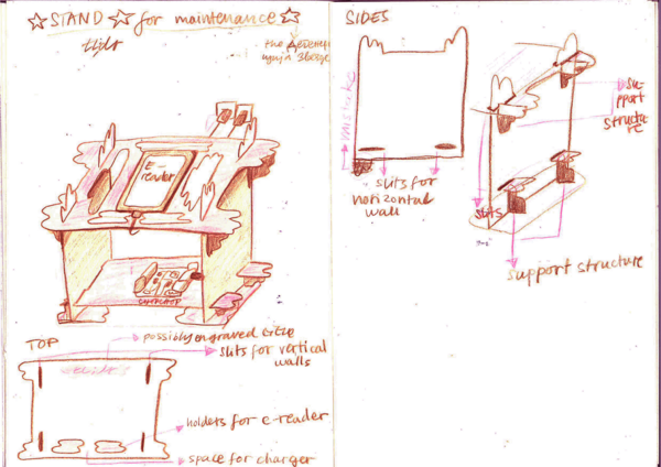
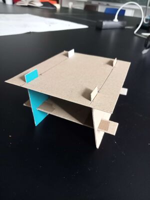
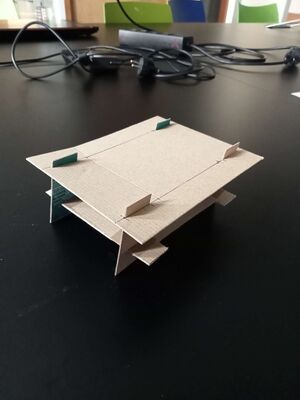
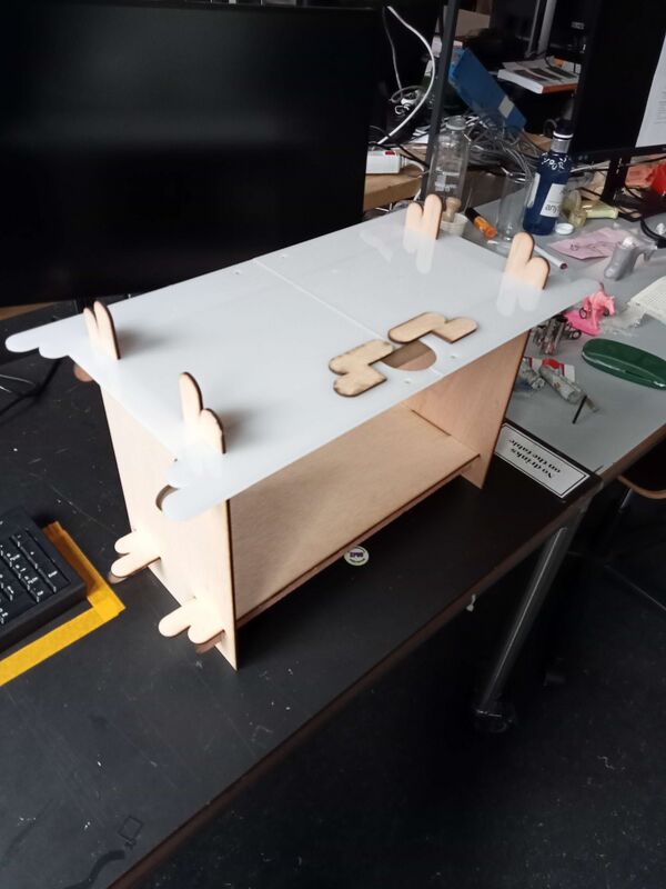
Senka made a few sketches and a small cardboard makette to think about a way to display chopchop and the e-reader together. This idea was based on having "windows" or a porous structure that would show what is usually hidden in a black box.
The idea was to use this structure, laser cut it on thin plywood and assemble it. This was the structure can move and travel easily, and be modular.
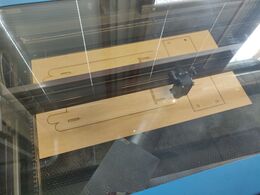
Lasercutting 2024-03-20
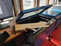
We booked the lasercutter one hour before class on Wednesday. This was ambitious: there were some setbacks. In particular, the thickness of the wood (bought in the WdKA store) is NOT the advertised 3.6mm. We managed to cut all of the wood parts, but not the plexiglass.
[TO ADD: screenshot of A**** I******** file with to-be-cut design]
[TO ADD: final sizes that ]
Lasercutting 2024-03-22
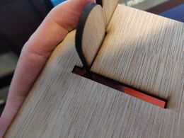
The fight with the lasercutter continues. Finally everything was successfully lasercut. Somehow the longer you lasercut wood on the largest lasercutter, the worst the quality of the cut gets. In my experience, this has not been the case with other materials, just the "3.6mm" wood from the WdKa store. The models can be assembled and disassembled, but with caution and care, some parts fit more smoothly than other. The last bit that needs to be finished is the sanding of the edges (only slight sanding).

