User:Flo/Aqua2: Difference between revisions
mNo edit summary |
mNo edit summary |
||
| Line 1: | Line 1: | ||
<div style="font-family: Georgia; font-size: 14px; color:grey; width: 60%; padding-left:10%;"> | <div style="font-family: Georgia; font-size: 14px; color:grey; width: 60%; padding-left:10%;"> | ||
[[File:Aquariumwindow.jpg|frameless] | [[File:Aquariumwindow.jpg|frameless]] | ||
==AQUARIUM 2.0== | ==AQUARIUM 2.0== | ||
<div style="text-align: center;"> | <div style="text-align: center;"> | ||
Revision as of 19:39, 9 December 2021
AQUARIUM 2.0
Piet Zwart Instituut’s Experimental Publishing presents Aquarium 2.0.
29th Nov - 4th Dec De Buitenboel Taandersstraat 121 K1 3026xs Rotterdam
🎏 with Clara Gradel, Floor van Meeuwen, Martin Foucaut, Camilo Garcia, Federico Poni, Nami Kim, Euna Lee, Kendal Beynon, Jacopo Lega and Louisa Teichmann 🎏
After an evening of experiments and workshops, we’re back with an invitation to tap upon the glass and peer into the research projects we are exploring.
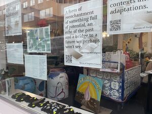
From the 29th of November until the 4th of December, we put ourselves on display by using the windows as an entry point into our think tank. Navigating between topics through sound, print media and sensors, we invite you to gaze inside the tank and float with us.
On Saturday 4th December, from 15h to 17h, we will end our Aquarium with a series of in-person workshops and conversations.
🌊Welcome back to the ecosystem of living thoughts. 🌊
PLEASE NOTE: Regarding Saturday 4th, we have a limit on the maximum amount of people allowed inside the space + a QR-code is required to enter.
Check the website here: https://hub.xpub.nl/sandbot/Aquarium/
Objects
Found materials
For the second Aquarium event it took a while to come up with an idea. For the last weeks I was reading a lot and producing less. I thought of ways to share knowledge or texts that I found interesting through an workshop at Aquarium 2.0 but because of new restrictions for Covid 19 I was not feeling any enthusiasm to host any type of workshop because our location this time was De Buitenboel, a small community center near Delfshaven. Because this space has big windows I thought more about showing material through posters.
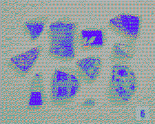
Important for me was to talk about materials specific to computers for this event, I researched on the most used elements inside computers such as copper, but didn't found a way to communicate about this in a way of interest to me. Because only showing posters felt too minimal I wanted to show real materials as well, only a print about a certain material would be too abstract. A few days before the start of Aquarium 2.0 I realised that I was collecting all different sorts of material that I found during walks on the streets, in the soil or at the sea. When gathering all these little pieces I started to categorize them, defining what kind of material these found object were made of. One of the similarities in these objects was that they were all broken pieces of man made objects. They all differentiate in material, color and shape. Together these little materials show their differences and qualities more than alone.
Brochure
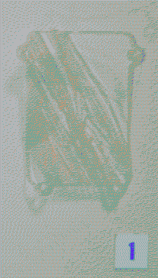
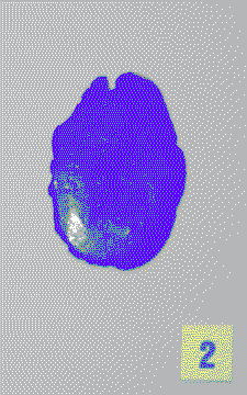
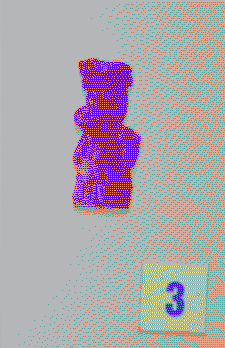
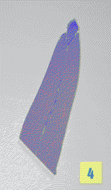
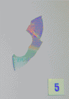
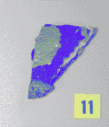
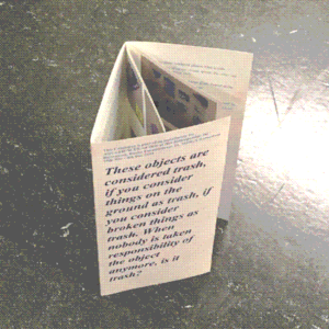
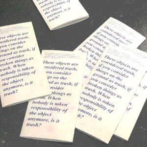
To show the different origin, qualities and original purpose of all these objects I made a brochure. I photographed all objects with a number, in the style of depicted excavations. The description of each object concludes the material & the place where I found the object. With some objects there is also some personal info added, or questions that came up when looking at the object. I perceive a brochure in itself as an publication that contains objective information. By adding personal information to these objects I try to play with this. The text of the brochure can be viewed here.
Design
The bright yellow paper used for the numbers is cardboard painted with gouache (etalagekarton). This paper was previously used in drawing lessons. The original purpose of the neon paper is for shop signs, especially the market.
The paper of this catalogue is found in the basement of van Beek Art Supplies that was not suited for re-sale anymore.
The typeface is Times New Roman, one of the least ink using fonts.
The booklet is designed with OpenOffice & the images are processed with www.ditherit.com
The ink used for printing the brochure is CMYK.
Dithering
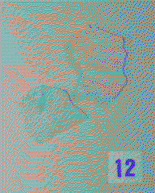
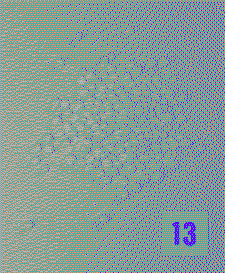
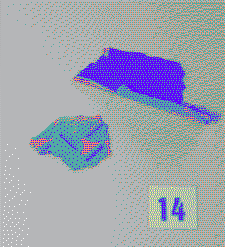
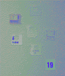
For all the images I used dithering tools to make them smaller in size, this taking less space on this wiki or on web pages. Dithering could also be used to create texture in the image to use less ink, sadly the photo's I made of all the objects had a light grey background, so the style of dithering I used for the images didn't use less ink for printing the brochures.
Dithering Tools
The window
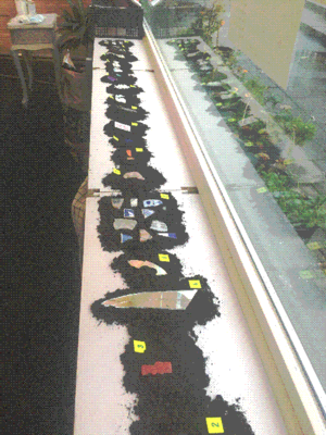
To present the objects and the brochure I used the windowsill in De Buitenboel.
Soil
All the objects were places on a bump of soil to give each piece a bit more attention. The black color of the loam gave a higher contrast to the objects but was also a reference to the objects found on the ground and suited the location. De Buitenboel is surrounded with plants, inside and outside. When I spoke to the owner of De Buitenboel she told me that the building where it is located is actually a house owned by a housing company without the purpose for living at the moment because of sewage problems. De Buitenboel is allowed to use the place as a "greenhouse", which resulted in them using the place for garden activities.
