User:Lucia Dossin/Graduation Project Proposal: Difference between revisions
Lucia Dossin (talk | contribs) (Created page with "<h2>Draft #3</h2> <h3>Research</h3> In the context of human-computer interaction, what does it mean to say 'the best interface is no interface'? What are the motivations and...") |
Lucia Dossin (talk | contribs) No edit summary |
||
| (38 intermediate revisions by 2 users not shown) | |||
| Line 1: | Line 1: | ||
<h2> | <h2>FINAL Graduation Project Proposal</h2> | ||
<h3>Research</h3> | <h3>Research</h3> | ||
In the context of human-computer interaction, there is a trend to rename the components of this interaction: the user, the computer and the interface. In this new terminology, the term 'users' should be replaced by 'people', 'computers' should be referred to as 'devices' and interfaces should disappear altogether. What are the motivations and consequences of such a shift in the terminology in regards to the visibility of technology? | |||
In the context of human-computer interaction, | |||
<h3>Project</h3> | <h3>Project</h3> | ||
The | The research will equip me not only with arguments for supporting my position in favor of visibility of technology, but it will also point the best approaches the project should embrace. The experiments below indicate the direction of the research undertaken thus far and explore possible approaches and formats to be taken in the future.<br><br> | ||
'''1. wakeuptcha'''<br> | '''1. wakeuptcha'''<br> | ||
A | [[File:Lucia_Mockup1.png|300px]] | ||
[[File:Lucia_Mockup2.png|300px]]<br> | |||
[[File:Lucia_Mockup3.png|300px]] | |||
A variation would be to present some | [[File:Lucia_Mockup4.png|300px]]<br> | ||
[ | A CAPTCHA widget that aims to call the user’s attention by presenting a combination of meaningful words, instead of random distorted letters.<br> | ||
A variation would be to present some background information regarding a selection of topics and then ask a question. Example below:<br> | |||
[[File:Lucia_Mockup5.png|600px]]<br> | |||
'''2. | '''2. one way'''<br> | ||
[[File:In-out.jpg|600px]]<br> | |||
A very user-friendly exercise of power through design, without the use of any screens, consisting of a sensor monitored space where the design (architecture, program controlled sensors and signage) will help users understand how they are supposed to experience it. The installation would be 'simple': for example, the goal could be to design a small space/system where the entrance door can only be used to get in, and the exit door only to get out.<br> | |||
'''3. iFood'''<br> | '''3. iFood'''<br> | ||
Fictitious product + advertisement <br> | |||
iFood, a <span style="text-decoration: line-through;">microwave oven</span> smart | iFood, a <span style="text-decoration: line-through;">microwave oven</span> smart cooking device. You don’t have to bother reading recipes, buying vegetables at the supermarket nor even spending time preparing your own food. iFood allows you to spend time on things that really matter in your life.<br> | ||
iFood works in combination with iSoup, a | iFood works in combination with iSoup, a delicious set of carefully designed soups.<br> | ||
How it works: position the iSoup cover in front of the iEye to be scanned. That will open iFood’s door. The cover contains all information that iFood needs to prepare your meal and that information is sent when you scan the cover. | How it works: position the iSoup cover in front of the iEye to be scanned. That will open iFood’s door. The cover contains all information that iFood needs to prepare your meal and that information is sent when you scan the cover. | ||
Disclaimer: iFood requires that you use iSoup.<br><br> | |||
'' | Because there is 'no interface' (better said, there are no control buttons), all the cooking settings will be defined by the information scanned from the soup package. Even to simply open the door you need the iSoup package. Thought of keeping an old package just to open the door? Forget about it, you still won't be able to use the device as an usual microwave, as the cooking program (time and power level) is set through the package scan.<br> | ||
< | Given the fact that this kind of advertising only promotes the positive aspects of the product, I would need to find a way to inform the downsides of using such a device. The fact that it would only work with iSoup and that it would not work with fresh ingredients nor with 'samSoup' would have to be reinforced somehow. <br> | ||
[[File:IFood-Forum.png | 600px ]]<br> | |||
'''4. Free Association Index - voice interface'''<br> | |||
I am also interested in developing further this project that I started working on last year. It consists of a subjective index of interrelated words. Besides improving the existing index, it can be interesting/relevant to investigate the effect of a voice interface in the project's use, content and intelligibility, in comparison to the original interface.<br> | |||
The project in its original version can be found here:<br> | |||
http://headroom.pzwart.wdka.hro.nl/~ldossin/free-association-index/<br><br> | |||
A mockup of the voice interface can be found here: | |||
http://headroom.pzwart.wdka.hro.nl/~ldossin/fai-voice (An updated version of Chrome and a microphone are needed.)<br> | |||
In case the mockup above cannot be used, the video below can illustrate the idea.<br> | |||
<div style="width: 600px; text-align: center; font-weight: bold;">[http://headroom.pzwart.wdka.hro.nl/~ldossin/fai-voice/assets/Fai-mockup.mp4 If you use Safari, click here]</div> | |||
[[File:Fai-mockup.ogv]]<br><br> | |||
'''5. User Interviews'''<br> | |||
Another possible approach would be realizing tests and/or interviews with users, critically exploring the relationship between interface, visibility of technology and user-friendliness. | |||
<h3>Context</h3> | |||
<h3> | |||
<big>'''“One of the horrible words we use is users. I am on a crusade to get rid of the word ‘users’. I would prefer to call them ‘people.’”'''</big> | <big>'''“One of the horrible words we use is users. I am on a crusade to get rid of the word ‘users’. I would prefer to call them ‘people.’”'''</big> | ||
| Line 139: | Line 58: | ||
<br>Golden Krishna, 2013 – SXSW [http://www.theverge.com/2013/3/10/4086392/samsung-golden-krishna-the-best-interface-is-no-interface]<br> | <br>Golden Krishna, 2013 – SXSW [http://www.theverge.com/2013/3/10/4086392/samsung-golden-krishna-the-best-interface-is-no-interface]<br> | ||
In the last decade, the vocabulary that addresses human-computer interaction has been changing, specially among designers. | In the last decade, the vocabulary that addresses human-computer interaction has been changing, specially among designers. As the quotes above state, 'users' should be replaced by 'people' and 'interface' should better just simply disappear. In a similar fashion, a computer is now referred to as a device. There is, in the new terminology trend, a clear intention to consolidate the idea of invisible technology. | ||
[http://www.youtube.com/watch?v=RQieoqCLWDo This] iPad trailer puts that idea into words (and image and sound), right in the first 30 seconds: 'We believe technology is at its very best when it's invisible. When you're conscious only of what you're doing, not the device you're doing it with. And iPad is the perfect expression of that idea. It's just this magical pane of glass that can become anything you want it to be.' | [http://www.youtube.com/watch?v=RQieoqCLWDo This] iPad trailer puts that idea into words (and image and sound), right in the first 30 seconds: 'We believe technology is at its very best when it's invisible. When you're conscious only of what you're doing, not the device you're doing it with. And iPad is the perfect expression of that idea. It's just this magical pane of glass that can become anything you want it to be.' | ||
The change in the vocabulary reflects not so much the verification of a fact (users are people, in this case) as it reflects a design choice (we want users to be defined as people). As in any design choice, there are reasons underneath it. The alleged reasons for adopting this new vocabulary are at first sight humanistic: user is seen as a degrading term because it reduces the ambiguous and complex event of being human. Designers should be designing for people, not for users. | |||
The shift from interface requires a bit more of context. Common sense tends to consider interface literally as the graphic component (icons, layout, text) of the interaction between human and computer. But an interface is actually the point of contact between human and computer, not simply the format in which this contact is made. There are command line interfaces, text-based interfaces, graphical interfaces, voice interfaces and so on. | |||
The statement 'the best interface is no interface' (http://www.cooper.com/journal/2012/08/the-best-interface-is-no-interface.html) would then mean no interaction. Golden Krishna showcases an example where a graphical interface of an app requires the user to go through 13 steps before having the task done. He then compares the same task being accomplished through the use of a sensor and a smart device, easily done in one step, without requiring any action from the user except to be physically inside the range of the sensor field while carrying the smart device. According to him, it is because there is no graphical interface that the task is so easily accomplished. The most adequate solution to one design problem cannot be applied to all design problems. So, while it is not possible to say that a graphical interface can provide the solution to every problem, it is also not reasonable to affirm that all interfaces should cease to exist. In the case of the ex-user and the no-interface, there is a clear emphasis on the invisibility of technology - it seems to be an ideal pursued by some designers working for giant 'tech companies'. | |||
If we focus on the iPad trailer again, this invisibility is being sold to us as ''the'' way to optimize our time, to allow us to be more productive and more creative by focusing on the task to be accomplished. A separation between task and tool is what is being proposed (i.e., designed). While, on one hand, I understand how frustrating it can be when the tool is not easily understood or mastered at first sight, on the other hand I do believe that being confronted with problems to solve does help a user understand better the tool – and the task - not only in a technological level, but also understand the material, social, legal conditions under which technology operates. We live in a world where computers are everywhere - regarding technology as something that keeps staying in our way sounds like a weird and out-of-place mantra to sing. | |||
I believe the motivations for the shift in terminology derive from a market strategy (to tackle the large scale penetration of personal computers, smartphones and alike into the market, as a way of making computers easier for consumers to use) rather than from a legitimate concern regarding the depth of the human experience and life quality standards. Actually, it's very well possible that the depth of the experience is becoming more and more flat instead. But that is perhaps beyond the scope of this proposal. | |||
Let's try to see the terminology issue in another context: students are people – so are teachers. By calling students 'students', instead of people, we are not degrading them as human beings - we are indicating their role in a school, defining their position in the relationship. By erasing this differentiation, the possibility of addressing the relationship is erased too. Erasing the possibility to address a relationship does not – by any means - make this relationship better. In reality, it removes any possibility to transform it whenever needed. 'By removing our knowledge of the glue that holds the systems that make up the infrastructure together, it becomes much more difficult, if not impossible, to begin to understand how we are constructed as subjects, what types of systems are brought into place (legal, technical, social, etc.) and where the possibilities for transformation exist.' (Matt Ratto, 2007 - Ethics of Seamless infrastructures http://www.i-r-i-e.net/inhalt/008/008_4.pdf) | |||
This question is too important to be left for designers, cognitive psychology specialists, marketing gurus, software developers and giant tech companies to decide alone. Nor should the user's agreement be equivalent to a click on a button without actual knowledge over what this is all about. This topic needs more visibility, clear definitions and debate. My Graduation Project and my thesis will aim to address that. | |||
<h3>Previous Works</h3> | <h3>Previous Works</h3> | ||
| Line 172: | Line 81: | ||
'''Let Me Think''' | '''Let Me Think''' | ||
Let me think is a browser plug-in that interferes in the online shopping experience at Amazon by canceling the 'buy in one click' feature. By adding time to the shopping cycle, I'm trying to break this automatic, almost unconscious behavior that web shops wants us to engage with | Let me think is a browser plug-in that interferes in the online shopping experience at Amazon by canceling the 'buy in one click' feature. By adding time to the shopping cycle, I'm trying to break this automatic, almost unconscious behavior that web shops wants us to engage with: just clicking on things and buying without reflecting on what we're doing. | ||
This project is an attempt to reflect on the interface's impact on user behavior, by changing the carefully designed page functionality. | |||
[[File:Let-me-think-01.png|600px]]<br> | [[File:Let-me-think-01.png|600px]]<br> | ||
'''Free Association Index''' | '''Free Association Index''' | ||
The Free Association Index. The index in this case is a set of subjective relationships among words, accessible through a Google-like interface. By using a well-known interface in a different context | The Free Association Index. The index in this case is a set of subjective relationships among words, accessible through a Google-like interface. By using a well-known interface, on one hand the project is easy to grasp – in terms of the expected user interaction – and on the other hand it proposes a different context for using the content. By doing that, the project's intention is to rise questions about how the content was gathered and about the legitimacy of the results. | ||
[[File:Fai.png|600px]] | [[File:Fai.png|600px]] | ||
'''Print Cake''' | '''Print Cake''' | ||
Print Cake is an on-demand print shop installation/performance where visitors can buy cupcakes decorated with a snippet of William Morris' News from Nowhere printed on edible paper and edible ink. There are two kinds of cupcakes: the standard and the customized. The former costs less than the latter. In the customized version, customers choose a color and a word, through a simple interface (a | Print Cake is an on-demand print shop installation/performance where visitors can buy cupcakes decorated with a snippet of William Morris' News from Nowhere printed on edible paper and edible ink. There are two kinds of cupcakes: the standard and the customized. The former costs less than the latter. In the customized version, customers choose a color and a word, through a simple and easy to use graphical interface (a three-step process). The word generates a snippet of text (taken from News from Nowhere). This text is placed onto a designed template and in combination with the chosen color is printed on edible paper and placed on top of the cupcake. In the standard version no choices are possible – they all have the same color and just a few variations on the text snippets. | ||
In this project, part of the creative process was apparently transferred to the user. But in fact, the whole project structure was designed in a way that would allow users to only choose from a quite limited range of choices and by following a very specific and short sequence of steps. This structure was grounded on very concrete issues, such as how to make the project possible/viable while interesting/entertaining to the users and conveying common meaning with the rest of exhibition. | |||
[[File:Table-sketch.png|600px]] | [[File:Table-sketch.png|600px]] | ||
<h3>Work Survey</h3> | <h3>Work Survey</h3> | ||
The selected works vary immensely in format but they all share a wish to make invisible structures visible somehow.<br><br> | |||
'''Immaterials: Light painting WiFi'''<br> | '''Immaterials: Light painting WiFi'''<br> | ||
Timo Arnall | Timo Arnall <br> | ||
WiFi signal strength on the streets made visible through a moving led 'ruler', registered in long exposure photos.<br> | WiFi signal strength on the streets made visible through a moving led 'ruler', registered in long exposure photos.<br> | ||
'''Why it relates:''' visibility | '''Why it relates:''' gives visibility to invisible infrastructure.<br> | ||
http://vimeo.com/20412632<br> | http://vimeo.com/20412632<br> | ||
[[File:Light-painting-wifi.jpg|600px]]<br><br> | [[File:Light-painting-wifi.jpg|600px]]<br><br> | ||
'''Immaterials: the ghost in the field'''<br> | '''Immaterials: the ghost in the field'''<br> | ||
Timo Arnall, Jack Schulze & Einar Sneve Martinussen | Timo Arnall, Jack Schulze & Einar Sneve Martinussen<br> | ||
'A photographic mapping of the readable volume of a radio field from an RFID reader'.([http://berglondon.com/blog/2009/10/12/the-ghost-in-the-field/])<br> | 'A photographic mapping of the readable volume of a radio field from an RFID reader'.([http://berglondon.com/blog/2009/10/12/the-ghost-in-the-field/])<br> | ||
'''Why it relates:''' | '''Why it relates:''' shows what's invisible.<br> | ||
http://vimeo.com/7022707<br> | http://vimeo.com/7022707<br> | ||
[[File:Ghost_field.jpg|600px]]<br><br> | [[File:Ghost_field.jpg|600px]]<br><br> | ||
'''BumpList, an Email community for the Determined!'''<br> | '''BumpList, an Email community for the Determined!'''<br> | ||
Jonah Brucker-Cohen | Jonah Brucker-Cohen<br> | ||
A mailing list where only 6 members are allowed. Every new subscriber bumps one member from the list. In order to keep participating in the list, interested ones have to continuously subscribe to it.<br> | A mailing list where only 6 members are allowed. Every new subscriber bumps one member from the list. In order to keep participating in the list, interested ones have to continuously subscribe to it.<br> | ||
'''Why it relates:''' opposes to the idea of infinite | '''Why it relates:''' opposes to the idea of infinite computer resources and brings the idea of design choice to the discussion: why limit the number of participants? why 6?<br> | ||
http://www.coin-operated.com/2010/05/13/bumplist-an-email-community-for-the-determined-2003/<br> | http://www.coin-operated.com/2010/05/13/bumplist-an-email-community-for-the-determined-2003/<br> | ||
[[File:Bumplist2.gif|600px]]<br> | [[File:Bumplist2.gif|600px]]<br> | ||
'''Superglue'''<br> | '''Superglue'''<br> | ||
Danja Vasiliev, Joscha Jaeger, Michael Zeder | Danja Vasiliev, Joscha Jaeger, Michael Zeder <br> | ||
A toolkit (browser plugin plus personal server) that aims to make it possible for users to make their website easily and host the websites at home<br> | A toolkit (browser plugin plus personal server) that aims to make it possible for users to make their website easily and host the websites at home<br> | ||
'''Why it relates:''' interesting attempt to give the user some independence without necessarily demanding too much technical knowledge, brings the subject of making and hosting websites to discussion.<br> | '''Why it relates:''' interesting attempt to give the user some independence without necessarily demanding too much technical knowledge, brings the subject of making and hosting websites to discussion.<br> | ||
| Line 215: | Line 129: | ||
'''Revealing Errors – Website'''<br> | '''Revealing Errors – Website'''<br> | ||
Benjamin Mako Hill | Benjamin Mako Hill<br> | ||
A website that displays manifestations of computer errors and human errors resulting from ignorance towards computers.<br> | A website that displays manifestations of computer errors and human errors resulting from ignorance towards computers.<br> | ||
'''Why it relates:''' | '''Why it relates:''' technology that is only visible when it fails.<br> | ||
http://revealingerrors.com/<br> | http://revealingerrors.com/<br> | ||
[[File:Transparentes_reis_small.jpg|600px]]<br> | [[File:Transparentes_reis_small.jpg|600px]]<br> | ||
<h3>Literature Survey</h3> | <h3>Literature Survey</h3> | ||
Arnall T. (2013) No to no UI, http://www.elasticspace.com/2013/03/no-to-no-ui<br> | |||
Bolter J.D. and Gromala D. (2003) Windows and Mirrors, MIT Press<br> | |||
Galloway, A.R. (2012) The Interface Effect, Polity Press<br> | |||
Krishna G. (2012) The best interface is no interface, http://www.cooper.com/journal/2012/08/the-best-interface-is-no-interface.html<br> | |||
Lialina O. (2012) Turing Complete User, http://contemporary-home-computing.org/turing-complete-user/<br> | |||
Mansoux A. (2013) Sandbox Culture [not published yet]<br> | |||
Norretranders T. (1991) The User Illusion, Penguin Books<br> | |||
Odlyzko A. (1999) The visible problem of the invisible computer: a skeptical look at information appliances, AT&T Labs Research<br> | |||
Serres M. (2007) Parasite, Minesota Press<br> | |||
No to no UI | Suchman L.(2007) Human-Machine Reconfigurations, Cambridge University Press<br> | ||
van den Bosch Christensen L. (2014) I, for one, welcome our new Overlords, PZI<br> | |||
< | |||
http:// | |||
[ | |||
The User Illusion | |||
The visible problem of the invisible computer: a skeptical look at information appliances | |||
Latest revision as of 22:28, 25 November 2014
FINAL Graduation Project Proposal
Research
In the context of human-computer interaction, there is a trend to rename the components of this interaction: the user, the computer and the interface. In this new terminology, the term 'users' should be replaced by 'people', 'computers' should be referred to as 'devices' and interfaces should disappear altogether. What are the motivations and consequences of such a shift in the terminology in regards to the visibility of technology?
Project
The research will equip me not only with arguments for supporting my position in favor of visibility of technology, but it will also point the best approaches the project should embrace. The experiments below indicate the direction of the research undertaken thus far and explore possible approaches and formats to be taken in the future.
1. wakeuptcha
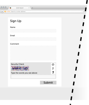
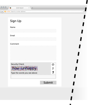

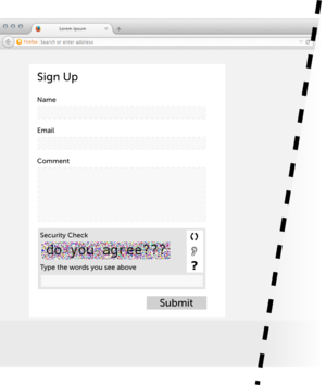
A CAPTCHA widget that aims to call the user’s attention by presenting a combination of meaningful words, instead of random distorted letters.
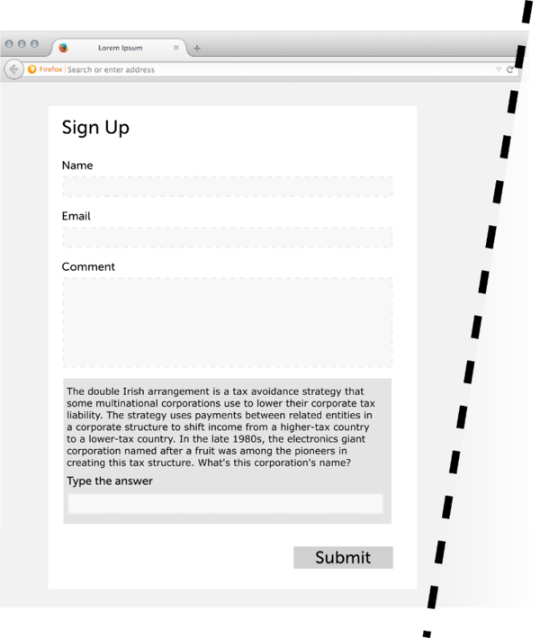
A variation would be to present some background information regarding a selection of topics and then ask a question. Example below:
2. one way
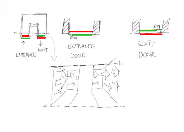
A very user-friendly exercise of power through design, without the use of any screens, consisting of a sensor monitored space where the design (architecture, program controlled sensors and signage) will help users understand how they are supposed to experience it. The installation would be 'simple': for example, the goal could be to design a small space/system where the entrance door can only be used to get in, and the exit door only to get out.
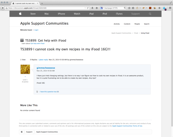
3. iFood
Fictitious product + advertisement
iFood, a microwave oven smart cooking device. You don’t have to bother reading recipes, buying vegetables at the supermarket nor even spending time preparing your own food. iFood allows you to spend time on things that really matter in your life.
iFood works in combination with iSoup, a delicious set of carefully designed soups.
How it works: position the iSoup cover in front of the iEye to be scanned. That will open iFood’s door. The cover contains all information that iFood needs to prepare your meal and that information is sent when you scan the cover.
Disclaimer: iFood requires that you use iSoup.
Because there is 'no interface' (better said, there are no control buttons), all the cooking settings will be defined by the information scanned from the soup package. Even to simply open the door you need the iSoup package. Thought of keeping an old package just to open the door? Forget about it, you still won't be able to use the device as an usual microwave, as the cooking program (time and power level) is set through the package scan.
Given the fact that this kind of advertising only promotes the positive aspects of the product, I would need to find a way to inform the downsides of using such a device. The fact that it would only work with iSoup and that it would not work with fresh ingredients nor with 'samSoup' would have to be reinforced somehow.
4. Free Association Index - voice interface
I am also interested in developing further this project that I started working on last year. It consists of a subjective index of interrelated words. Besides improving the existing index, it can be interesting/relevant to investigate the effect of a voice interface in the project's use, content and intelligibility, in comparison to the original interface.
The project in its original version can be found here:
http://headroom.pzwart.wdka.hro.nl/~ldossin/free-association-index/
A mockup of the voice interface can be found here:
http://headroom.pzwart.wdka.hro.nl/~ldossin/fai-voice (An updated version of Chrome and a microphone are needed.)
In case the mockup above cannot be used, the video below can illustrate the idea.
File:Fai-mockup.ogv
5. User Interviews
Another possible approach would be realizing tests and/or interviews with users, critically exploring the relationship between interface, visibility of technology and user-friendliness.
Context
“One of the horrible words we use is users. I am on a crusade to get rid of the word ‘users’. I would prefer to call them ‘people.’”
Don Norman, 2008 – UXWeek [1]
“The best interface is no interface.”
Golden Krishna, 2013 – SXSW [2]
In the last decade, the vocabulary that addresses human-computer interaction has been changing, specially among designers. As the quotes above state, 'users' should be replaced by 'people' and 'interface' should better just simply disappear. In a similar fashion, a computer is now referred to as a device. There is, in the new terminology trend, a clear intention to consolidate the idea of invisible technology.
This iPad trailer puts that idea into words (and image and sound), right in the first 30 seconds: 'We believe technology is at its very best when it's invisible. When you're conscious only of what you're doing, not the device you're doing it with. And iPad is the perfect expression of that idea. It's just this magical pane of glass that can become anything you want it to be.'
The change in the vocabulary reflects not so much the verification of a fact (users are people, in this case) as it reflects a design choice (we want users to be defined as people). As in any design choice, there are reasons underneath it. The alleged reasons for adopting this new vocabulary are at first sight humanistic: user is seen as a degrading term because it reduces the ambiguous and complex event of being human. Designers should be designing for people, not for users.
The shift from interface requires a bit more of context. Common sense tends to consider interface literally as the graphic component (icons, layout, text) of the interaction between human and computer. But an interface is actually the point of contact between human and computer, not simply the format in which this contact is made. There are command line interfaces, text-based interfaces, graphical interfaces, voice interfaces and so on.
The statement 'the best interface is no interface' (http://www.cooper.com/journal/2012/08/the-best-interface-is-no-interface.html) would then mean no interaction. Golden Krishna showcases an example where a graphical interface of an app requires the user to go through 13 steps before having the task done. He then compares the same task being accomplished through the use of a sensor and a smart device, easily done in one step, without requiring any action from the user except to be physically inside the range of the sensor field while carrying the smart device. According to him, it is because there is no graphical interface that the task is so easily accomplished. The most adequate solution to one design problem cannot be applied to all design problems. So, while it is not possible to say that a graphical interface can provide the solution to every problem, it is also not reasonable to affirm that all interfaces should cease to exist. In the case of the ex-user and the no-interface, there is a clear emphasis on the invisibility of technology - it seems to be an ideal pursued by some designers working for giant 'tech companies'.
If we focus on the iPad trailer again, this invisibility is being sold to us as the way to optimize our time, to allow us to be more productive and more creative by focusing on the task to be accomplished. A separation between task and tool is what is being proposed (i.e., designed). While, on one hand, I understand how frustrating it can be when the tool is not easily understood or mastered at first sight, on the other hand I do believe that being confronted with problems to solve does help a user understand better the tool – and the task - not only in a technological level, but also understand the material, social, legal conditions under which technology operates. We live in a world where computers are everywhere - regarding technology as something that keeps staying in our way sounds like a weird and out-of-place mantra to sing.
I believe the motivations for the shift in terminology derive from a market strategy (to tackle the large scale penetration of personal computers, smartphones and alike into the market, as a way of making computers easier for consumers to use) rather than from a legitimate concern regarding the depth of the human experience and life quality standards. Actually, it's very well possible that the depth of the experience is becoming more and more flat instead. But that is perhaps beyond the scope of this proposal.
Let's try to see the terminology issue in another context: students are people – so are teachers. By calling students 'students', instead of people, we are not degrading them as human beings - we are indicating their role in a school, defining their position in the relationship. By erasing this differentiation, the possibility of addressing the relationship is erased too. Erasing the possibility to address a relationship does not – by any means - make this relationship better. In reality, it removes any possibility to transform it whenever needed. 'By removing our knowledge of the glue that holds the systems that make up the infrastructure together, it becomes much more difficult, if not impossible, to begin to understand how we are constructed as subjects, what types of systems are brought into place (legal, technical, social, etc.) and where the possibilities for transformation exist.' (Matt Ratto, 2007 - Ethics of Seamless infrastructures http://www.i-r-i-e.net/inhalt/008/008_4.pdf)
This question is too important to be left for designers, cognitive psychology specialists, marketing gurus, software developers and giant tech companies to decide alone. Nor should the user's agreement be equivalent to a click on a button without actual knowledge over what this is all about. This topic needs more visibility, clear definitions and debate. My Graduation Project and my thesis will aim to address that.
Previous Works
Last year I have been working on projects which aim to put user passiveness, unawareness and consumerism in the spotlight, by sometimes unveiling the structure running behind the surface, other times by disguising the critique into something digestible and fun to play with.
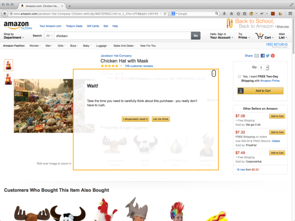
Let Me Think Let me think is a browser plug-in that interferes in the online shopping experience at Amazon by canceling the 'buy in one click' feature. By adding time to the shopping cycle, I'm trying to break this automatic, almost unconscious behavior that web shops wants us to engage with: just clicking on things and buying without reflecting on what we're doing.
This project is an attempt to reflect on the interface's impact on user behavior, by changing the carefully designed page functionality.
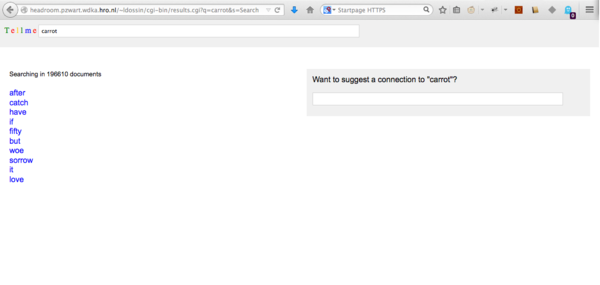
Free Association Index The Free Association Index. The index in this case is a set of subjective relationships among words, accessible through a Google-like interface. By using a well-known interface, on one hand the project is easy to grasp – in terms of the expected user interaction – and on the other hand it proposes a different context for using the content. By doing that, the project's intention is to rise questions about how the content was gathered and about the legitimacy of the results.
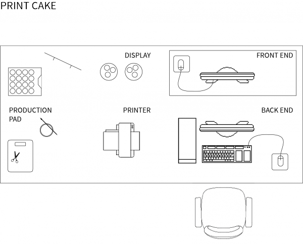
Print Cake Print Cake is an on-demand print shop installation/performance where visitors can buy cupcakes decorated with a snippet of William Morris' News from Nowhere printed on edible paper and edible ink. There are two kinds of cupcakes: the standard and the customized. The former costs less than the latter. In the customized version, customers choose a color and a word, through a simple and easy to use graphical interface (a three-step process). The word generates a snippet of text (taken from News from Nowhere). This text is placed onto a designed template and in combination with the chosen color is printed on edible paper and placed on top of the cupcake. In the standard version no choices are possible – they all have the same color and just a few variations on the text snippets.
In this project, part of the creative process was apparently transferred to the user. But in fact, the whole project structure was designed in a way that would allow users to only choose from a quite limited range of choices and by following a very specific and short sequence of steps. This structure was grounded on very concrete issues, such as how to make the project possible/viable while interesting/entertaining to the users and conveying common meaning with the rest of exhibition.
Work Survey
The selected works vary immensely in format but they all share a wish to make invisible structures visible somehow.
Immaterials: Light painting WiFi
Timo Arnall
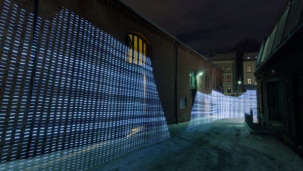
WiFi signal strength on the streets made visible through a moving led 'ruler', registered in long exposure photos.
Why it relates: gives visibility to invisible infrastructure.
http://vimeo.com/20412632
Immaterials: the ghost in the field
Timo Arnall, Jack Schulze & Einar Sneve Martinussen
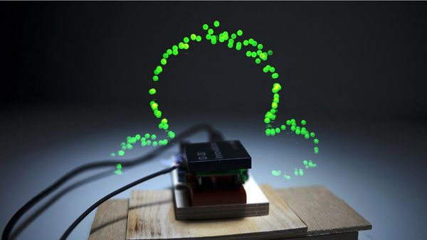
'A photographic mapping of the readable volume of a radio field from an RFID reader'.([3])
Why it relates: shows what's invisible.
http://vimeo.com/7022707
BumpList, an Email community for the Determined!
Jonah Brucker-Cohen
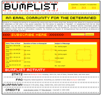
A mailing list where only 6 members are allowed. Every new subscriber bumps one member from the list. In order to keep participating in the list, interested ones have to continuously subscribe to it.
Why it relates: opposes to the idea of infinite computer resources and brings the idea of design choice to the discussion: why limit the number of participants? why 6?
http://www.coin-operated.com/2010/05/13/bumplist-an-email-community-for-the-determined-2003/
Superglue
Danja Vasiliev, Joscha Jaeger, Michael Zeder
A toolkit (browser plugin plus personal server) that aims to make it possible for users to make their website easily and host the websites at home
Why it relates: interesting attempt to give the user some independence without necessarily demanding too much technical knowledge, brings the subject of making and hosting websites to discussion.
http://www.superglue.it
Revealing Errors – Website
Benjamin Mako Hill
A website that displays manifestations of computer errors and human errors resulting from ignorance towards computers.
Why it relates: technology that is only visible when it fails.
http://revealingerrors.com/

Literature Survey
Arnall T. (2013) No to no UI, http://www.elasticspace.com/2013/03/no-to-no-ui
Bolter J.D. and Gromala D. (2003) Windows and Mirrors, MIT Press
Galloway, A.R. (2012) The Interface Effect, Polity Press
Krishna G. (2012) The best interface is no interface, http://www.cooper.com/journal/2012/08/the-best-interface-is-no-interface.html
Lialina O. (2012) Turing Complete User, http://contemporary-home-computing.org/turing-complete-user/
Mansoux A. (2013) Sandbox Culture [not published yet]
Norretranders T. (1991) The User Illusion, Penguin Books
Odlyzko A. (1999) The visible problem of the invisible computer: a skeptical look at information appliances, AT&T Labs Research
Serres M. (2007) Parasite, Minesota Press
Suchman L.(2007) Human-Machine Reconfigurations, Cambridge University Press
van den Bosch Christensen L. (2014) I, for one, welcome our new Overlords, PZI

