User:Michel W/Self-learning: Difference between revisions
(→⭑HTML⭑) |
|||
| (59 intermediate revisions by the same user not shown) | |||
| Line 1: | Line 1: | ||
<div style=" font-family: Times New Roman; font-size: | <div style=" font-family: Times New Roman; font-size: 17px; "> | ||
=⭑HTML⭑= | |||
[https://github.com/Michelmsw My⭑Github⊹⊹⊹ ] | [https://github.com/Michelmsw My⭑Github⊹⊹⊹ ] | ||
⊹A Simple HTML | ⊹A Simple HTML structure: | ||
[[File:Html.jpg|400 px|frameless|none]] | [[File:Html.jpg|400 px|frameless|none]] | ||
⊹General Technique: | * <body> = contains all elements that are visible | ||
* <head> = all the elements that are not visible on the page ex. <title> <style> | |||
⊹General Technique: 1. Create element with HTML 2. Style with CSS one-by-one | |||
⊹Well chosen content of H1 element is crucial to SEO. | ⊹Well chosen content of H1 element is crucial to SEO. | ||
| Line 18: | Line 22: | ||
Syntax: <a target="_blank|_self|_parent|_top|framename"> | Syntax: <a target="_blank|_self|_parent|_top|framename"> | ||
==Entities== | |||
* Help avoid rendering issues | * Help avoid rendering issues | ||
* Safeguard against more limited character encoding | * Safeguard against more limited character encoding | ||
| Line 40: | Line 44: | ||
⊹Option + Command + I --- Google Chrome | ⊹Option + Command + I --- Google Chrome | ||
==Class== | |||
* The class attribute can be used on any HTML element. | * The class attribute can be used on any HTML element. | ||
| Line 49: | Line 53: | ||
* JavaScript can access elements with a specific class name with the getElementsByClassName() method | * JavaScript can access elements with a specific class name with the getElementsByClassName() method | ||
==Elements== | |||
===Text elements=== | |||
⊹ <p> by default, come with margin at the top and bottom. So, <code> {margin-top:0px; margin-bottom:0px; } </code> | |||
<strong> </strong> --- bold | |||
<u> </u> --- underline | |||
<span class="span-example" > </span> --- modify a specific part of the text without affecting the whole thing | |||
.span-example { | |||
color: red | |||
margin-left: 12px; ---'''set a white space for text''' | |||
} | |||
.span-example:hover { | |||
text-decoration: underline; | |||
} | |||
===<div>=== | |||
division --- just a box, is a block element, it can contain other elements (like a container) | |||
Ex. | |||
<div class="video-preview"> | |||
.video-preview { | |||
width:300px; | |||
display: inline-block; | |||
vertical-aligh: top; | |||
margin-right: 15px; | |||
} | |||
===<pre>=== | ===<pre>=== | ||
| Line 94: | Line 135: | ||
"a" —> opacity, how see through this color is | "a" —> opacity, how see through this color is | ||
==⭑CSS⭑ | ==Image and Text box== | ||
<img src="/images/html5.gif" alt="HTML5 Icon"> | |||
* src - Specifies the path to the image | |||
* alt - Specifies an alternate text for the image | |||
{ | |||
width: 300px; | |||
height: 300px; | |||
object-fit: cover; | |||
object-position: contain; | |||
border-width: right; | |||
border-style: solid; | |||
border-color: red; | |||
} | |||
Text box: | |||
<input class="search-bar" type="text" placeholder="Search"> | |||
.search-bar { | |||
font-size: 20px; | |||
margin-left: 12px; | |||
} | |||
==Nested Layouts Technique== | |||
* vertical layout | |||
* horizontal layout | |||
use <div> to separate layouts. Create horizontal layouts with also display: inline-block. | |||
==Responsive design== | |||
Media query: | |||
@media (max-width: 500px){ | |||
} | |||
=⭑CSS⭑= | |||
<code><link | <code><link rel="stylesheet" href="style.css"></code> | ||
===⊹Syntax simple CSS selectors | rel = relation | ||
<link rel="stylesheet" href="styles/mystyle.css"> --- use / inside a folder, Filepaths | |||
==⊹Syntax simple CSS selectors== | |||
* Element | * Element | ||
| Line 138: | Line 226: | ||
} | } | ||
==⊹Conflict Resolution== | |||
* Origin precedence: Last declaration wins | * Origin precedence: Last declaration wins | ||
| Line 148: | Line 236: | ||
Class name selector > Element name selector | Class name selector > Element name selector | ||
== | ==Text Styles== | ||
.style { | .style { | ||
| Line 162: | Line 250: | ||
[https://www.w3schools.com/css/css_font.asp CSS Fonts] | [https://www.w3schools.com/css/css_font.asp CSS Fonts] | ||
'''[https://fonts.google.com/ ⭑Google Fonts] put links into <head>, then change the font-family in CSS''' | |||
''Set Font Size With Em:'' | |||
To allow users to resize the text (in the browser menu), many developers use em instead of pixels. | To allow users to resize the text (in the browser menu), many developers use em instead of pixels. | ||
| Line 171: | Line 260: | ||
The size can be calculated from pixels to em using this formula: pixels/16=em | The size can be calculated from pixels to em using this formula: pixels/16=em | ||
== | ==The Box Model== | ||
⊹The box-sizing property allows us to include the padding and border in an element's total width and height. | ⊹The box-sizing property allows us to include the padding and border in an element's total width and height. | ||
| Line 185: | Line 274: | ||
The * selector can also select all elements inside another element. | The * selector can also select all elements inside another element. | ||
===Margin Collapse=== | |||
Vertical(Top and bottom) margins that touch collapse and the ''larger'' one wins. | Vertical(Top and bottom) margins that touch collapse and the ''larger'' one wins. | ||
| Line 223: | Line 312: | ||
} | } | ||
==⭑JAVA SCRIPT⭑ | ==Display Property== | ||
1. block element: entire line | |||
2. inline-block element: only takes up as much space as it needs to | |||
3. inline element: within a line of text | |||
Ex. | |||
.video-author, | |||
.video-stats { | |||
display: inline-block; --- can change from block element to inline-block element | |||
} | |||
==Grid== | |||
Inline styles: | |||
<div style="background-color: lightblue;"> div1 </div"> | |||
'''A grid is a layout that has rows and columns. To create a grip, we need a container.''' | |||
<div style=" display: grid; | |||
grid-template-columns: 1fr 1fr 1fr; --- fr= free space, ratio | |||
column-gap: 20px; row-gap: 40px; --- add space between columns and rows | |||
"> | |||
<div style="background-color: lightblue; height:200px;"> ABC </div"> | |||
The layout is more rigid in Grid than Felxbox. | |||
==Flexbox== | |||
Flexbox = flexible layout (dependent on our ''content size'') | |||
{display: flex; | |||
flex-direction: row; | |||
justify-content: space-between; | |||
align-items: start/end/center/; | |||
max-width: 300px;} | |||
===Nested Flexbox=== | |||
.search-bar { | |||
flex: 1; | |||
height: 34px; | |||
padding-left: 10px; | |||
font-size: 16px; | |||
border-width: 1px; | |||
border-style: solid; | |||
border-color: grey; | |||
border-radius: 2px; | |||
box-shadow: inset 1px 2px 5px rgba(0,0,0,0.05); | |||
'''margin-left: -1px;''' | |||
} | |||
<code>flex-shrink: 0;</code> ---> Keep the width! | |||
<code>width: 0;</code> ---> Shrink! | |||
Target the placeholder on an input element: <code>.search-bar::placeholder{}</code> | |||
==Position== | |||
Position: Static --> by default | |||
Position: fixed: | |||
* Top (How far away our element is from the top of the window) | |||
* Left, bottom, right --> can also be negative numbers | |||
* Height, weight --> don’t want to resize the page | |||
'''Absolute''': placed on the page | |||
'''Relative''': placed in the browser window | |||
Z-index: 1.2.......100 | |||
=⭑JAVA SCRIPT⭑= | |||
<script src="js/script.js"></script> | <script src="js/script.js"></script> | ||
<script> </script> | <script> </script> | ||
Latest revision as of 19:03, 11 May 2024
⭑HTML⭑
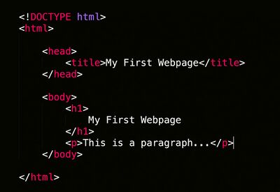
⊹A Simple HTML structure:
- <body> = contains all elements that are visible
- <head> = all the elements that are not visible on the page ex. <title> <style>
⊹General Technique: 1. Create element with HTML 2. Style with CSS one-by-one
⊹Well chosen content of H1 element is crucial to SEO.
⊹Only for links: <a href="https://www.w3schools.com" target="_blank">Visit Me!</a>
The target attribute specifies where to open the linked document.
Syntax: <a target="_blank|_self|_parent|_top|framename">
Entities
- Help avoid rendering issues
- Safeguard against more limited character encoding
- Provide characters not available on a keyboard
| Instead of | < | > | & |
| Use: | < ; | > ; | & ; |
Use nbsp; HTML document ALWAYS appear together on 1 line
⊹Option + Command + I --- Google Chrome
Class
- The class attribute can be used on any HTML element.
- The HTML class attribute specifies one or more class names for an element.
- Different HTML elements can point to the same class name.
- JavaScript can access elements with a specific class name with the getElementsByClassName() method
Elements
Text elements
⊹ <p> by default, come with margin at the top and bottom. So, {margin-top:0px; margin-bottom:0px; }
<strong> </strong> --- bold
<u> </u> --- underline
<span class="span-example" > </span> --- modify a specific part of the text without affecting the whole thing
.span-example {
  color: red
  margin-left: 12px; ---set a white space for text
}
.span-example:hover {
  text-decoration: underline;
}
<div>
division --- just a box, is a block element, it can contain other elements (like a container)
Ex.
<div class="video-preview">
.video-preview {
  width:300px;
  display: inline-block;
  vertical-aligh: top;
  margin-right: 15px;
}
<pre>
Text in a <pre> element is displayed in a fixed-width font, and the text preserves both spaces and line breaks. Really useful with ASCII-Art.
⊹<pre> elements with the default values:
pre {
 display: block;
 font-family: monospace;
 white-space: pre;
 margin: 1em 0;
}
<buttom>
Ex.
.button1 {
 background-color: blue;
 color: white;
 border: none;
 border-radius:18px;
 text-align: center;
 text-decoration: none;
 display: inline-block;
 font-weigh: bold;
 font-size: 16px;
 margin: 4px 2px;
 padding-bottom: 10px;
 vertical-align: top;
 transition-duration: 0.4s;
 cursor: pointer;
}
html: <button class="button button1">White</button>
{border-radius: 2px;} - rounded corner (ex. button )
{transition: background-color 1s, color 1s;}
{box-shadow: 5px(horizontal) 5px(vertical) 10px(blur) rgba(0, 0, 0, 0.6);}
"a" —> opacity, how see through this color is
Image and Text box
<img src="/images/html5.gif" alt="HTML5 Icon">
- src - Specifies the path to the image
- alt - Specifies an alternate text for the image
{
  width: 300px;
  height: 300px;
  object-fit: cover;
  object-position: contain;
  border-width: right;
  border-style: solid;
  border-color: red;
}
Text box:
<input class="search-bar" type="text" placeholder="Search">
.search-bar {
  font-size: 20px;
  margin-left: 12px;
}
Nested Layouts Technique
- vertical layout
- horizontal layout
use <div> to separate layouts. Create horizontal layouts with also display: inline-block.
Responsive design
Media query:
@media (max-width: 500px){

}
⭑CSS⭑
<link rel="stylesheet" href="style.css">
rel = relation
<link rel="stylesheet" href="styles/mystyle.css"> --- use / inside a folder, Filepaths
⊹Syntax simple CSS selectors
- Element
- class (define with .) -target
- id (define with #)
⊹Combining Selectors:
- Element with class selectors (selector.class)
- Child (direct) selector (selector > selector)
- Descendant selector (selector selector)
-Didn't cover:
- Adjacent sibling selector (selector + selector)
- General sibling selector (selector ~ selector)
⊹Pseudo-Class Selector (adds extra styles in a certain situation)
- : link
- : visited
- : hover
- : active
- : nth-child
Ex.
.subscribe-button:hover {
Background-color: blue ;
opacity: 0.3 -> to fade out an element, 0 (transparent)
}
.subscribe-button:active {
Background-color: green;
}
{
trasition: opacity 1s;
}
⊹Conflict Resolution
- Origin precedence: Last declaration wins
- Inheritance: DOM Tree
- Specificity: Most specific selector combination wins (has higher priority!)
(Score) 1. Style="..." 2. ID 3. Class, pseudo-class, attribute 4. # of Elements
Class name selector > Element name selector
Text Styles
.style {
  font-family: Arial, Helvetica, sans-serif;
  font-size: 24px;
  font-weight: bold;
  font-style: italic;
  text-align: center;
  color: #0000ff;
  line-height: 24px;
}
⭑Google Fonts put links into <head>, then change the font-family in CSS
Set Font Size With Em:
To allow users to resize the text (in the browser menu), many developers use em instead of pixels.
1em is equal to the current font size. The default text size in browsers is 16px. So, the default size of 1em is 16px.
The size can be calculated from pixels to em using this formula: pixels/16=em
The Box Model
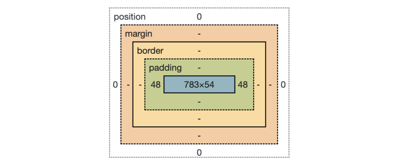
⊹The box-sizing property allows us to include the padding and border in an element's total width and height.
If you set box-sizing: border-box; on an element, padding and border are included in the width and height
* {
 box-sizing: border-box;
}
The * selector selects all elements.
The * selector can also select all elements inside another element.
Margin Collapse
Vertical(Top and bottom) margins that touch collapse and the larger one wins.
Horizontal margins combine together.
- Margins don't define the width of the box. Just define how far other elements should be pushed away from it.
- Space (around an element) = margin, Space (inside of an element) = Padding
⊹The float property is used for positioning and formatting content e.g. let an image float left to the text in a container.
float: left|right|none|inherit;
<style>
img {
 float: right;
}
</style>
- Float don't have vertical margin collapse
⊹The clear property controls the flow next to floated elements.
Specifies what should happen with the element that is next to a floating element.
clear: none|left|right|both|initial|inherit;
img {
 float: left;
}
p.clear {
 clear: left;
}
Display Property
1. block element: entire line
2. inline-block element: only takes up as much space as it needs to
3. inline element: within a line of text
Ex.
.video-author,
.video-stats {
  display: inline-block; --- can change from block element to inline-block element
}
Grid
Inline styles:
<div style="background-color: lightblue;"> div1 </div">
A grid is a layout that has rows and columns. To create a grip, we need a container.
<div style=" display: grid;
grid-template-columns: 1fr 1fr 1fr; --- fr= free space, ratio
column-gap: 20px; row-gap: 40px; --- add space between columns and rows
">
<div style="background-color: lightblue; height:200px;"> ABC </div">
The layout is more rigid in Grid than Felxbox.
Flexbox
Flexbox = flexible layout (dependent on our content size)
{display: flex;
flex-direction: row;
justify-content: space-between;
align-items: start/end/center/;
max-width: 300px;}
Nested Flexbox
.search-bar {
flex: 1;
height: 34px;
padding-left: 10px;
font-size: 16px;
border-width: 1px;
border-style: solid;
border-color: grey;
border-radius: 2px;
box-shadow: inset 1px 2px 5px rgba(0,0,0,0.05);
margin-left: -1px;
}
flex-shrink: 0; ---> Keep the width!
width: 0; ---> Shrink!
Target the placeholder on an input element: .search-bar::placeholder{}
Position
Position: Static --> by default
Position: fixed:
- Top (How far away our element is from the top of the window)
- Left, bottom, right --> can also be negative numbers
- Height, weight --> don’t want to resize the page
Absolute: placed on the page
Relative: placed in the browser window
Z-index: 1.2.......100
⭑JAVA SCRIPT⭑
<script src="js/script.js"></script>
<script> </script>


