User:Senka/special issue 2/My webpage: Difference between revisions
No edit summary |
No edit summary |
||
| (One intermediate revision by the same user not shown) | |||
| Line 1: | Line 1: | ||
==User page== | ==<span style="font-family: Helvetica; color: white; font-size: 30px; background-image: linear-gradient(180deg, white, #9300FF); padding: 5px;">User page</span>== | ||
Current state of user page/welcome mat: <br> | Current state of user page/welcome mat: <br> | ||
[[File:Screenshot user page.png|900px|frameless]] <br> | [[File:Screenshot user page.png|900px|frameless]] <br> | ||
| Line 5: | Line 5: | ||
* Implementing accessibility features that I have long forgotten to in my work online. Some I've implement here are contrast change, font change, font size change and of course alt text. Alt Text as Poetry [https://alt-text-as-poetry.net/] was a specifically relevant source here. | * Implementing accessibility features that I have long forgotten to in my work online. Some I've implement here are contrast change, font change, font size change and of course alt text. Alt Text as Poetry [https://alt-text-as-poetry.net/] was a specifically relevant source here. | ||
* Trying to build a more light-weight website. I used Image Magick to apply a ditering effect while preserving the colour of the image. This is the code I used: | * Trying to build a more light-weight website. I used Image Magick to apply a ditering effect while preserving the colour of the image. This is the code I used: | ||
{| width=100% align=center | |||
* I also wanted to have a double scroll view where the images and text are separate. | |<pre style="border:1px solid black; background:#D5B4FF; color:black;">magick convert "input file location.jpg/png" -resize 540 -gravity South -extent 540 -colorspace RGB -ordered-dither o8x8 "output file location.jpg/png" | ||
</pre> | |||
|} | |||
* I also wanted to have a double scroll view where the images and text are separate. Just as a point of people being able to interact differently with the information given and form connections in a less linear way. | |||
The user page can be found here for now [https://hub.xpub.nl/chopchop/~senak/] | The user page can be found here for now [https://hub.xpub.nl/chopchop/~senak/] | ||
==Abandoned Strike Page== | ==<span style="font-family: Helvetica; color: white; font-size: 30px; background-image: linear-gradient(180deg, white, #9300FF); padding: 5px;">Abandoned Strike Page</span>== | ||
I made a kind of magic 8 ball strike page, which would generate strike ideas when clicked on. This was abandoned quickly, mostly because I didn't not have too much time to put in different ideas of striking the cloud that I thought would resonate with the rest. I made the little prototype mostly thinking that we need to find playful ways in which we can resist these infrastructure that feels so all-encompassing and big.<br> | I made a kind of magic 8 ball strike page, which would generate strike ideas when clicked on. This was abandoned quickly, mostly because I didn't not have too much time to put in different ideas of striking the cloud that I thought would resonate with the rest. I made the little prototype mostly thinking that we need to find playful ways in which we can resist these infrastructure that feels so all-encompassing and big.<br> | ||
The little prototype can still be found here: https://hub.xpub.nl/chopchop/~senak/stike-ideas.html | The little prototype can still be found here: [https://hub.xpub.nl/chopchop/~senak/stike-ideas.html] | ||
[[File:Strike prototype.png|600px|thumb|right|alt=Strike webpage prototype|Strike webpage prototype]] | [[File:Strike prototype.png|600px|thumb|right|alt=Strike webpage prototype|Strike webpage prototype]] | ||
Latest revision as of 18:02, 31 March 2024
User page
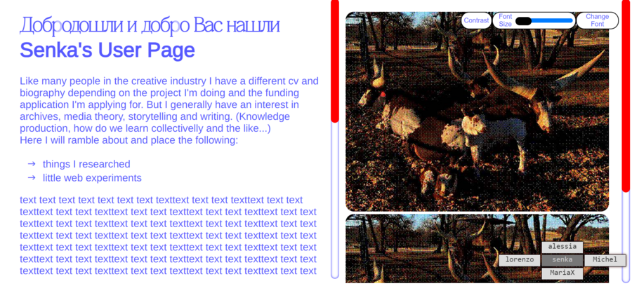
Current state of user page/welcome mat:

What I was trying to play with here:
- Implementing accessibility features that I have long forgotten to in my work online. Some I've implement here are contrast change, font change, font size change and of course alt text. Alt Text as Poetry [1] was a specifically relevant source here.
- Trying to build a more light-weight website. I used Image Magick to apply a ditering effect while preserving the colour of the image. This is the code I used:
magick convert "input file location.jpg/png" -resize 540 -gravity South -extent 540 -colorspace RGB -ordered-dither o8x8 "output file location.jpg/png" |
- I also wanted to have a double scroll view where the images and text are separate. Just as a point of people being able to interact differently with the information given and form connections in a less linear way.
The user page can be found here for now [2]
Abandoned Strike Page
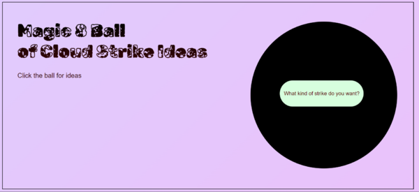
I made a kind of magic 8 ball strike page, which would generate strike ideas when clicked on. This was abandoned quickly, mostly because I didn't not have too much time to put in different ideas of striking the cloud that I thought would resonate with the rest. I made the little prototype mostly thinking that we need to find playful ways in which we can resist these infrastructure that feels so all-encompassing and big.
The little prototype can still be found here: [3]

