Nami's archive for graduation project: Difference between revisions
No edit summary |
|||
| (111 intermediate revisions by the same user not shown) | |||
| Line 1: | Line 1: | ||
<b style="font-size: | ==<b style="font-size:1.5rem; color:#740099;">Starting point : Why do all the websites look the same today?</b>== | ||
===<p style="color: #c200ff;>Questions</p>=== | |||
<li>"Why are all the same rules in web design iterated?"</li> | |||
<li>"Why can't designers and client get out of the loop?"</li> | |||
<li style="text-decoration: underline dotted #E79EFF;">[[Nami-project_proposal|Project proposal(old)]]</li> | |||
<li style="text-decoration: underline dotted #E79EFF;">[[Nami-newproject_proposal|Project proposal(new)]]</li> | |||
<li style="text-decoration: underline dotted #E79EFF;">[[Nami-thesis_outline|Thesis outline]]</li> | |||
== | ===<p style="color: #c200ff;>Target audiences</p>=== | ||
Designers and front-end developers currently working in the industry. | Designers and front-end developers currently working in the industry. | ||
==Aesthetics== | ==<b style="font-size:1.5rem; color:#740099;">Research</b>== | ||
===<p style="color:#c200ff;">Aesthetics</p>=== | |||
<ul> | <ul> | ||
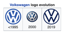
<b>Flat deisgn</b> | <b style = "font-size:18px; color:#DD75FF;"><Flat deisgn></b> | ||
<li>[https://en.wikipedia.org/wiki/Flat_design What is Flat design?]</li> | <li>[https://en.wikipedia.org/wiki/Flat_design What is Flat design?]</li> | ||
[[File:Volkswagenlogoevolution.png| | [[File:Volkswagenlogoevolution.png|250px|frameless|none|Volkswagen logo evolution]]<br> | ||
<li>Reading an article <b><i>Why the Flat Design Trend is Hurting Usability</i></b> (from :https://www.vandelaydesign.com/why-the-flat-design-trend-is-hurting-usability/)</li> | |||
[[File:Ioschangetoflatdesign.png|400px|frameless|none|IOS change to flat design]] | |||
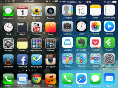
<p style = "width:70%;">Before the iOS change to a flat look, icons resembled how they appeared in real life, but now the icons look more like illustrations and much less like real life objects. When Jony Ive, Apple’s Senior Vice President of Design, explained the reason why iOS 7 went with a flat design, he pointed out that people are now comfortable with touch screens and no longer need real world representations. “So there was an incredible liberty in not having to reference the physical world so literally. We were trying to create an environment that was less specific. It got design out of the way.” <br> | |||
Flat designs work well in <b>responsive websites</b> as well, since flat designs are based on a <b>grid</b>. The Archie Wilkinson website below is an excellent example of just how beautifully a flat design transfers between differently sized display devices. The navigation menu, the image, the icons all line up neatly and cleanly on a smaller screen, and the flat design keeps it from looking crowded on such a small space.</p> | |||
<br> | |||
[[File:iphonecontrolcenter.png|350px|frameless|none|Iphone Control Center]] | |||
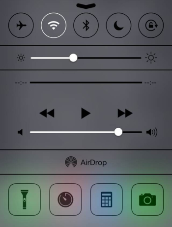
<i>The iPhone Control Center is so flat, it’s hard to tell if any of the icons are buttons.</i><br> | |||
<p style = "width:70%;">Two large complaints about flat designs are that they are not intuitive and are simply way too confusing. Without the visual cues that help users know which icons are buttons, interfaces and websites leave many users frustrated. Windows 8 created their flat design specifically for tablets, and it works pretty well for tablet users since swiping through the interface works for a touch screen. However, desktop users with a mouse have trouble learning how to manuever through the interface.</p> | |||
<li> | |||
<b style = "color:blue;">Interesting study : [https://www.nngroup.com/articles/flat-ui-less-attention-cause-uncertainty/ Flat UI Elements Attract Less Attention and Cause Uncertainty]</b></li> | |||
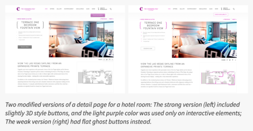
<p style = "width:70%;">Nielsen Norman Group took 9 web pages from live websites and modified them to create two nearly identical versions of each page, with the same layout, content and visual style. The two versions differed only in the use of strong, weak, or absent signifiers for interactive elements (buttons, links, tabs, sliders).<br> | |||
In result,<br> | |||
- The average amount of time was significantly higher on the weak-signifier versions than the strong-signifier versions. <br> | |||
- On average participants spent 22% more time (i.e., slower task performance) looking at the pages with weak signifiers. | |||
The average number of fixations was significantly higher on the weak-signifier versions than the strong-signifier versions. On average, people had 25% more fixations on the pages with weak signifiers.</p> | |||
[[File:Flatdesignexperiment.png|500px|frameless|none|Nielsen Norman Group's design experiment about flat-ising existing website]] | |||
<br> | |||
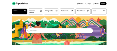
<li>Tripadvisor</li> | |||
[[File:tripadvisor2.png|400px|thumb|none|flat links]] | |||
<br> | |||
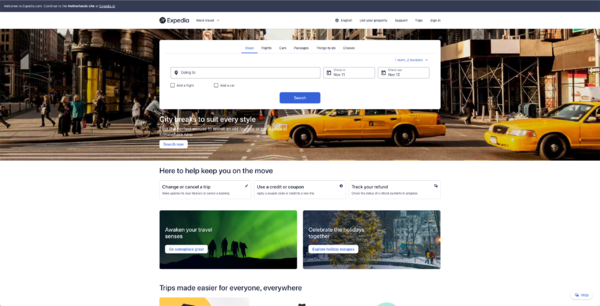
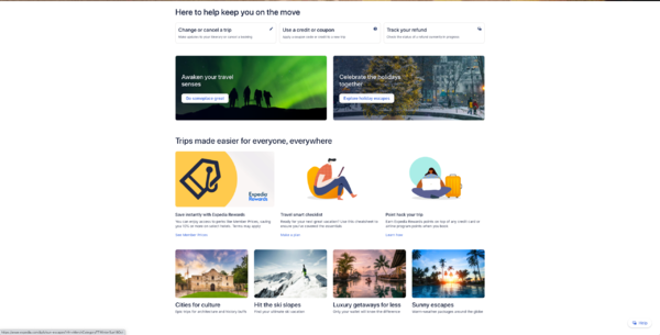
<li>Expedia</li> | |||
[[File:expedia1.png|600px|thumb|none|landing page]]<br> | |||
[[File:expedia2.png|600px|thumb|none|landing page]] | |||
<br> | |||
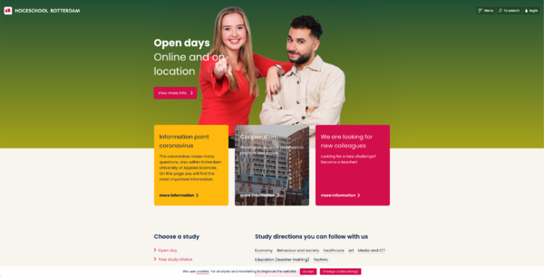
<li>Hogeschool Rotterdam</li> | |||
[[File:hoge1.png|600px|thumb|none|landing page is typically flat.]] | |||
[[File:hoge4.png|600px|thumb|none|This website indicates links(buttons) with underline decoration.quite traditional but somehow flat.]] | |||
[[File:hoge5.png|600px|thumb|none|This website indicates links(buttons) with textbox decoration.]] <br> | |||
</ul> | |||
<ul><b style="font-size: 14px;">-->Findings (These will be my further research questions.)</b> | |||
<li>Co-relation(influence) between <i>the Flat design</i> and <i>Efficient User Interface</i></li>. (<--necessarily? is that an absolute rule?)<br> | |||
These kinds of flat design were chosen not only for trend of minimalistic visual culture but also for (still controversial) efficient user navigation, which is still controversial if it really is. </li> | |||
<li>Co-relation(influence) between <i>the Flat design</i> and <i>Responsive design motto</i></li> | |||
<li><i>[https://en.wikipedia.org/wiki/Bootstrap_(front-end_framework) On August 19, 2013, Bootstrap 3, was released. It redesigned components to use <b>flat design</b> and a mobile first approach. Bootstrap 3 features new plugin system with namespaced events. Bootstrap 3 dropped Internet Explorer 7 and Firefox 3.6 support, but there is an optional polyfil for these browsers.]</i></li> | |||
</ul> | </ul> | ||
| Line 18: | Line 61: | ||
<ul> | <ul> | ||
<b>Brutalist design</b> | <b style = "font-size:18px; color:#DD75FF;"><Brutalist design></b> | ||
<li>[https://brutalistwebsites.com/ example1]</li> | <p style = "width:70%%;">Brutalism is a hot trend in web design, and this framework is a free, open source framework for building brutal websites.<br> | ||
Brutalism = C.R.U.D.E.<br> | |||
When thinking of brutalism, think <b>CRUDE</b>:<br> | |||
<li style = "list-style:none;"><b>C</b>ynically confrontational</li> | |||
<li style = "list-style:none;"><b>R</b>oughly raw & rugged</li> | |||
<li style = "list-style:none;"><b>U</b>ncomfortably ugly & unpolished</li> | |||
<li style = "list-style:none;"><b>D</b>eliberately daring & damaging</li> | |||
<li style = "list-style:none;"><b>E</b>xtremely exasperated & embittered</li></p><br> | |||
<p><li>Webpages aiming for this style of design</li></p> | |||
<li>[https://www.hoverstat.es/ example2: hoverstat.es]</li> | |||
<li>[https://brutalistwebsites.com/ example1:brutalistwebsites.com]</li> | |||
<li>[https://www.brutalistframework.com/#aboutbf/ example3: brutalist framework.com]</li> | |||
<p style = "color:red; font-family: Gill Sans;">I wonder if the brutalist movement tends to draw <i>worse level of user navigating</i> and <i>worse responsive/adaptive design</i> than <span style="color: blue;">the flat design</span>?<br> | |||
Thus I'd like to find good examples of the brutalist design in web, having good user experience and responsive mechanism.</p><br> | |||
</ul> | </ul> | ||
==Tools== | <br> | ||
<ul> | |||
<b style = "font-size:18px; color:#DD75FF;"><A middle-ground between skeuomorphism and flat design by <i>[https://en.wikipedia.org/wiki/Jakob_Nielsen_(usability_consultant) Jakob Nielsen]></i></b> | |||
<br>Things to be filled...<br><br><br></ul> | |||
===<p style="color:#c200ff">Mobile-first agenda</p>=== | |||
<b>Responsive design</b>(from Wikipedia about [https://en.wikipedia.org/wiki/Jakob_Nielsen_(usability_consultant) Jakob Nielson])<br> | |||
Nielsen's 2012 guidelines, "Repurposing vs Optimized Design" that web sites made for mobile devices be designed separately from their desktop-oriented counterparts has come under fire from Webmonkey's Scott Gilbertson,[38] as well as [https://news.uga.edu/chuck-bryant-and-josh-clark-stuff-you-should-know/ Josh Clark writing] in .net magazine,[39] and Opera's Bruce Lawson, writing in Smashing Magazine,[40] and other technologists and web designers who advocate responsive web design.[41][42] In an interview with .net magazine, Nielsen explained that he wrote his guidelines from a usability perspective, not from the viewpoint of implementation.[43] | |||
However, Nielsen appeared to have ignored the emerging software technology related to responsive web design, whereby a single body of code, while requiring more painstaking implementation, can be run on devices of various screen sizes, from mobile screens to desktop monitors.[42] Nielsen has been accused of taking a "puritanical" approach to usability, and not being able to keep up his usability evaluations in step of technological changes.[8] | |||
</ul> | |||
===<p style="color:#c200ff">Tools</p>=== | |||
<ul> | <ul> | ||
<b>Bootstrap</b> | <b>Bootstrap</b> | ||
<p style = "width:80%;">[https://en.wikipedia.org/wiki/Bootstrap_(front-end_framework) Bootstrap] is a free and open-source CSS framework directed at responsive, mobile-first front-end web development. It contains CSS- and (optionally) JavaScript-based design templates for typography, forms, buttons, navigation, and other interface components.As of August 2021, Bootstrap is the tenth most starred project on GitHub, with over 152,000 stars, behind freeCodeCamp (over 328,000 stars), Vue.js framework, React library, TensorFlow and others. </p> | |||
</ul> | </ul> | ||
<ul> | <ul> | ||
<b>React</b> | <b>React (Javascript library)</b> | ||
<p style = "width:80%;">[https://en.wikipedia.org/wiki/React_(JavaScript_library) React] (also known as React.js or ReactJS) is a free and open-source front-end JavaScript library[3] for building user interfaces based on UI components. It is maintained by Meta (formerly Facebook) and a community of individual developers and companies.[4][5][6] React can be used as a base in the development of single-page or mobile applications. However, React is only concerned with state management and rendering that state to the DOM, so creating React applications usually requires the use of additional libraries for routing, as well as certain client-side functionality</p> | |||
</ul> | </ul> | ||
<ul> | |||
<b>Material design (web design guidelines by Google) - relevant with Flat-design</b> | |||
<p style = "width:80%;"></p> | |||
</ul> | |||
<b>Experiments : Clumsy coding!</b> | |||
<p style = "width:80%">In reality, coding line by line through hands is rarely involved, as designers and developers working in the industry mostly have a very limited amount of time to finish the work, meaning they tend to extract certain codes from libraries such as Bootstrap and React.<br>For example Bootstrap has a whole code library that users can download and adjust. Then I wonder what if I try to embody the same sketch, not seeing their codes, but only using my knowledge in front-end skills and searching things by myself.</p> | |||
[[File:Header by bootstrap.png|400px|frameless|none|Header by bootstrap]] | |||
<html lang = "en"> | |||
<head> | |||
<meta name = "viewport" content = "width=device-width, initial-scale=1.0"> | |||
<meta http-equiv="X-UA-Compatible" content="ie=edge"> | |||
<title>Bootstrap_header test</title> | |||
<link rel="canonical" href="https://getbootstrap.com/docs/5.1/examples/headers/"> | |||
<!-- Bootstrap core CSS --> | |||
<link href="../assets/dist/css/bootstrap.min.css" rel="stylesheet"> | |||
<style> | |||
.bd-placeholder-img { | |||
font-size: 1.125rem; | |||
text-anchor: middle; | |||
-webkit-user-select: none; | |||
-moz-user-select: none; | |||
user-select: none; | |||
} | |||
@media (min-width: 768px) { | |||
.bd-placeholder-img-lg { | |||
font-size: 3.5rem; | |||
} | |||
} | |||
</style> | |||
<!-- Custom styles for this template --> | |||
<link rel = "stylesheet" href = "boot_test1.css"> | |||
</head> | |||
<body> | |||
<header class="p-3 bg-dark text-white"> | |||
<div class="container"> | |||
<div class="d-flex flex-wrap align-items-center justify-content-center justify-content-lg-start"> | |||
<a href="/" class="d-flex align-items-center mb-2 mb-lg-0 text-white text-decoration-none"> | |||
<svg class="bi me-2" width="40" height="32" role="img" aria-label="Bootstrap"><use xlink:href="#bootstrap"/></svg> | |||
</a> | |||
<ul class="nav col-12 col-lg-auto me-lg-auto mb-2 justify-content-center mb-md-0"> | |||
<li><a href="#" class="nav-link px-2 text-secondary">Home</a></li> | |||
<li><a href="#" class="nav-link px-2 text-white">Features</a></li> | |||
<li><a href="#" class="nav-link px-2 text-white">Pricing</a></li> | |||
<li><a href="#" class="nav-link px-2 text-white">FAQs</a></li> | |||
<li><a href="#" class="nav-link px-2 text-white">About</a></li> | |||
</ul> | |||
<form class="col-12 col-lg-auto mb-3 mb-lg-0 me-lg-3"> | |||
<input type="search" class="form-control form-control-dark" placeholder="Search..." aria-label="Search"> | |||
</form> | |||
<div class="text-end"> | |||
<button type="button" class="btn btn-outline-light me-2">Login</button> | |||
<button type="button" class="btn btn-warning">Sign-up</button> | |||
</div> | |||
</div> | |||
</div> | |||
</header> | |||
<script src="../assets/dist/js/bootstrap.bundle.min.js"></script> | |||
</body> | |||
</html> | |||
<br> | |||
[[File:Header_by_myhands_resized.png|400px|frameless|left|Header by my hands]] | |||
===<p style="color:#c200ff">Interview</p>=== | |||
<li>[[Francesco (XPUB1 student)]]</li> | |||
===<p style="color:#c200ff">Workshop</p>=== | |||
First workshop: 4th Dec 2021 [[https://pad.xpub.nl/p/041221_workshop]] | |||
Latest revision as of 11:42, 20 December 2021
Starting point : Why do all the websites look the same today?
Questions
Target audiences
Designers and front-end developers currently working in the industry.
Research
Aesthetics
-
<Flat deisgn>
- What is Flat design?
- Reading an article Why the Flat Design Trend is Hurting Usability (from :https://www.vandelaydesign.com/why-the-flat-design-trend-is-hurting-usability/)
- Interesting study : Flat UI Elements Attract Less Attention and Cause Uncertainty
- Tripadvisor
- Expedia
- Hogeschool Rotterdam
Before the iOS change to a flat look, icons resembled how they appeared in real life, but now the icons look more like illustrations and much less like real life objects. When Jony Ive, Apple’s Senior Vice President of Design, explained the reason why iOS 7 went with a flat design, he pointed out that people are now comfortable with touch screens and no longer need real world representations. “So there was an incredible liberty in not having to reference the physical world so literally. We were trying to create an environment that was less specific. It got design out of the way.”
Flat designs work well in responsive websites as well, since flat designs are based on a grid. The Archie Wilkinson website below is an excellent example of just how beautifully a flat design transfers between differently sized display devices. The navigation menu, the image, the icons all line up neatly and cleanly on a smaller screen, and the flat design keeps it from looking crowded on such a small space.
The iPhone Control Center is so flat, it’s hard to tell if any of the icons are buttons.
Two large complaints about flat designs are that they are not intuitive and are simply way too confusing. Without the visual cues that help users know which icons are buttons, interfaces and websites leave many users frustrated. Windows 8 created their flat design specifically for tablets, and it works pretty well for tablet users since swiping through the interface works for a touch screen. However, desktop users with a mouse have trouble learning how to manuever through the interface.
Nielsen Norman Group took 9 web pages from live websites and modified them to create two nearly identical versions of each page, with the same layout, content and visual style. The two versions differed only in the use of strong, weak, or absent signifiers for interactive elements (buttons, links, tabs, sliders).
In result,
- The average amount of time was significantly higher on the weak-signifier versions than the strong-signifier versions.
- On average participants spent 22% more time (i.e., slower task performance) looking at the pages with weak signifiers.
The average number of fixations was significantly higher on the weak-signifier versions than the strong-signifier versions. On average, people had 25% more fixations on the pages with weak signifiers.
- -->Findings (These will be my further research questions.)
- Co-relation(influence) between the Flat design and Efficient User Interface . (<--necessarily? is that an absolute rule?)
- Co-relation(influence) between the Flat design and Responsive design motto
- On August 19, 2013, Bootstrap 3, was released. It redesigned components to use flat design and a mobile first approach. Bootstrap 3 features new plugin system with namespaced events. Bootstrap 3 dropped Internet Explorer 7 and Firefox 3.6 support, but there is an optional polyfil for these browsers.
These kinds of flat design were chosen not only for trend of minimalistic visual culture but also for (still controversial) efficient user navigation, which is still controversial if it really is.
-
<Brutalist design>
- Cynically confrontational
- Roughly raw & rugged
- Uncomfortably ugly & unpolished
- Deliberately daring & damaging
- Extremely exasperated & embittered
- Webpages aiming for this style of design
- example2: hoverstat.es
- example1:brutalistwebsites.com
- example3: brutalist framework.com
Brutalism is a hot trend in web design, and this framework is a free, open source framework for building brutal websites.
Brutalism = C.R.U.D.E.
When thinking of brutalism, think CRUDE:
I wonder if the brutalist movement tends to draw worse level of user navigating and worse responsive/adaptive design than the flat design?
Thus I'd like to find good examples of the brutalist design in web, having good user experience and responsive mechanism.
-
<A middle-ground between skeuomorphism and flat design by Jakob Nielsen>
Things to be filled...
Mobile-first agenda
Responsive design(from Wikipedia about Jakob Nielson)
Nielsen's 2012 guidelines, "Repurposing vs Optimized Design" that web sites made for mobile devices be designed separately from their desktop-oriented counterparts has come under fire from Webmonkey's Scott Gilbertson,[38] as well as Josh Clark writing in .net magazine,[39] and Opera's Bruce Lawson, writing in Smashing Magazine,[40] and other technologists and web designers who advocate responsive web design.[41][42] In an interview with .net magazine, Nielsen explained that he wrote his guidelines from a usability perspective, not from the viewpoint of implementation.[43]
However, Nielsen appeared to have ignored the emerging software technology related to responsive web design, whereby a single body of code, while requiring more painstaking implementation, can be run on devices of various screen sizes, from mobile screens to desktop monitors.[42] Nielsen has been accused of taking a "puritanical" approach to usability, and not being able to keep up his usability evaluations in step of technological changes.[8]
Tools
-
Bootstrap
Bootstrap is a free and open-source CSS framework directed at responsive, mobile-first front-end web development. It contains CSS- and (optionally) JavaScript-based design templates for typography, forms, buttons, navigation, and other interface components.As of August 2021, Bootstrap is the tenth most starred project on GitHub, with over 152,000 stars, behind freeCodeCamp (over 328,000 stars), Vue.js framework, React library, TensorFlow and others.
-
React (Javascript library)
React (also known as React.js or ReactJS) is a free and open-source front-end JavaScript library[3] for building user interfaces based on UI components. It is maintained by Meta (formerly Facebook) and a community of individual developers and companies.[4][5][6] React can be used as a base in the development of single-page or mobile applications. However, React is only concerned with state management and rendering that state to the DOM, so creating React applications usually requires the use of additional libraries for routing, as well as certain client-side functionality
-
Material design (web design guidelines by Google) - relevant with Flat-design
Experiments : Clumsy coding!
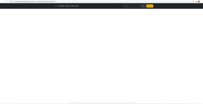
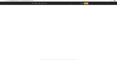
In reality, coding line by line through hands is rarely involved, as designers and developers working in the industry mostly have a very limited amount of time to finish the work, meaning they tend to extract certain codes from libraries such as Bootstrap and React.
For example Bootstrap has a whole code library that users can download and adjust. Then I wonder what if I try to embody the same sketch, not seeing their codes, but only using my knowledge in front-end skills and searching things by myself.
<html lang = "en"> <head>
 <meta name = "viewport" content = "width=device-width, initial-scale=1.0">
 <meta http-equiv="X-UA-Compatible" content="ie=edge">
 <title>Bootstrap_header test</title>

 <link rel="canonical" href="https://getbootstrap.com/docs/5.1/examples/headers/">
<link href="../assets/dist/css/bootstrap.min.css" rel="stylesheet">
   <style>
     .bd-placeholder-img {
       font-size: 1.125rem;
       text-anchor: middle;
       -webkit-user-select: none;
       -moz-user-select: none;
       user-select: none;
     }
     @media (min-width: 768px) {
       .bd-placeholder-img-lg {
         font-size: 3.5rem;
       }
     }
   </style>
<link rel = "stylesheet" href = "boot_test1.css">
</head>
<body>
<header class="p-3 bg-dark text-white">
       <a href="/" class="d-flex align-items-center mb-2 mb-lg-0 text-white text-decoration-none">
         <svg class="bi me-2" width="40" height="32" role="img" aria-label="Bootstrap"><use xlink:href="#bootstrap"/></svg>
       </a>
       <form class="col-12 col-lg-auto mb-3 mb-lg-0 me-lg-3">
         <input type="search" class="form-control form-control-dark" placeholder="Search..." aria-label="Search">
       </form>
         <button type="button" class="btn btn-outline-light me-2">Login</button>
         <button type="button" class="btn btn-warning">Sign-up</button>
 </header>
 <script src="../assets/dist/js/bootstrap.bundle.min.js"></script>
</body>
</html>
Interview
Workshop
First workshop: 4th Dec 2021 [[1]]
