User:Max Lehmann/Resubmition: Difference between revisions
Max Lehmann (talk | contribs) No edit summary |
Max Lehmann (talk | contribs) No edit summary |
||
| Line 80: | Line 80: | ||
<hr> | <hr> | ||
Over the course of the project I will develop further experiments, such as a website specifically for people with impaired vision, or a website that is as distraction-free as possible. I might also explore variations of the interfaces already mentioned. | Over the course of the project I will develop further experiments, such as a website specifically for people with impaired vision, or a website that is as distraction-free as possible. I might also explore variations of the interfaces already mentioned. | ||
[[MA_documentation | Documentation]] | |||
Latest revision as of 19:14, 14 June 2021
MAX LEHMANN
PROJECT PROPOSAL
08.02.2021
| Presentation
WHY
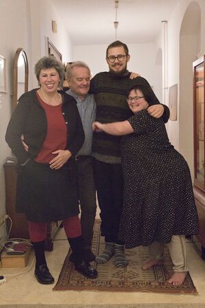
Growing up, I witnessed both the benefits of functioning social inclusion as well as the emotional and functional consequences of exclusionary structures due to my family context and personal history. The main reason for this is that since my sister was born with Trisomy21, my parents raised her to be self-determined, even though the system we live in does not provide for this. For as long as I can remember my parents, my mother especially, have invested most of their time in supporting a development towards a more inclusive society.
My upbringing and education led me to the field of media design and since the beginning of this course I have been particularly interested in web coding and design. I have already addressed the issue of inclusion in many ways, including in the context of Special Issue 10, where I developed a gesture controllable sound interface. In Special Issue 11 I collaborated on the "Cookbook" web-publication, which presented a complex topic in a simplified way. I also had my first experiences with a Wiki as a backend solution in this project.
With this project it is my desire to simplify the implementation of websites for inclusion by bringing together a selection of information researched on the internet and structuring it in a clear and understandable way. I would like to take on a mediating function by relating this practical content to individual user experiences of disadvantages and exclusion linked to the use of websites and thus clarify for website creators the concise practical and emotional advantages of an inclusive approach for users.
By conducting interface experiments, I additionally aim to explore an open, collaborative system for website creation that is responsive to human diversity by recognizing that different solutions may be necessary to address different needs to ultimately provide equal opportunities to participate for all.
WHAT
I am creating an index of online references that can help with the creation of websites for inclusion on a Wiki. Websites for inclusion in this case means websites that work well for all people, including those with physical or mental disabilities. The references will be combined with individual testimonials of exclusion in this area, as well as illustrations and simple summaries.
The wiki will serve as both, the primary interface to access these contents, as well as a backend from which I will conduct interface experiments. In these experiments I will write scripts to create websites by querying contents from the wiki. I will at least create one functioning secondary experimental interface. I will go into the ideas regarding these interfaces in more detail later in the following text.
LARGER CONTEXT
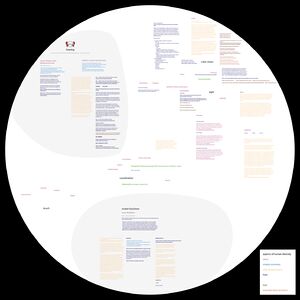
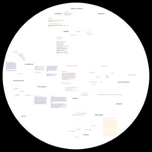
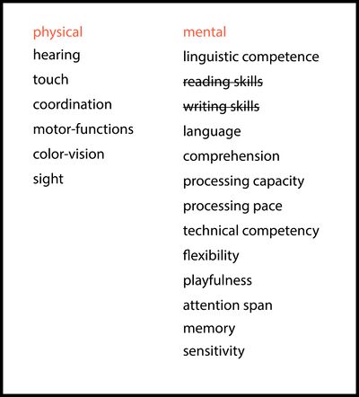
My approach is based on the basic assumption that there is no such thing as a normal user, that each person is special in various aspects and therefore may need or at least benefit from support or adaptations. Following this assumption, I have created a list of abilities in which people may differ when using websites, which can lead to exclusion if not taken into account in the creation process. From these aspects of human abilities, I have derived areas of website creation from which exclusion can arise. I assign appropriate references to these areas to help with an inclusive implementation.
From this assumption I also conclude that different interfaces work differently well or badly for different people. Above all, it becomes clear that it is probably impossible, but in any case highly demanding, to create an interface that works for everyone. So I am assuming that a "one-fits-all" interface does not exist.
There is of course the possibility to offer customization on a website (as seen here ) or the use of assistive technology. In my project, however, I want to look beyond the usual way of dealing with diversity in websites so far and see if there are advantages in offering many different interfaces that structure and render the same content in different ways. My idea is that this should be an open ended system, where I offer the content for collaboration, so that on a long term other interested people could develop further interfaces and offer them to the general public. The user can in the end choose which of the interfaces she/he prefers as her/his first interaction with the website.
AUDIENCE
This publication is aiming at creators of websites. To be specific, web designers, web developers, as well as people who prepare content explicitly for use on the Internet. Even though this is a very broad area of work, I think that it is hardly possible to reduce oneself to certain groups here because of the entanglement of the individual areas. Basically, it is for those who work in the described field and make decisions that affect the user's interaction with a website.
HOW
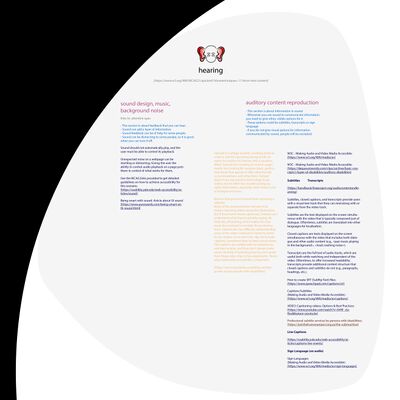
To feed the index with helpful content, I am gathering a collection of references and tools linked to the topic of inclusive creation of websites through extensive online research. I will structure the content on a wiki in the near future. I have already set up the Wiki on a personal Raspberry Pi. So far, I have been using Adobe Illustrator to collect and organize the collected content.
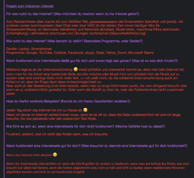
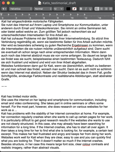
I will conduct a limited number of interviews on the topic of disadvantage and exclusion when using websites, but also on individual preferences and needs to surpass these. If additional testimonials are needed, I will research them online. The testimonies are intended to demonstrate to website creators in a direct and easily understandable way, why it is important to adopt an inclusive approach. This will work by building empathy with the excluded individuals through the stories, which will explain the concrete factual and emotional consequences for excluded individuals. I have already sent a set of questions to one person, received answers and summarized them in a text. I will ask the person additional questions to complete the text and have the person confirm the final text. By communicating in this way, I can ensure that the texts produced reflects the experiences and opinions of the interviewee as realistically as possible.
The illustrations, some of which I will animate, should be as minimalist and unambiguous in style as possible. As a secondary means of communication they will support the content, make it lively and playful to interact with.
Simple summaries will facilitate a direct understanding of what a certain section of the map is covering. These two contents can reduce the inhibition to interact with the material. I will create both myself.
In a manual, which will be available on the wiki and the other interfaces I will document my process, examine the functionality, advantages and disadvantages of the different interfaces. In addition, basic information and explanations on diversity and inclusion will be provided here.
As the primary interface, the wiki should be as inclusive as possible, so that as many people as possible, including those with disabilities, can access the content. To ensure this, I would like to use Wikimedia skins and possibly adapt them further. The Skin:2018 might be a good starting point for this.
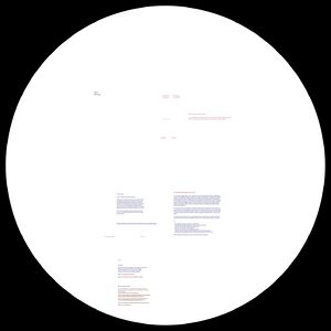
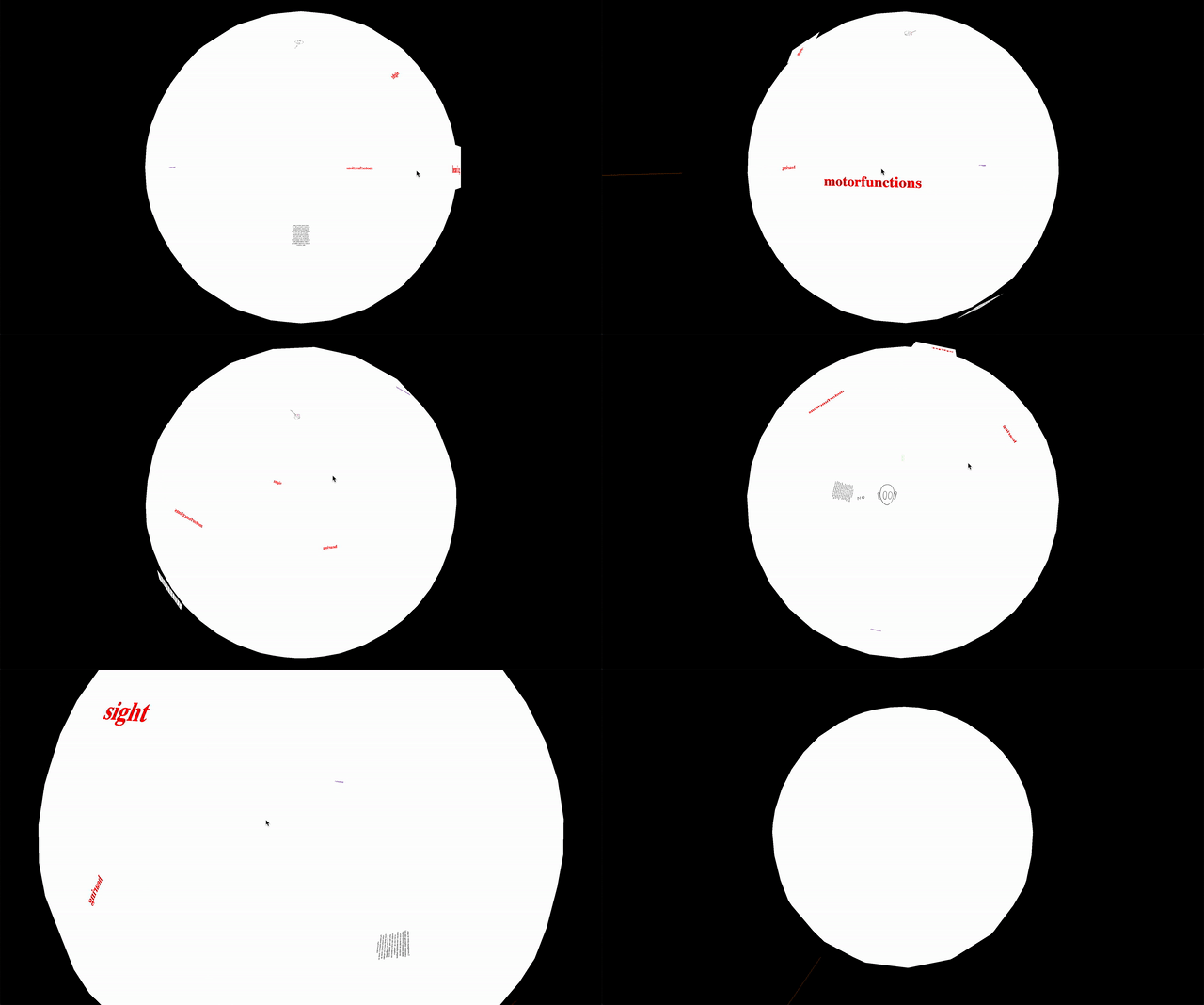
The first interface experiment that I am trying to implement is the presentation of the content as an interactive map. In this experiment I am assuming that spatially arranging content may be a more intuitive approach for some users. The non-linear navigation, which works by rotation and zoom, might be more comfortable for some users, as all information is accessible on one page. What is particularly interesting for me here is the reduction of complexity that is usually associated with the zoom level in maps: from far away, the viewer only sees the uppermost level of a complex information structure. When the user zooms into the map, further layers of information appear that are spatially structured around superordinate points. I want to find out how it works to use this form of interaction for a guide that has nothing to do with geography. This might allow for complex content structures to be navigated easily and intuitively. In this way, acquiring knowledge on inclusive approaches should be easy and fun, hopefully increasing the willingness to adopt them. However, this approach excludes users who are dependent on linear navigation, such as users with impaired vision.
After testing several, I am using the Javascript Library three.js. to render contents in 3D and to recreate the described functionality of a map. I have already made important progress with this experiment after writing a Javascript/ThreeJS script that automatically places listed content on a sphere based on four attributes (Name, Type, Position & Content).
Over the course of the project I will develop further experiments, such as a website specifically for people with impaired vision, or a website that is as distraction-free as possible. I might also explore variations of the interfaces already mentioned. Documentation

