AndreasSteveFeedbackonProposal: Difference between revisions
No edit summary |
No edit summary |
||
| (7 intermediate revisions by the same user not shown) | |||
| Line 1: | Line 1: | ||
<div style='max-width: 50rem; margin: 0 auto;'> | <div style='max-width: 50rem; margin: 0 auto;'> | ||
Back to: | |||
https://pzwiki.wdka.nl/mediadesign/Andreas_Project_Proposal_Draft_3 | |||
'''Hi Andreas. Steve writes:I decided to reproduce your page and add annotations because it occurred to me after our meeting that you need to consider some key elements''' | '''Hi Andreas. Steve writes:I decided to reproduce your page and add annotations because it occurred to me after our meeting that you need to consider some key elements''' | ||
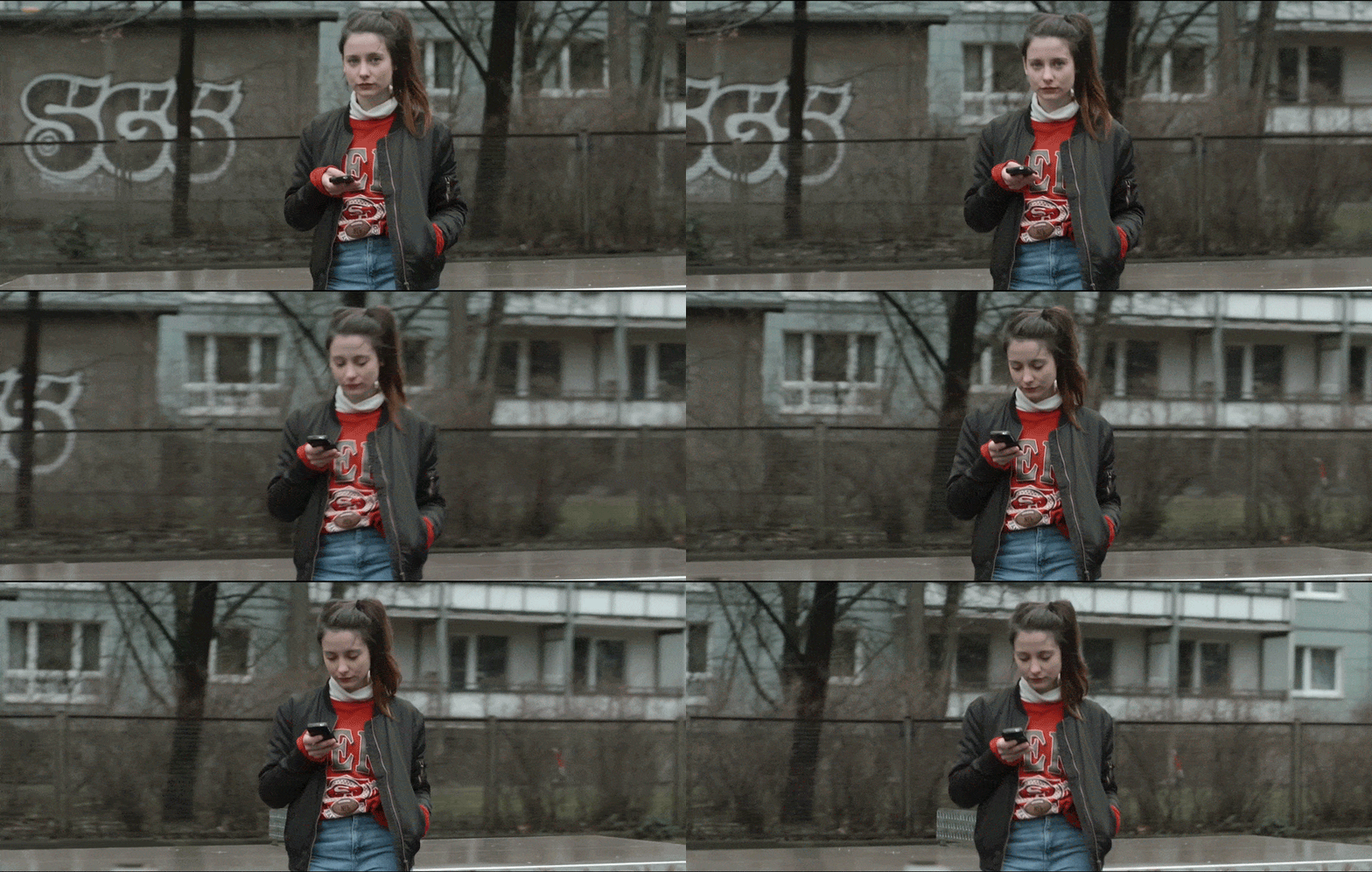
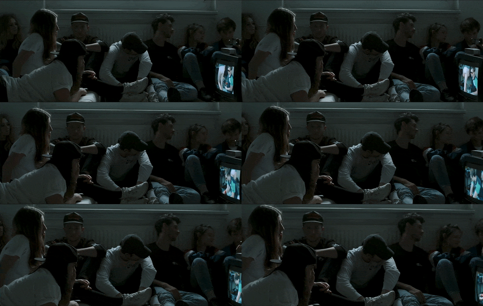
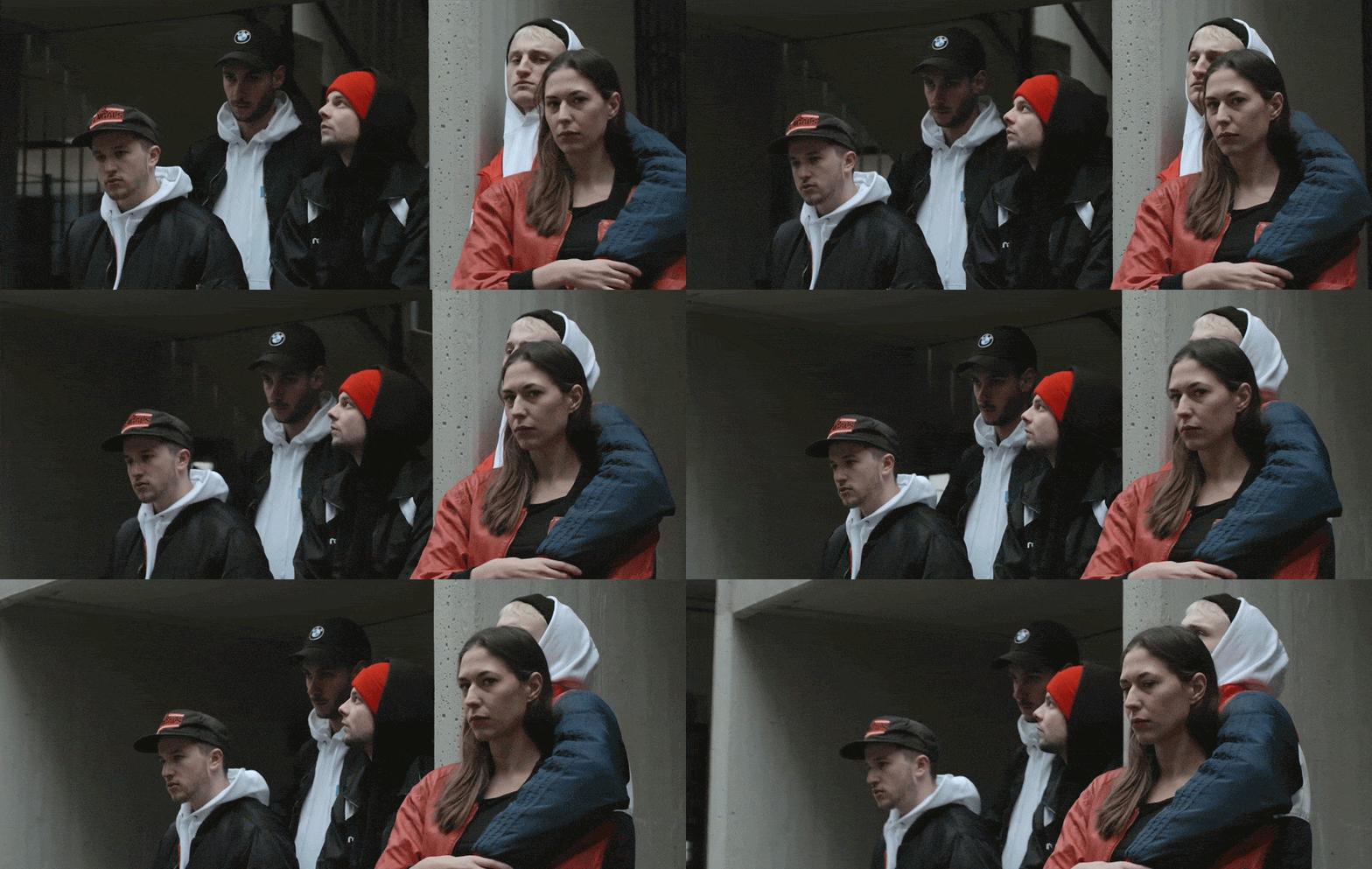
'''The first thing that strikes me is the clarity of these images''' | |||
[[File:Virtusdecendi1.gif|Fig 1]] | |||
[[File:Virtusdecendi2.gif|Fig 2]] | |||
[[File:Virtusdecendi3.gif|Fig 3]] | |||
'''They leave me space to recognise the issues underlining your work. Their power is lost when we see them 'layered' into a sketch which synthesises the various things you have been working on. Why not remove the need to explain from your project altogether, and leave that for the thesis. I think of you explore the formal elements of these new forms, such as the gif or Tiktok you could make some interesting work. The desire to 'layer' seems to me to be a way to force a synthesis of the different elements of your work. Perhaps it might be more useful to separate them. Your proposal would still be around brevity but the elements would be separate. So you could propose to produce a series of discreet works which explore brevity plus a thesis which discusses brevity. My issue with the documentary you propose is that you might miss the opportunity to explore the issue of brevity artistically. I feel you need to give yourself space to actually make work that really explores the possibilities and implications of this term 'brevity'. To simultaneously make commentary on it seems limiting to me. As far as I understand you do not have material for the two aspects of your film the 'professionals' and 'your own comments'; but you do have your experiments and films. I suspect you feel you may have to deliver a big, multi-layered project, whereas you may need to consolidate the practice you are developing (without feeling the need to justify every move you make). These are my thoughts. I will be in next week if you want to meet for a chat. ''' | |||
==What do you want to make?== | ==What do you want to make?== | ||
| Line 135: | Line 153: | ||
[[File:Virtusdecendi3.gif|Fig 3]] | [[File:Virtusdecendi3.gif|Fig 3]] | ||
== Visual Inspiration: == | == Visual Inspiration: == | ||
Latest revision as of 14:17, 27 November 2019
Back to: https://pzwiki.wdka.nl/mediadesign/Andreas_Project_Proposal_Draft_3
Hi Andreas. Steve writes:I decided to reproduce your page and add annotations because it occurred to me after our meeting that you need to consider some key elements
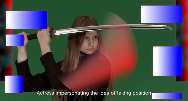
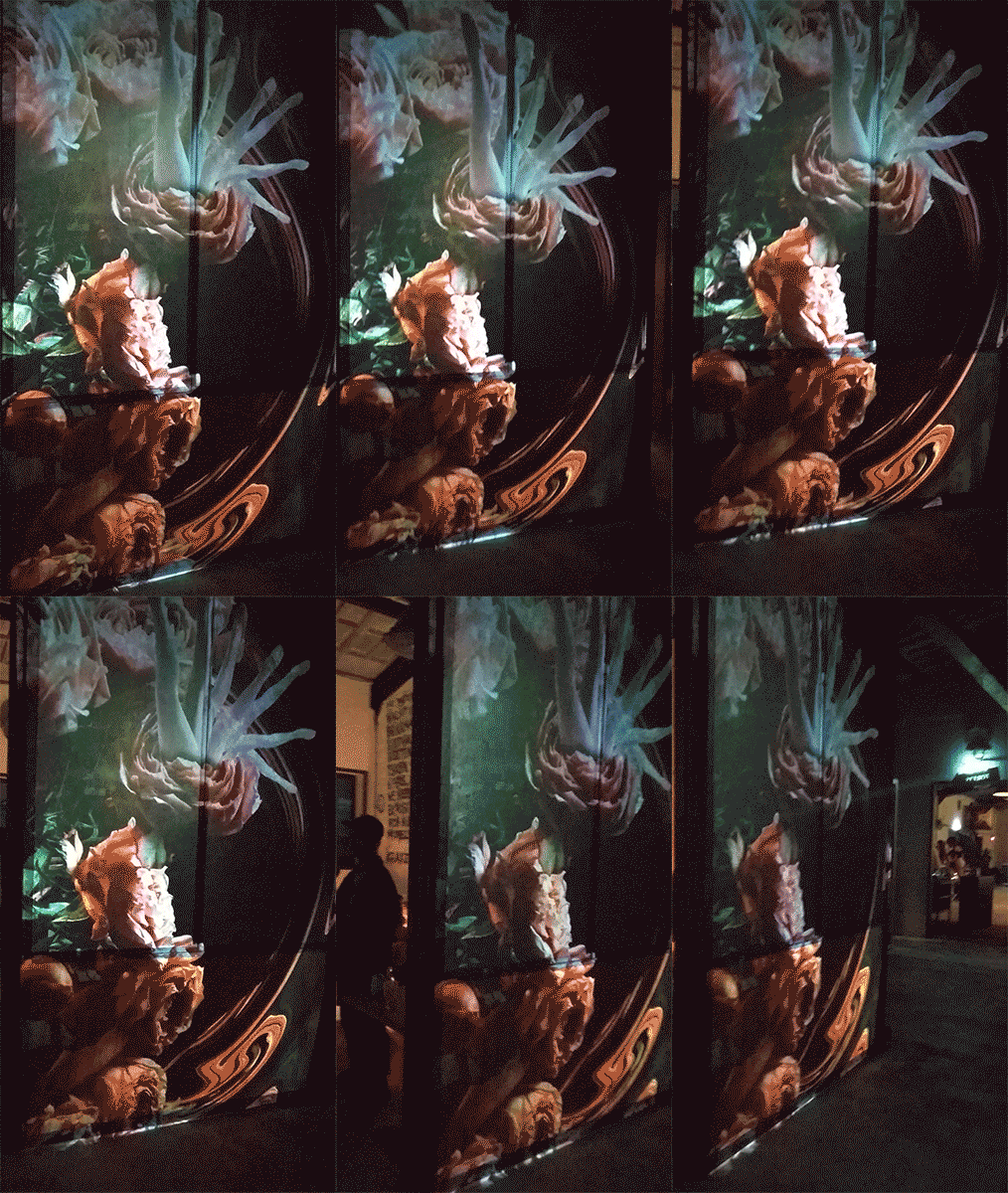
The first thing that strikes me is the clarity of these images
They leave me space to recognise the issues underlining your work. Their power is lost when we see them 'layered' into a sketch which synthesises the various things you have been working on. Why not remove the need to explain from your project altogether, and leave that for the thesis. I think of you explore the formal elements of these new forms, such as the gif or Tiktok you could make some interesting work. The desire to 'layer' seems to me to be a way to force a synthesis of the different elements of your work. Perhaps it might be more useful to separate them. Your proposal would still be around brevity but the elements would be separate. So you could propose to produce a series of discreet works which explore brevity plus a thesis which discusses brevity. My issue with the documentary you propose is that you might miss the opportunity to explore the issue of brevity artistically. I feel you need to give yourself space to actually make work that really explores the possibilities and implications of this term 'brevity'. To simultaneously make commentary on it seems limiting to me. As far as I understand you do not have material for the two aspects of your film the 'professionals' and 'your own comments'; but you do have your experiments and films. I suspect you feel you may have to deliver a big, multi-layered project, whereas you may need to consolidate the practice you are developing (without feeling the need to justify every move you make). These are my thoughts. I will be in next week if you want to meet for a chat.
What do you want to make?
I want to make a visual essay that features interviews from professionals (in the field of psychology and sociology) and my observations (I am aware that these may be subjective and sometimes abstract) on the topic of brevity.
[ what is 'the brevity discourse'? here outline what is at stake, for you what do you want the piece to be about what key topics do you want to discuss or cover?]
If I want to bring the brevity discourse to the moving image, the film has to be what the narrator was in the Roman age. With a film in a cinema the movie is carrying the same kind of responsibility that the narrator was (or still is) carrying.
(An installation would not guarantee that the viewer would watch the work from start to end. It would be very likely that the audience would walk in and out in the middle of the film instead of watching it as a whole. However, I have to admit that it would also be an interesting task to keep the viewer informed and interested throughout the whole time – if it were a installation piece.) [<<you do not need to go into detail about what it is NOT...]
How do you plan to make it?
Visually I want to embrace two layers: Interviews with Professionals and My Observations
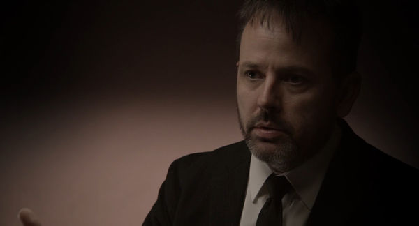
The Interviews could look documentary-styled "objective":
These interviews can be either kept simple and short or very elaborate and circumlocutory.
My observations could look more "subjective":
News Videos and Videos that show people receiving this media are getting covered with animations, that are done in the style I did for the ‘Bring your own Beamer’ event.
This work was created in a fast pace since I got the call to take part at the event one week before. On the other hand it was the first time that I have been setting up an installation with my work. Based on commissioned posters that I created, I selected a few and animated those – stripping it from all its typography. I ended up with various animated collages. I didn't see these as finished works. I saw them as works I can build on to. They are experiments that have been created in a fast pace.
It is interesting to use this style of visualisation, because the evolution of these animations are closely connected to the topic: I can directly review my method on working on these animations and how I did curate which posters I animate.
After looking at the historical brevity discourse last year, I want to do research on how the brain processes information. How does distraction work? And is distraction necessarily a bad thing?
Furthermore I want to research density of information in news programs. How is modern media supporting or contradicting focus on its program? To which extent are news outlets made to process their information? Let's take the public-sector broadcaster ‘Das Erste’ for example: The day starts with five minutes national and international news (including the weather) at 09:00. This newsshow called ‘Tagesschau’ then is being broadcasted again from 12:00 to 12:15. At 14:00, 15:00 and 16:00 it provides another program for ten minutes. At 17:00 and 20:00 the Germans can watch news again for fifteen minutes. Eventually, at 22:15 ‘Tagesthemen’ is providing thirty minutes of news from the day (including weather). How come, that this sender thinks the television crowd is only capable of receiving ten to fifteen minutes of news throughout the day? Or is that already too much? Of course I am very aware that television is already outdated and society is much more moving to on-demand news media via Apps (on Mobile as well as on Desktop), but doesn't television have enough historical statistics to know how to reach their audience?
I want to find out to which extent brevity applies to the moving image in social media (including advertising). Instagram for example only allows Stories of max. 15 Seconds each or Videos of max. 1 Minute each. How is the content played out in comparison to other Social Media Outlets or Websites?
What is your timetable?
November
Film:
Sketch ideas on how to approach the film: what will be the content and how can it be shot
December
Film:
film testing, map out all technical details: get in contact with individuals, begin production plans; complete screenplay; begin storyboarding;
Write the script and the shooting plan for the final film.
January
Thesis: first thesis draft complete by end of month
Film: all resources/people/support secured by month’s end, complete storyboarding, fix schedule with all individuals
February
Thesis: second draft
Film: set design etc., schedule for filming fix
March
Thesis: complete thesis
Film: Shoot first versions and get feedback from tutors and classmates
April
Film: editing and contingency for filming, if necessary shoot additional shots
May
Film: final editing and completion
Exhibition: exhibition layout plan; printing/construction of any supporting work
June
Exhibition
Why do you want to make it?
Whenever I have a discussion about history or politics, many of my friends are stating that they don't want to take part in the discussion because they feel like they know too little about it. I was observing this not only in the small circle that I used to live in, but I have heard this statement being made everywhere I have been so far. Reading Kenneth Goldsmiths Wasting Time on the Internet I am curious if this is really due to the fact that the modern society is exposed to much more information (Short Messages, E-Mails, Billboards, Radio, Newspages and so on).
I want to find out how a varying extent of content is changing the mediation of communication.
   How much communication is necessary?
   And necessary for whom? For the sender, or the recipient?
   What defines, what is exceeding the needful, what is unnecessary or what is missing to the needful?
Who can help you and how?
Aside from the tutors who can help me with critical thinking and narrative skills developing, the PZI classmates can always offer excellent ideas for my work. I will reach out for example to Dr. Maren Jäger (who is a Postdoctorate for Literature at the HU Berlin), Susanne Janssen (Graphic Design Graduate of the WdKA 2019), Florian Cramer (Reader in 21st Century Visual Culture/Autonomous Practices) and Kenneth Goldsmith (Poet, Writer and Teacher at the University of Pennsylvania) and see if they would be open to be interviewed for my film. On top of that I will be able to borrow equipment from the photo-studio I am working at right now. Since the Academy is very poorly equipped, this is a substantial help on getting cameras and lenses.
Relation to previous practice
The first Trimester I did experiments on the topic of maximisation and minimisation. With the Focal Camera I was examining the recognition of two subjects in one image. I wanted to find out how the identity of one image changes bringing in two subjects in one. Secondly I did digital glitch experiments. In this way it was closely connected to the information theory. This exercise had a high entropy, describing the amount of uncertainty involved in the value of a random variable. The outcome of the glitch was relatively unpredictable, but actually performing the glitch and learning the results gave some new information.
Afterwards Susanna Fasciolo and I made a photo series called Frown, depicting portraits of cyclists and people who ride their scooters over the Erasmusbridge. The book consists of cropped images showing faces. We wanted to force the viewer to make assumptions on where these photos could have been taken.
Then I did the short film with the title The Gifted Horse for the screening at the EYE Amsterdam. It is five minutes long, has 5.1 Surround Sound and is being screened in FullHD. In terms of film genre, it probably would fit best into the genre of the Drama. The visual style is low-key, black-and-white, sometimes also showing grain and light leaks that were very present during post-war cinema. The sujet is the portrait of an actress that is representing the German actress/singer Hildegard Knef. The short film links in some scenes to the cynicism usually present in film noir during the post-war realistic period. Since the actress is recalling her career from a modern perspective, the post-war era is being contrasted by using an aspect ratio of 16:9, which is representative for the nowadays cinematic context. The only sound throughout the film is a combination of slow-paced classical and ambient-electronic music. More specific, the film is accompanied by the song A Pledge, that was composed by the French musician Mike Lévy, professionally known as Gesaffelstein and was released in the year 2015. With its estimated 95bpm the track is comparably slow, leading the viewer unagitated through the story. The whole film was shot in 60fps and is played back in half-speed, slowing down all movements.
Relation to a larger context
This text has been taken from my Andreas methods 15-05-19
How concentrated is the reception of content happening nowadays? Short messages, eMail, Chats and Twitter – these and other mass-media did bring up a mode of correspondence, that is setting the virtus dicendi because of time- and type economy. Emoticons and the more or less creative abbreviation culture (from fyi, to btw) are some symptoms of this maxime. Kenneth Goldsmith is setting up an interesting hypothesis: he is claiming, that people do not read less in overall, but the omnipresence of digital media is causing the opposite. He is stating that daily news, Facebook statuses or the fast Twitter notification on the smartphones are making everyone read more, like no print medium would have been able to. That is why the amount of reading would have even increased; only the way of reading has changed. (Goldsmith, 2016, p. 4)
In the meantime even carriers of important positions are using just 140 characters to send out information of big scope. Donald Trump was therefore even called the master of simplification. Are these messages therefore more authentic? Closer to the person? Or does it instead just reveal a polarization, that has been less visible before? By using short statements one can react often and quick. But quantity has the tendency to cover quality. (Jäger, 2018)
References
COUPLAND, D. (1991) Generation X: Tales for an Accelerated Culture. 1st ed. New York: St. Martin's Press
EAMES, C. and R. (1953) A Communications Primer [online]. Available at: https://archive.org/details/communications_primer (Accessed: 23 May 2019)
FLUSSER, V. (2000) Towards a philosophy of photography. 1st ed. London: Reaktion Books
GOLDSMITH, K. (2016) Wasting Time on the Internet. 1st ed. New York: HarperCollinsPublishers
JANSSEN, S. (2019) Software organism BA Research Project [online]. Available at: http://www.susannejanssen.eu/software-organism-ba-research (Accessed: 07 October 2019)
JÄGER, M. (2018) Kommunikation in der Wissenschaft Kurz und knackig, auf die Zwölf, bitte. Deutschlandfunk Nova [online]. Available at: https://www.deutschlandfunknova.de/beitrag/kommunikation-in-der-wissenschaft-kurz-und-knackig (Accessed: 27. February 2019)
ROSA, H. (2016) Beschleunigung und Entfremdung: Entwurf einer kritischen Theorie spätmoderner Zeitlichkeit. 5. Auflage. – Berlin : Suhrkamp
Sketches
Visual Inspiration:
Metahaven – The Sprawl
The project explores the mutation of propaganda in the age of social media, with a particular focus on how the diffuse, networked circulation of messages through these channels affects how we read, interpret, and understand events.
Quote from http://sprawl.space/about-the-sprawl/ Nowadays, films live in a thousand and one forms on the internet. As short trailers, fragments, cloud-based copies of copies, endangered data, self-hosted vaults, and so on. Viewing cinema on a laptop screen is only possible when remembering that such an experience has little to do with cinema itself. As a hybrid, episodic documentary, “The Sprawl”‘s story isn’t linear. The film lends itself to be seen as a succession of impressions—a trailer, forever unfinished; the duration of each of those video pieces, or “shards,” is attuned to an attention span that is less cinema, and more internet.
http://www.youtube.com/watch?v=knk74TJgT5E
http://www.youtube.com/watch?v=zay2MW_iIuY
http://www.youtube.com/watch?v=5x0NRIJWWOs
I find it inspiring to read what Metahaven have to say on their treatment of temporality of the film Sprawl:
https://prostory.net.ua/en/9-publikatsii/krytyka/300-imaginary-motherland-some-notes-on-the-sprawl-propaganda-about-propaganda-and-a-google-doc-conversation-with-metahaven released 2018 by prostory.net.ua
Lesia Prokopenko interviewing Methaven LP: ‘Technology, that is, the internet, has been changing our relations with language and information similar to how the invention of printing changed them, and, later, the invention of photography — and this inevitably implies transformations in the perception of time. Film, as a medium, is one of the ways to explore and manipulate time, which is, at the moment, a more appealing idea than ever. How do you treat temporality in your work?’
MH: ‘(...) In our films, including Information Skies, but also in our new essay, Digital Tarkovsky—which is to be out soon with Strelka Press—we address duration or temporality. Andrei Tarkovsky and Aleksandr Sokurov are heroes of ours who used, and use, time as their primary instrument. But we want to look at this through the lens of platforms, and in the digital age (sorry for the term), where duration is associated with Facebook, Instagram addiction, and Netflix binge-watching. We are convinced that there is a cinematic core to our time spent on the smartphone—if only because it is banned from most movie theatres.’
Back to Main Project Seminar:
http://pzwiki.wdka.nl/mw-mediadesign/index.php?title=Graduate_Seminar_2019-2020

