User:Zpalomagar/HACKPACT: Difference between revisions
Zpalomagar (talk | contribs) |
Zpalomagar (talk | contribs) No edit summary |
||
| (62 intermediate revisions by the same user not shown) | |||
| Line 1: | Line 1: | ||
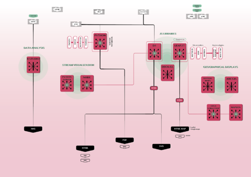
This is a collection of experiments in which different tools are tested in order to visualise information with digital mechanisms. These exercises allowed me to discover and research different strategies for translating data and create visual narratives. As a result of these exercises, I built my own toolbox, that are the technical foundations that I am using in the creation of my speculative atlas of counter-cartographies. | |||
[[File:toolboxx.png|500px|thumb|center|Toolbox]] | |||
==#H1_CHALLENGE CHANGE.ORG DISPLAY== | ==#H1_CHALLENGE CHANGE.ORG DISPLAY== | ||
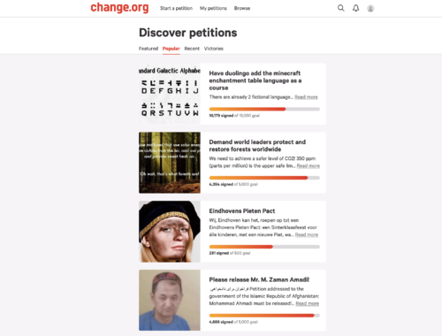
The starting point of this proposal is looking for online spaces where people or communities can publish their suggestions or requests. Taking as the reference one of the most important platforms all over the world in order to achieve this goal(change.org), this hackpact develop an experiment challenging the display of the conventional structure that is followed in the platform. In order to work with visual content, I’m going to extract just the visual elements that are displayed on the website (you can only update one picture on each petition). | |||
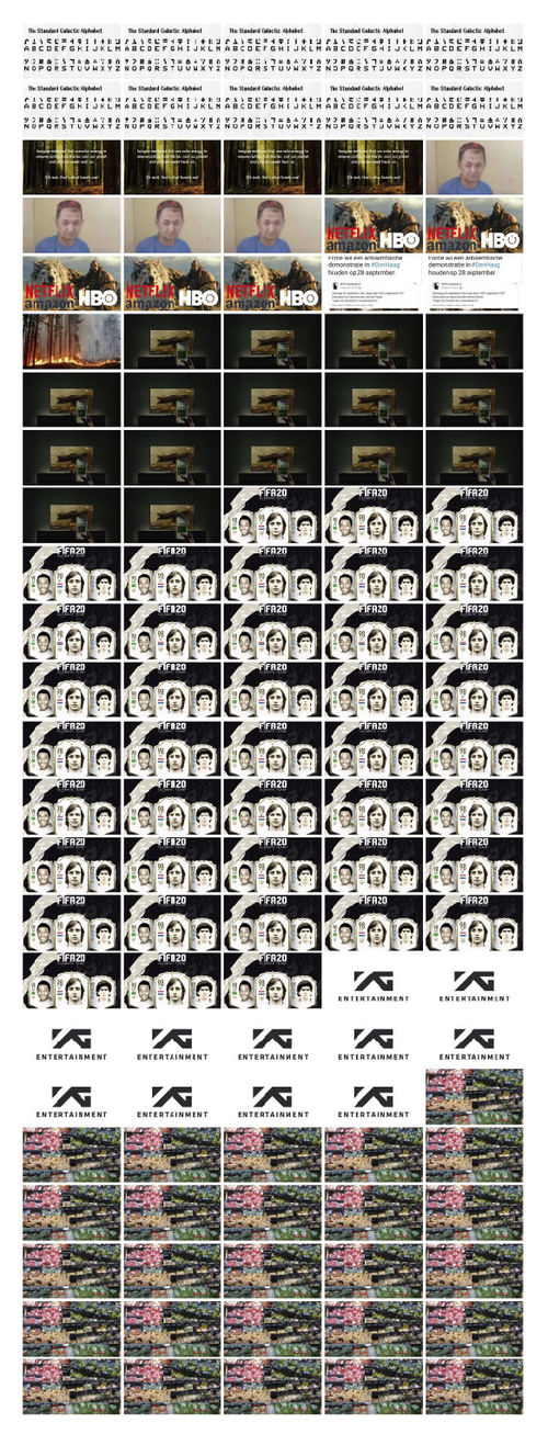
The traditional representation method introduced by Otto Neurath, when isotypes were created, said that in order to facilitate the lecture and comparison of quantitative data, you must repeat an item as many times as you need proportionally to the amount it represents. In this example, each photo represents 1000 people supporting a petition. | |||
The traditional representation method introduced by Otto Neurath ,when isotypes were created, said that in order to facilitate the lecture and comparison of quantitative data, you must repeat an item as many times as you need proportionally to the amount it represents. In this example each photo represents 1000 people supporting a petition. | |||
With this alternative HTML structure the information that is transmitted to the reader is purely visual and you can infer people interest just with a glance and notice the difference in support and relevance between them. | With this alternative HTML structure, the information that is transmitted to the reader is purely visual and you can infer people interest just with a glance and notice the difference in support and relevance between them. | ||
[[File:changeorg1.png|thumbnail|500px|center|Current Change.org display]] | [[File:changeorg1.png|thumbnail|500px|center|Current Change.org display]] | ||
| Line 13: | Line 16: | ||
==#H2_LOOKING AT THE WORLD WITH EMOJIS == | ==#H2_LOOKING AT THE WORLD WITH EMOJIS == | ||
This hackpact has the goal of experimenting python as a tool to read data ( | This hackpact has the goal of experimenting python as a tool to read data (cvs files) and visualise it. The database used for this experiment is a cvs file with population of every country in different years. With this piece of code, we can read this data and create lists of the information that we are interested in. With this translation of data, we are able to extract this quantitative information and work with that as if it was a python element. | ||
I am going to use two additional libraries for python. On the one hand pandas library in order to read data from the cdv file and on the other emoji library to use the universal emoji library for visualising the result. | |||
Each emoji represent 1 million citizens so the strategy used to display the information is repetition in the same way as I did in the previous example. | |||
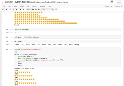
I did this experiment using Jupiter Notebook in order to have momentary results that allowed me to debug the code and keep the previous versions there with annotations | |||
[http://www.unicode.org/emoji/charts/full-emoji-list.html FULL EMOJI LIST] | |||
[[File:jupyternotebook.png|thumbnail|500px|center|Jupyter Notebook process]] | |||
<br> | <br> | ||
Netherlands Population<br> | Netherlands Population<br> | ||
1952🥪🥪🥪🥪🥪🥪🥪🥪🥪🥪<br> | 1952🥪🥪🥪🥪🥪🥪🥪🥪🥪🥪<br> | ||
| Line 32: | Line 43: | ||
2002🥪🥪🥪🥪🥪🥪🥪🥪🥪🥪🥪🥪🥪🥪🥪🥪<br> | 2002🥪🥪🥪🥪🥪🥪🥪🥪🥪🥪🥪🥪🥪🥪🥪🥪<br> | ||
2007🥪🥪🥪🥪🥪🥪🥪🥪🥪🥪🥪🥪🥪🥪🥪🥪<br> | 2007🥪🥪🥪🥪🥪🥪🥪🥪🥪🥪🥪🥪🥪🥪🥪🥪<br> | ||
| Line 87: | Line 95: | ||
2002🌴🌴🌴🌴🌴🌴🌴🌴🌴🌴🌴<br> | 2002🌴🌴🌴🌴🌴🌴🌴🌴🌴🌴🌴<br> | ||
2007🌴🌴🌴🌴🌴🌴🌴🌴🌴🌴🌴<br> | 2007🌴🌴🌴🌴🌴🌴🌴🌴🌴🌴🌴<br> | ||
Finland Population<br> | |||
1952⛄⛄⛄⛄<br> | |||
1957⛄⛄⛄⛄<br> | |||
1962⛄⛄⛄⛄<br> | |||
1967⛄⛄⛄⛄<br> | |||
1972⛄⛄⛄⛄<br> | |||
1977⛄⛄⛄⛄<br> | |||
1982⛄⛄⛄⛄<br> | |||
1987⛄⛄⛄⛄<br> | |||
1992⛄⛄⛄⛄⛄<br> | |||
1997⛄⛄⛄⛄⛄<br> | |||
2002⛄⛄⛄⛄⛄<br> | |||
2007⛄⛄⛄⛄⛄<br> | |||
==#H3_HOW DOES THE NETHERLANDS LOOK IN THE WORLD? == | |||
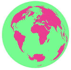
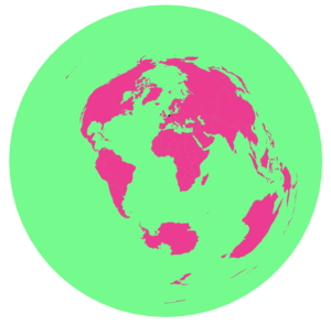
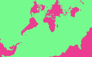
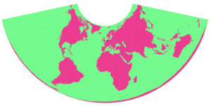
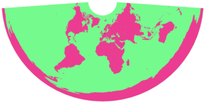
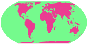
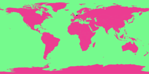
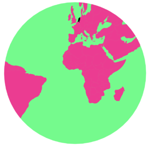
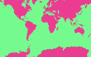
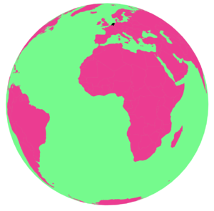
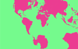
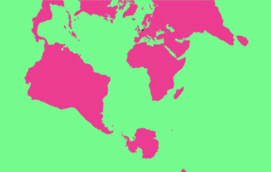
I’ve started to research how to draw maps based on GeoJSON files and how can you modify them. Based on D3 script I’ve experiment with different projections that you can use in order to represent world cartographies. Because the standard settings are not the only option I did this small experiment highlighting the Netherlands in each map and observing how the dimension and the position of the country change. All these projections are real and true because it doesn’t exist a universal way of transforming a sphere into a plan just consensus or tradition but why not to experiment with that?. | |||
In order to change the projection of the maps, we need to add a couple of scripts (d3-array and d3-geo). | |||
[[File:p_projection_geoAzimuthalEqualArea.png|thumbnail|300px|center|geoAzimuthalEqualArea]] | |||
[[File:p_projection_geoAzimuthalEquidistant.png|thumbnail|300px|center|geoAzimuthalEquidistant]] | |||
[[File:p_projection_geoConicConformal.png|thumbnail|300px|center|geoConicConformal]] | |||
[[File:p_projection_geoConicEqualArea.png|thumbnail|300px|center|geoConicEqualArea]] | |||
[[File:p_projection_geoConicEquidistant.png|thumbnail|300px|center|geoConicEquidistant]] | |||
[[File:p_projection_geoEqualEarth.png|thumbnail|300px|center|geoEqualEarth]] | |||
[[File:p_projection_geoEquirectangular.png|thumbnail|300px|center|geoEquirectangular]] | |||
[[File:p_projection_geoGnomonic.png|thumbnail|300px|center|geoGnomonic]] | |||
[[File:p_projection_geoMercator.png|thumbnail|300px|center|geoMercator]] | |||
[[File:p_projection_geoOrthographic.png|thumbnail|300px|center|geoOrthographic]] | |||
[[File:p_projection_geoStereographic.png|thumbnail|300px|center|geoStereographic]] | |||
[[File:p_projection_geoTransverseMercator.png|thumbnail|300px|center|geoTransverseMercator]] | |||
<source lang="html4strict"> | |||
<!DOCTYPE html> | |||
<html> | |||
<head> | |||
<title>Map projection experiments</title> | |||
<meta charset="utf-8"> | |||
<script src="https://d3js.org/d3.v4.min.js"></script> | |||
<script src="https://d3js.org/topojson.v2.min.js"></script> | |||
<script src="https://d3js.org/d3-array.v1.min.js"></script> | |||
<script src="https://d3js.org/d3-geo.v1.min.js"></script> | |||
<style> | |||
path { | |||
fill: #FF1493; | |||
} | |||
.graticule { | |||
fill: none; | |||
stroke: none; | |||
stroke-width: .5px; | |||
} | |||
.foreground { | |||
fill: #00FF7F; | |||
stroke: none; | |||
} | |||
</style> | |||
</head> | |||
<body> | |||
<svg width="960" height="600"></svg> | |||
<script> | |||
const svg = d3.select("svg") | |||
const myProjection = d3.geoEqualEarth() | |||
const path = d3.geoPath().projection(myProjection) | |||
const graticule = d3.geoGraticule() | |||
function drawMap(err, world) { | |||
if (err) throw err | |||
svg.append("path") | |||
.datum(graticule) | |||
.attr("class", "graticule") | |||
.attr("d", path); | |||
svg.append("path") | |||
.datum(graticule.outline) | |||
.attr("class", "foreground") | |||
.attr("d", path); | |||
svg.append("g") | |||
.selectAll("path") | |||
.data(topojson.feature(world, world.objects.countries).features) | |||
.enter().append("path") | |||
.attr("d", path); | |||
} | |||
d3.json("https://unpkg.com/world-atlas@1.1.4/world/110m.json", drawMap) | |||
</script> | |||
</body> | |||
</html> | |||
</source> | |||
==#H4_HIERARCHICAL SETTINGS== | |||
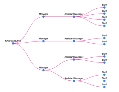
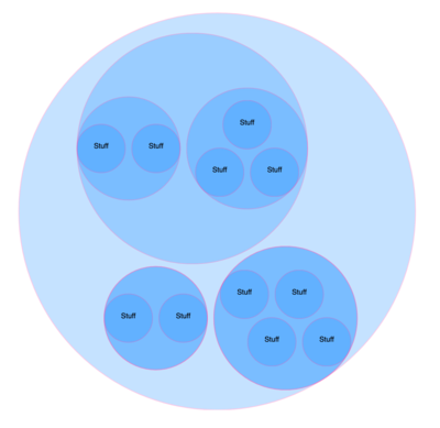
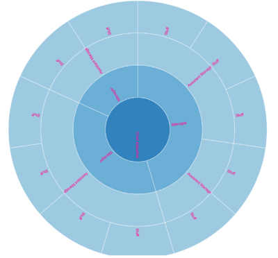
When I started to dive a little deeper into the possibilities of visualization with d3 I came across many predefine layouts of hierarchical structures. What does it mean? Are we being pressured to represent our data hierarchically?. Traditionally diagrams and maps have been understood as an element of power, as tools to represent powerful structures and this is another example that it’s true. The goal of this Hackpact is to explore how is the process of representing hierarchical structures with D3, different layout of visual possibilities and how is the data that represent this information. | |||
In order to develop a dataset, I built a simple Json file that expresses the hierarchical structure of a company that have a Chief Executive whose children are the Managers assistant whose children are the Staff. | |||
[[File:p_hierarchy1.png|thumbnail|400px|center|Tree hierarchical structure]] | |||
[[File:p_hierarchy2.png|thumbnail|400px|center|Packed circles hierarchical structure]] | |||
[[File:p_hierarchy3.png|thumbnail|400px|center|Sunburst hierarchical structure]] | |||
<source lang="javascript"> | |||
<!DOCTYPE html> | |||
<html> | |||
<head> | |||
<meta charset="utf-8"> | |||
<title>D3 tutorial</title> | |||
<script src='https://d3js.org/d3.v3.min.js'></script> | |||
</head> | |||
<body> | |||
<script> | |||
var canvas = d3.select("body") | |||
.append("svg") | |||
.attr("width", 500) | |||
.attr("height", 500) | |||
.append("g") | |||
.attr("transform", "translate(50,50)"); | |||
// with cluster layout all data that don't have children are in the same level | |||
// var tree = d3.layout.cluster() | |||
var tree = d3.layout.tree() | |||
.size([400,400]); | |||
d3.json("hierarchicalstructure.json", function(data){ | |||
var nodes = tree.nodes(data); | |||
var links = tree.links(nodes); | |||
var node = canvas.selectAll("node") | |||
.data(nodes) | |||
.enter() | |||
.append("g") | |||
.attr("class", "node") | |||
// to flip the nodes you just have to change the x and the y | |||
.attr("transform", function (d) {return "translate(" + d.y + "," +d.x + ")"}) | |||
node.append("circle") | |||
.attr("r", 5) | |||
.attr("fill", "dodgerblue"); | |||
node.append("text") | |||
.text(function(d) {return d.name;}) | |||
.attr("transform", "translate(0,-8)") | |||
.attr("font-family","sans-serif") | |||
.attr("font-size","10px") | |||
.attr("text-anchor","middle") | |||
.attr("fill","black"); | |||
var diagonal = d3.svg.diagonal() | |||
// To rotate the paths | |||
.projection(function (d) {return [d.y, d.x];}); | |||
canvas.selectAll("link") | |||
.data(links) | |||
.enter() | |||
.append ("path") | |||
.attr("class", "link") | |||
.attr("fill", "none") | |||
.attr("stroke", "deeppink") | |||
.attr("d", diagonal); | |||
}) | |||
</script> | |||
</body> | |||
</html> | |||
</source> | |||
==#H5_EXPLORING D3 == | |||
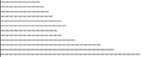
This Hackpact has the goal of experimenting the visualisation options in D3 and HTML so the process is to repeat the visualisation doing in Hackpact number three trying to read and visualise the data with D3 in this case and HTML, mainly testing the loop possibilities and how repetition can be materialised. | |||
[[File:D3test.png|thumbnail|500px|center|Output D3 and HTML]] | |||
<source lang="javascript"> | |||
<script> | |||
function times (text, n) { | |||
var ret = ''; | |||
for (var i=0; i<n; i++) {ret += text;} | |||
return ret; | |||
} | |||
d3.csv("countries_af.csv", function(data) { | |||
d3.selectAll("p") | |||
.data(data) | |||
.enter() | |||
.append("p") | |||
.html(function(d) { | |||
return times(d.year, d.population/1000000) | |||
}) | |||
}) | |||
</script> | |||
</source> | |||
==#H5_FINDING GEO DATA IN TWITTER USING TWEEPY== | |||
Twitter is a platform where people can share with freedom claims, initiatives or just thoughts. Understanding what's happening in Twitter means to understand a society. If we try to link that with cartographies we need to establish geographical links between people who are publishing a tweet and location. There are some tools to scrape twitter, in this Hackpact I'm going to explore Tweepy. Tweepy is a python library that allows us to receive stream information of twitter in a Json format. | |||
Before running this script I had to create a developer account on Twitter and create an app in which you define what are you going to do with this data. When I completed this process I had my API KEYS and TOKEN KEYS that are saved on a different file. | |||
<source lang="python"> | |||
from tweepy.streaming import StreamListener | |||
from tweepy import OAuthHandler | |||
from tweepy import Stream | |||
import credentials | |||
class StdOutListener(StreamListener): | |||
def on_data(self, data): | |||
print(data) | |||
return True | |||
def on_error(self, status): | |||
print(status) | |||
if __name__ == "__main__": | |||
auth = OAuthHandler(credentials.API_KEY, credentials.API_SECRET_KEY) | |||
auth.set_access_token(credentials.ACCESS_TOKEN, credentials.ACCESS_TOKEN_SECRET) | |||
listener = StdOutListener() | |||
stream = Stream(auth, listener) | |||
stream.filter(track=['zpalomagar']) | |||
</source> | |||
My first goal es to check what type of geo-information can I obtain from each Tweet. I'm going to use this python script in order to print in the terminal the Tweets that anyone post which includes the word "zpalomagar". When you publish a tweet with your phone you can add geo-information including a location (it doesn't have to be your real location). The geo-information that we receive looks like this: | |||
<source lang="javascript"> | |||
"place":{ | |||
"id":"ea0a61fa0c646676", | |||
"url":"https:\/\/api.twitter.com\/1.1\/geo\/id\/ea0a61fa0c646676.json", | |||
"place_type":"city", | |||
"name":"R\u00f3terdam", | |||
"full_name":"R\u00f3terdam, Holanda", | |||
"country_code":"NL", | |||
"country":"Holanda", | |||
"bounding_box":{ | |||
"type":"Polygon", | |||
"coordinates":[ | |||
[ | |||
[ | |||
3.941836, | |||
51.842113 | |||
], | |||
[ | |||
3.941836, | |||
52.006802 | |||
], | |||
[ | |||
4.601379, | |||
52.006802 | |||
], | |||
[ | |||
4.601379, | |||
51.842113 | |||
] | |||
] | |||
] | |||
}, | |||
</source> | |||
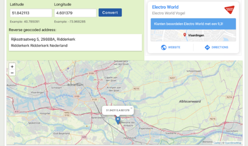
if we check the position of the coordinates, they form a polygon around the city of Rotterdam. | |||
[[File:p_latlong.png|thumbnail|500px|center|Coordinates display]] | |||
==#H6_STREAM TWITTER VISUALISATION, IT'S RUNNING! == | |||
[[File:streamtwittervisualisation.gif|center]] | |||
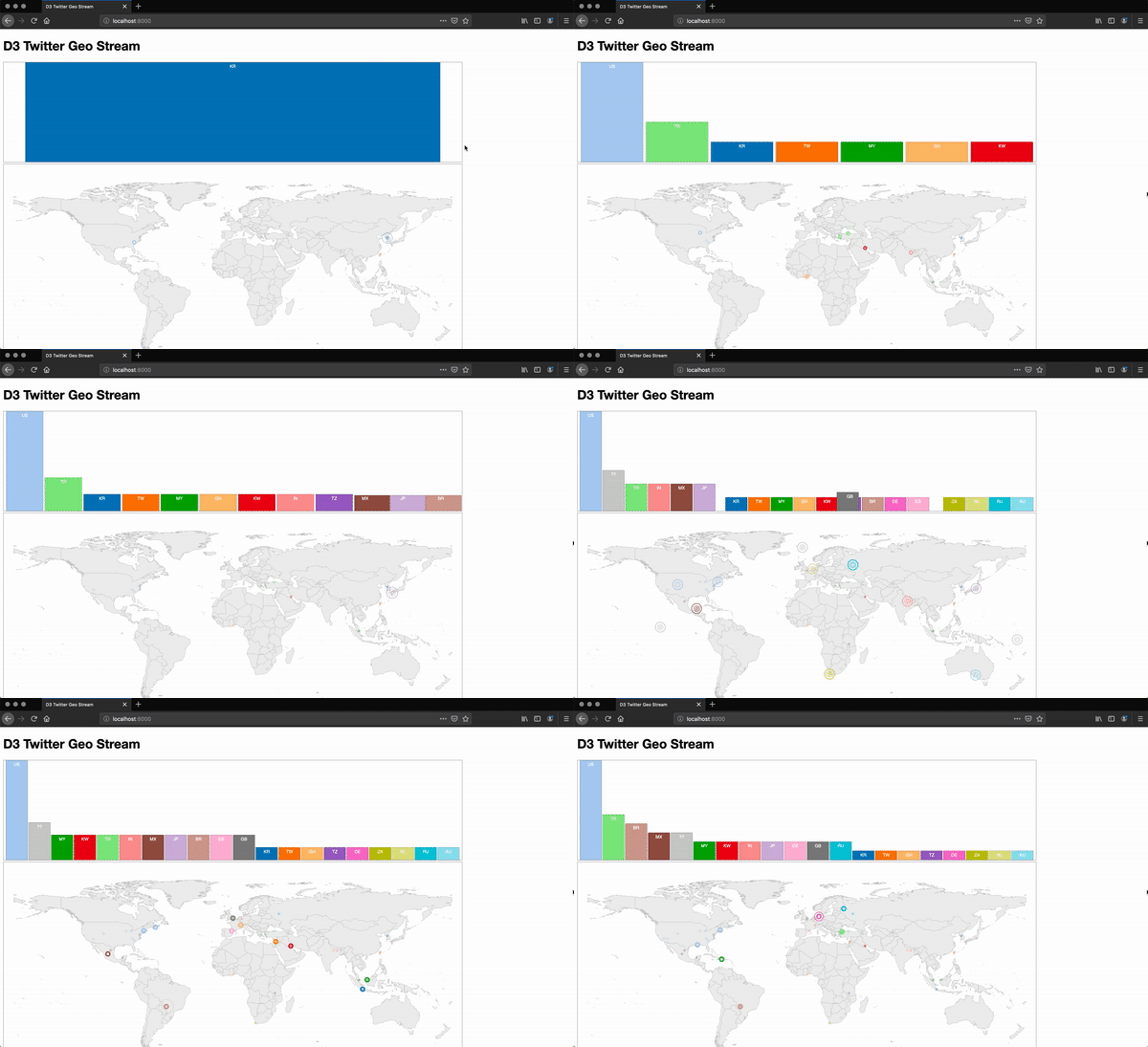
After several failed attempts (with Tweepy and Kafka) in this Hackpact I run a stream Twitter D3 visualisation in my localhost. First I had to run a python server (in d3-twitter-geo-stream-master folder) | |||
<source lang="html4strict"> | |||
python -m SimpleHTTPServer | |||
</source> | |||
When python server is running I can access the HTML file from a browser visiting the URL: | |||
<source lang="html4strict"> | |||
http://localhost:8000/ | |||
</source> | |||
The D3 Twitter Geo Stream visualisation connects to an instance of the Twitter Geo Server over a web socket listening in the port 5025 . To run Twitter Geo Server I had to install node ( and nmp) and run the server.js file in the port 5025 ( the default one is 5000) ( in twitter-geo-server-js-master) | |||
<source lang="html4strict"> | |||
node server.js -p=5025 | |||
</source> | |||
If node can not run server.js, check the modules! apparently, sometimes they are installed in other path. A quick solution is to install it globally using the command | |||
<source lang="html4strict"> | |||
sudo nmp install -g | |||
</source> | |||
[https://github.com/UsabilityEtc/d3-twitter-geo-stream GIT] | |||
Latest revision as of 16:42, 4 December 2019
This is a collection of experiments in which different tools are tested in order to visualise information with digital mechanisms. These exercises allowed me to discover and research different strategies for translating data and create visual narratives. As a result of these exercises, I built my own toolbox, that are the technical foundations that I am using in the creation of my speculative atlas of counter-cartographies.
#H1_CHALLENGE CHANGE.ORG DISPLAY
The starting point of this proposal is looking for online spaces where people or communities can publish their suggestions or requests. Taking as the reference one of the most important platforms all over the world in order to achieve this goal(change.org), this hackpact develop an experiment challenging the display of the conventional structure that is followed in the platform. In order to work with visual content, I’m going to extract just the visual elements that are displayed on the website (you can only update one picture on each petition).
The traditional representation method introduced by Otto Neurath, when isotypes were created, said that in order to facilitate the lecture and comparison of quantitative data, you must repeat an item as many times as you need proportionally to the amount it represents. In this example, each photo represents 1000 people supporting a petition.
With this alternative HTML structure, the information that is transmitted to the reader is purely visual and you can infer people interest just with a glance and notice the difference in support and relevance between them.
#H2_LOOKING AT THE WORLD WITH EMOJIS
This hackpact has the goal of experimenting python as a tool to read data (cvs files) and visualise it. The database used for this experiment is a cvs file with population of every country in different years. With this piece of code, we can read this data and create lists of the information that we are interested in. With this translation of data, we are able to extract this quantitative information and work with that as if it was a python element.
I am going to use two additional libraries for python. On the one hand pandas library in order to read data from the cdv file and on the other emoji library to use the universal emoji library for visualising the result.
Each emoji represent 1 million citizens so the strategy used to display the information is repetition in the same way as I did in the previous example.
I did this experiment using Jupiter Notebook in order to have momentary results that allowed me to debug the code and keep the previous versions there with annotations
Netherlands Population
1952🥪🥪🥪🥪🥪🥪🥪🥪🥪🥪
1957🥪🥪🥪🥪🥪🥪🥪🥪🥪🥪🥪
1962🥪🥪🥪🥪🥪🥪🥪🥪🥪🥪🥪
1967🥪🥪🥪🥪🥪🥪🥪🥪🥪🥪🥪🥪
1972🥪🥪🥪🥪🥪🥪🥪🥪🥪🥪🥪🥪🥪
1977🥪🥪🥪🥪🥪🥪🥪🥪🥪🥪🥪🥪🥪
1982🥪🥪🥪🥪🥪🥪🥪🥪🥪🥪🥪🥪🥪🥪
1987🥪🥪🥪🥪🥪🥪🥪🥪🥪🥪🥪🥪🥪🥪
1992🥪🥪🥪🥪🥪🥪🥪🥪🥪🥪🥪🥪🥪🥪🥪
1997🥪🥪🥪🥪🥪🥪🥪🥪🥪🥪🥪🥪🥪🥪🥪
2002🥪🥪🥪🥪🥪🥪🥪🥪🥪🥪🥪🥪🥪🥪🥪🥪
2007🥪🥪🥪🥪🥪🥪🥪🥪🥪🥪🥪🥪🥪🥪🥪🥪
import pandas as pd
import emoji
data = pd.read_csv ('countries.csv')
netherlands = data[data.country == 'Netherlands']
l_netherlandspopulation = list(netherlands.population / 10**6)
l_netherlandsyear = list(netherlands.year)
print("Netherlands Population")
n=0
l=0
while l<len(l_netherlandspopulation):
    print(l_netherlandsyear[n], end = '')
    for i in range(int(l_netherlandspopulation[n])):
        print(emoji.emojize(":sandwich:"), end="")
    print()
    n=n+1
    l=l+1
- Some other countries:
Spain Population
1952💃💃💃💃💃💃💃💃💃💃💃💃💃💃💃💃💃💃💃💃💃💃💃💃💃💃💃💃
1957💃💃💃💃💃💃💃💃💃💃💃💃💃💃💃💃💃💃💃💃💃💃💃💃💃💃💃💃💃
1962💃💃💃💃💃💃💃💃💃💃💃💃💃💃💃💃💃💃💃💃💃💃💃💃💃💃💃💃💃💃💃
1967💃💃💃💃💃💃💃💃💃💃💃💃💃💃💃💃💃💃💃💃💃💃💃💃💃💃💃💃💃💃💃💃
1972💃💃💃💃💃💃💃💃💃💃💃💃💃💃💃💃💃💃💃💃💃💃💃💃💃💃💃💃💃💃💃💃💃💃
1977💃💃💃💃💃💃💃💃💃💃💃💃💃💃💃💃💃💃💃💃💃💃💃💃💃💃💃💃💃💃💃💃💃💃💃💃
1982💃💃💃💃💃💃💃💃💃💃💃💃💃💃💃💃💃💃💃💃💃💃💃💃💃💃💃💃💃💃💃💃💃💃💃💃💃
1987💃💃💃💃💃💃💃💃💃💃💃💃💃💃💃💃💃💃💃💃💃💃💃💃💃💃💃💃💃💃💃💃💃💃💃💃💃💃
1992💃💃💃💃💃💃💃💃💃💃💃💃💃💃💃💃💃💃💃💃💃💃💃💃💃💃💃💃💃💃💃💃💃💃💃💃💃💃💃
1997💃💃💃💃💃💃💃💃💃💃💃💃💃💃💃💃💃💃💃💃💃💃💃💃💃💃💃💃💃💃💃💃💃💃💃💃💃💃💃
2002💃💃💃💃💃💃💃💃💃💃💃💃💃💃💃💃💃💃💃💃💃💃💃💃💃💃💃💃💃💃💃💃💃💃💃💃💃💃💃💃
2007💃💃💃💃💃💃💃💃💃💃💃💃💃💃💃💃💃💃💃💃💃💃💃💃💃💃💃💃💃💃💃💃💃💃💃💃💃💃💃💃
Cuba Population
1952🌴🌴🌴🌴🌴🌴
1957🌴🌴🌴🌴🌴🌴
1962🌴🌴🌴🌴🌴🌴🌴
1967🌴🌴🌴🌴🌴🌴🌴🌴
1972🌴🌴🌴🌴🌴🌴🌴🌴
1977🌴🌴🌴🌴🌴🌴🌴🌴🌴
1982🌴🌴🌴🌴🌴🌴🌴🌴🌴
1987🌴🌴🌴🌴🌴🌴🌴🌴🌴🌴
1992🌴🌴🌴🌴🌴🌴🌴🌴🌴🌴
1997🌴🌴🌴🌴🌴🌴🌴🌴🌴🌴
2002🌴🌴🌴🌴🌴🌴🌴🌴🌴🌴🌴
2007🌴🌴🌴🌴🌴🌴🌴🌴🌴🌴🌴
Finland Population
1952⛄⛄⛄⛄
1957⛄⛄⛄⛄
1962⛄⛄⛄⛄
1967⛄⛄⛄⛄
1972⛄⛄⛄⛄
1977⛄⛄⛄⛄
1982⛄⛄⛄⛄
1987⛄⛄⛄⛄
1992⛄⛄⛄⛄⛄
1997⛄⛄⛄⛄⛄
2002⛄⛄⛄⛄⛄
2007⛄⛄⛄⛄⛄
#H3_HOW DOES THE NETHERLANDS LOOK IN THE WORLD?
I’ve started to research how to draw maps based on GeoJSON files and how can you modify them. Based on D3 script I’ve experiment with different projections that you can use in order to represent world cartographies. Because the standard settings are not the only option I did this small experiment highlighting the Netherlands in each map and observing how the dimension and the position of the country change. All these projections are real and true because it doesn’t exist a universal way of transforming a sphere into a plan just consensus or tradition but why not to experiment with that?.
In order to change the projection of the maps, we need to add a couple of scripts (d3-array and d3-geo).
<!DOCTYPE html>
<html>

<head>
  <title>Map projection experiments</title>
  <meta charset="utf-8">
  <script src="https://d3js.org/d3.v4.min.js"></script>
  <script src="https://d3js.org/topojson.v2.min.js"></script>
  <script src="https://d3js.org/d3-array.v1.min.js"></script>
  <script src="https://d3js.org/d3-geo.v1.min.js"></script>

  <style>
    path {
      fill: #FF1493;
    }

    .graticule {
      fill: none;
      stroke: none;
      stroke-width: .5px;
    }

    .foreground {
      fill: #00FF7F;
      stroke: none;
    }
  </style>
</head>

<body>
  <svg width="960" height="600"></svg>
  <script>

    const svg = d3.select("svg")
    const myProjection = d3.geoEqualEarth()
    const path = d3.geoPath().projection(myProjection)
    const graticule = d3.geoGraticule()

    function drawMap(err, world) {
      if (err) throw err

      svg.append("path")
        .datum(graticule)
        .attr("class", "graticule")
        .attr("d", path);

      svg.append("path")
        .datum(graticule.outline)
        .attr("class", "foreground")
        .attr("d", path);

      svg.append("g")
        .selectAll("path")
        .data(topojson.feature(world, world.objects.countries).features)
        .enter().append("path")
        .attr("d", path);
    }

    d3.json("https://unpkg.com/world-atlas@1.1.4/world/110m.json", drawMap)


  </script>
</body>

</html>
#H4_HIERARCHICAL SETTINGS
When I started to dive a little deeper into the possibilities of visualization with d3 I came across many predefine layouts of hierarchical structures. What does it mean? Are we being pressured to represent our data hierarchically?. Traditionally diagrams and maps have been understood as an element of power, as tools to represent powerful structures and this is another example that it’s true. The goal of this Hackpact is to explore how is the process of representing hierarchical structures with D3, different layout of visual possibilities and how is the data that represent this information.
In order to develop a dataset, I built a simple Json file that expresses the hierarchical structure of a company that have a Chief Executive whose children are the Managers assistant whose children are the Staff.
<!DOCTYPE html>
<html>
<head>
	<meta charset="utf-8">
	<title>D3 tutorial</title>
	<script src='https://d3js.org/d3.v3.min.js'></script>
</head>
<body>

	<script>

		var canvas = d3.select("body")
			.append("svg")
			.attr("width", 500)
			.attr("height", 500)
			.append("g")
				.attr("transform", "translate(50,50)");

		// with cluster layout all data that don't have children are in the same level
		// var tree = d3.layout.cluster()
		var tree = d3.layout.tree()
			.size([400,400]);

		d3.json("hierarchicalstructure.json", function(data){

			var nodes = tree.nodes(data);

			var links = tree.links(nodes);

			var node = canvas.selectAll("node")
				.data(nodes)
				.enter()
				.append("g")
					.attr("class", "node")
					// to flip the nodes you just have to change the x and the y
					.attr("transform", function (d) {return "translate(" + d.y + "," +d.x + ")"})

				node.append("circle")
					.attr("r", 5)
					.attr("fill", "dodgerblue");

				node.append("text")
					.text(function(d) {return d.name;})
					.attr("transform", "translate(0,-8)")
					.attr("font-family","sans-serif")
					.attr("font-size","10px")
					.attr("text-anchor","middle")
					.attr("fill","black");


				var diagonal = d3.svg.diagonal()
					// To rotate the paths
					.projection(function (d) {return [d.y, d.x];});

				canvas.selectAll("link")
					.data(links)
					.enter()
					.append	("path")
					.attr("class", "link")
					.attr("fill", "none")
					.attr("stroke", "deeppink")
					.attr("d", diagonal);

		})

	</script>

</body>
</html>
#H5_EXPLORING D3
This Hackpact has the goal of experimenting the visualisation options in D3 and HTML so the process is to repeat the visualisation doing in Hackpact number three trying to read and visualise the data with D3 in this case and HTML, mainly testing the loop possibilities and how repetition can be materialised.
<script>
		function times (text, n) {
		var ret = '';
		for (var i=0; i<n; i++) {ret += text;}
		return ret;
		}

		d3.csv("countries_af.csv", function(data) {

                d3.selectAll("p")
			.data(data)
			.enter()
			.append("p")
			.html(function(d) {
				return times(d.year, d.population/1000000)
		        })
                })
</script>
#H5_FINDING GEO DATA IN TWITTER USING TWEEPY
Twitter is a platform where people can share with freedom claims, initiatives or just thoughts. Understanding what's happening in Twitter means to understand a society. If we try to link that with cartographies we need to establish geographical links between people who are publishing a tweet and location. There are some tools to scrape twitter, in this Hackpact I'm going to explore Tweepy. Tweepy is a python library that allows us to receive stream information of twitter in a Json format.
Before running this script I had to create a developer account on Twitter and create an app in which you define what are you going to do with this data. When I completed this process I had my API KEYS and TOKEN KEYS that are saved on a different file.
from tweepy.streaming import StreamListener
from tweepy import OAuthHandler
from tweepy import Stream
import credentials

class StdOutListener(StreamListener):
    def on_data(self, data):
        print(data)
        return True

    def on_error(self, status):
        print(status)

if __name__ == "__main__":
    auth = OAuthHandler(credentials.API_KEY, credentials.API_SECRET_KEY)
    auth.set_access_token(credentials.ACCESS_TOKEN, credentials.ACCESS_TOKEN_SECRET)
    listener = StdOutListener()
    stream = Stream(auth, listener)
    stream.filter(track=['zpalomagar'])
My first goal es to check what type of geo-information can I obtain from each Tweet. I'm going to use this python script in order to print in the terminal the Tweets that anyone post which includes the word "zpalomagar". When you publish a tweet with your phone you can add geo-information including a location (it doesn't have to be your real location). The geo-information that we receive looks like this:
"place":{
      "id":"ea0a61fa0c646676",
      "url":"https:\/\/api.twitter.com\/1.1\/geo\/id\/ea0a61fa0c646676.json",
      "place_type":"city",
      "name":"R\u00f3terdam",
      "full_name":"R\u00f3terdam, Holanda",
      "country_code":"NL",
      "country":"Holanda",
      "bounding_box":{
         "type":"Polygon",
         "coordinates":[
            [
               [
                  3.941836,
                  51.842113
               ],
               [
                  3.941836,
                  52.006802
               ],
               [
                  4.601379,
                  52.006802
               ],
               [
                  4.601379,
                  51.842113
               ]
            ]
         ]
      },
if we check the position of the coordinates, they form a polygon around the city of Rotterdam.
#H6_STREAM TWITTER VISUALISATION, IT'S RUNNING!
After several failed attempts (with Tweepy and Kafka) in this Hackpact I run a stream Twitter D3 visualisation in my localhost. First I had to run a python server (in d3-twitter-geo-stream-master folder)
python -m SimpleHTTPServer
When python server is running I can access the HTML file from a browser visiting the URL:
http://localhost:8000/
The D3 Twitter Geo Stream visualisation connects to an instance of the Twitter Geo Server over a web socket listening in the port 5025 . To run Twitter Geo Server I had to install node ( and nmp) and run the server.js file in the port 5025 ( the default one is 5000) ( in twitter-geo-server-js-master)
node server.js -p=5025
If node can not run server.js, check the modules! apparently, sometimes they are installed in other path. A quick solution is to install it globally using the command
sudo nmp install -g

