User:Marlon/projectproposal: Difference between revisions
No edit summary |
|||
| (48 intermediate revisions by the same user not shown) | |||
| Line 1: | Line 1: | ||
== Sjabloon == | |||
[[File:Templatewoop.png |thumb|template|200px]] | |||
[[File:Sjabloon.png|thumb| sjabloon]] | |||
[[File:Apple-iphone-ipad-monitor-mockup.jpg|thumb| apple iphone/ipad/monitor mockup |250px]] | |||
[[File:Proposal5.png|thumb|#nofilter|220px]] | |||
[[File:Emptybutton.jpg|thumb| empty button template |150px]] | |||
[[File:Proposal1.png|thumb| instagram filters |300px]] | |||
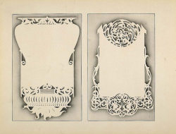
[[File:Artdecotemplate2.png |thumb| art nouveau template|250px]] | |||
This graduation year I am looking into ''template culture'', inspired by a Samsung smartphone commercial that promises its customers a chance to 'design their lives'. Mobile phones, apps and social networking sites are branded as services we can use to express ourselves online or to display our distinct personalities. But in reality, there is something quite depersonalising about it: we are all taking the same type of pictures on the same type of phone and uploading them to the same website. | |||
Not only do these devices and websites guarantee some kind of palette to 'paint your life' more beautiful, but extra features will help users manage every aspect of their busy lives. Not manage, compose! A semblance of control is promoted, not just related to lifestyle, but over the use of these applications as well. You decide the content, style and the presentation. But is this promise fulfilled or are they not just templates (or interfaces, filters) with minimal | Not only do these devices and websites guarantee some kind of palette to 'paint your life' more beautiful, but extra features will help users manage every aspect of their busy lives. Not manage, compose! A semblance of control is promoted, not just related to lifestyle, but over the use of these applications as well. You decide the content, style and the presentation. But is this promise fulfilled or are they not just templates (or interfaces, filters, themes) with minimal customisation options? And do these templates, while giving users the option to customize and personalise, not just generate a mass of homogeneous content? | ||
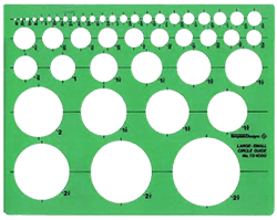
The Dutch word for template is 'sjabloon', its original meaning is 'modelvorm': a mold or stencil that, for example, is used to draw the same shape over and over again. In a more abstract sense, the word can be applied to anything that is conventional and often imitated or repeated. Sjabloon fits, because it outlines the multiple dimensions of this topic and it explains my fascination with it. With my background in Graphic Design, I have often encountered templates and created them. They're a part of the work that cannot be avoided, from style guides to "industry standard" software programs. Their restrictions and limitations can both liberate and limit the people who use them. Templates make a job easy, but tend to generate similar content. They are beautiful, but promote imitation. | |||
== Outcome == | |||
My goal is to create a catalogue of this current template culture, first by extracting and then exposing the underlying principles of a template. I'm especially interested in templates that are prominent in (graphic) design, web, lifestyle and advertisement: from design tools to photo-sharing websites. And from decorative 'sjablonen' to Instagram filters. The subject will be approached via a number of case studies, these could be: Tumblr themes, Pinterest boards, templates within apps and software for designers, mock-ups, smart phone advertisements, online graphic generators, etc. | |||
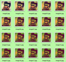
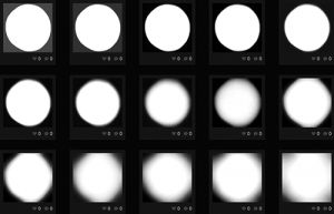
Regarding methodology, I plan to continue working by recontextualising or repurposing the visual language of digital culture. Each case study will be an investigation into the formal aspects of a template, revealing the framework by testing its boundaries. While underlining the visual, my aim is to also critically reflect on the effect of templates. The small exercises I've conducted so far illustrate this goal (documented in a work log, see below), when for example I applied Instagram filters to white backgrounds to find out what they look like without their content, the vintage looking "selfies" (self portrait created with a camera phone) or plates of food you typically find in an Instagram picture. | |||
This catalogue will have a graphic form, as this is something I am familiar and comfortable with. Most likely printed, it could be a collection of posters or a book. Important here is the interplay between the different projects. I think the topic becomes more clear when they are not standalone works, but viewed next to each other, illustrating the fact that templates are so very common. I will also keep in mind that not only the final outcome, but also the space it is displayed in will signify another type of template. | |||
== Practical steps == | |||
1. So far, I have started making small projects – that take no more than one day to finish – to avoid getting stuck in thinking, reading and conceptualising. I will continue to experiment with different examples within the topic of templates and while doing so, try to answer some of my key questions. What is a template without its content? What does it look like? How does it function in a different context? What is its interaction with (user-generated) content, and is it flexible? What happens to this content when the template changes and vice versa? | |||
2. These projects will be collected and documented in a work log. <u>[http://pzi.marlonharder.nl View the work log here]</u> | |||
. | 3. I am aware of how broad and open-ended my subject is and with these quick exercises I can allow myself to investigate different examples and fascinations, while still having some time to assess whether their outcome fits the goal I have in mind. After spending some, but not too much time on each small project I will be able to select one or two or three that will be developed further. And combined they will form an inventory of these unavoidable templates, showing how and why they work. | ||
== Previous practice == | |||
During the last two years of my bachelor, a fascination with the viral workings of the World Wide Web led to a number of projects. I focused on the process of finding information, especially in the case of current news events. Via image search engines or social networking sites I collected comments or images related to a topic and then attempted to recreate these stories or reinterpret the information. Some examples: | |||
''Tsunami by proxy (2011)'' | |||
This graduation piece is a collection of around 1200 postcards, printed with popular images found online that depict the earthquake, tsunami and nuclear disaster in Japan. (Natural) disasters are visual stories and the images that most accurately capture the imagination of the viewer are very popular online, even if they are stills from movies or images from other disasters. | |||
''PSYOP (2010)'' | |||
PSYOP is a collection of forum posts 'published' as a poetry book. The posts are comments on the 'Balloon boy hoax' of October 2009, as I was struck by how much meaningless content was produced by the online spectators of the story. The story went viral, picked up by the traditional media and more people rushed to their computer to share their advice, opinions, links and hastily generated gifs. The book is a chronological narration of the hoax, interspersed with quotes and screen captures from news broadcasting (a lot of the same messages and images repeated - a logical effect of 24/7 news coverage). | |||
<center> | <center> – – – – </center> | ||
At PZI, I became more interested in sharing and peer-to-peer networks. Both their social impact and how these notions are made visual. During the <u>[[User:Marlon/trimester2|second trimester]]</u> this resulted into an investigation that can be divided into three sections: | |||
''Pirate Bay Archive'' | |||
Karel Bilek created an archive of the Pirate Bay, a website that indexes (illegal) content available for download. The archive, an 75MB .XML file (a format used to store data), contains over 1,6 million links to torrent files. That would make it possible to recreate The Pirate Bay if it would ever be taken offline. As a very simple exercise I randomly displayed one item of the list on a website, with a link to the download. This gives users access to an enormous amount of content, but without the 'search option' it loses almost all its functionality. | |||
'' | ''.NFO-files'' | ||
.NFO files are a prominent tradition within the file sharing subculture. In the past the limited technical possibilities set boundaries for how the file looked and although the software used to create these files has developed significantly, the overall look of an .NFO file has remained the same, all due to its nostalgic value. I am impressed with how the creators of these files manage to construct something great with very little: a limited toolbox of white on black or black on white symbols is used to make impressive pieces of work. The files have changed from a necessity to a form of expression. It is the "corporate identity" of individuals or groups of people that manifest themselves online. | |||
''Peer-to-peer-to-Peer-to-peer'' | |||
A collage of images, downloaded via Google Images and printed on separate pages, that symbolise peer-to-peer networks. The printed pages overlap, connecting the peers of one diagram to those of another, forming a larger network of peer-to-peer networks. | |||
== | Peers can form a network of nodes in which they share data peer-to-peer, without any central coordination. Currently the term "peer-to-peer" is at the height of its popularity, something you see reflected in the striking amount of images visualising the system that circulate the Web. Though the system stays the same, its use is in constant development. This "evolution" can be observed when looking at these images: the older images are smaller in file-size, with low-tech graphics depicting desktop computers, while the newer versions illustrate the increasing social impact of the peer-to-peer system. | ||
== References == | |||
* Andrejevic, M (2004) Reality TV <br> | |||
* Galloway, A (2012) The Interface Effect | |||
* Manovich, L (2008) Software Takes Command | |||
* de Rijk, T (2010) Norm=Form | |||
* Bowker, G and Star, S (2000) Sorting Things Out | |||
* Lampand, M and Star, S (2008) Standards and Their Stories | |||
Latest revision as of 23:44, 1 December 2013
Sjabloon
This graduation year I am looking into template culture, inspired by a Samsung smartphone commercial that promises its customers a chance to 'design their lives'. Mobile phones, apps and social networking sites are branded as services we can use to express ourselves online or to display our distinct personalities. But in reality, there is something quite depersonalising about it: we are all taking the same type of pictures on the same type of phone and uploading them to the same website.
Not only do these devices and websites guarantee some kind of palette to 'paint your life' more beautiful, but extra features will help users manage every aspect of their busy lives. Not manage, compose! A semblance of control is promoted, not just related to lifestyle, but over the use of these applications as well. You decide the content, style and the presentation. But is this promise fulfilled or are they not just templates (or interfaces, filters, themes) with minimal customisation options? And do these templates, while giving users the option to customize and personalise, not just generate a mass of homogeneous content?
The Dutch word for template is 'sjabloon', its original meaning is 'modelvorm': a mold or stencil that, for example, is used to draw the same shape over and over again. In a more abstract sense, the word can be applied to anything that is conventional and often imitated or repeated. Sjabloon fits, because it outlines the multiple dimensions of this topic and it explains my fascination with it. With my background in Graphic Design, I have often encountered templates and created them. They're a part of the work that cannot be avoided, from style guides to "industry standard" software programs. Their restrictions and limitations can both liberate and limit the people who use them. Templates make a job easy, but tend to generate similar content. They are beautiful, but promote imitation.
Outcome
My goal is to create a catalogue of this current template culture, first by extracting and then exposing the underlying principles of a template. I'm especially interested in templates that are prominent in (graphic) design, web, lifestyle and advertisement: from design tools to photo-sharing websites. And from decorative 'sjablonen' to Instagram filters. The subject will be approached via a number of case studies, these could be: Tumblr themes, Pinterest boards, templates within apps and software for designers, mock-ups, smart phone advertisements, online graphic generators, etc.
Regarding methodology, I plan to continue working by recontextualising or repurposing the visual language of digital culture. Each case study will be an investigation into the formal aspects of a template, revealing the framework by testing its boundaries. While underlining the visual, my aim is to also critically reflect on the effect of templates. The small exercises I've conducted so far illustrate this goal (documented in a work log, see below), when for example I applied Instagram filters to white backgrounds to find out what they look like without their content, the vintage looking "selfies" (self portrait created with a camera phone) or plates of food you typically find in an Instagram picture.
This catalogue will have a graphic form, as this is something I am familiar and comfortable with. Most likely printed, it could be a collection of posters or a book. Important here is the interplay between the different projects. I think the topic becomes more clear when they are not standalone works, but viewed next to each other, illustrating the fact that templates are so very common. I will also keep in mind that not only the final outcome, but also the space it is displayed in will signify another type of template.
Practical steps
1. So far, I have started making small projects – that take no more than one day to finish – to avoid getting stuck in thinking, reading and conceptualising. I will continue to experiment with different examples within the topic of templates and while doing so, try to answer some of my key questions. What is a template without its content? What does it look like? How does it function in a different context? What is its interaction with (user-generated) content, and is it flexible? What happens to this content when the template changes and vice versa?
2. These projects will be collected and documented in a work log. View the work log here
3. I am aware of how broad and open-ended my subject is and with these quick exercises I can allow myself to investigate different examples and fascinations, while still having some time to assess whether their outcome fits the goal I have in mind. After spending some, but not too much time on each small project I will be able to select one or two or three that will be developed further. And combined they will form an inventory of these unavoidable templates, showing how and why they work.
Previous practice
During the last two years of my bachelor, a fascination with the viral workings of the World Wide Web led to a number of projects. I focused on the process of finding information, especially in the case of current news events. Via image search engines or social networking sites I collected comments or images related to a topic and then attempted to recreate these stories or reinterpret the information. Some examples:
Tsunami by proxy (2011)
This graduation piece is a collection of around 1200 postcards, printed with popular images found online that depict the earthquake, tsunami and nuclear disaster in Japan. (Natural) disasters are visual stories and the images that most accurately capture the imagination of the viewer are very popular online, even if they are stills from movies or images from other disasters.
PSYOP (2010)
PSYOP is a collection of forum posts 'published' as a poetry book. The posts are comments on the 'Balloon boy hoax' of October 2009, as I was struck by how much meaningless content was produced by the online spectators of the story. The story went viral, picked up by the traditional media and more people rushed to their computer to share their advice, opinions, links and hastily generated gifs. The book is a chronological narration of the hoax, interspersed with quotes and screen captures from news broadcasting (a lot of the same messages and images repeated - a logical effect of 24/7 news coverage).
At PZI, I became more interested in sharing and peer-to-peer networks. Both their social impact and how these notions are made visual. During the second trimester this resulted into an investigation that can be divided into three sections:
Pirate Bay Archive
Karel Bilek created an archive of the Pirate Bay, a website that indexes (illegal) content available for download. The archive, an 75MB .XML file (a format used to store data), contains over 1,6 million links to torrent files. That would make it possible to recreate The Pirate Bay if it would ever be taken offline. As a very simple exercise I randomly displayed one item of the list on a website, with a link to the download. This gives users access to an enormous amount of content, but without the 'search option' it loses almost all its functionality.
.NFO-files
.NFO files are a prominent tradition within the file sharing subculture. In the past the limited technical possibilities set boundaries for how the file looked and although the software used to create these files has developed significantly, the overall look of an .NFO file has remained the same, all due to its nostalgic value. I am impressed with how the creators of these files manage to construct something great with very little: a limited toolbox of white on black or black on white symbols is used to make impressive pieces of work. The files have changed from a necessity to a form of expression. It is the "corporate identity" of individuals or groups of people that manifest themselves online.
Peer-to-peer-to-Peer-to-peer
A collage of images, downloaded via Google Images and printed on separate pages, that symbolise peer-to-peer networks. The printed pages overlap, connecting the peers of one diagram to those of another, forming a larger network of peer-to-peer networks.
Peers can form a network of nodes in which they share data peer-to-peer, without any central coordination. Currently the term "peer-to-peer" is at the height of its popularity, something you see reflected in the striking amount of images visualising the system that circulate the Web. Though the system stays the same, its use is in constant development. This "evolution" can be observed when looking at these images: the older images are smaller in file-size, with low-tech graphics depicting desktop computers, while the newer versions illustrate the increasing social impact of the peer-to-peer system.
References
- Andrejevic, M (2004) Reality TV
- Galloway, A (2012) The Interface Effect
- Manovich, L (2008) Software Takes Command
- de Rijk, T (2010) Norm=Form
- Bowker, G and Star, S (2000) Sorting Things Out
- Lampand, M and Star, S (2008) Standards and Their Stories

